Family
Examples
Glyphs
Description
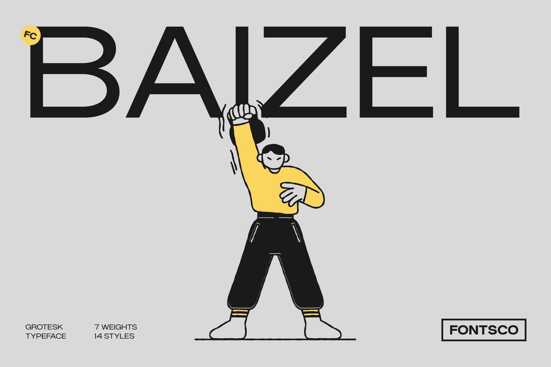
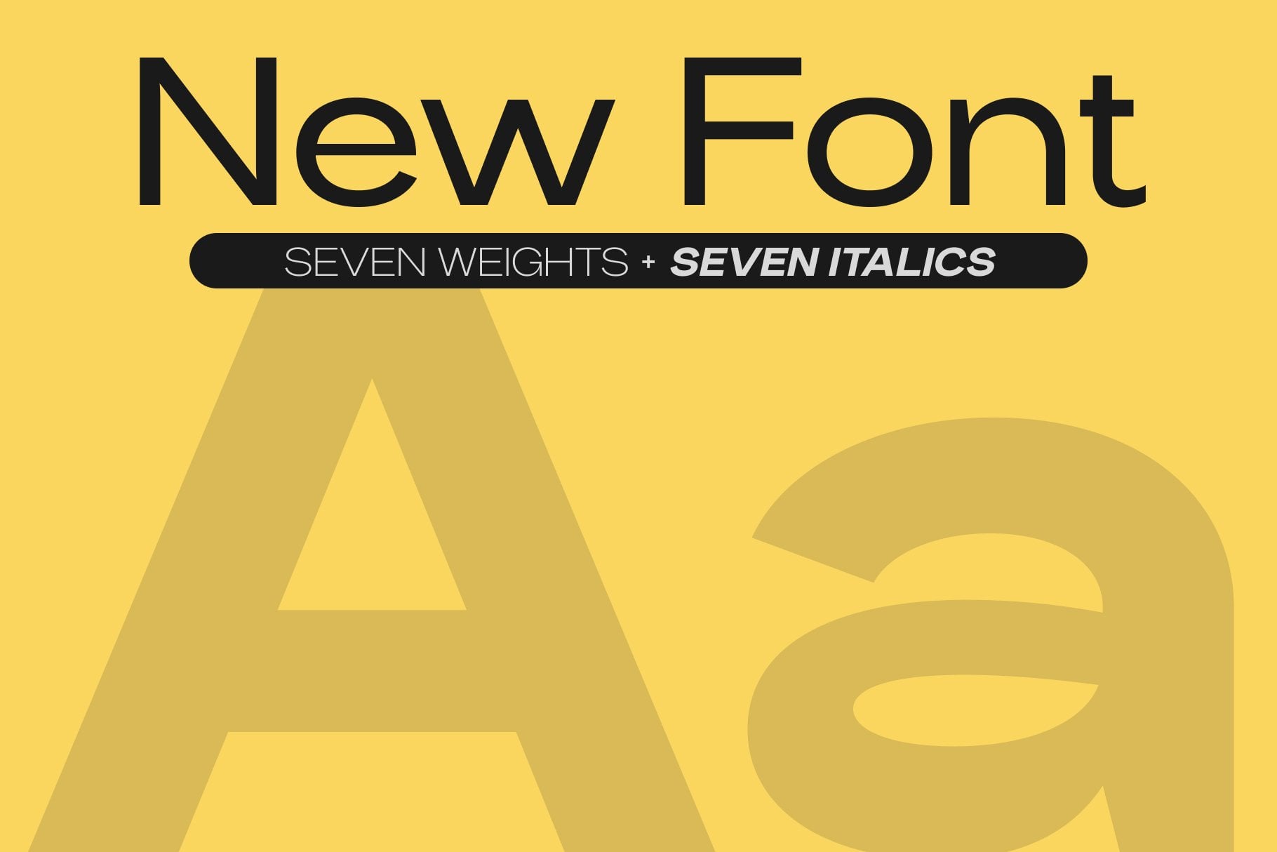
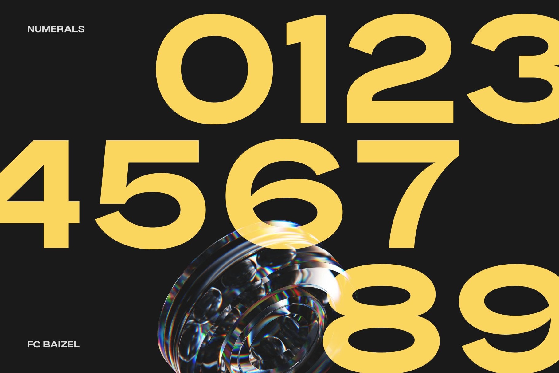

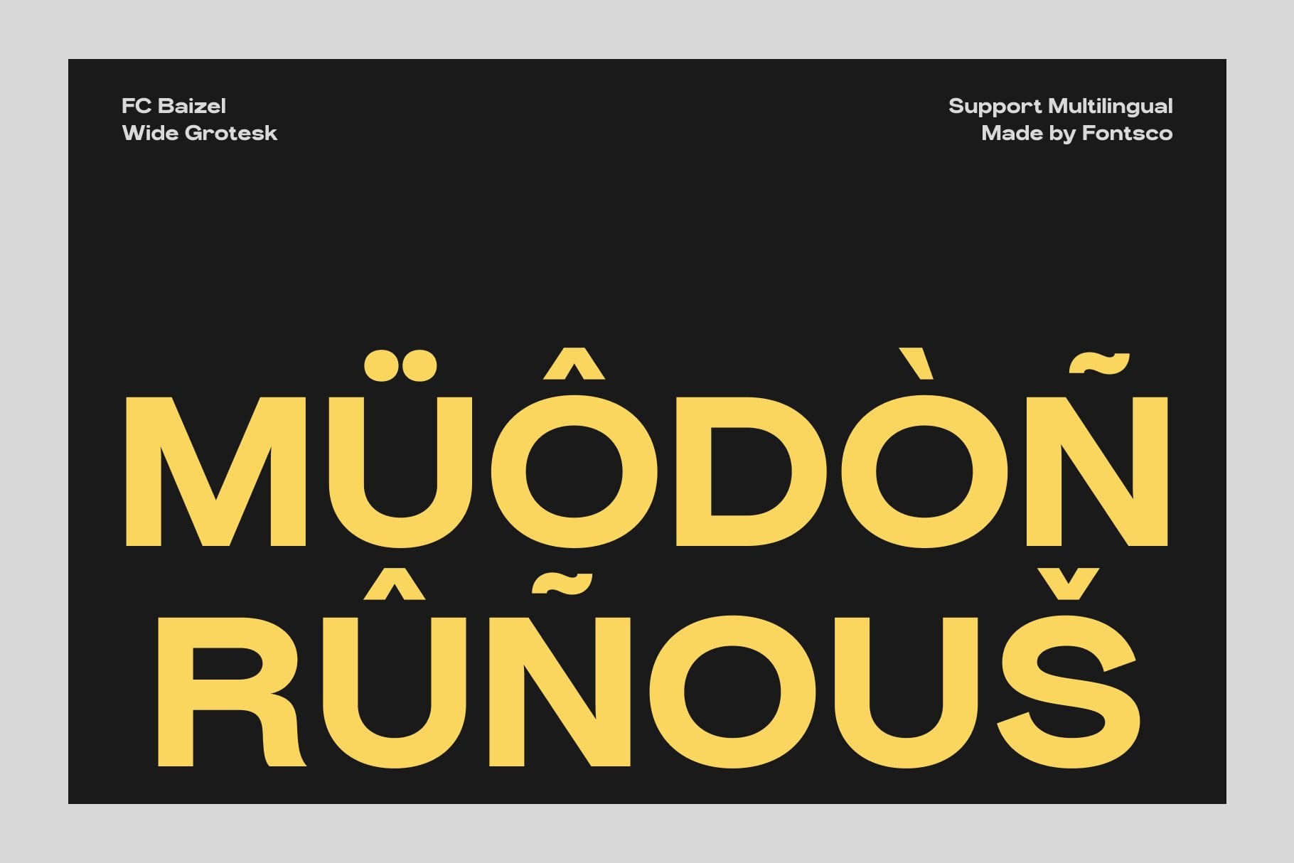
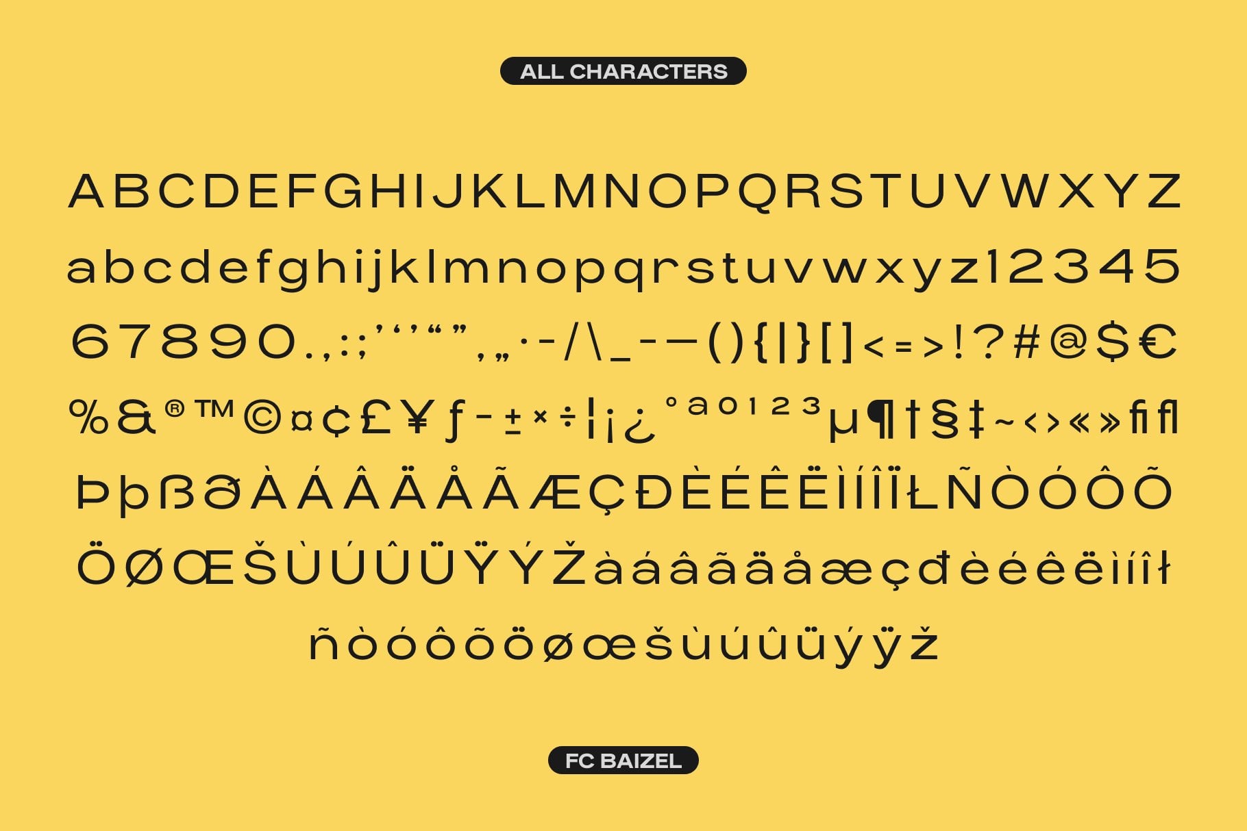
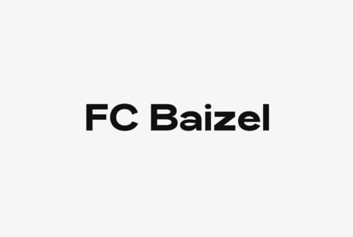
FC Baizel is a modern grotesk sans serif family by Fontsco, built around low-contrast details that keep letterforms clear and even at small sizes...The design follows a contemporary grotesk lineage, so the shapes feel familiar and purposeful rather than decorative. Stroke weight stays consistent across characters, and the forms remain open and legible when text is set tight. That balance makes FC Baizel a dependable choice when a project needs a clean, neutral voice that still carries a confident editorial edge.
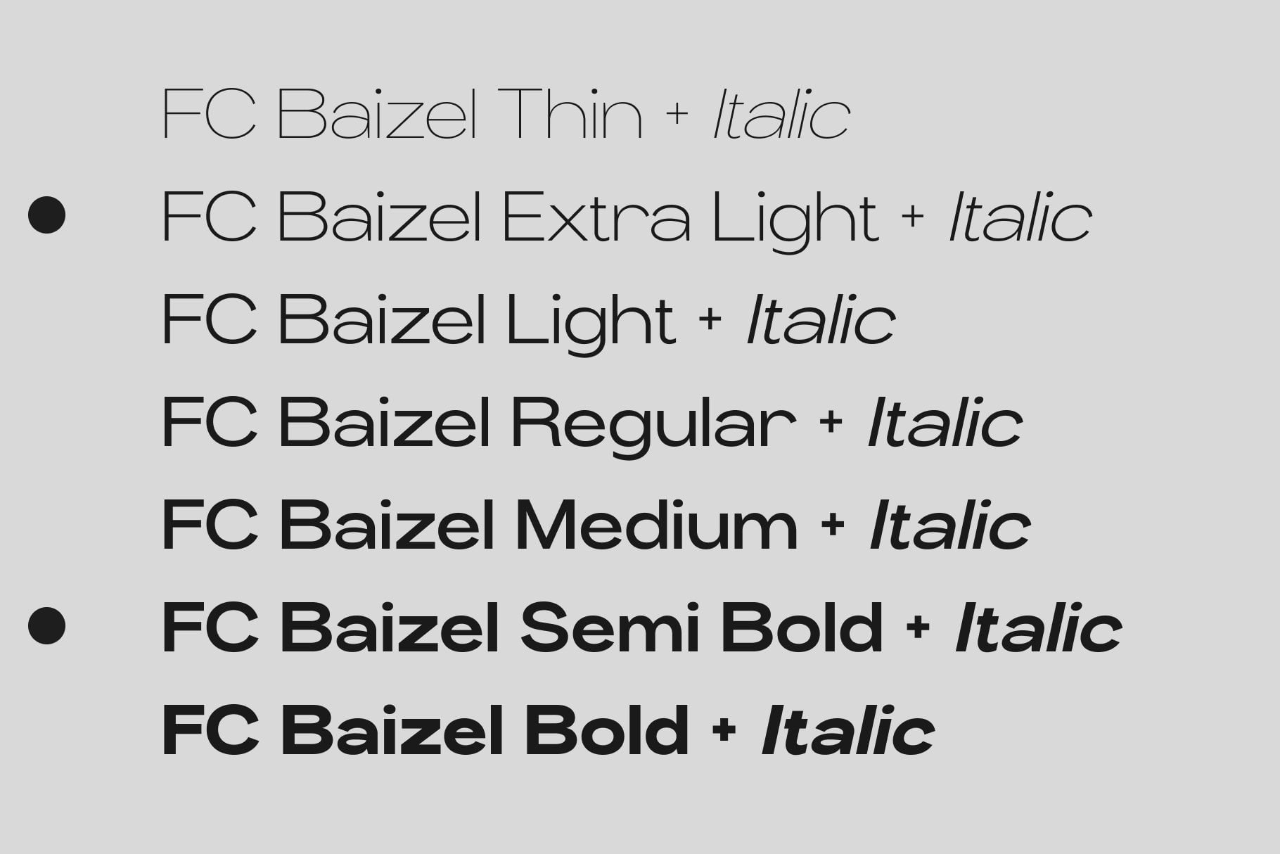
The family is available in both variable and static versions, giving designers flexibility across a wide range of applications. Use the variable version to fine-tune weight and optical size as a layout evolves, or reach for the static cuts when a fixed, predictable setting is preferred. Because FC Baizel handles both big and small text, one typeface can carry an entire project, from compact captions and body copy to larger display lines, without a visible shift in character or tone.
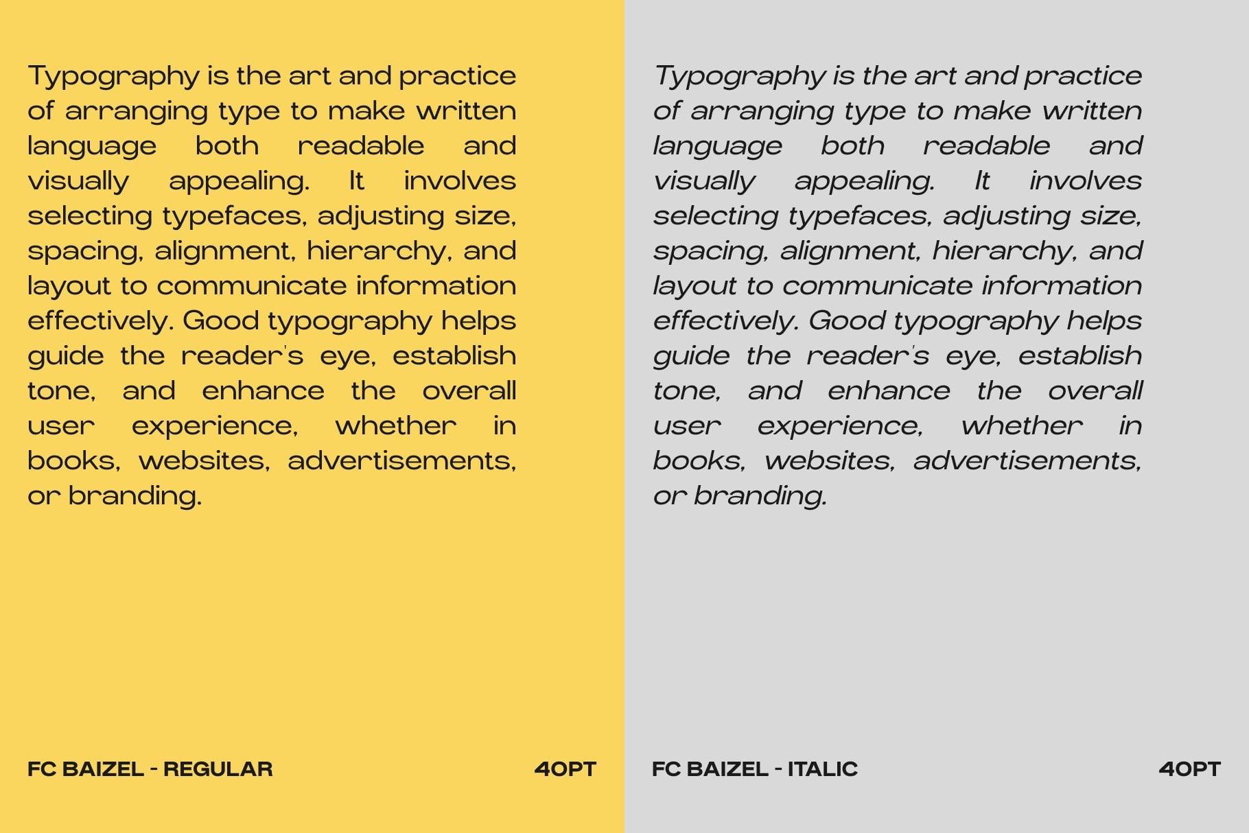
In practice, FC Baizel suits print materials especially well: books, reports, brochures, catalogs, and other editorial pieces where sustained reading matters. Its low-contrast construction keeps long passages comfortable, while the grotesk structure holds up in headings and cover typography. For book printing in particular, the family offers the steady rhythm and even color that dense pages demand, and the same qualities translate smoothly to shorter documents and supporting text.
FC Baizel is a straightforward, one-stop solution for designers who want a modern grotesk that works hard across formats. Its restrained details and broad weight range support almost any design project, and the typeface rewards thoughtful, imaginative use with text that looks polished and reads effortlessly.