II Increments Sans
Family
II Increments Sans LightII Increments Sans Light ObliqueII Increments Sans RegularII Increments Sans Regular ObliqueII Increments Sans MediumII Increments Sans Medium ObliqueII Increments Sans BoldII Increments Sans Bold ObliqueII Increments Sans BlackII Increments Sans Black Oblique
Examples
Think things through
In our fast-paced world today, we often forget the importance of patience and taking time to think things through. We want to remind people of the value of creativity and clever thinking.
In our fast-paced world today, we often forget the importance of patience and taking time to think things through. We want to remind people of the value of creativity and clever thinking, supporting a movement that embraces focus, skill, and understanding over fast production and short-lived trends. This doesn't mean we're against technology, but we're asking for a balance between using technology and the traditional principles of design as a craft.
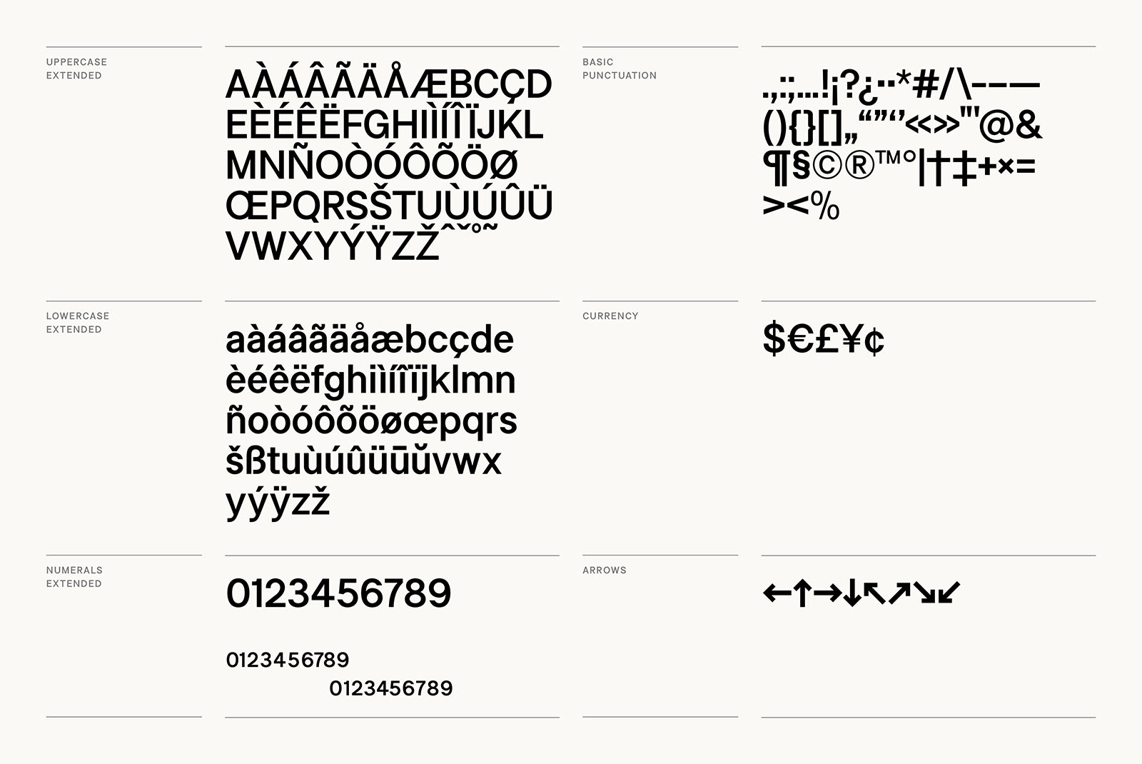
Glyphs
Description
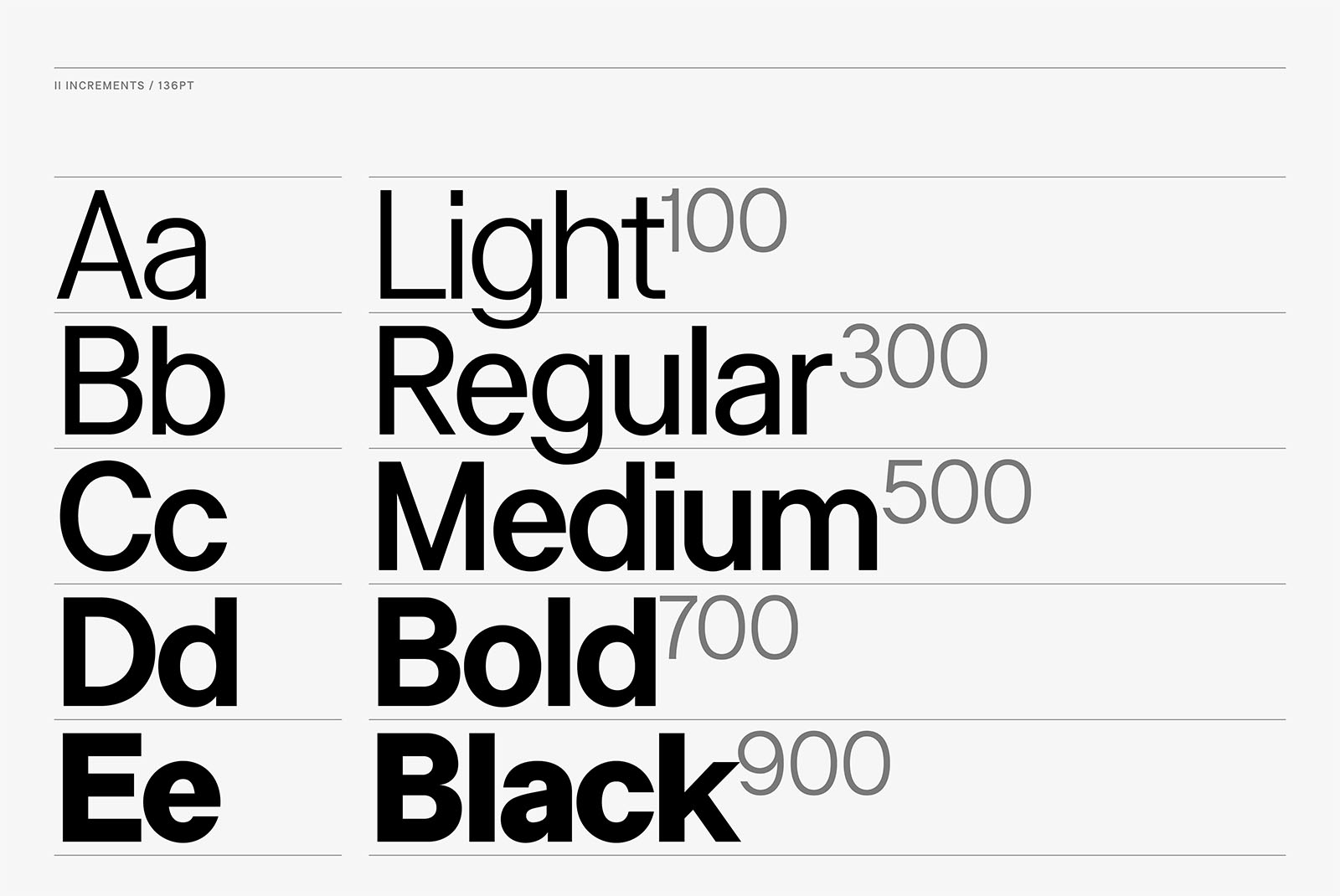
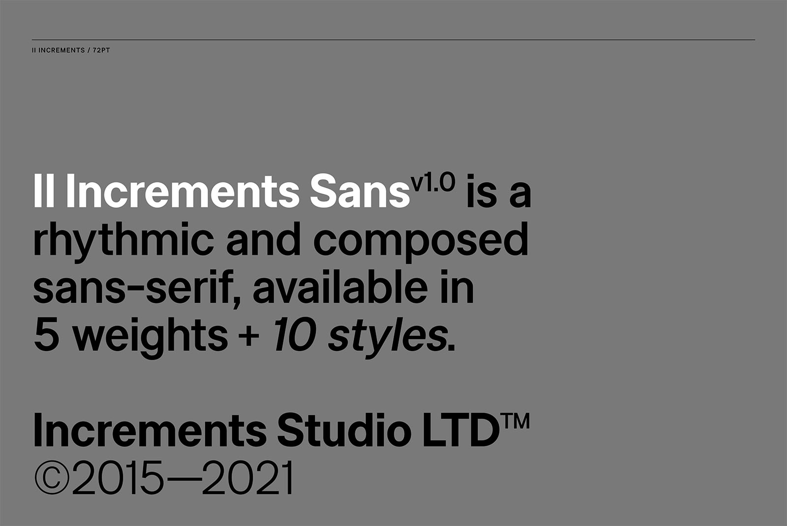
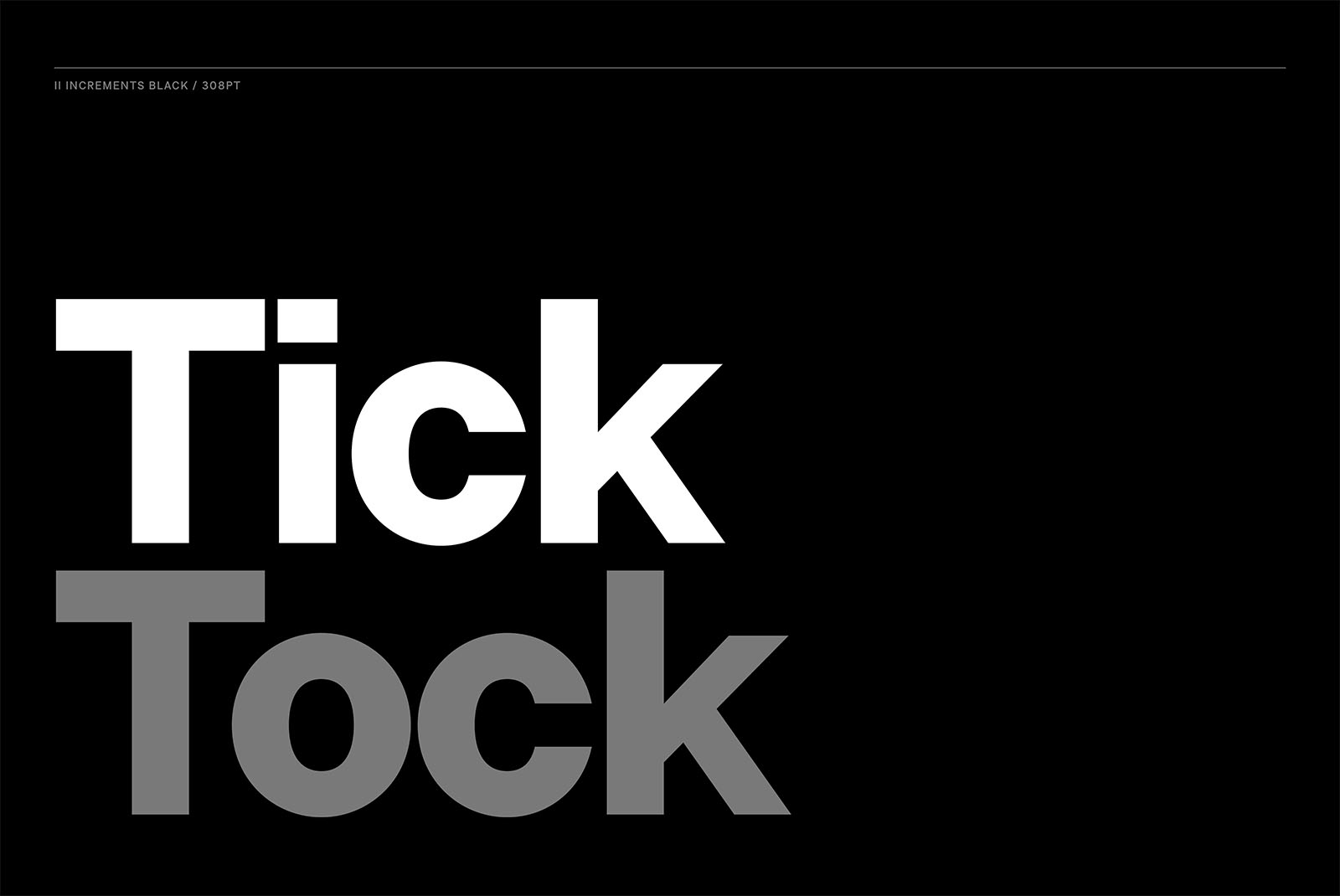
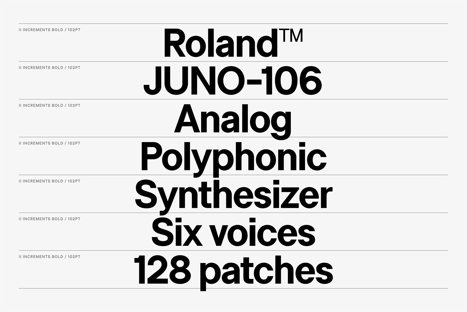
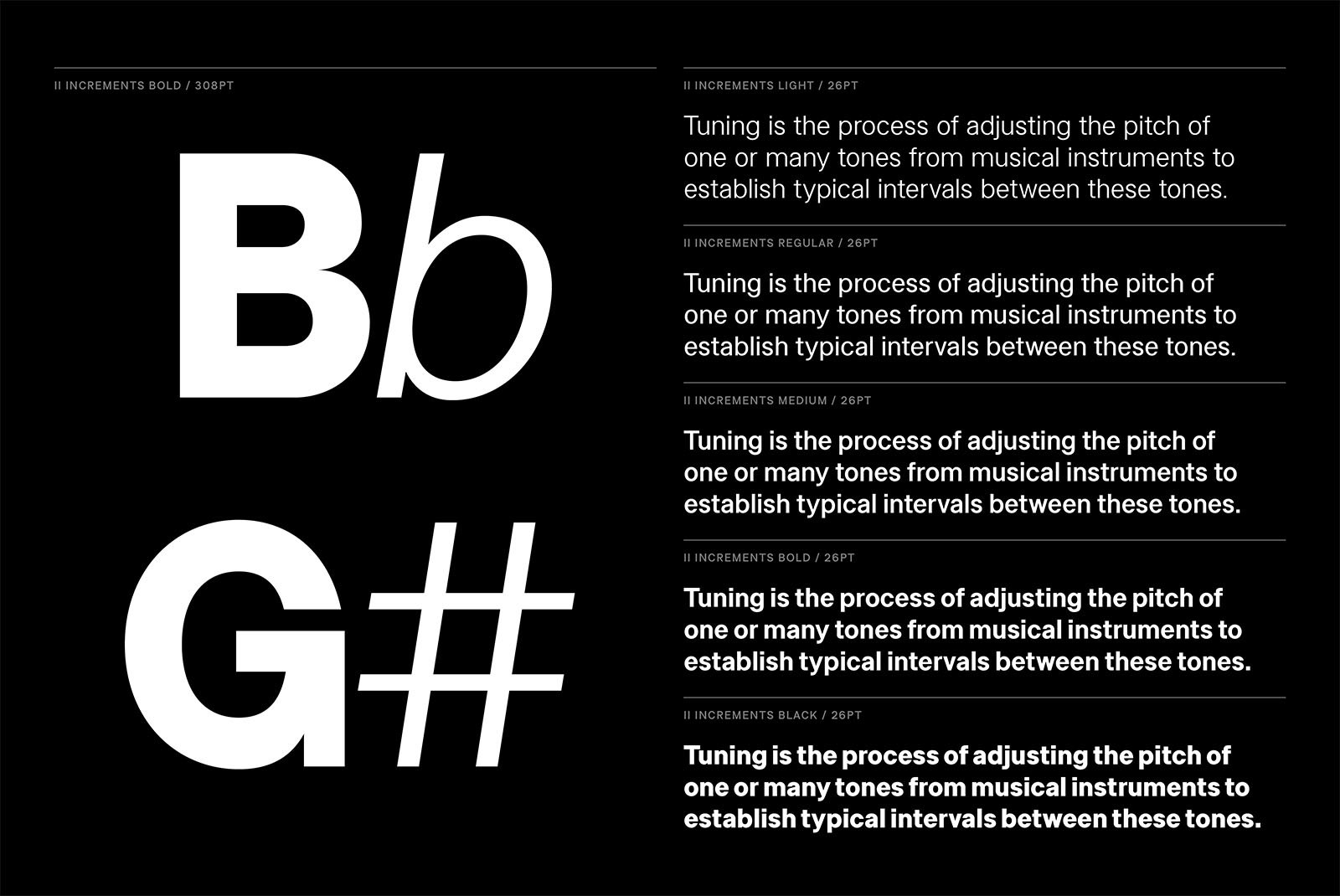
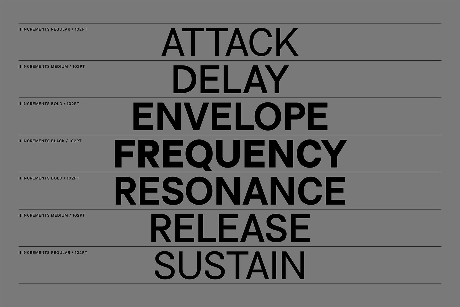
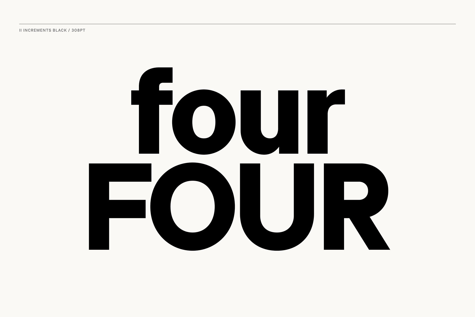

Informed by classic grotesk proportions and principles within musical theory, II Increments Sans results in a rhythmic and composed sans-serif. Set within a structured..grid, the intonation and harmony between its functional forms and emotive characteristics allow for use at both text and display sizes.