Family
Examples
Glyphs
Description
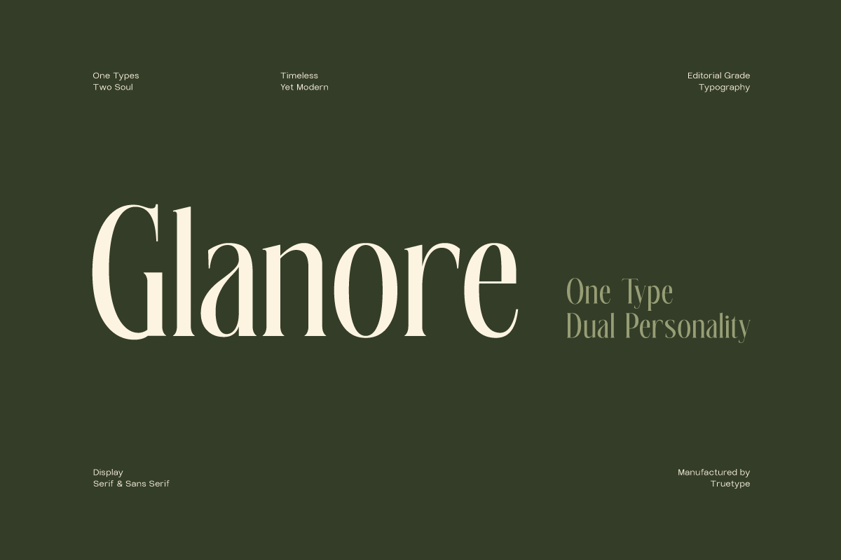
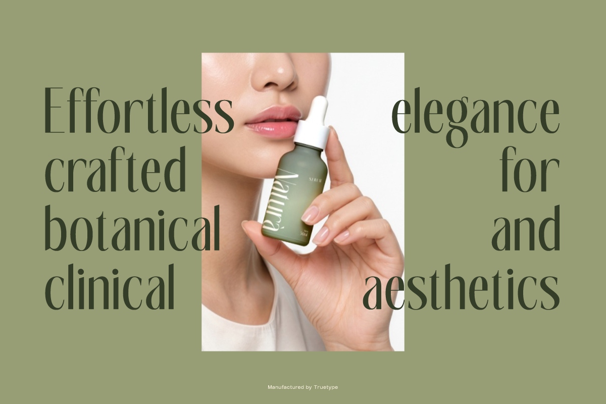
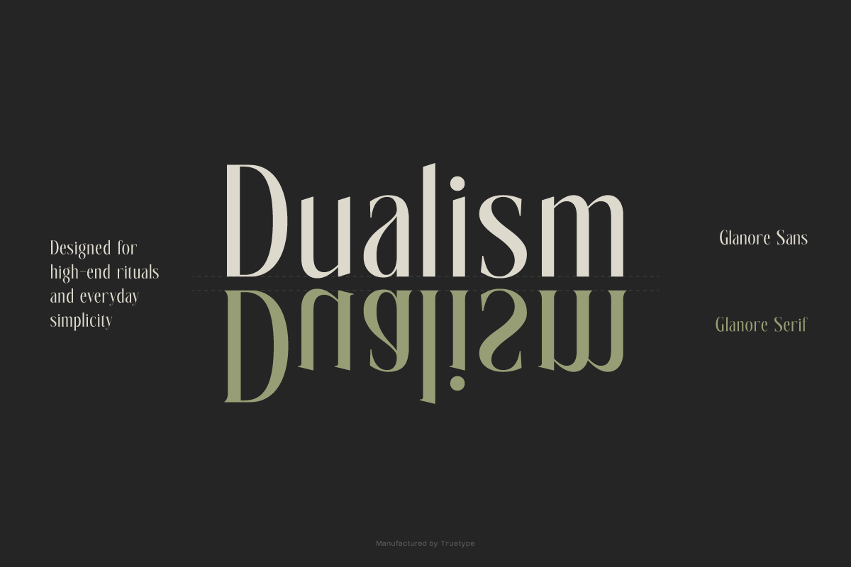
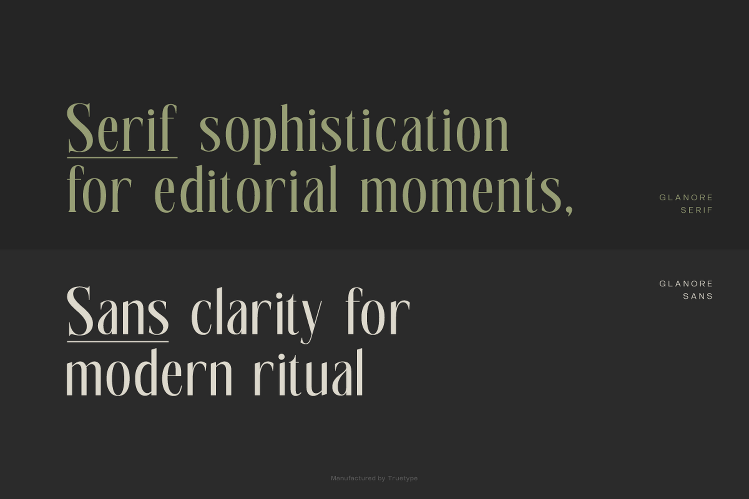
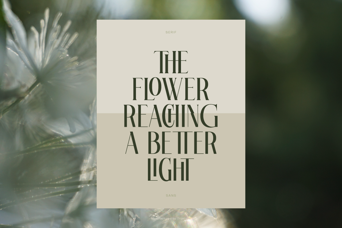
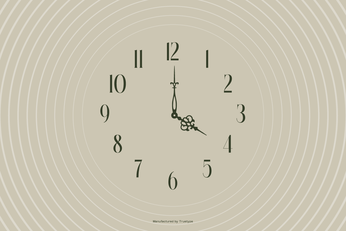
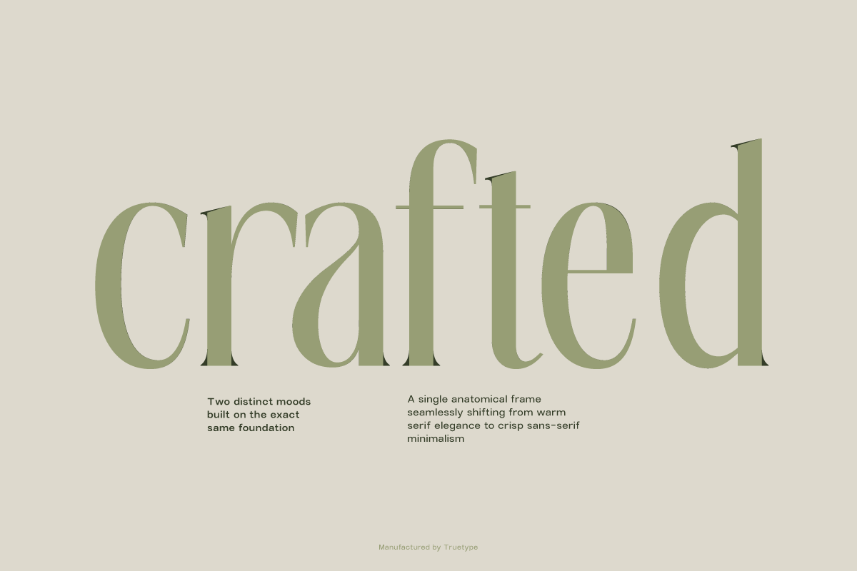
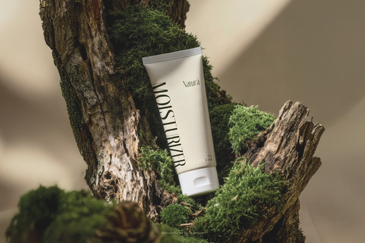
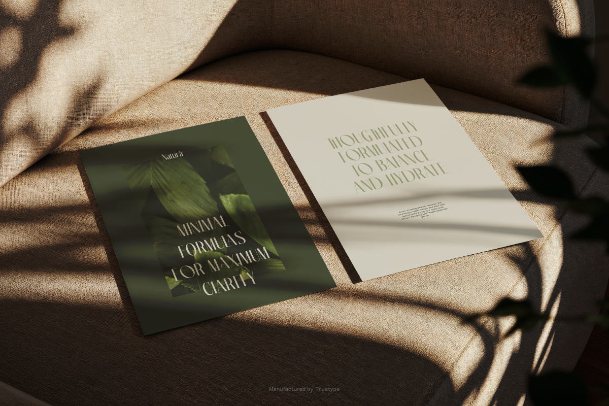
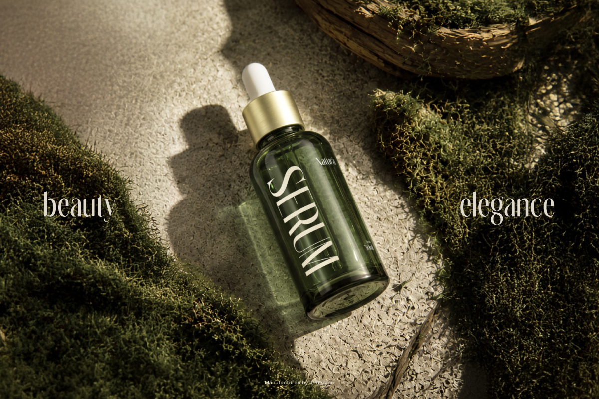
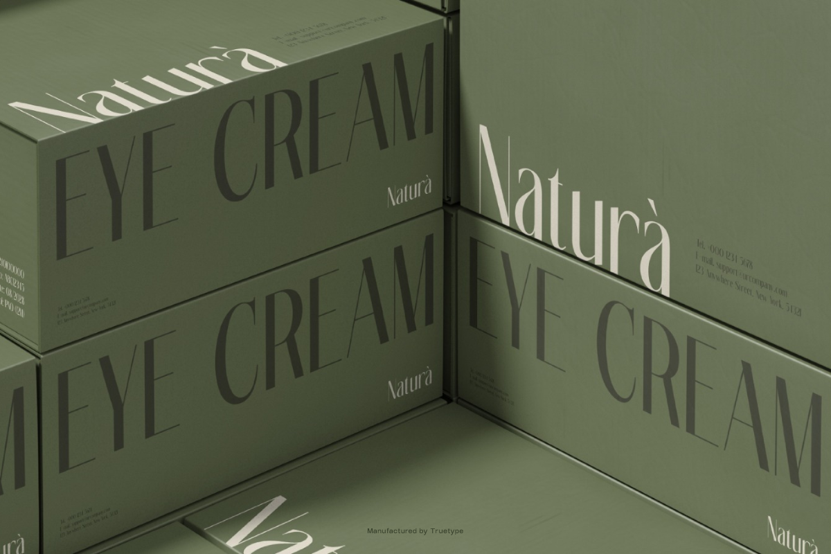
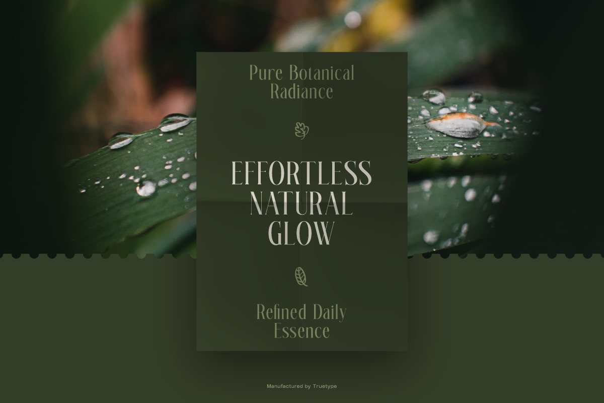
TRT Glanore sets a serif and a sans on one anatomical frame, and the variable version connects them. Move along the axis and the..serifs recede into a clean sans while the proportions underneath stay put, so one file covers both voices without a reflow.
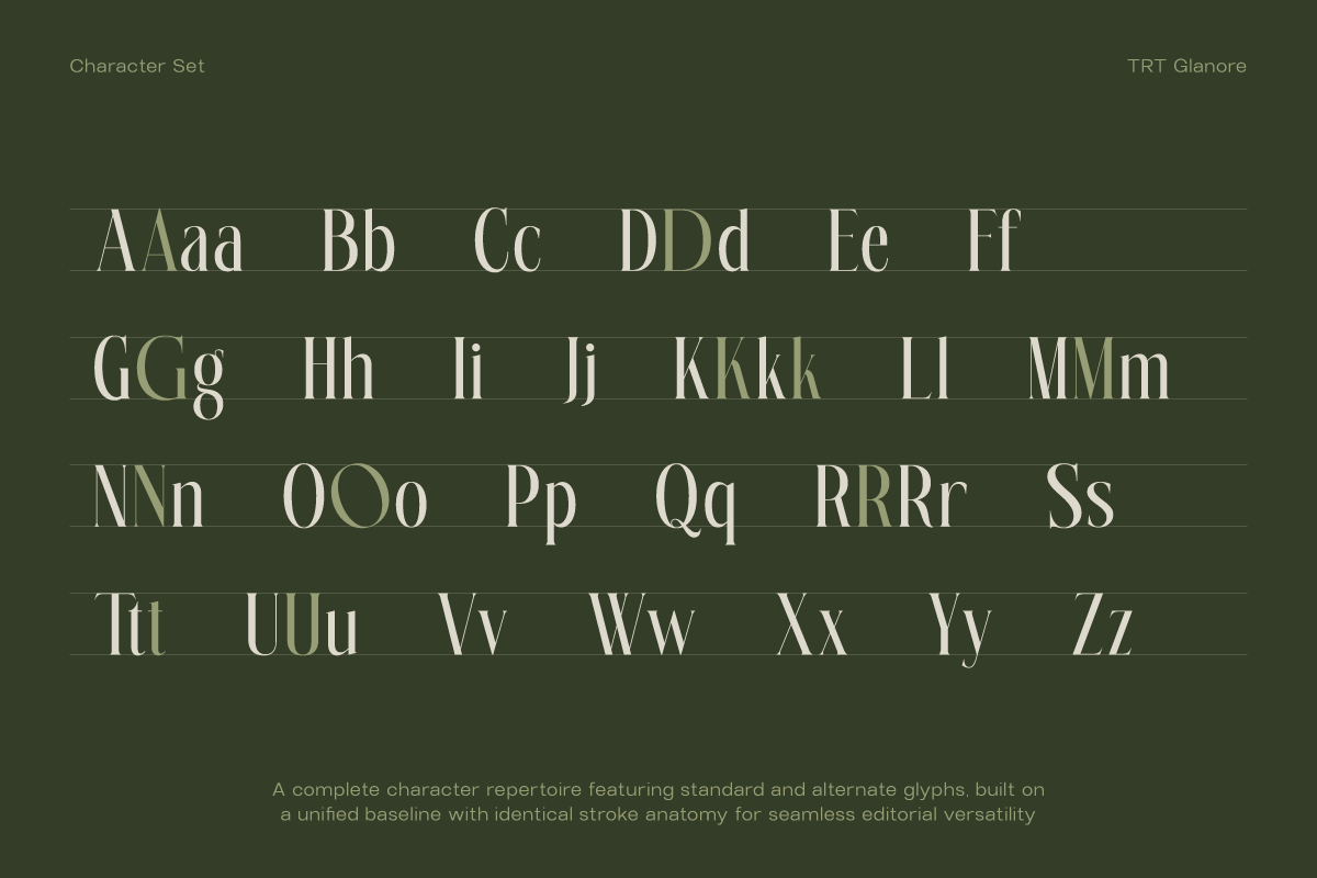
Both styles share the same 254 glyphs: uppercase, lowercase, numerals, punctuation, symbols, ligatures, and alternates on letters such as D, G, K, R, P, and O. The alternate O is drawn wider on purpose. At display size a standard O closes its counters, and the opened form holds contrast where headlines live.
That is what the pairing does for a project. A wordmark can run in the serif while the fine print runs in the sans without buying a second family, a brand system can move between the two by degrees, and a title can shift voice mid sequence without a cut.
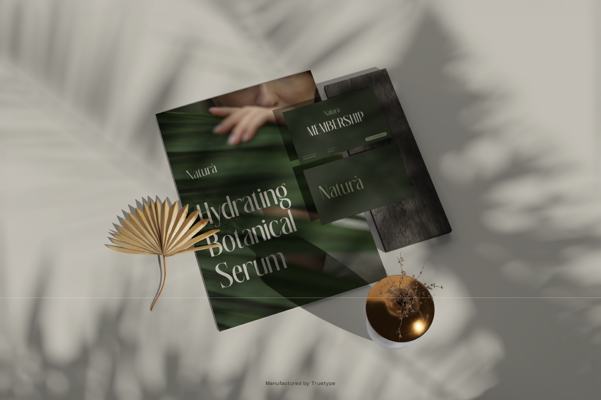
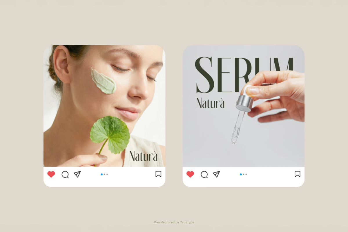
Built for headline and display work, logo and wordmark, editorial, packaging, posters and signage, brand identity, and experimental projects. Latin support, shipped as OTF, TTF, WOFF, WOFF2, and the variable font.
Designed and released by TrueType Lab.