Family
Examples
Glyphs
Description
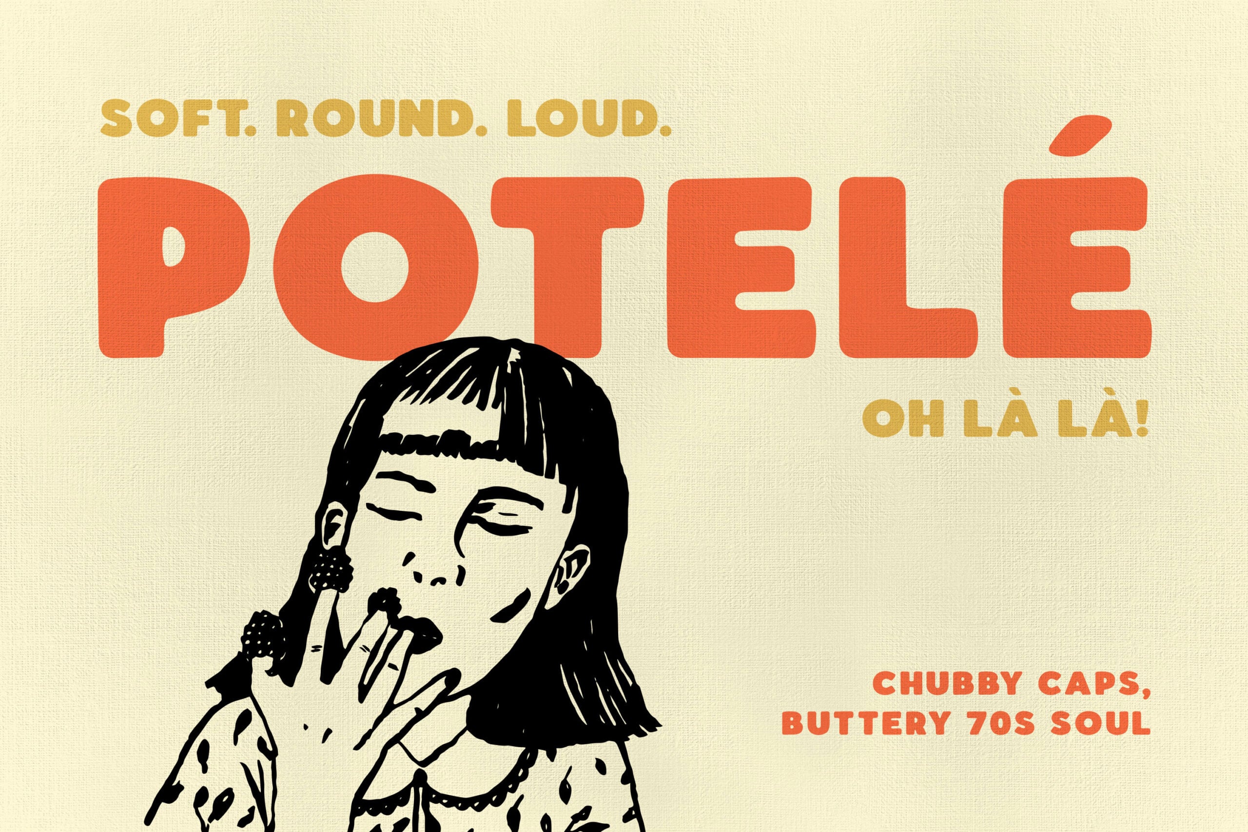
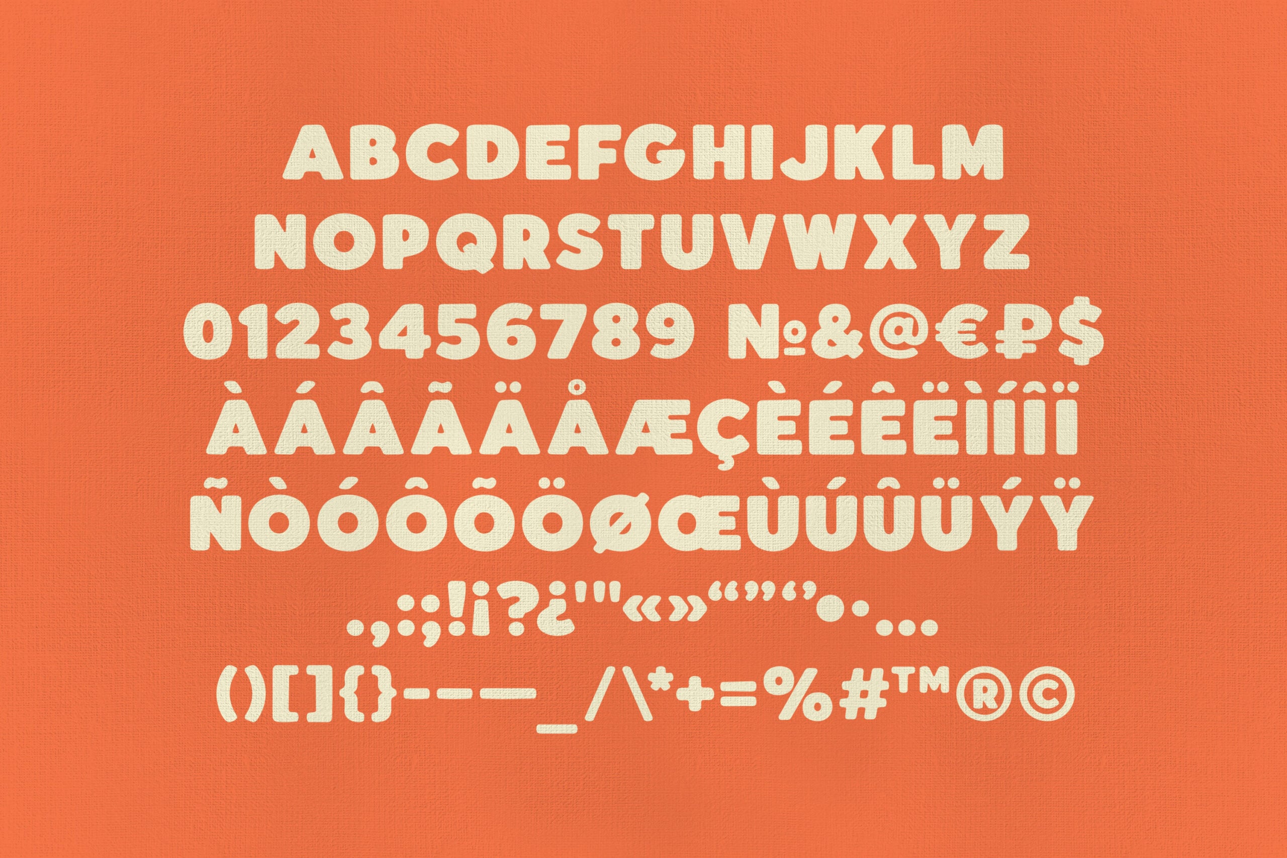
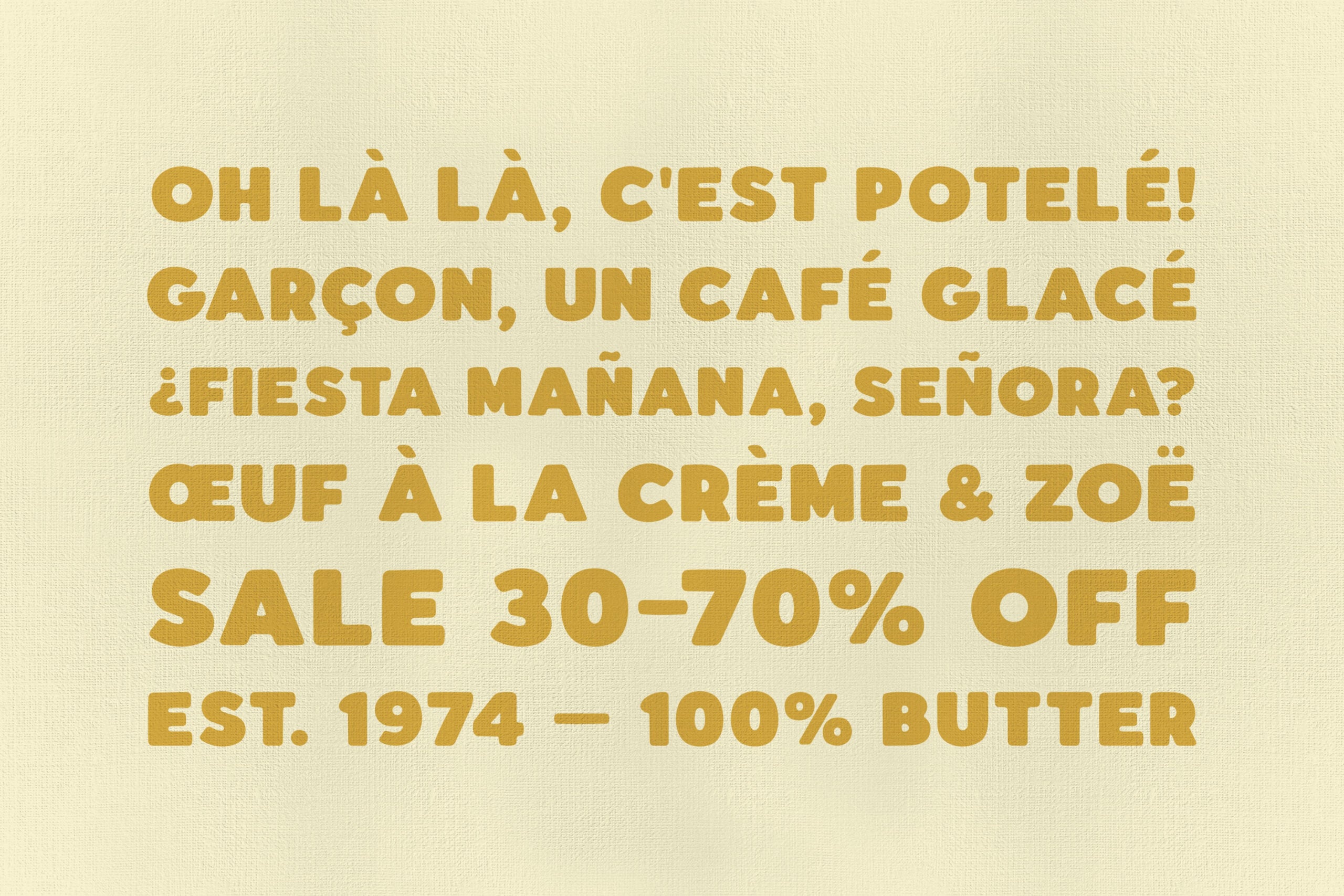
Potelé takes its name from the French word for plump, and the letterforms earn it: chubby all-caps on heavy strokes, full round bowls, and..soft huggable terminals, all finished with a naive hand-drawn wobble. It grows out of French sign-painting and the fat rounded lettering of 1970s film posters and café storefronts — yes, a café cliché. Annoyingly useful.
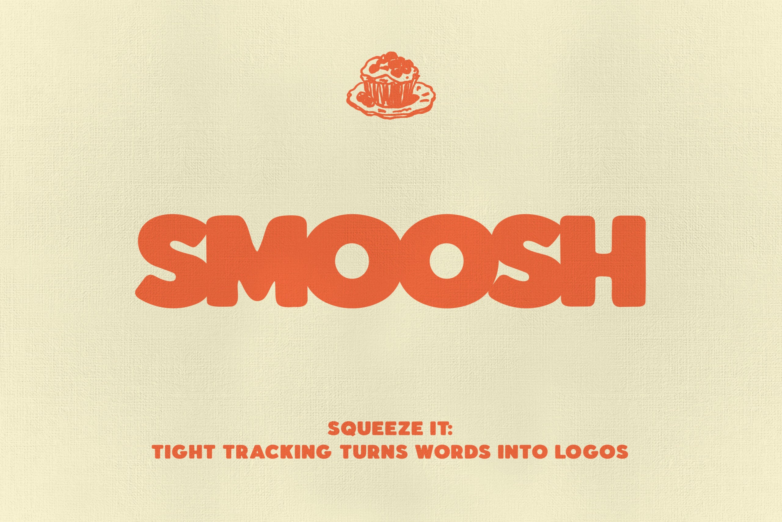
The font goes loud at display sizes, where the round caps take up room and do the talking. Tight tracking suits it best: squeeze the letters together and one word sets into a ready-made logo, the way an old shop sign reads as a single mark.
Practical uses:
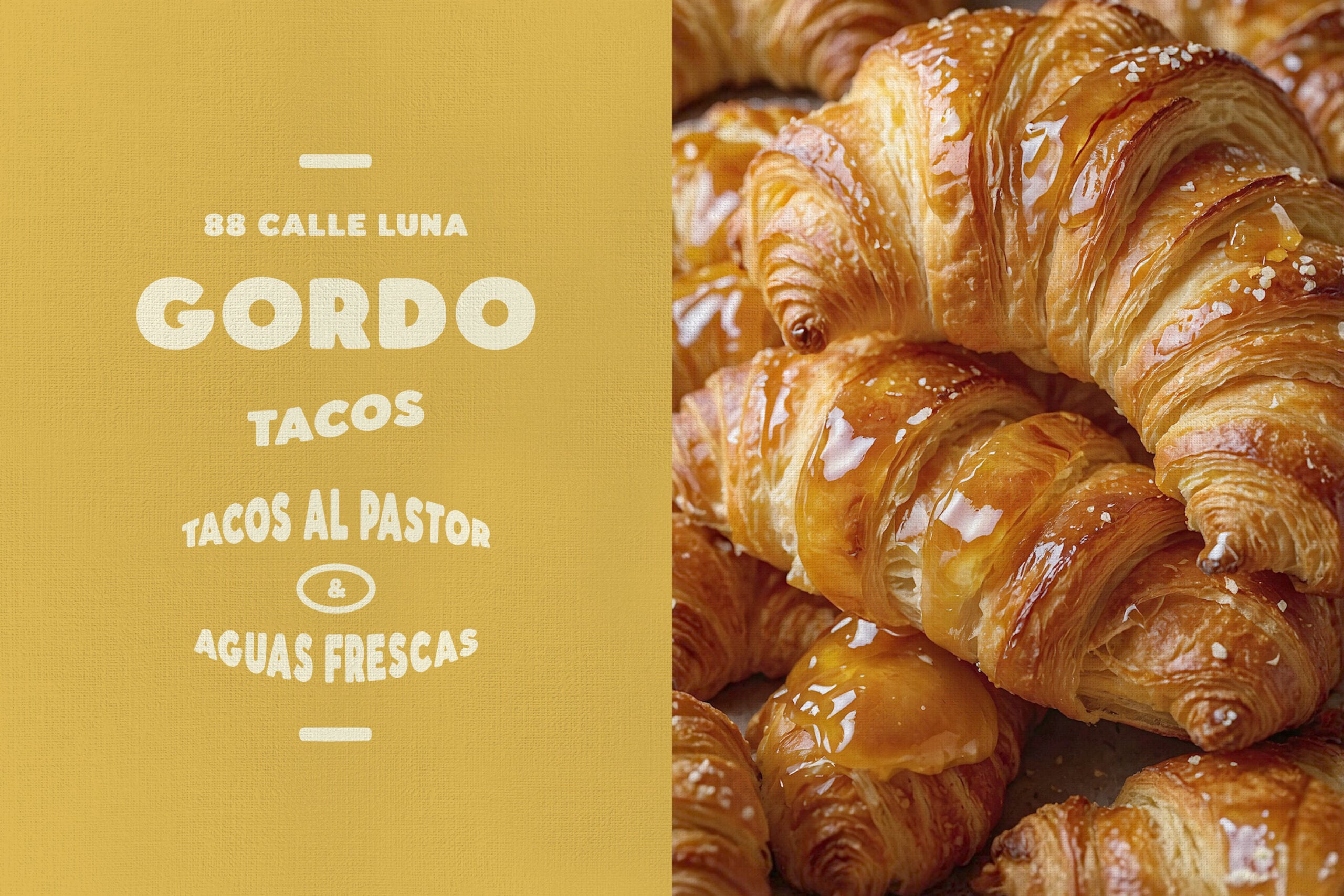
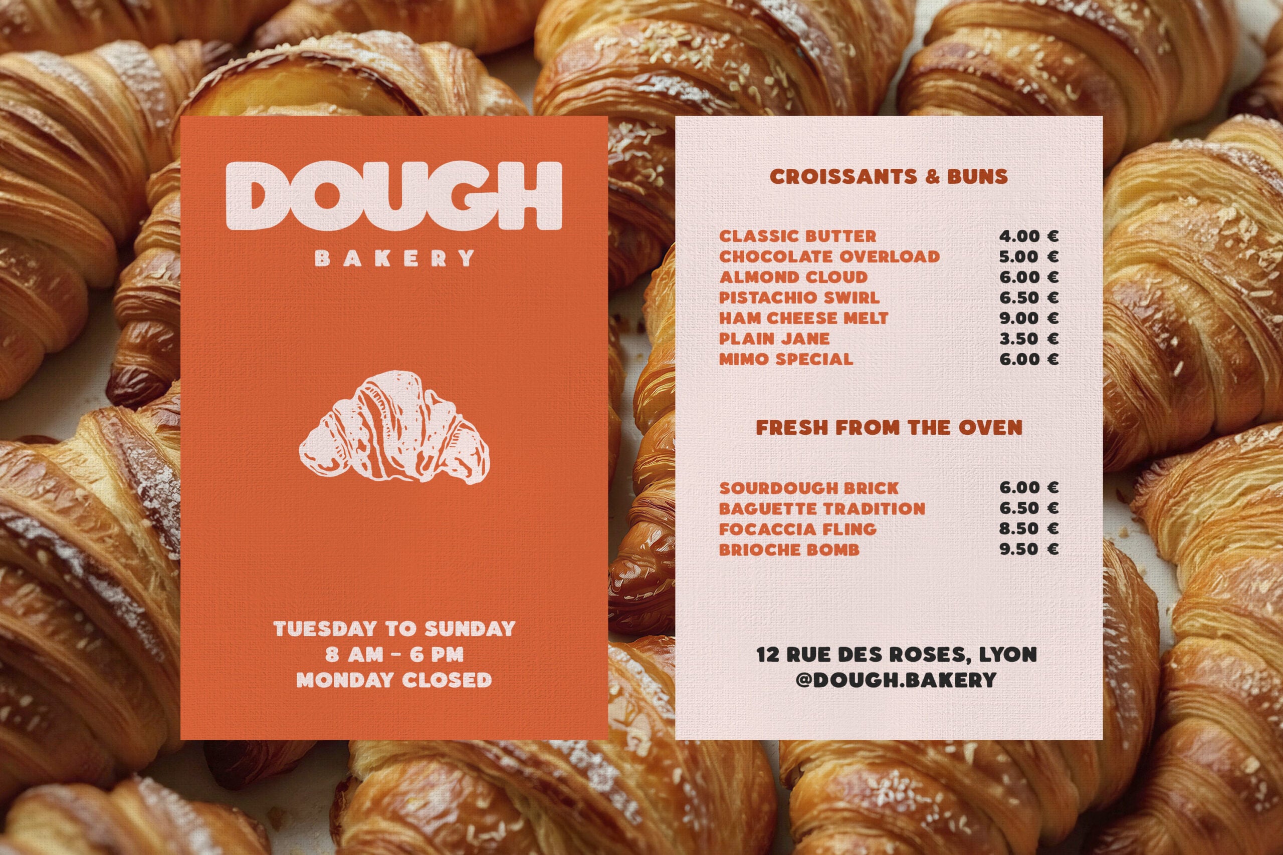
- Branding and logos — bakeries, patisseries, cafés, ice-cream parlors, natural-wine bars.
- Signage and menu boards — storefront signs, enamel-style plaques, chalkboard menus, market stalls.
- Poster and flyer design — festivals, film nights, food fairs, block parties, gig posters.
- Packaging design — kids' snacks, candy wrappers, jam jars, soda labels, gift boxes.
- Merchandise and editorial — totes, enamel pins, apparel prints, magazine headlines, chapter openers.
Features:
- 100% ASCII coverage: A–Z with matching lowercase set, numerals, punctuation & symbols;
- accented characters for Western European and Nordic languages;
- currency & reference marks (€ £ ¥ ¢ ₽ © ® ™);
- quotes & guillemets («» ‹› “” „);
- OTF, TTF, WOFF, WOFF2 formats.