Family
Examples
Glyphs
Description
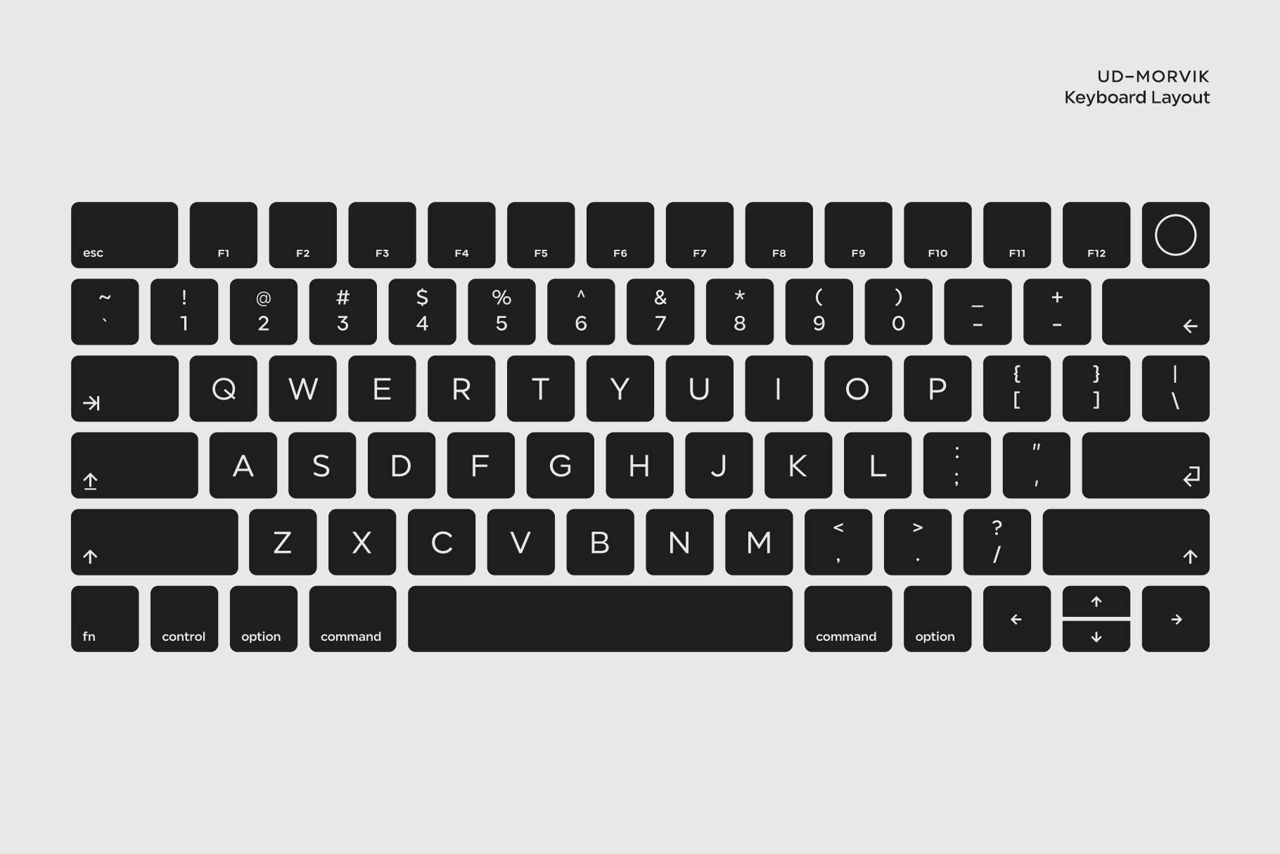
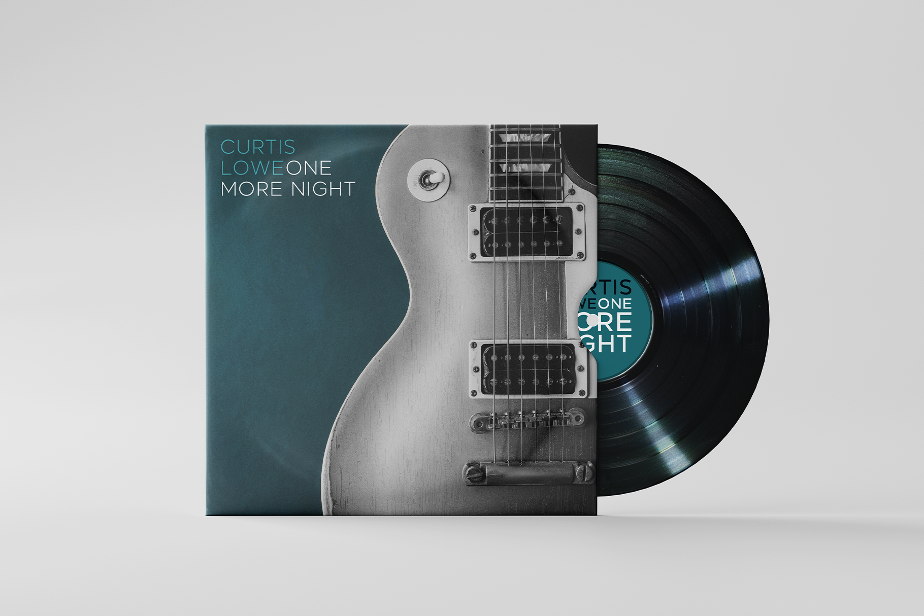
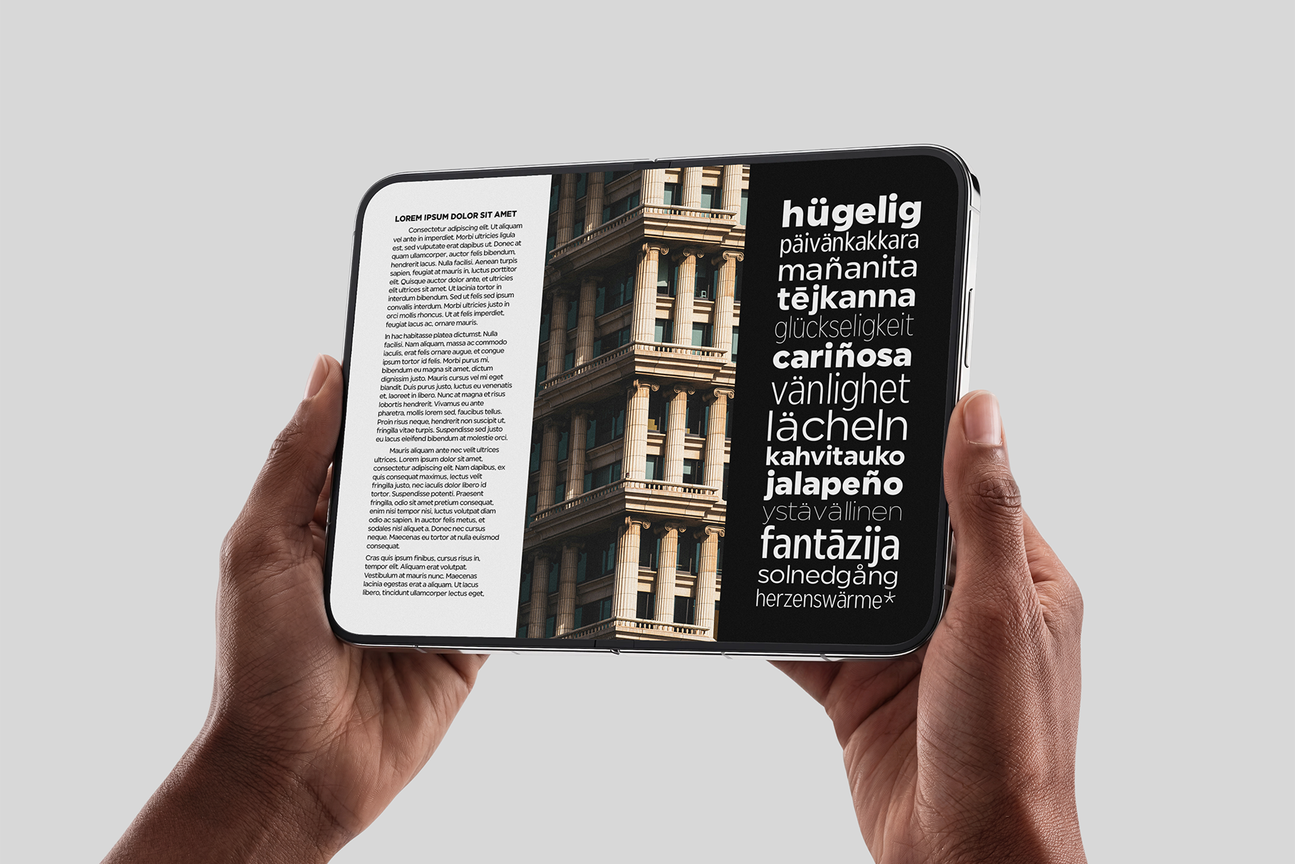
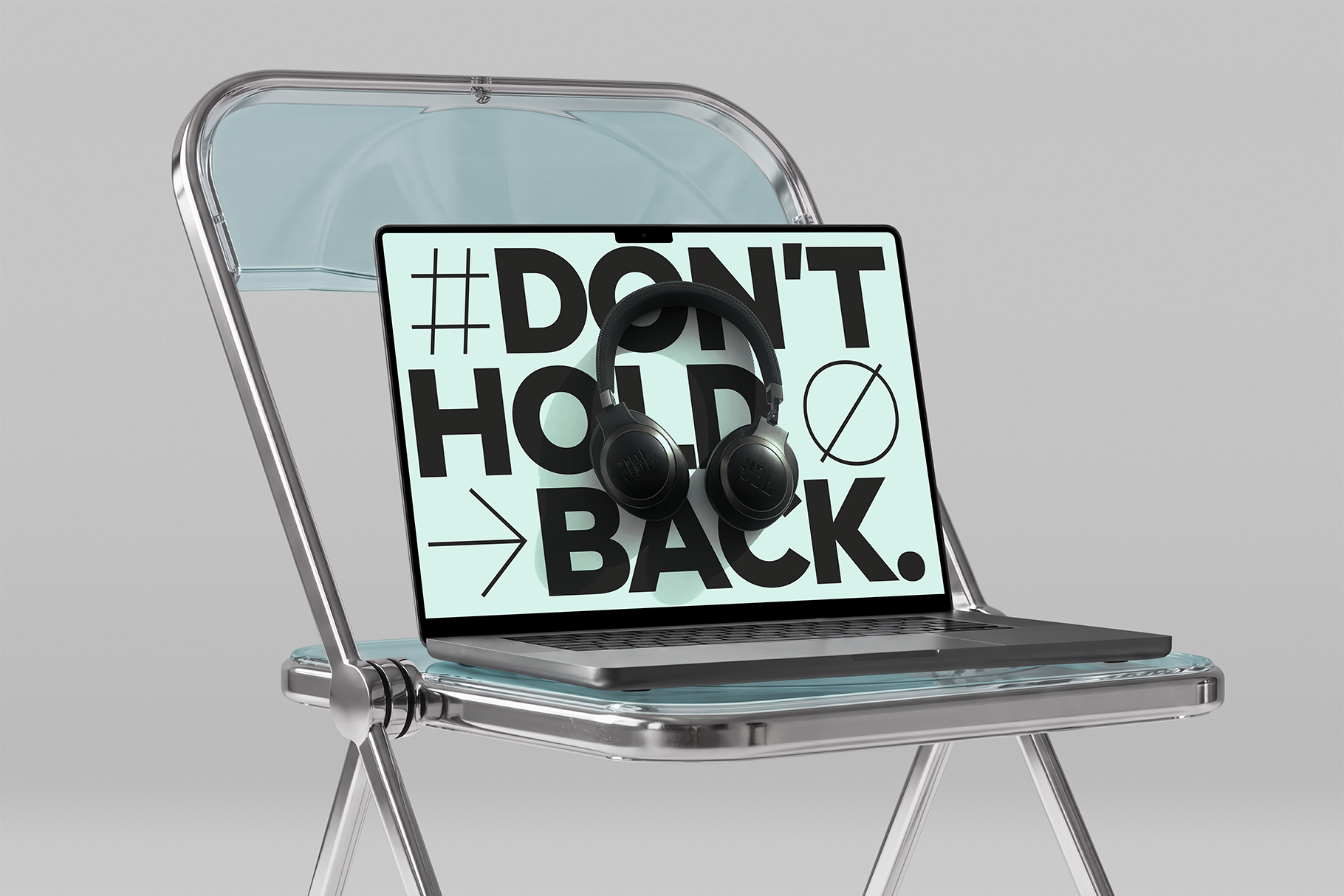
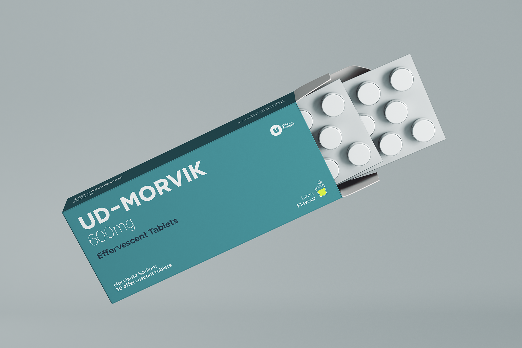
Look around at any moment of the day: the biscuit box on the breakfast table, the medicine blister pack in the cabinet, the corporate..website we visit every morning, the shipping label on a newly delivered parcel. None of this is accidental. The design that surrounds our daily lives is there because it works: it has been researched, refined, and field-tested to be instantly readable at a glance, commercially effective for the client, and deeply satisfying for the designer who crafted it.
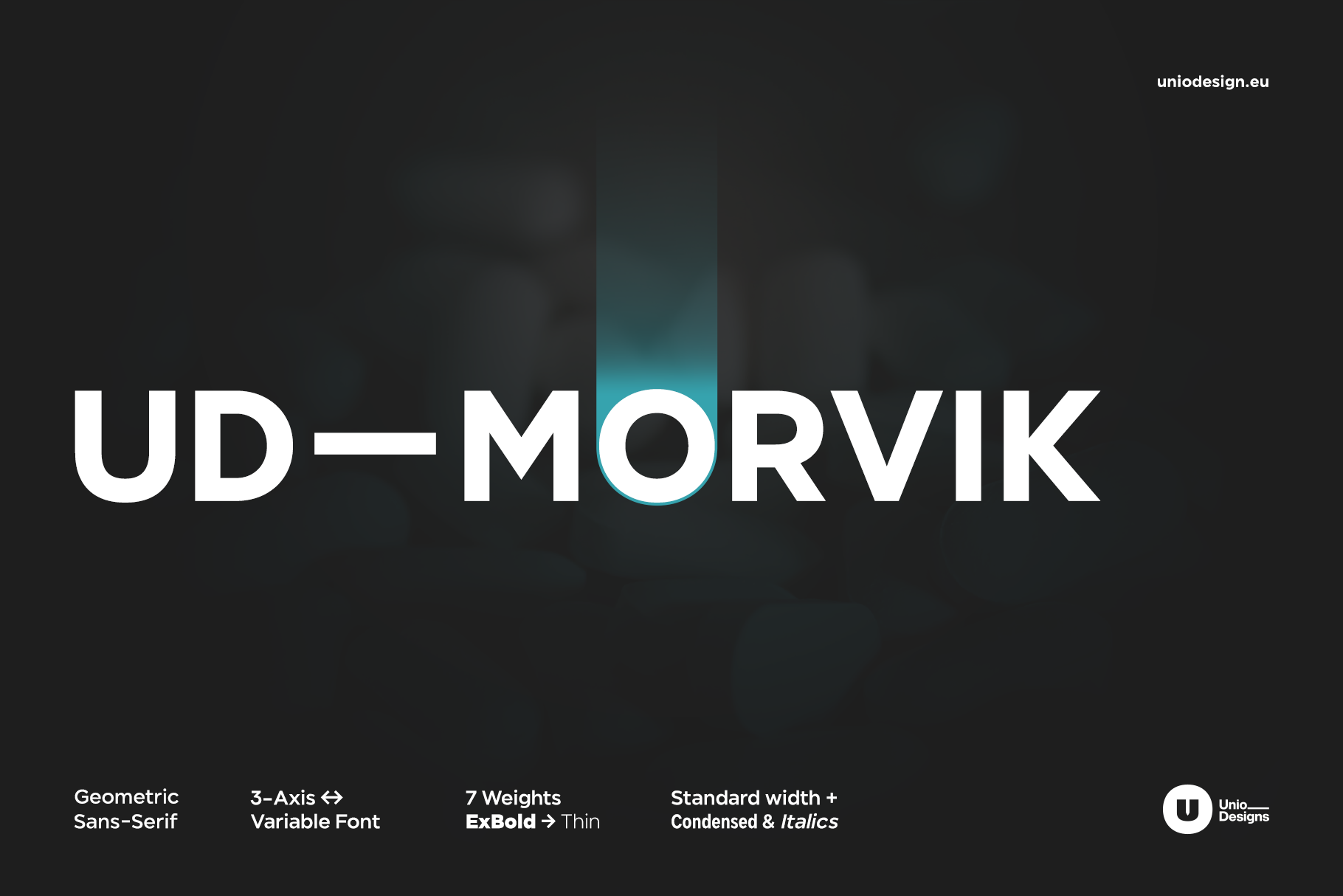
Morvik was born out of this exact awareness. Rather than chasing fleeting typographic quirks, Morvik embraces the concrete reality of visual design. It is a contemporary neo-grotesque rooted in Swiss clarity, engineered for anyone who needs a solid, dependable typeface with that reassuring touch of everyday familiarity that puts both reader and designer immediately at ease.
Morvik is the quintessential “safe bet”: a typeface you can purchase and drop into any layout knowing it will never let you down. It pairs effortlessly with photography, logotypes, and editorial grids without demanding the spotlight, ensuring impeccable optical stability. Built for broad and democratic distribution, it is designed to work on real-world projects every single day rather than remaining locked away as an untouchable collector’s piece.
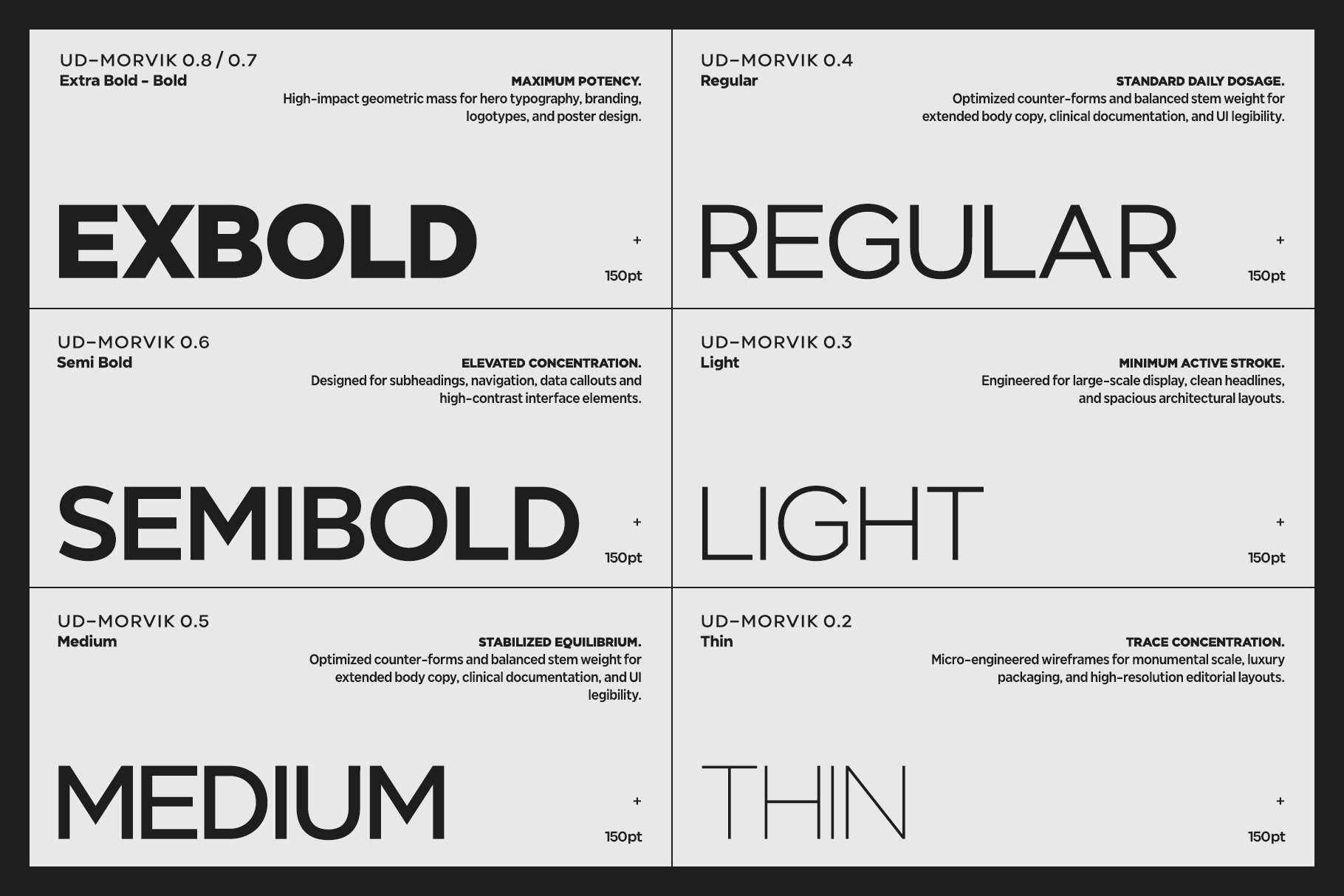
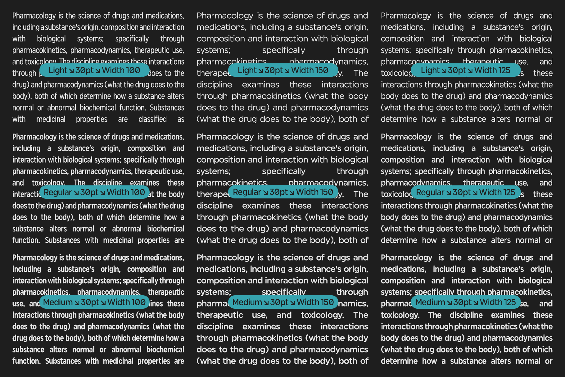
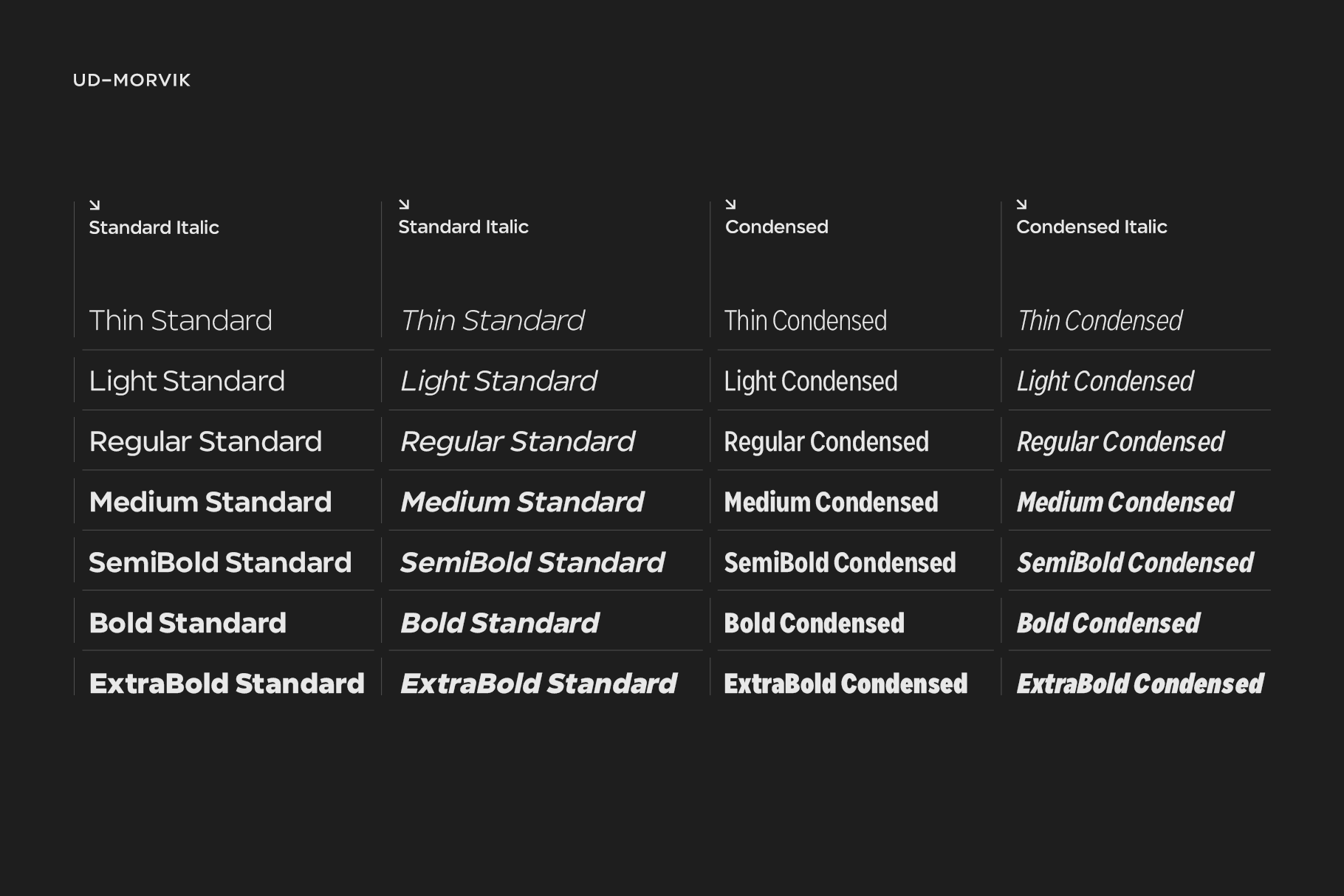
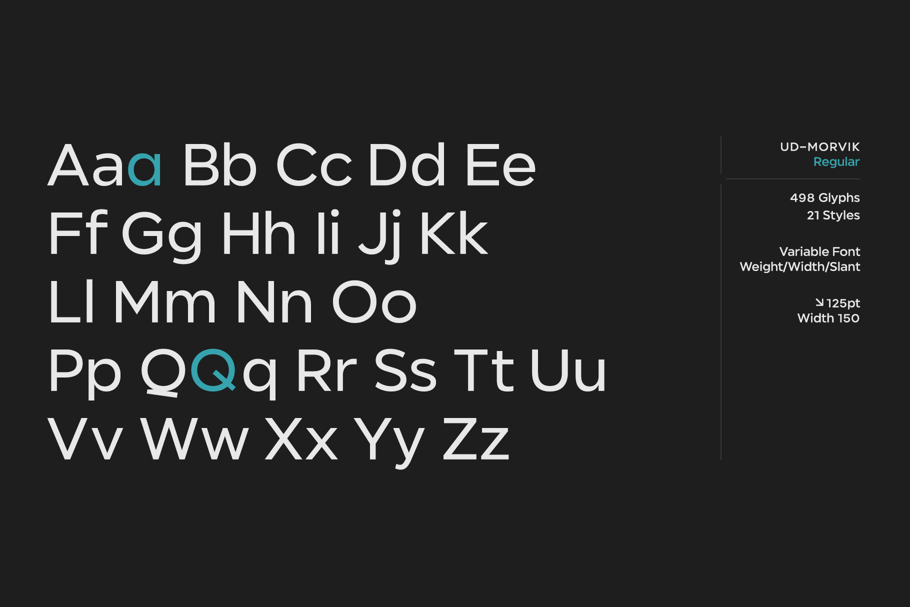
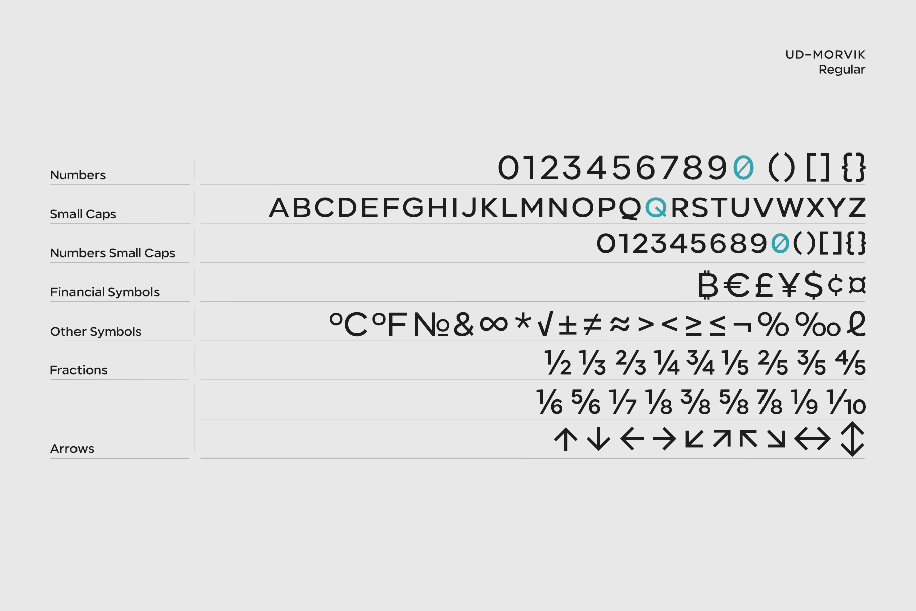
The family spans 14 styles across two versatile proportions: Normal (for brand identity and continuous reading) and Condensed (which saves nearly a third of horizontal space on packaging and tight layouts), ranging from Thin to ExtraBold with true 12-degree italics and a comprehensive Variable Font for the web. Featuring over 500 glyphs, true small caps, tabular figures, and language support for more than 200 Latin-based languages, Morvik is the dependable creative partner every design studio wants within arm’s reach.