TRT Veloura
Family
TRT Veloura ThinTRT Veloura Extra LightTRT Veloura LightTRT Veloura RegularTRT Veloura MediumTRT Veloura Semi BoldTRT Veloura BoldTRT Veloura Extra Bold
Examples
Think things through
In our fast-paced world today, we often forget the importance of patience and taking time to think things through. We want to remind people of the value of creativity and clever thinking.
In our fast-paced world today, we often forget the importance of patience and taking time to think things through. We want to remind people of the value of creativity and clever thinking, supporting a movement that embraces focus, skill, and understanding over fast production and short-lived trends. This doesn't mean we're against technology, but we're asking for a balance between using technology and the traditional principles of design as a craft.
Glyphs
Description
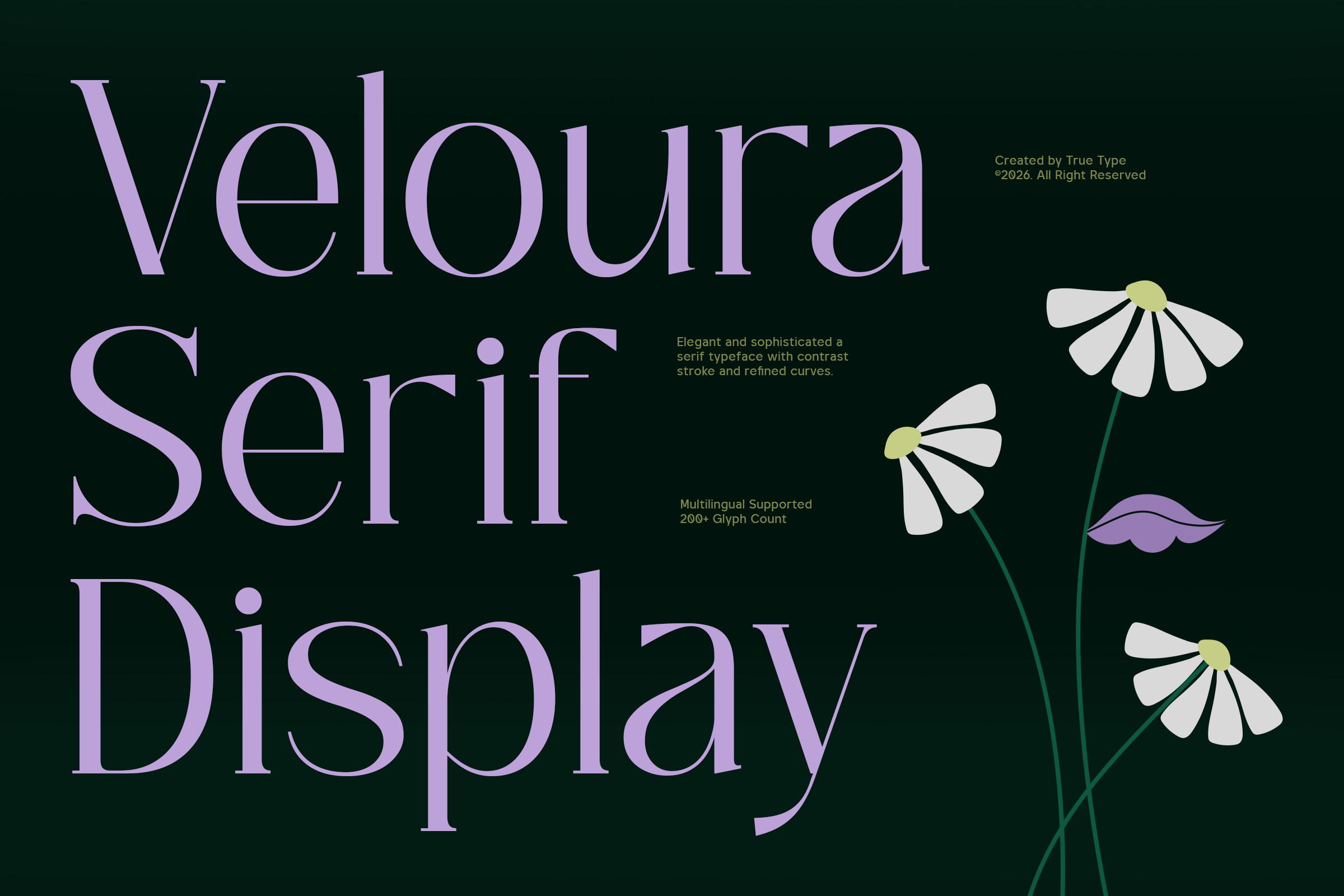
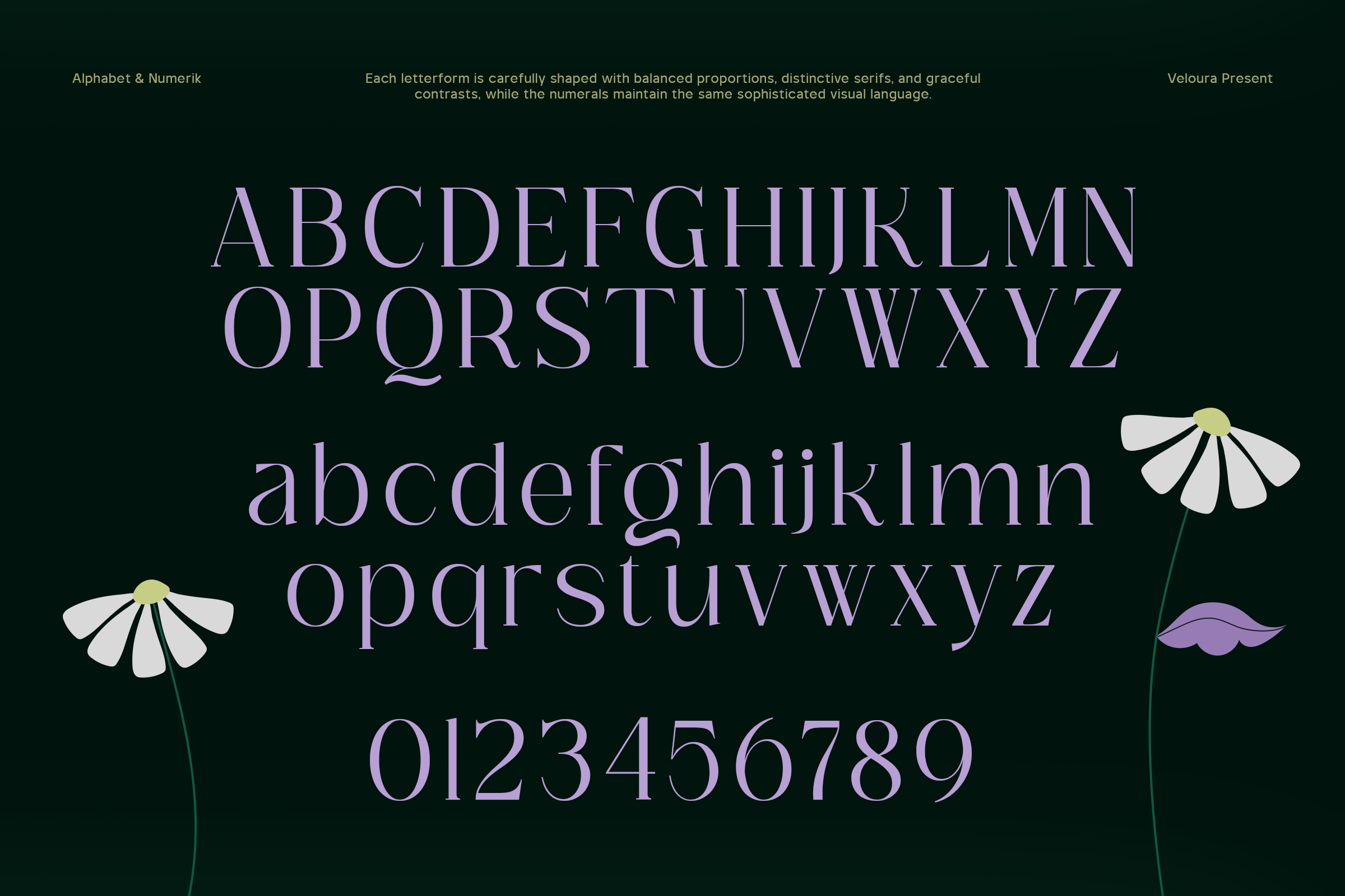
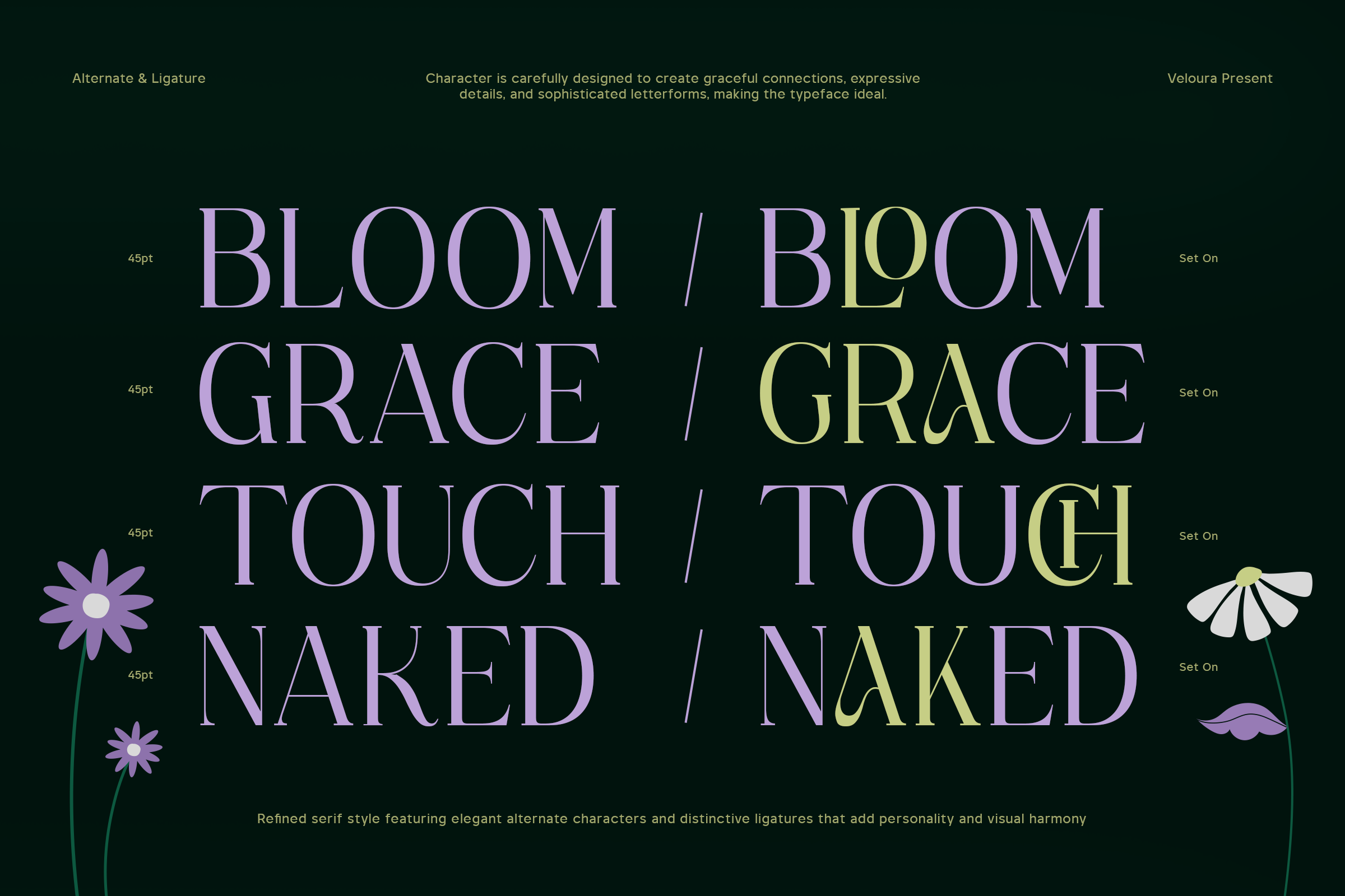
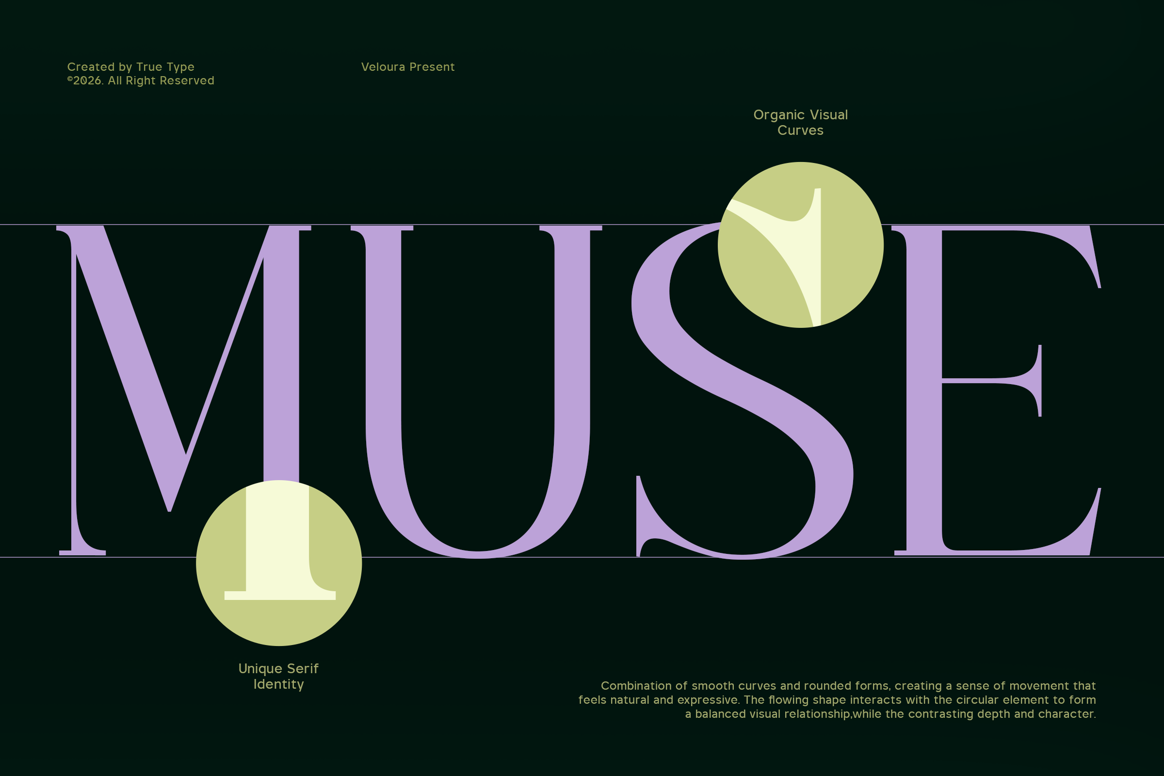
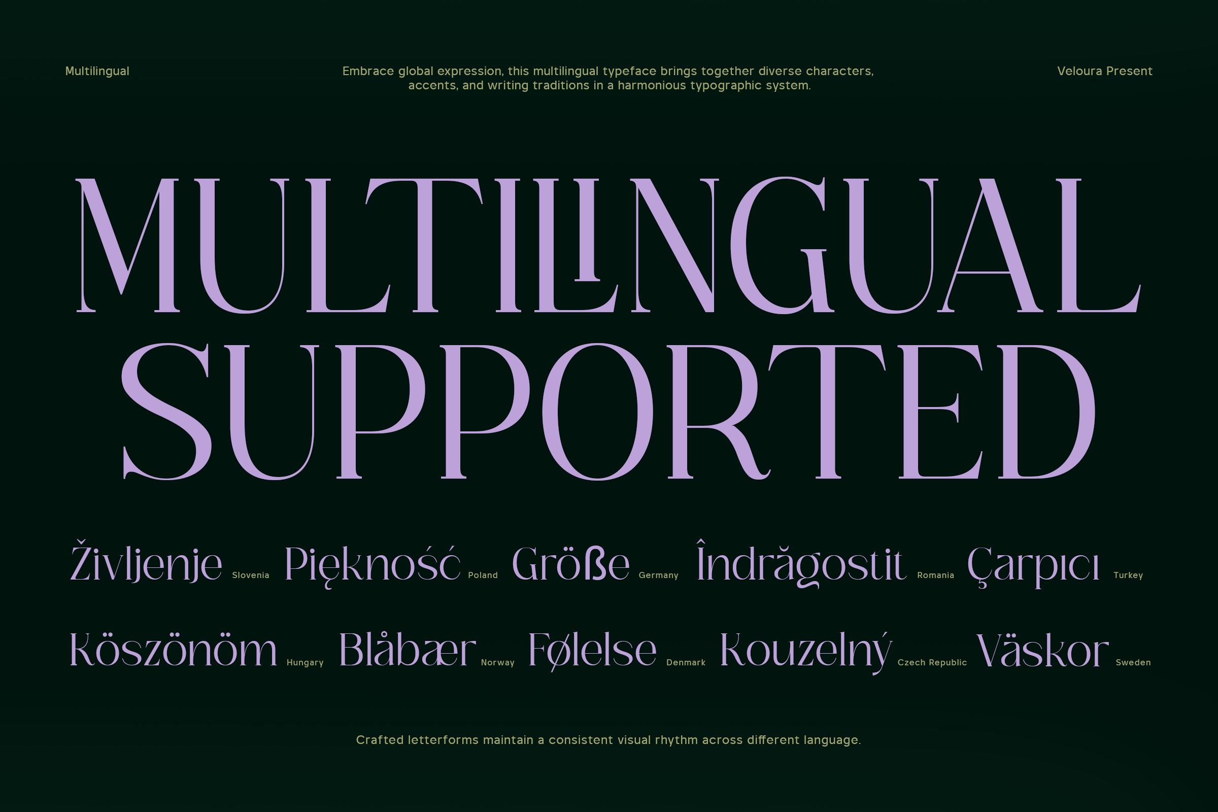
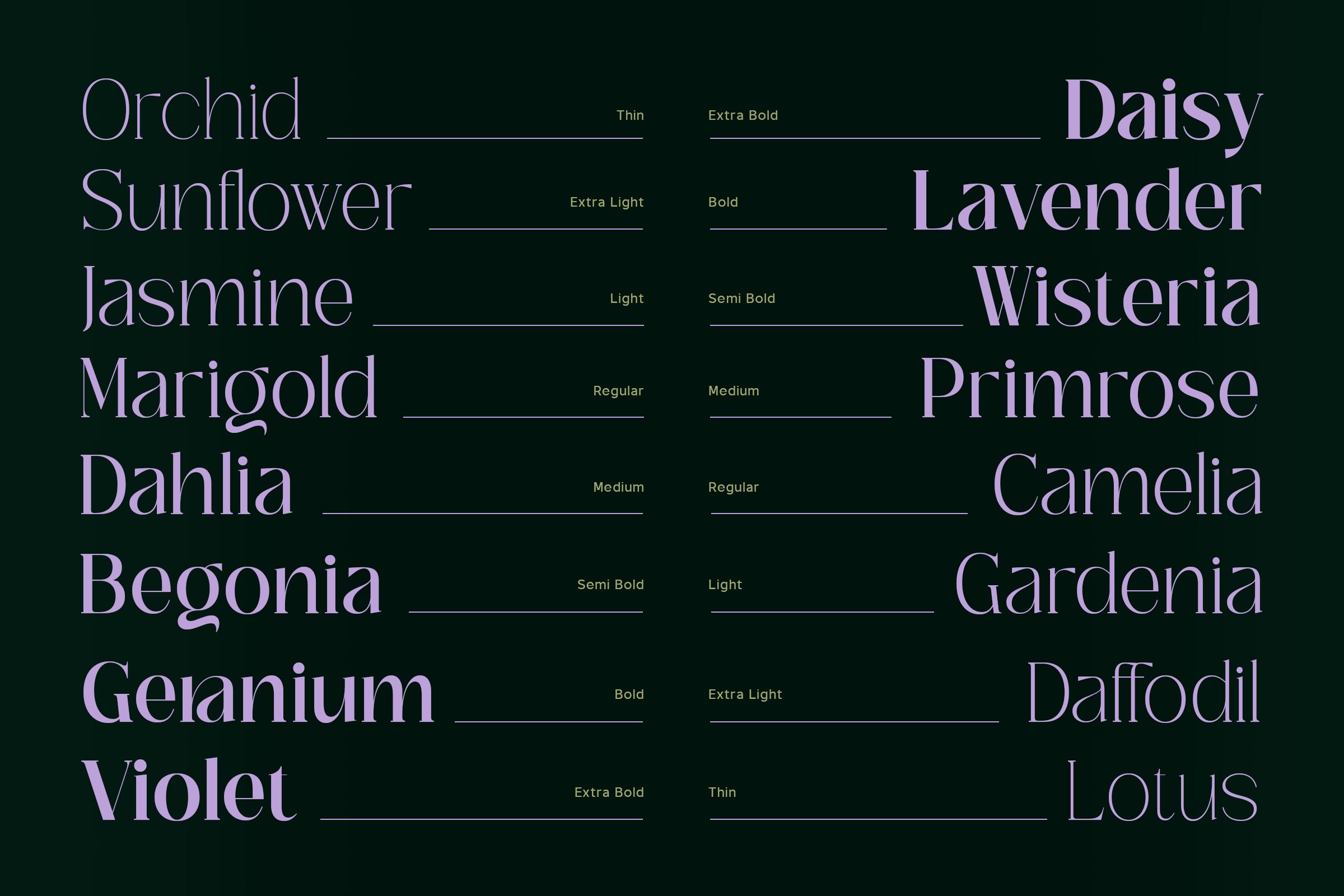
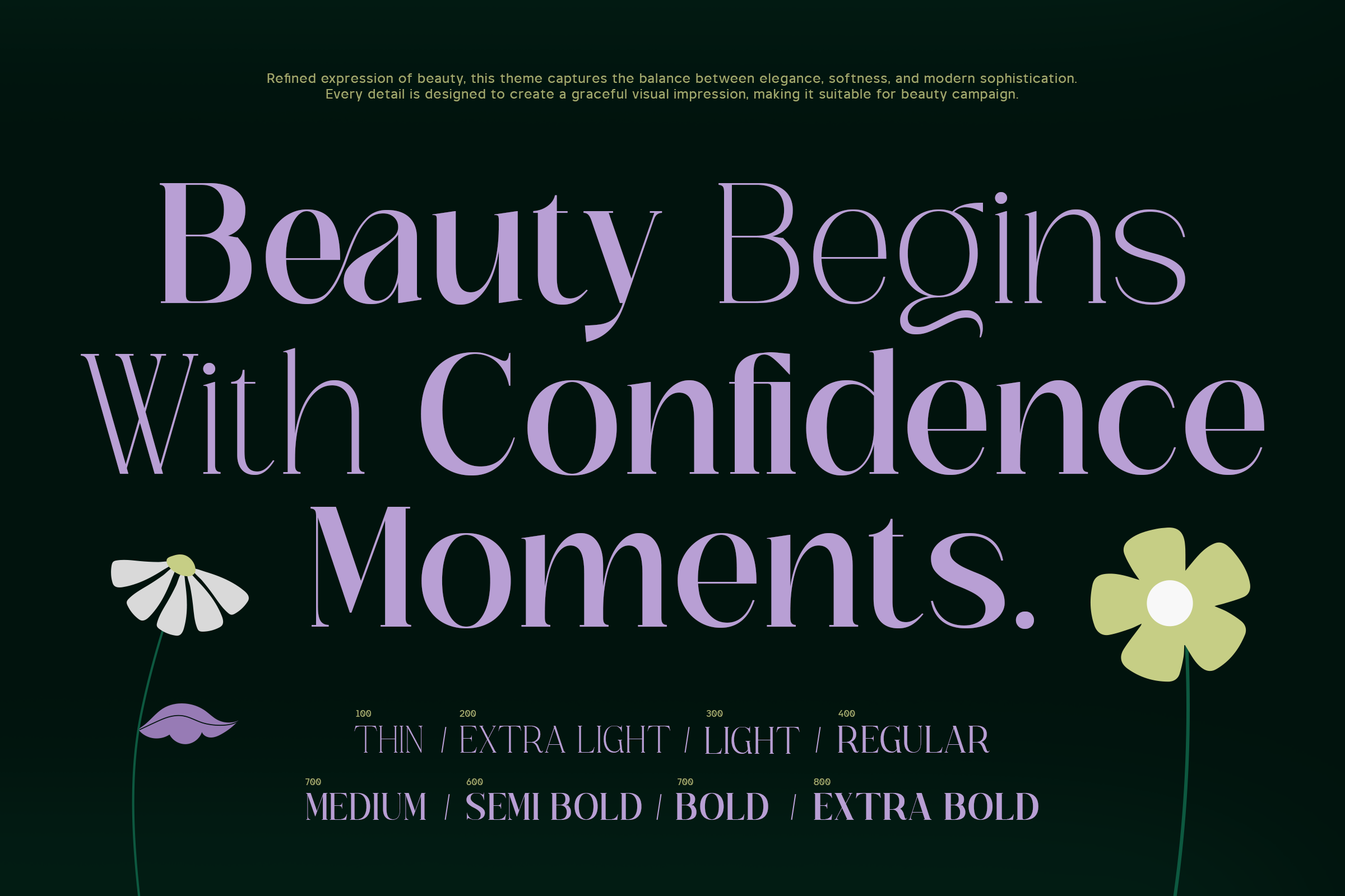
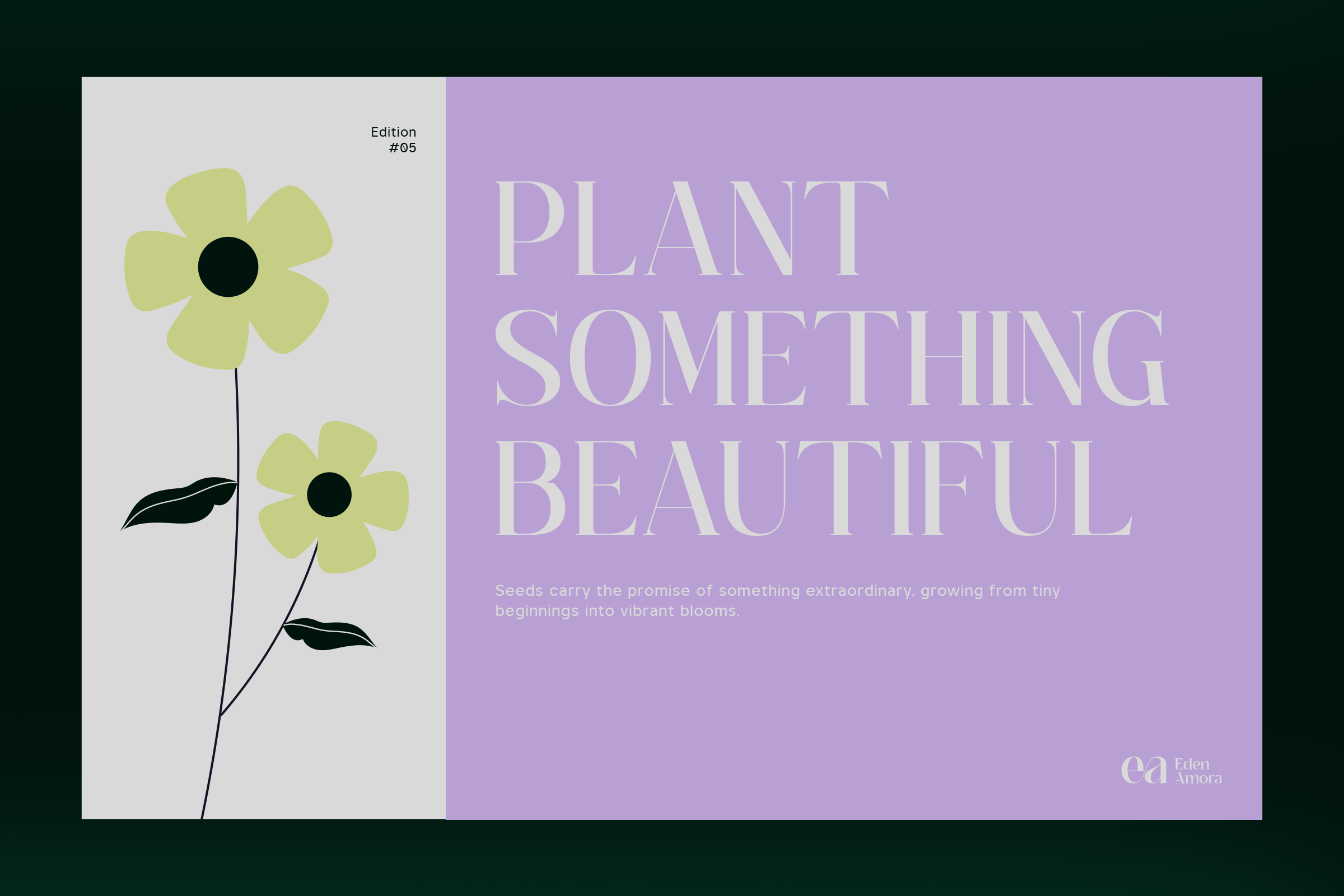
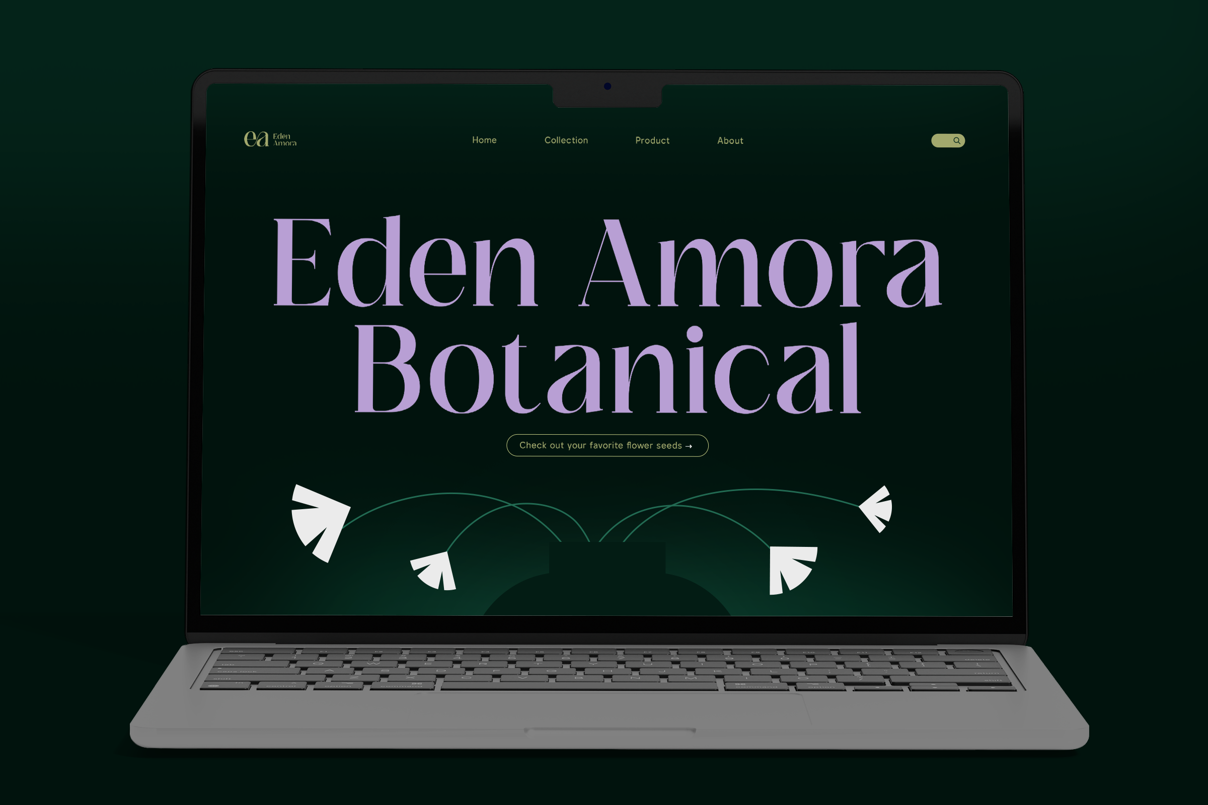
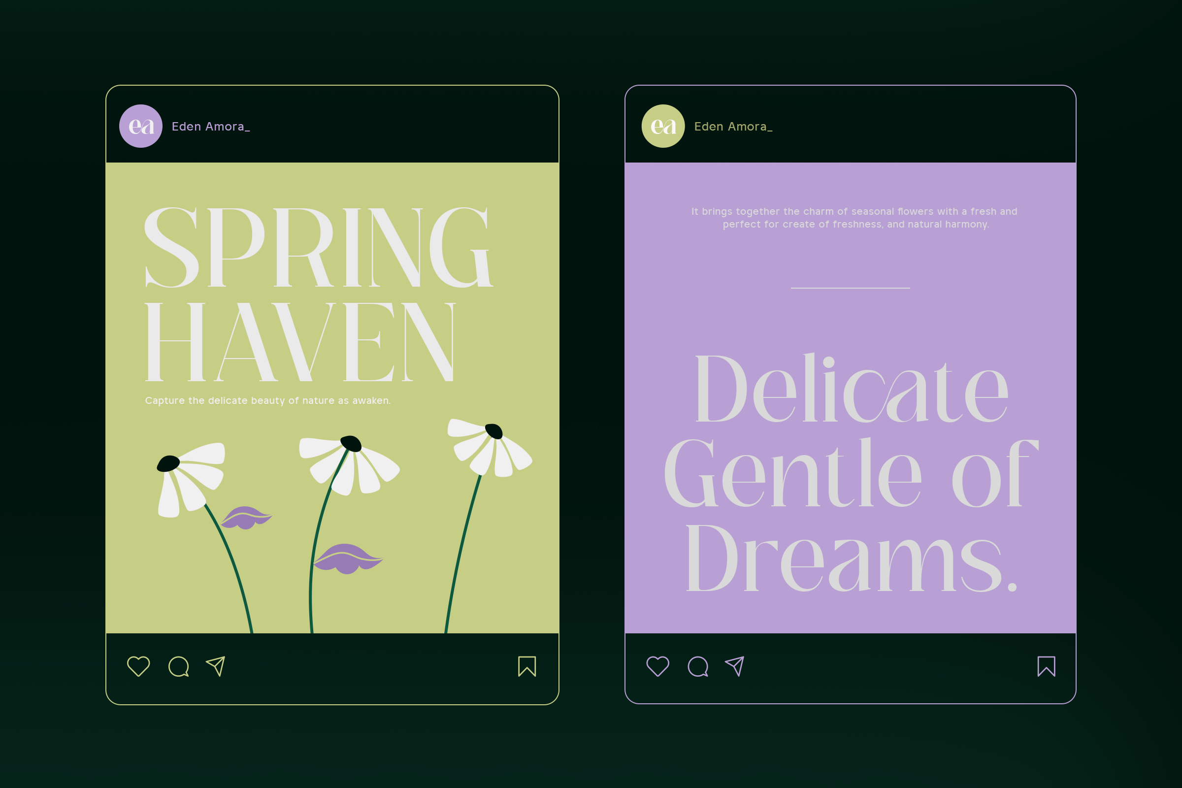
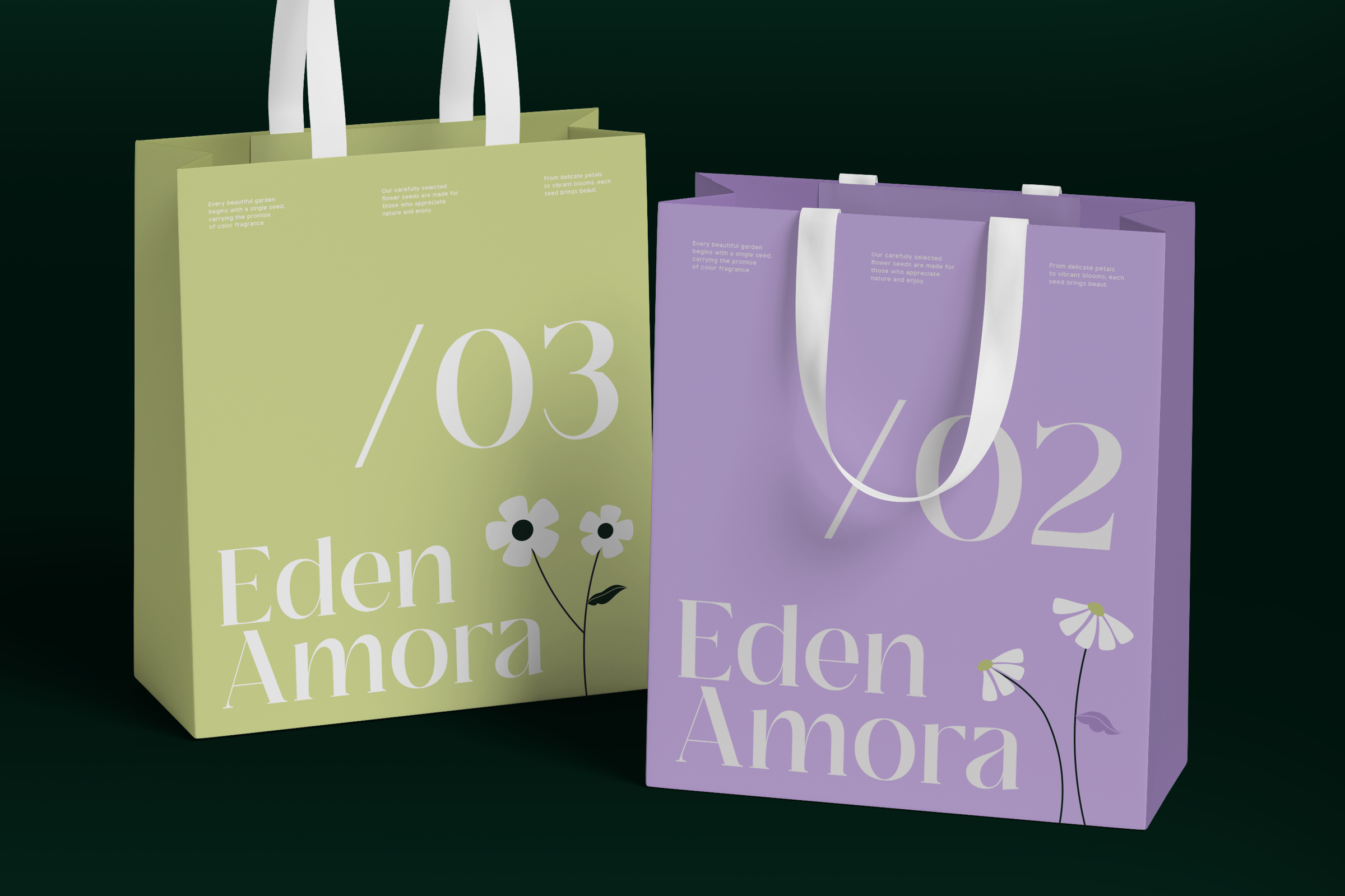
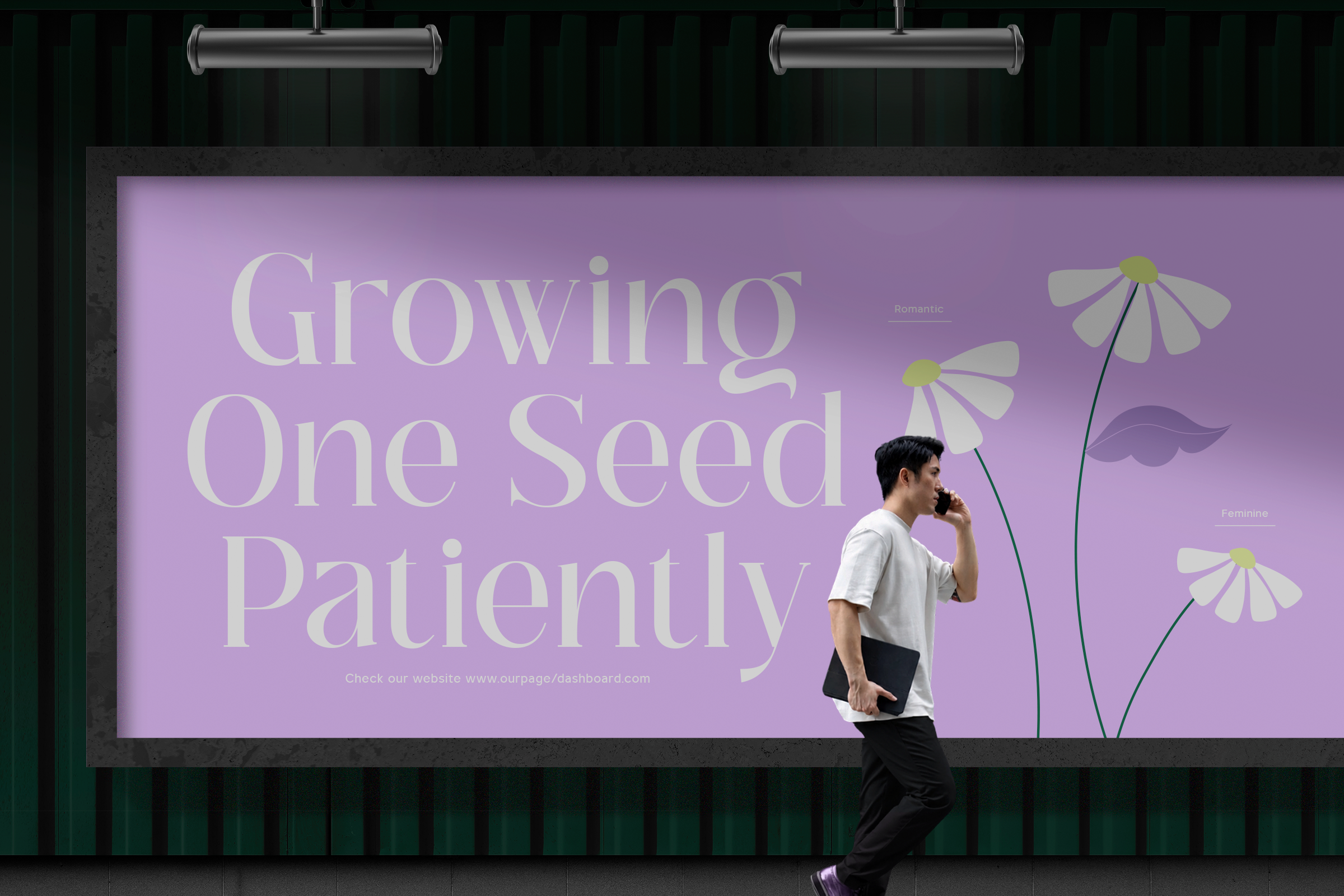
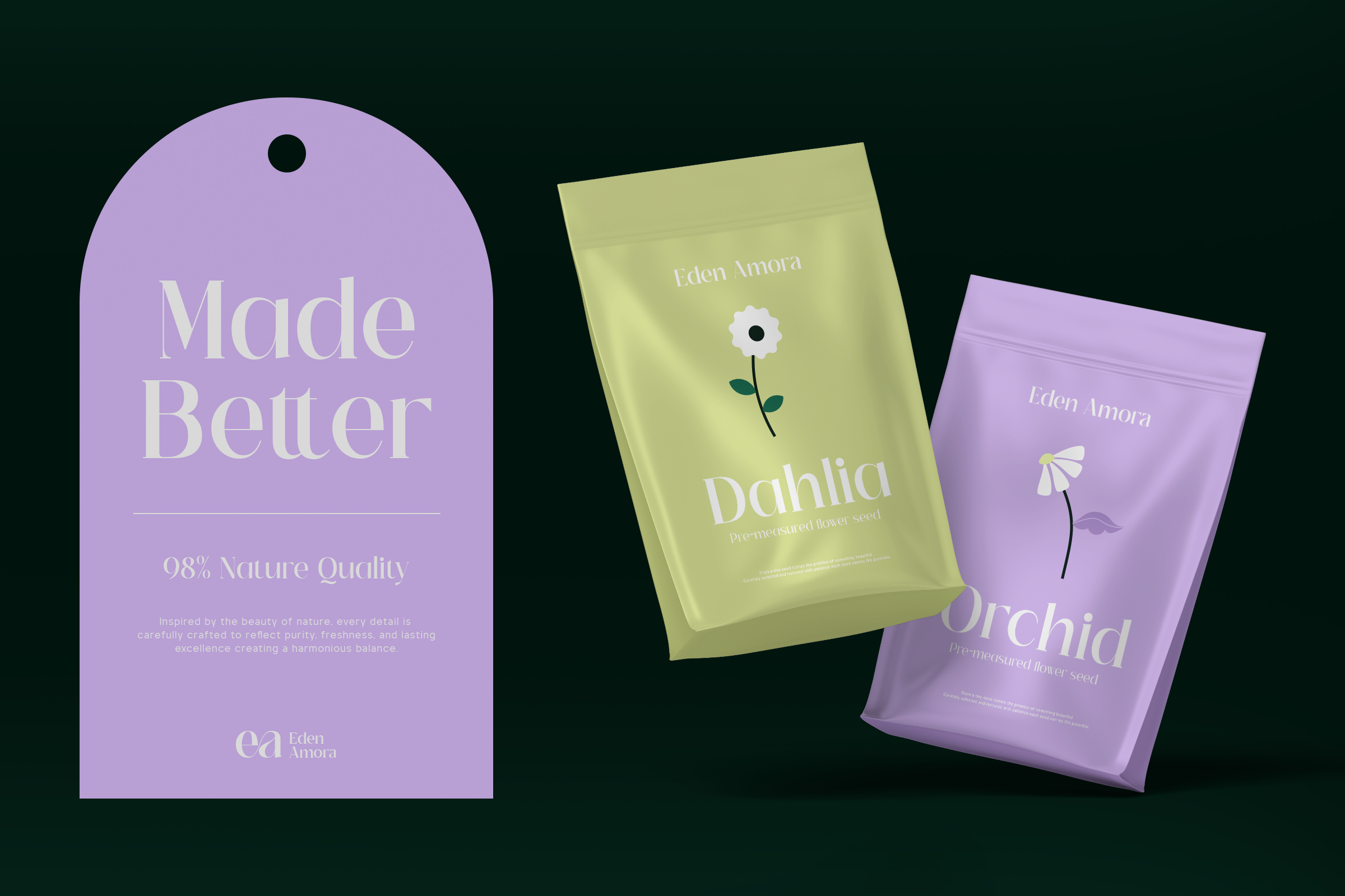
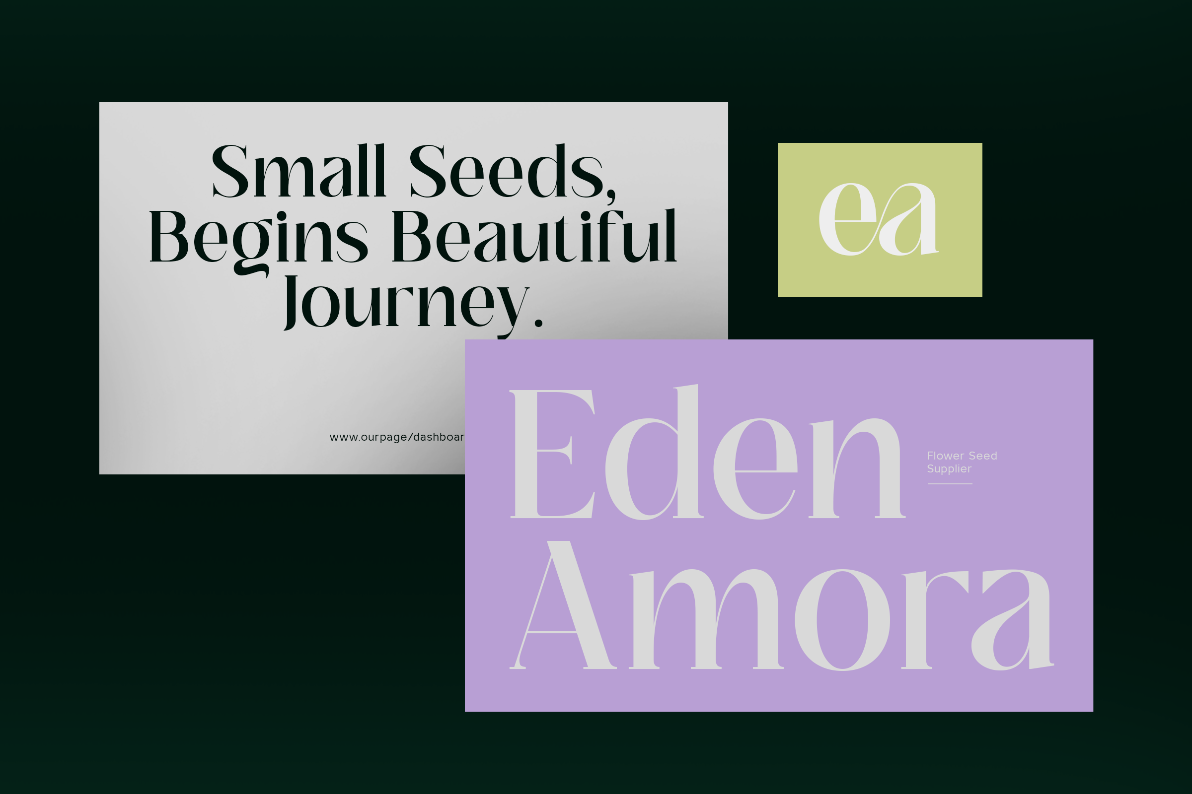
TRT Veloura is a high contrast display serif built for the few lines a cover opens with. The idea came from a flower's name,..old posters and the fashion magazines that still set titles this way. Eight weights, from Thin to Extra Bold, plus a variable version. The serifs are not symmetrical: the right foot stands straight like Didot, the left curves and stops softly, so each letter leans one direction.
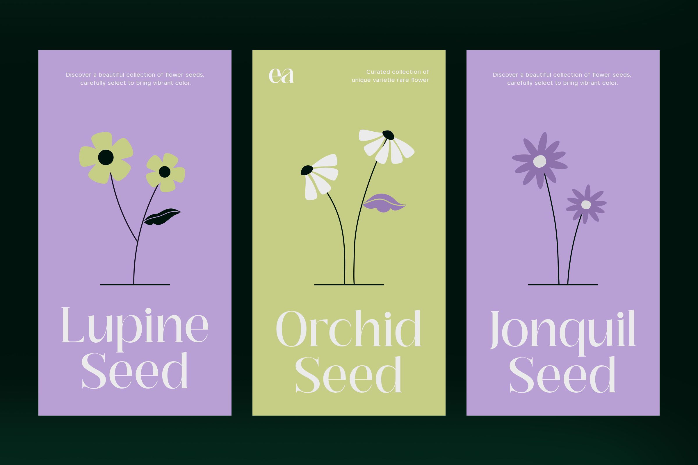
Wide, nearly round bowls in O, C and e keep a wordmark calm while the lowercase stems thin to a hair. Set it on perfume packaging, a bottle label, a wedding invitation or a fashion magazine cover, and pair it with something quieter for body text.