Family
Description
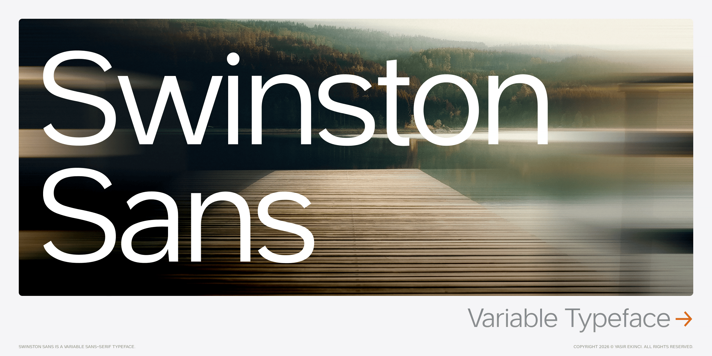
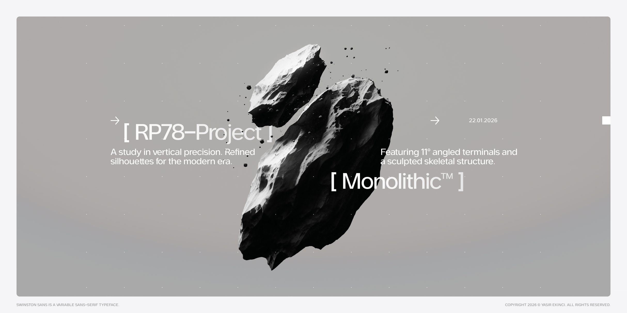
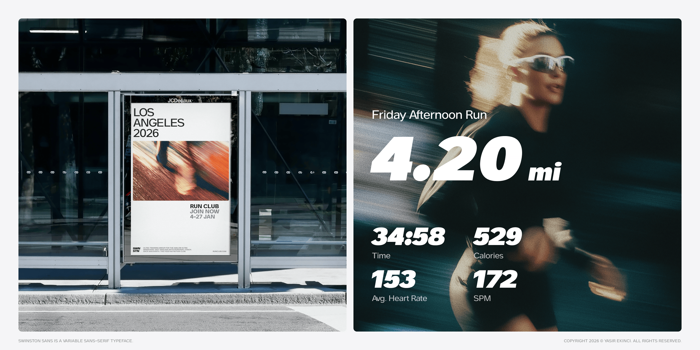
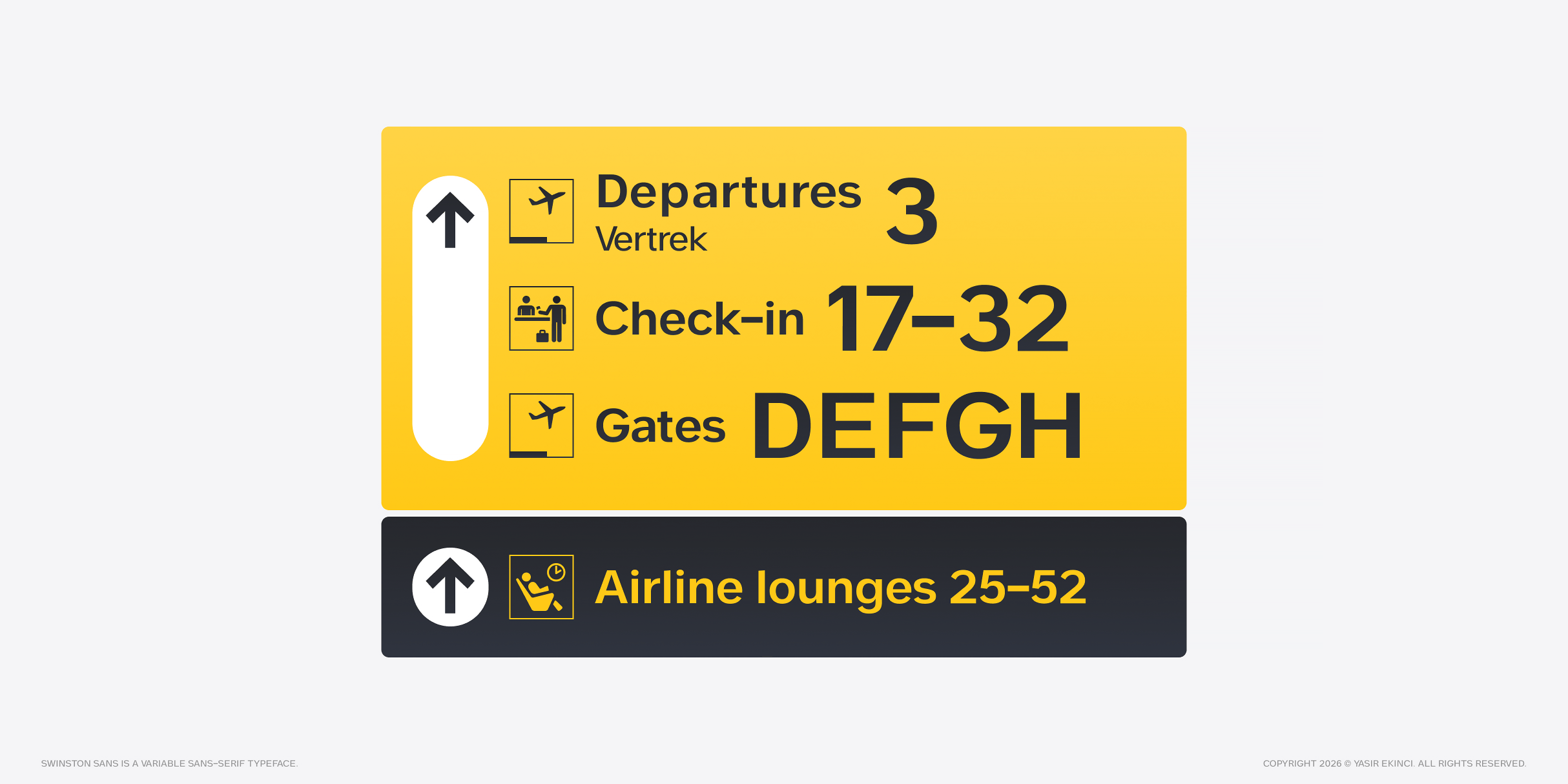
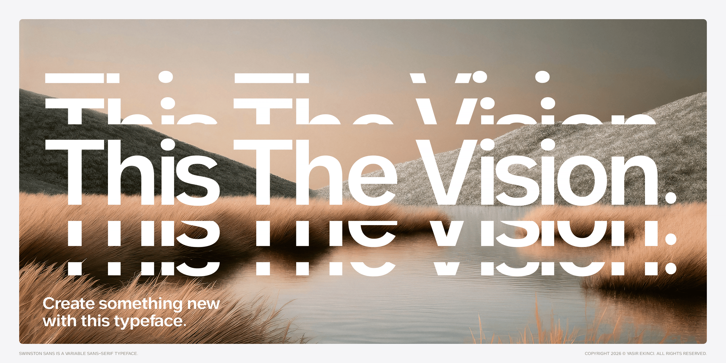
Swinston Sans — Variable Typeface
The Typeface That Translates
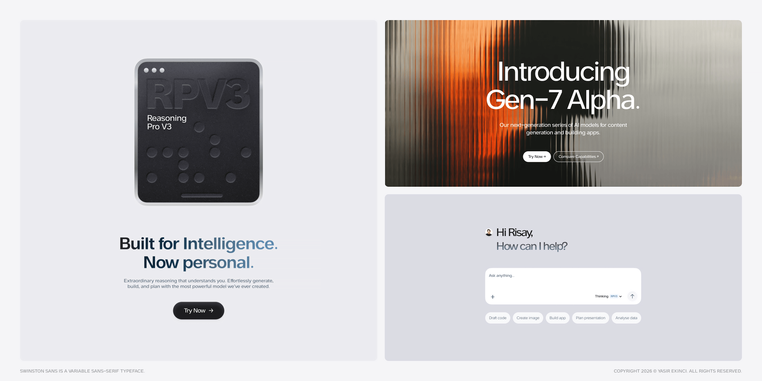
In a digital landscape drowning in neutrality, how do you design a typeface that feels engineered enough..for code, yet human enough for conversation? For the last decade, sans-serif typography has been dominated by invisibility. Fonts like Inter, Helvetica Now, and countless Neo-Grotesques have become the default language of digital design. They’re competent. They’re safe. They’re everywhere. But as we enter the era of generative AI, spatial computing, and hyper-personalised digital experiences, “neutral” is no longer enough. We don’t need fonts that disappear. We need fonts that translate. This is where Swinston Sans begins.
Origin Story: Three European Cities
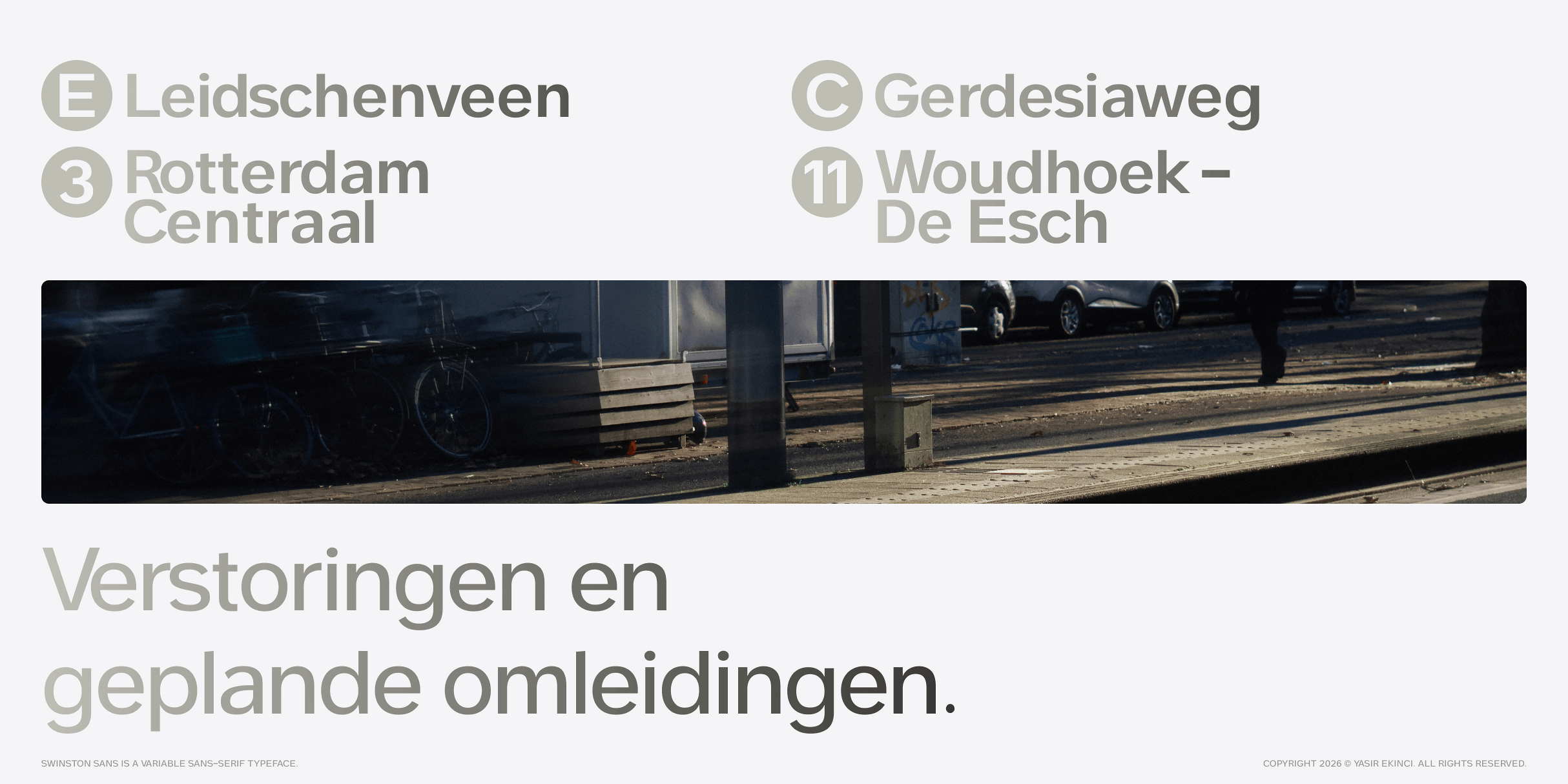
Rotterdam — The Grid
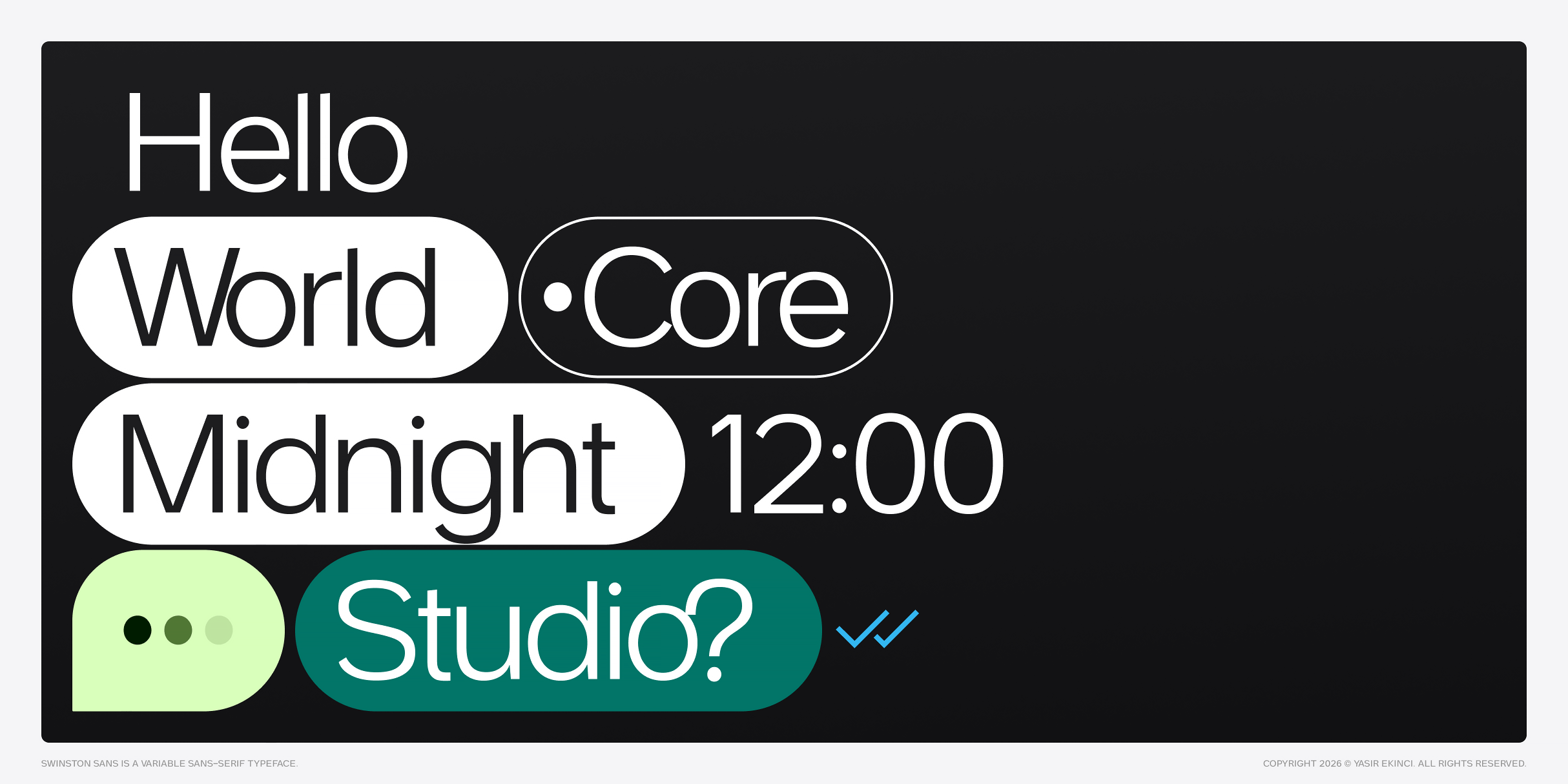
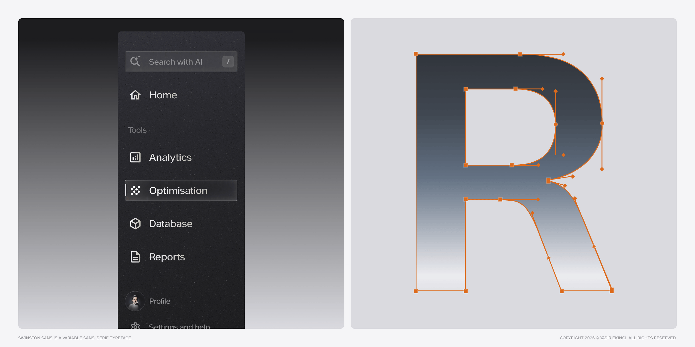
The origin of Swinston Sans was found on a rainy Tuesday morning at a tram stop in Rotterdam. I became obsessed with the destination blinds of the RET tram lines—those stark, high-contrast signs that cut through grey fog to tell you exactly where you’re going. Line E to Leidschenveen. Line 4 to Molenlaan. There’s a specific beauty in these signs. They don’t shout; they direct. They’re designed for “glanceability”—to be read in milliseconds by passengers in motion. This is the DNA of Swinston Sans: wayfinding logic applied to digital branding.
Amsterdam — The Lean
If Rotterdam provided the upright skeleton, Amsterdam’s famous “dancing houses” inspired the italics. These canal houses don’t just stand—they lean. Historians call this “op vlucht” (on flight), a deliberate architectural choice. Swinston Sans Italic doesn’t just slant—it leans with intention. Every curve was drawn to feel like those canal houses: slightly precarious, undeniably alive, unmistakably purposeful.
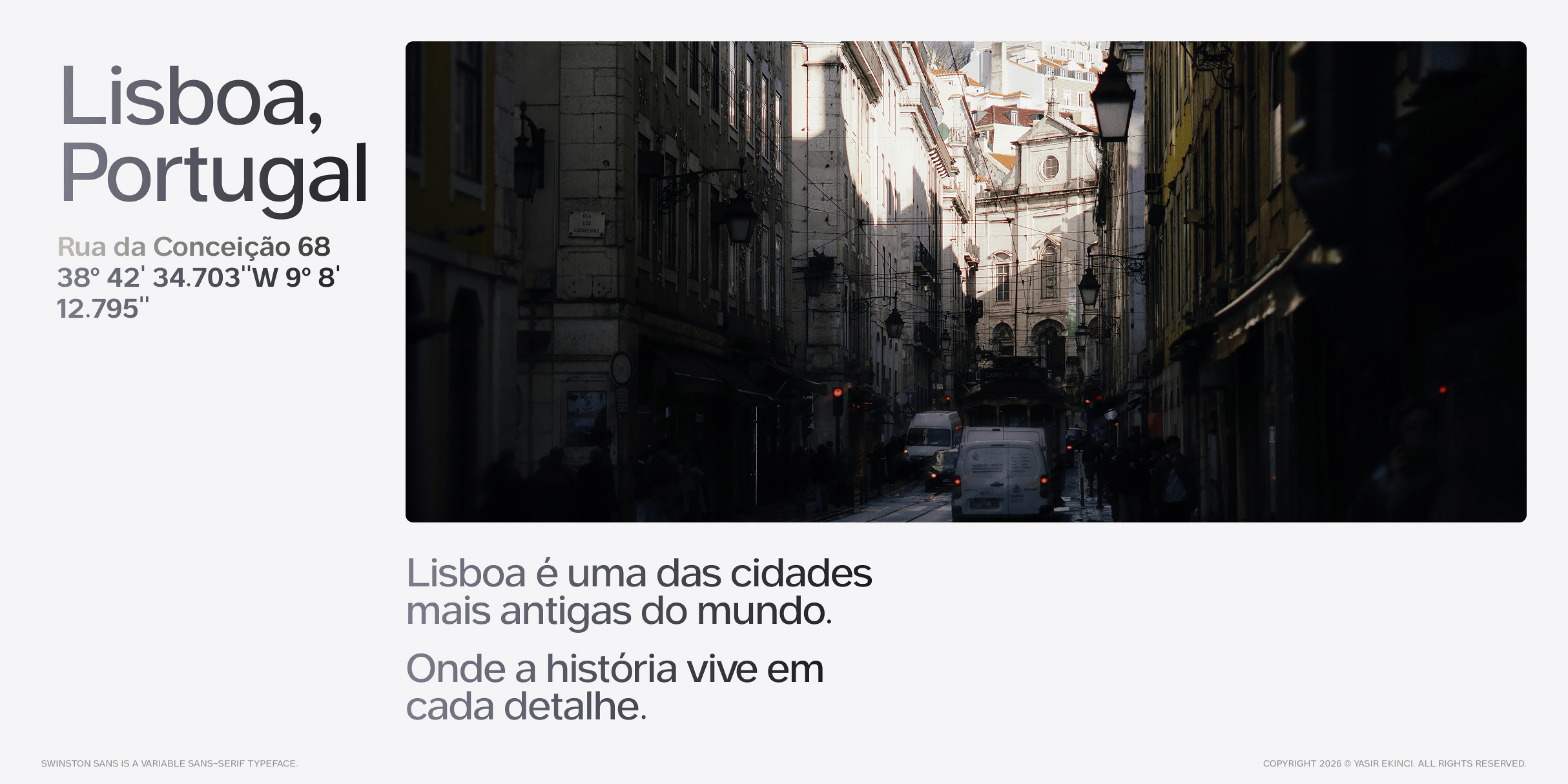
Lisbon — The Density
Lisbon taught me about working in tight spaces. Watching the iconic yellow Tram 28 squeeze through impossibly narrow streets, I engineered Swinston to thrive in density. Generous x-height, open apertures, carefully balanced counters
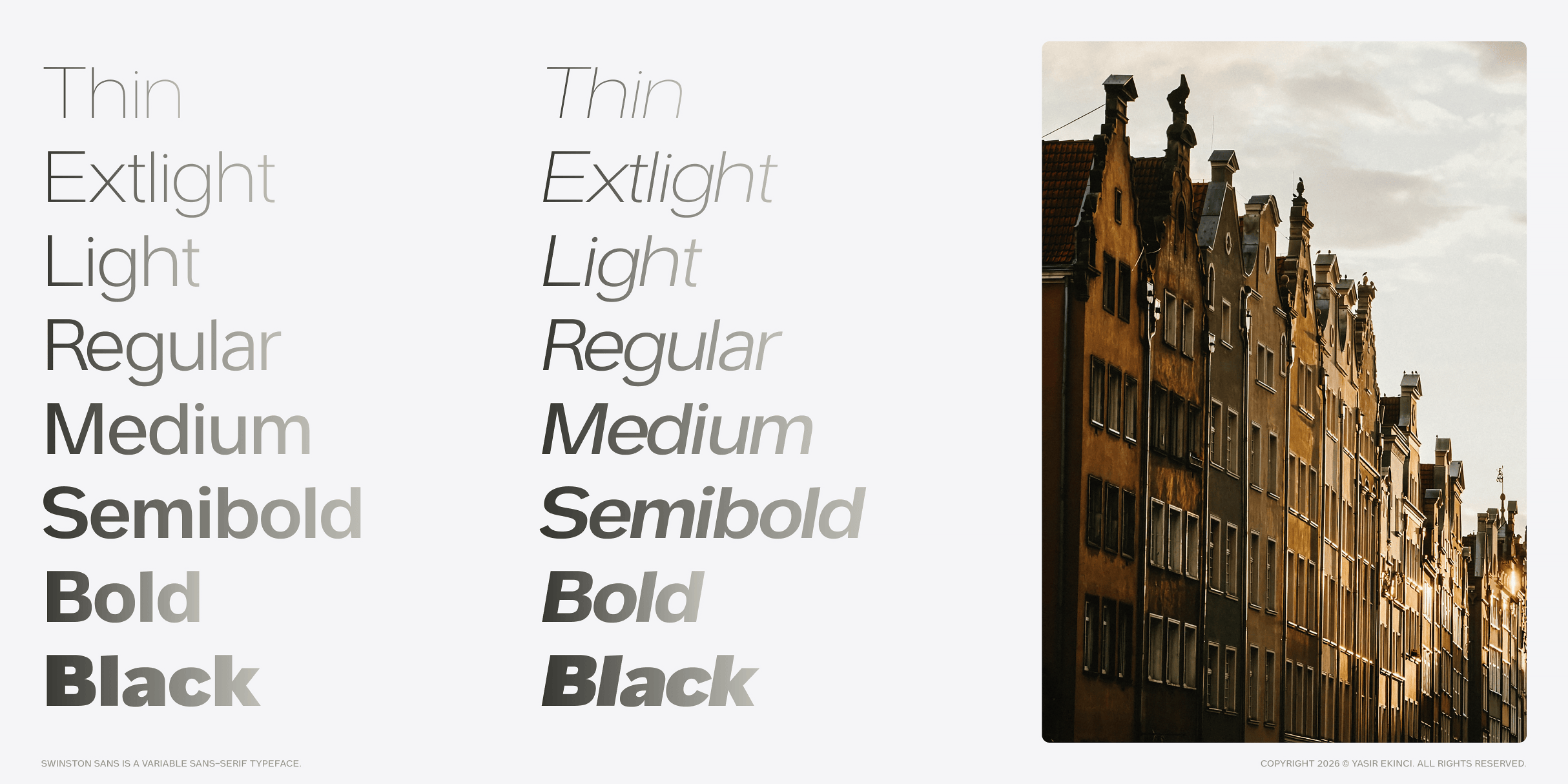
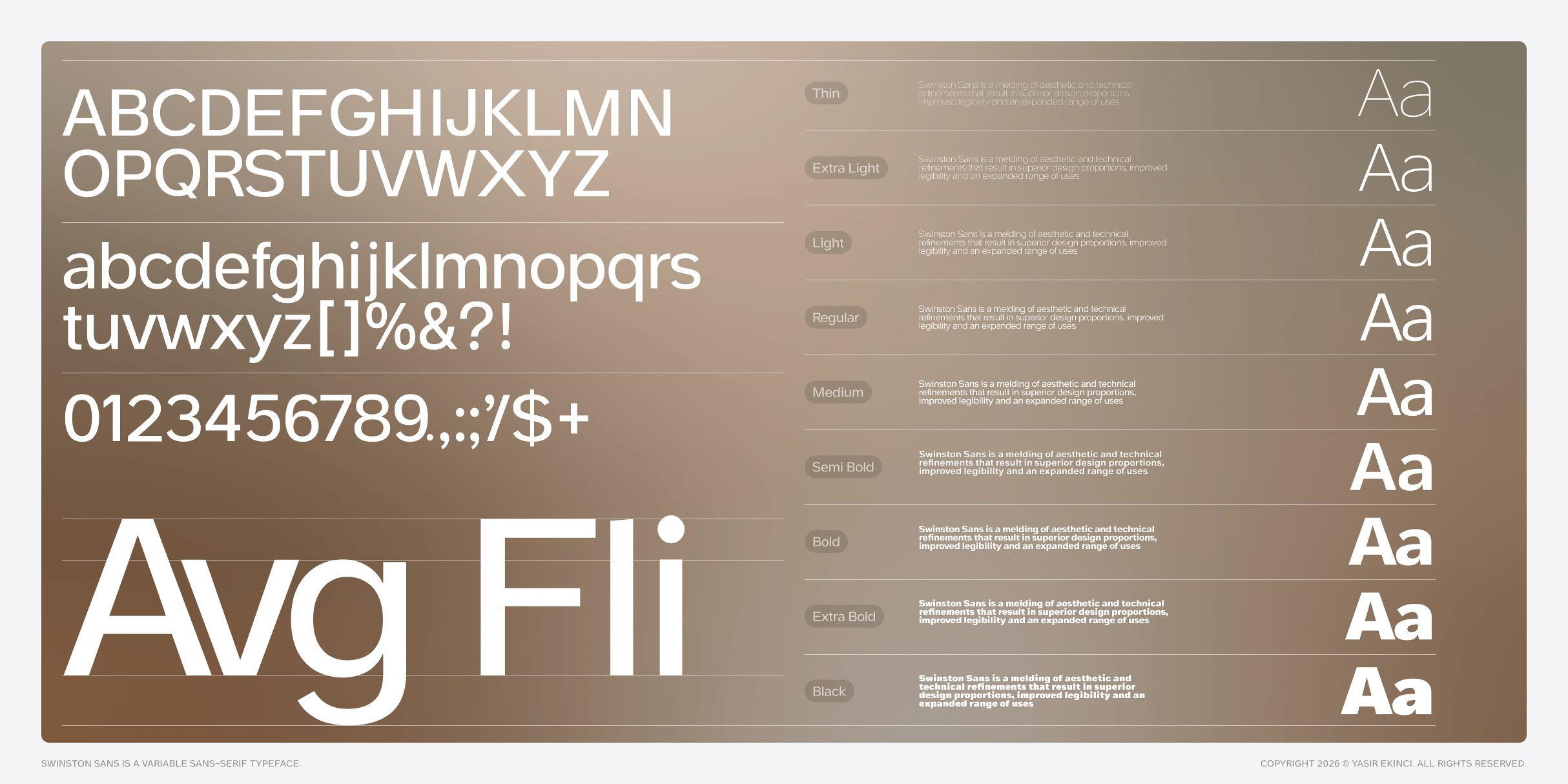
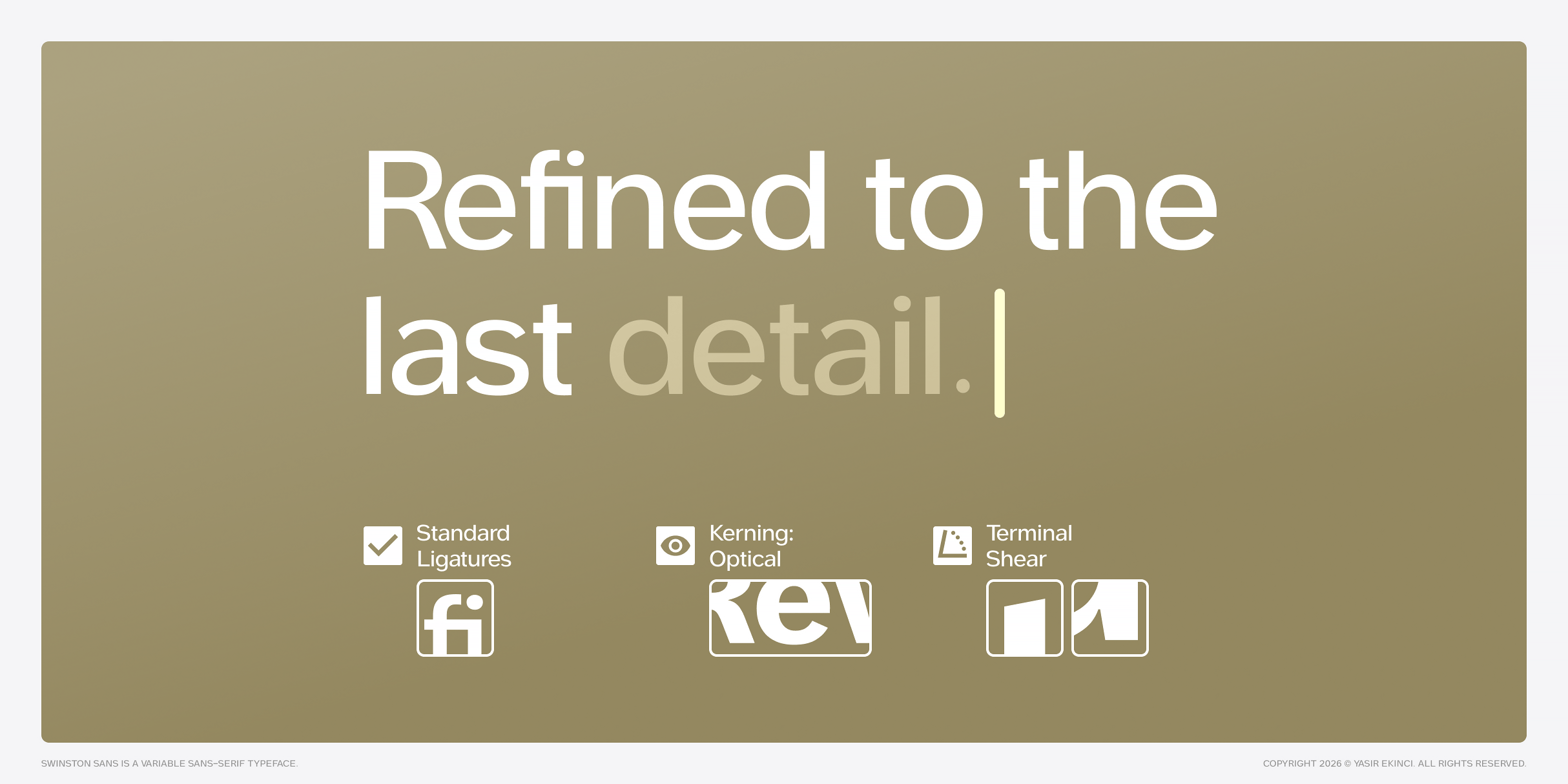
Glyphs