Family
Description
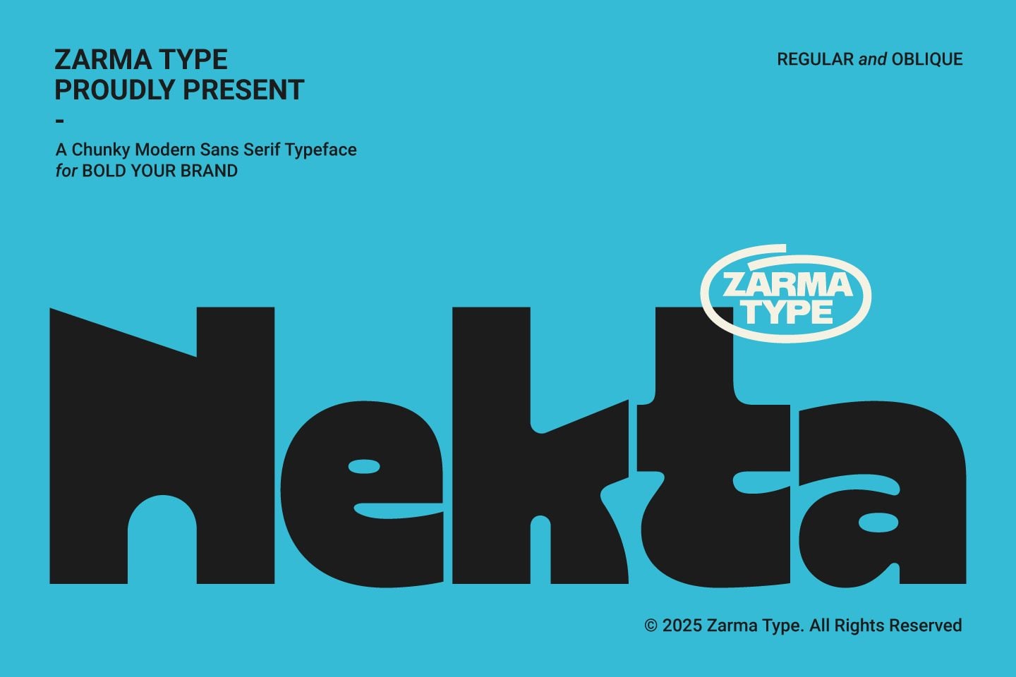
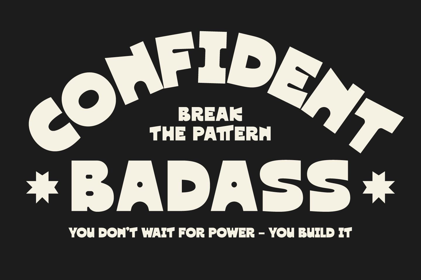
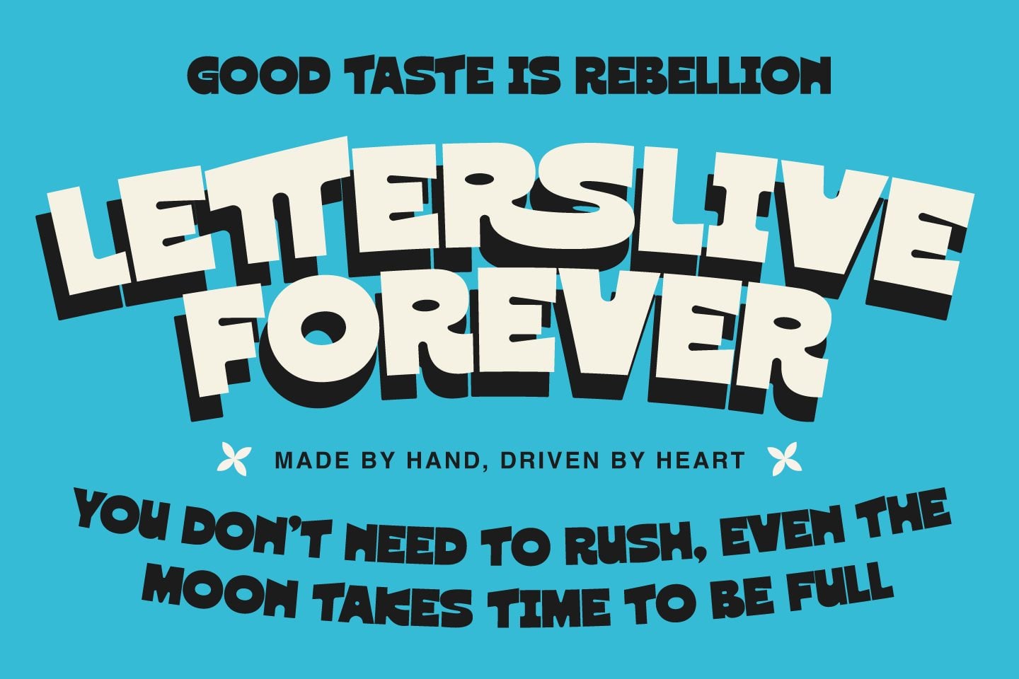
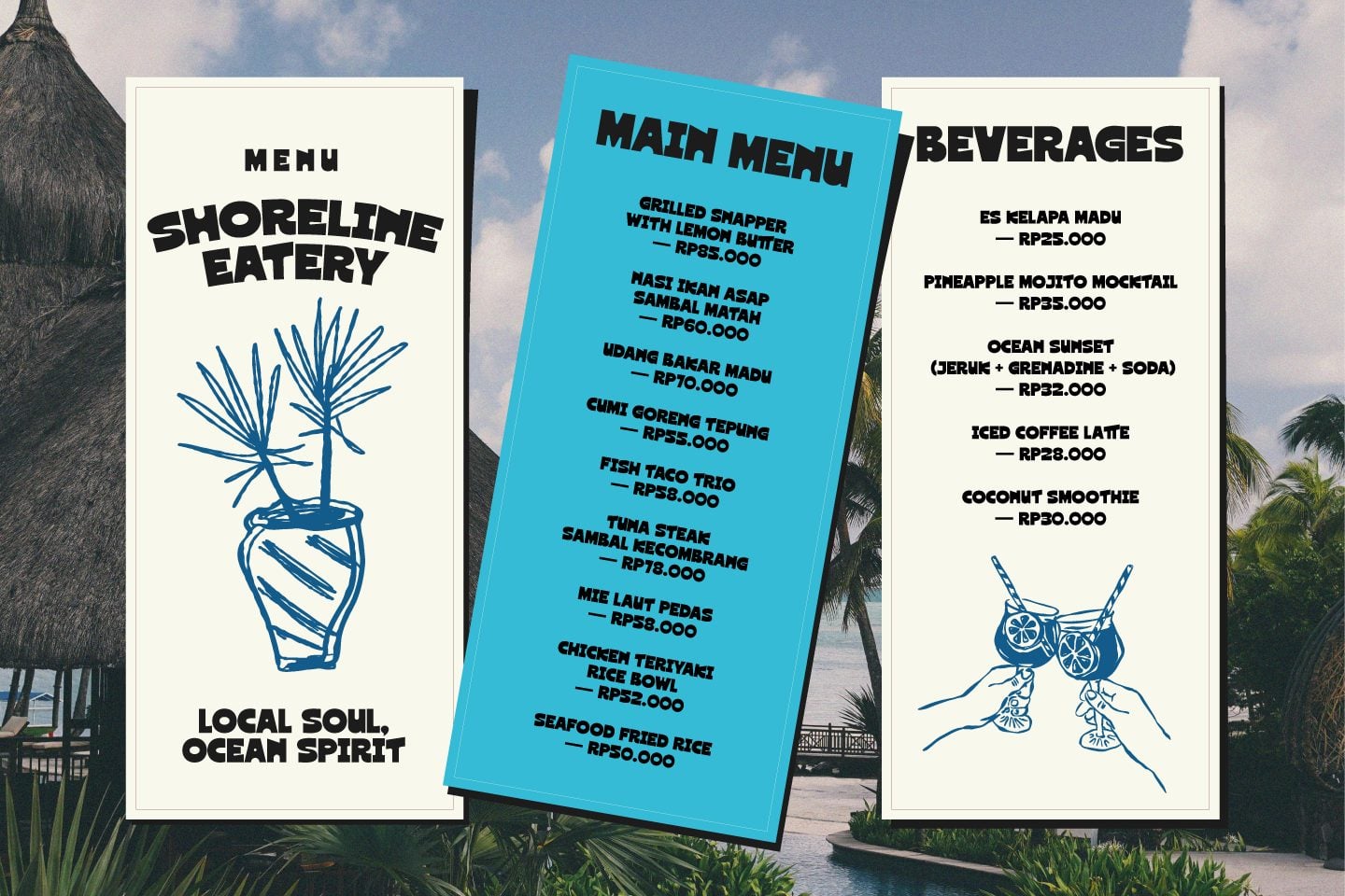
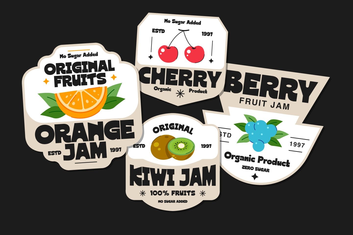
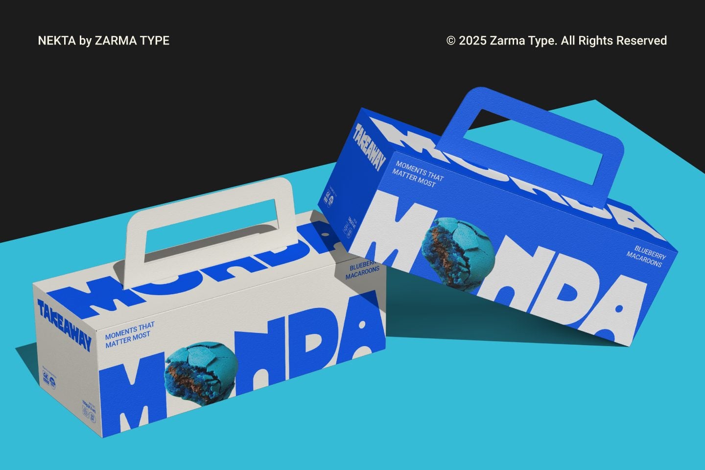
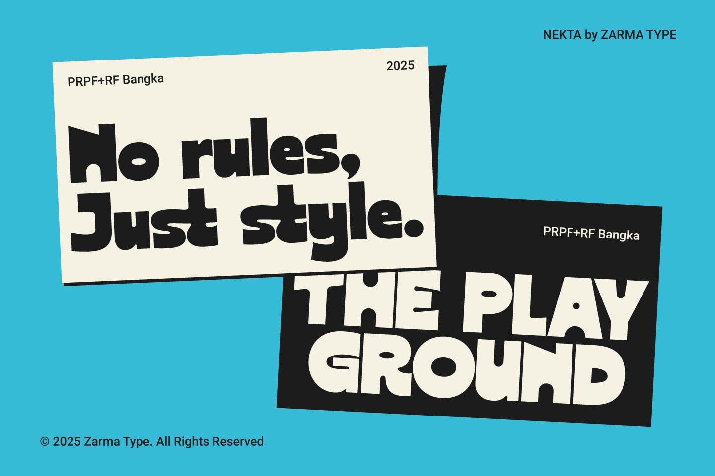
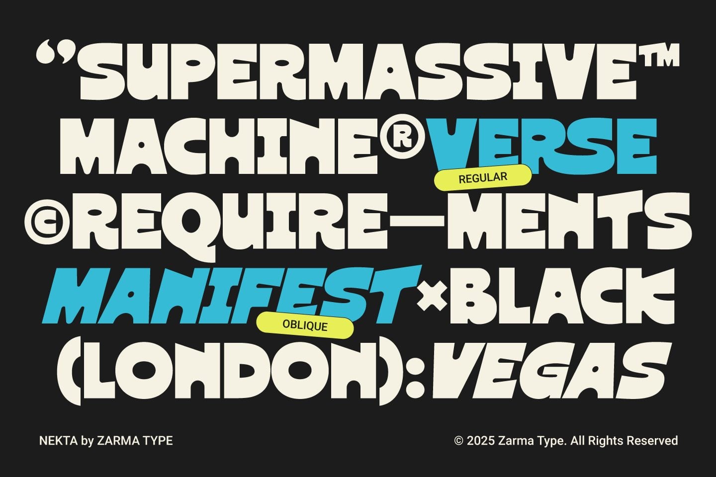
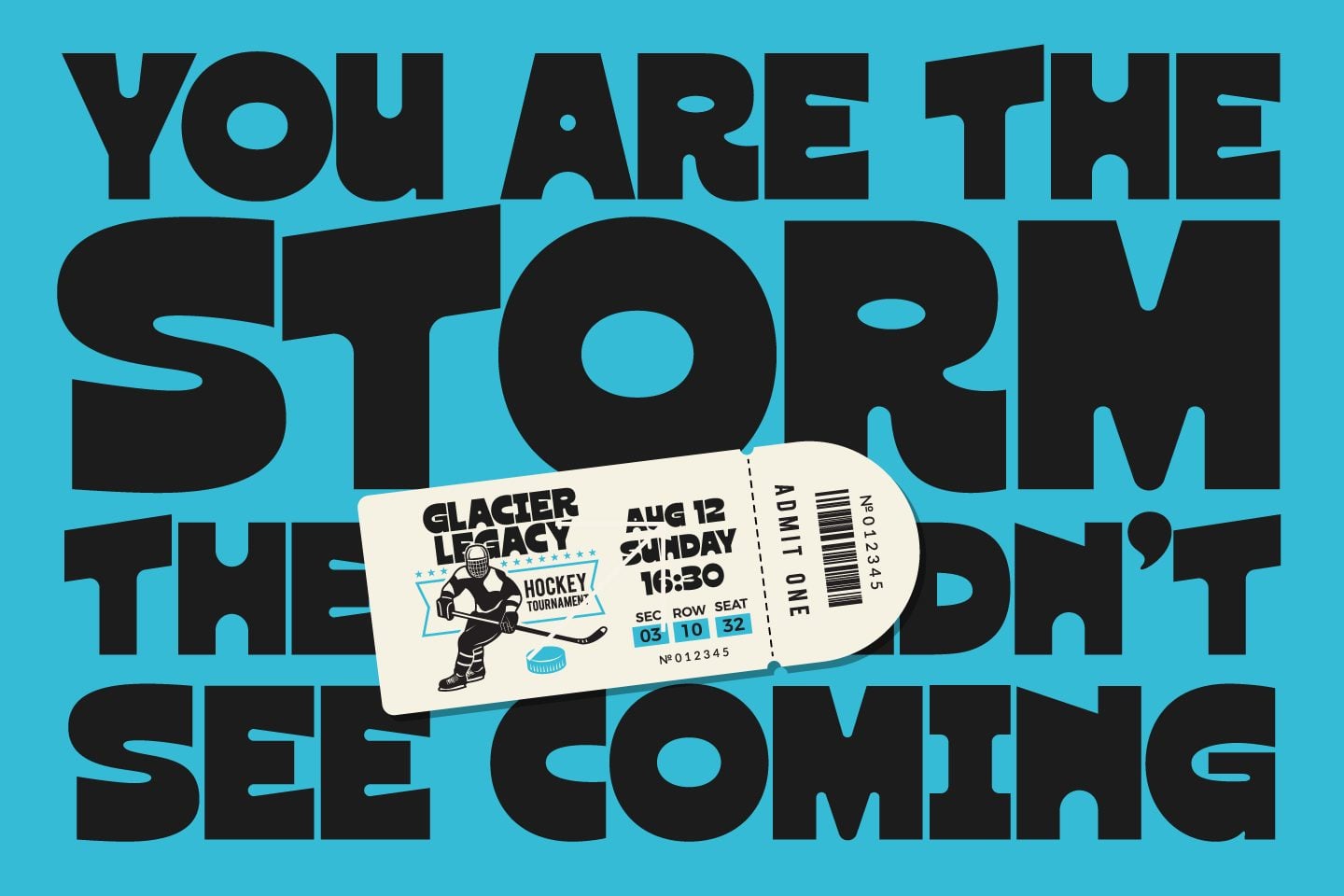
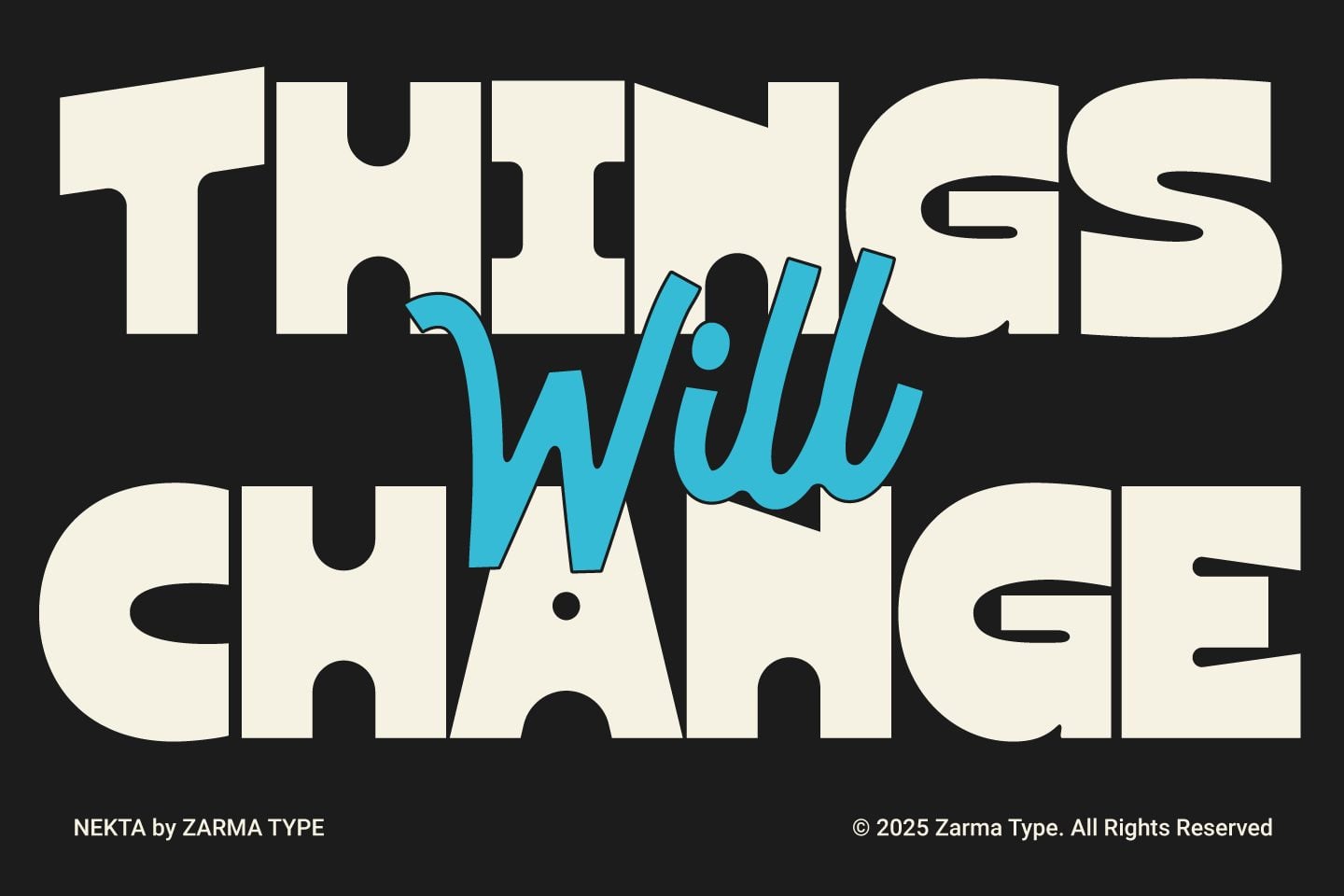
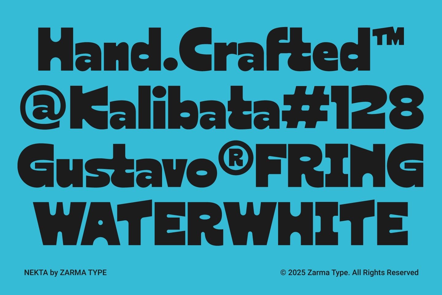
Nekta finds the sweet spot between power and warmth. Thick stems and rounded edges project confidence, while generous counters deliver easy reading at a glance. On dark canvases it feels punchy; on bright menu cards it stays crisp and welcoming. When the composition calls for momentum, the available oblique style adds a subtle push that guides the eye. From sports tickets to beach-side labels, Nekta keeps typography consistent across sizes and materials. Alternates and ligatures let you tighten spacing or add personality without losing clarity. Multilingual support ensures a single visual language for global campaigns. And whenever emphasis is needed, tip the headline slightly—the oblique option is available to bring speed and direction.
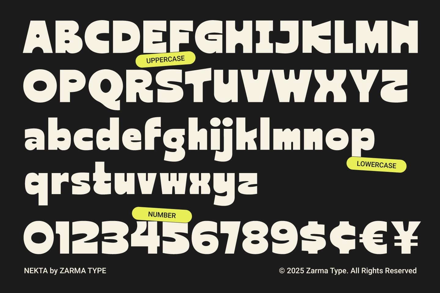
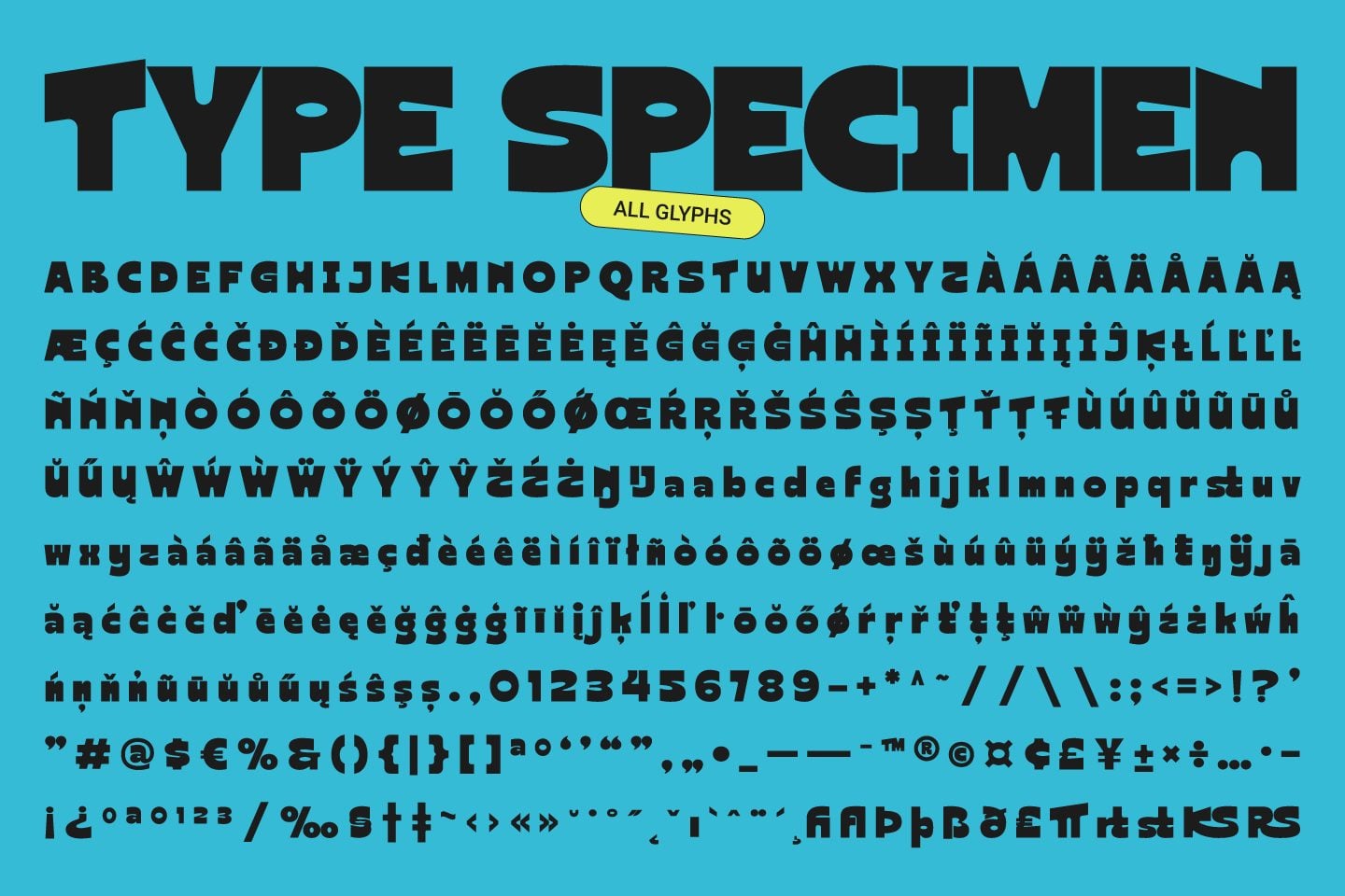
Glyphs