Family
Description
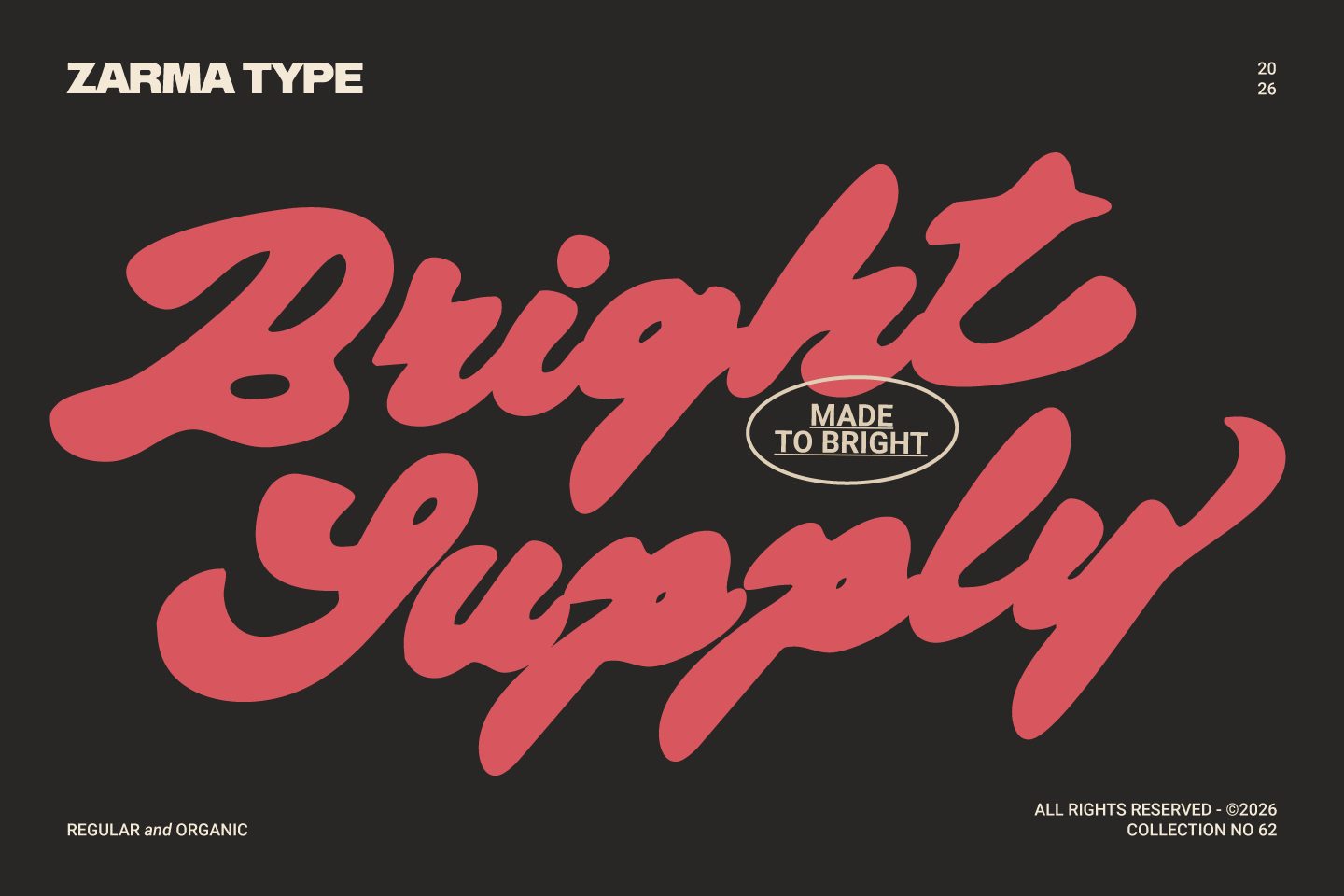
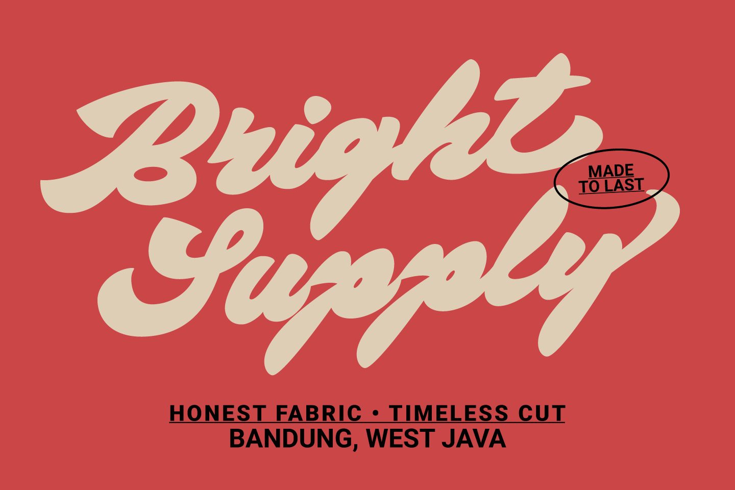
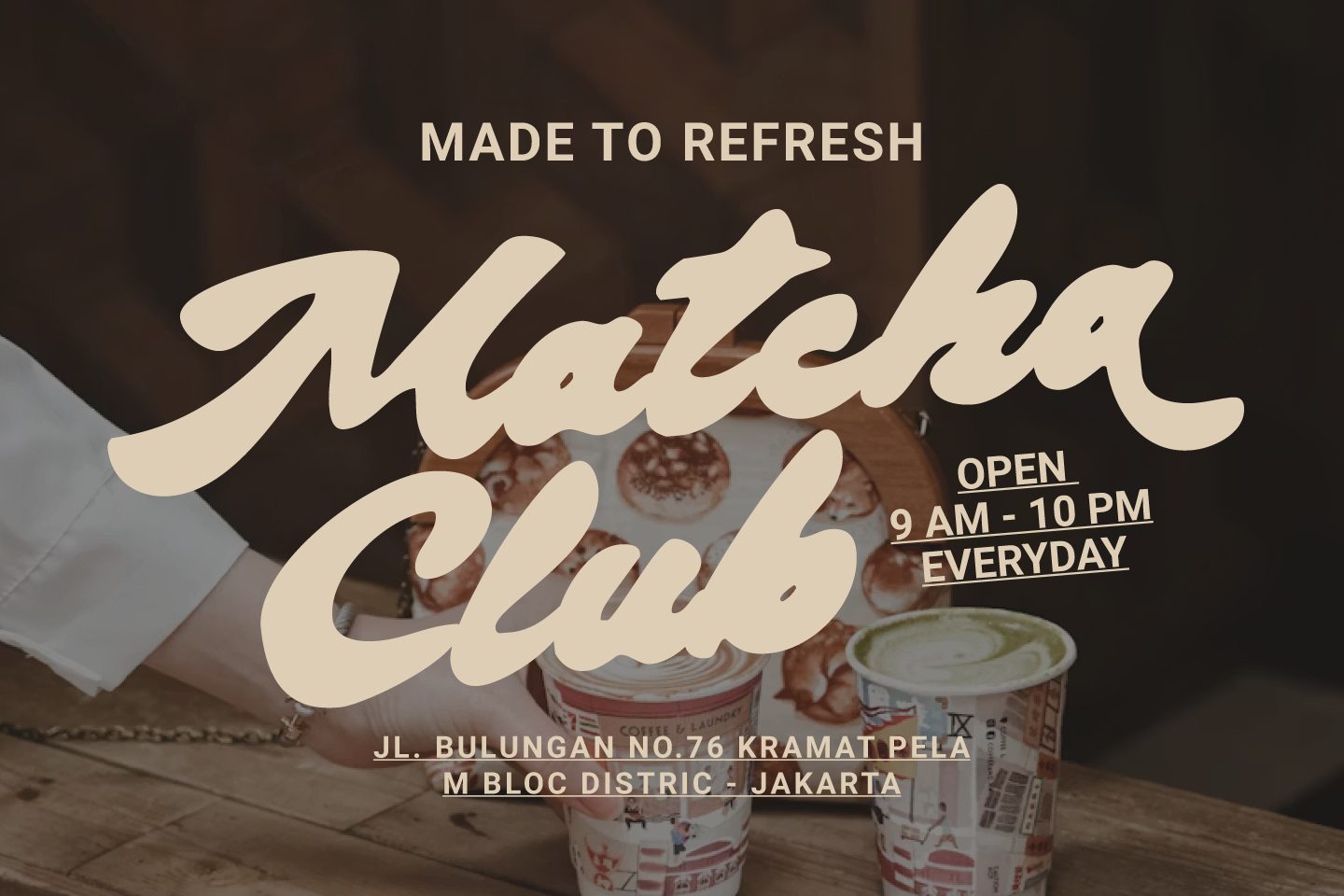
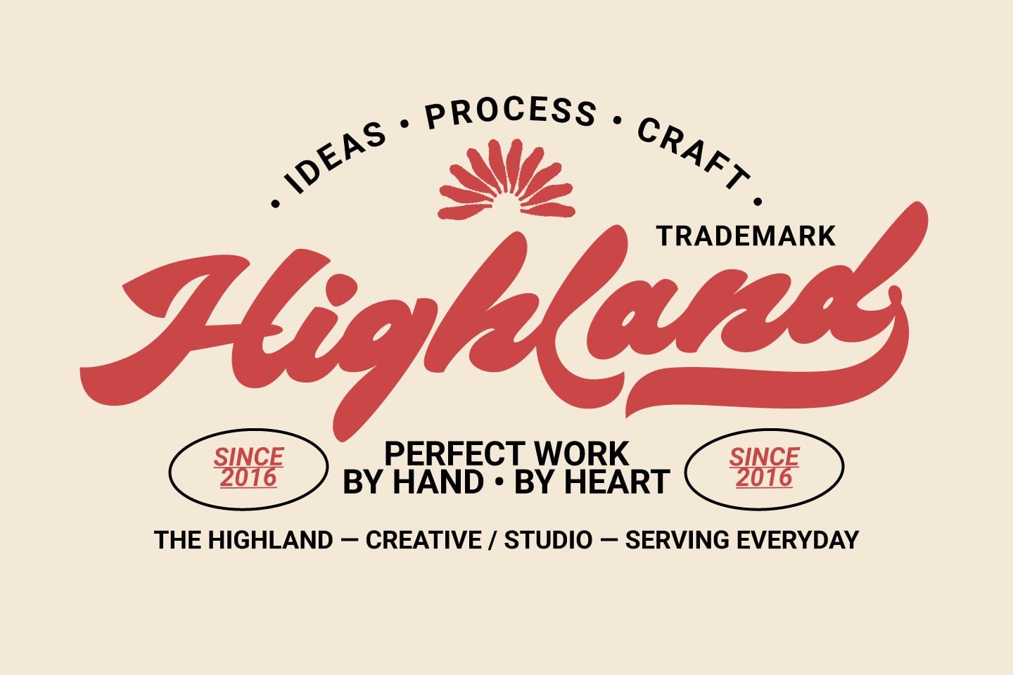
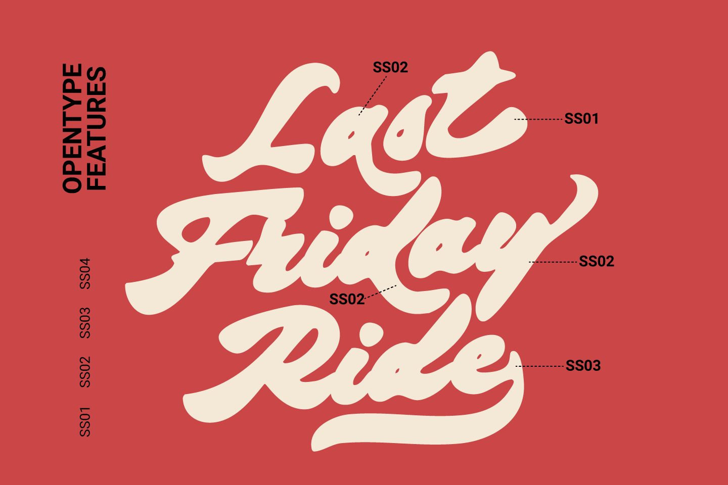
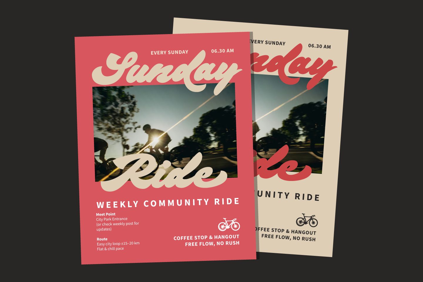
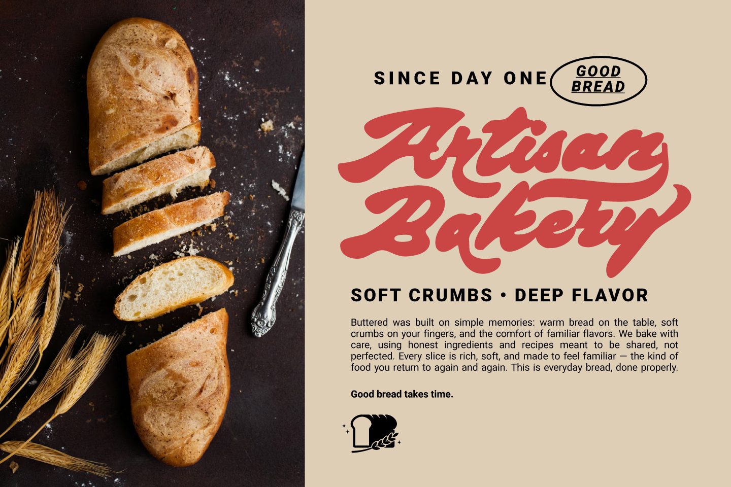
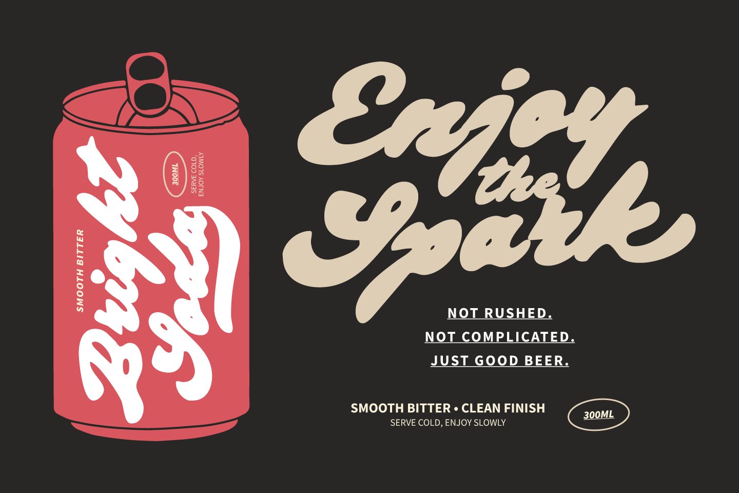
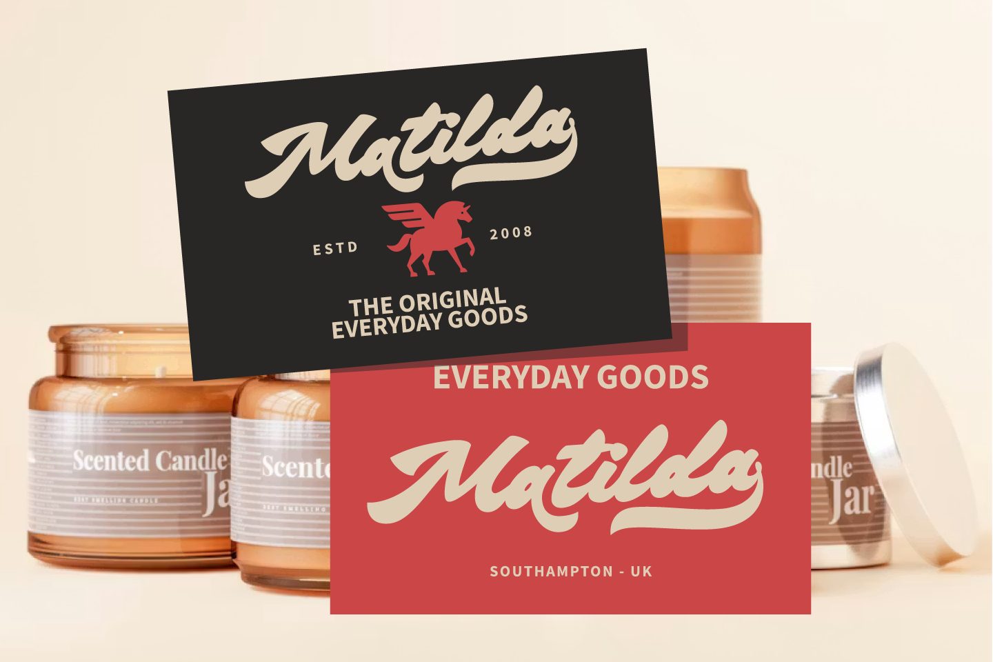
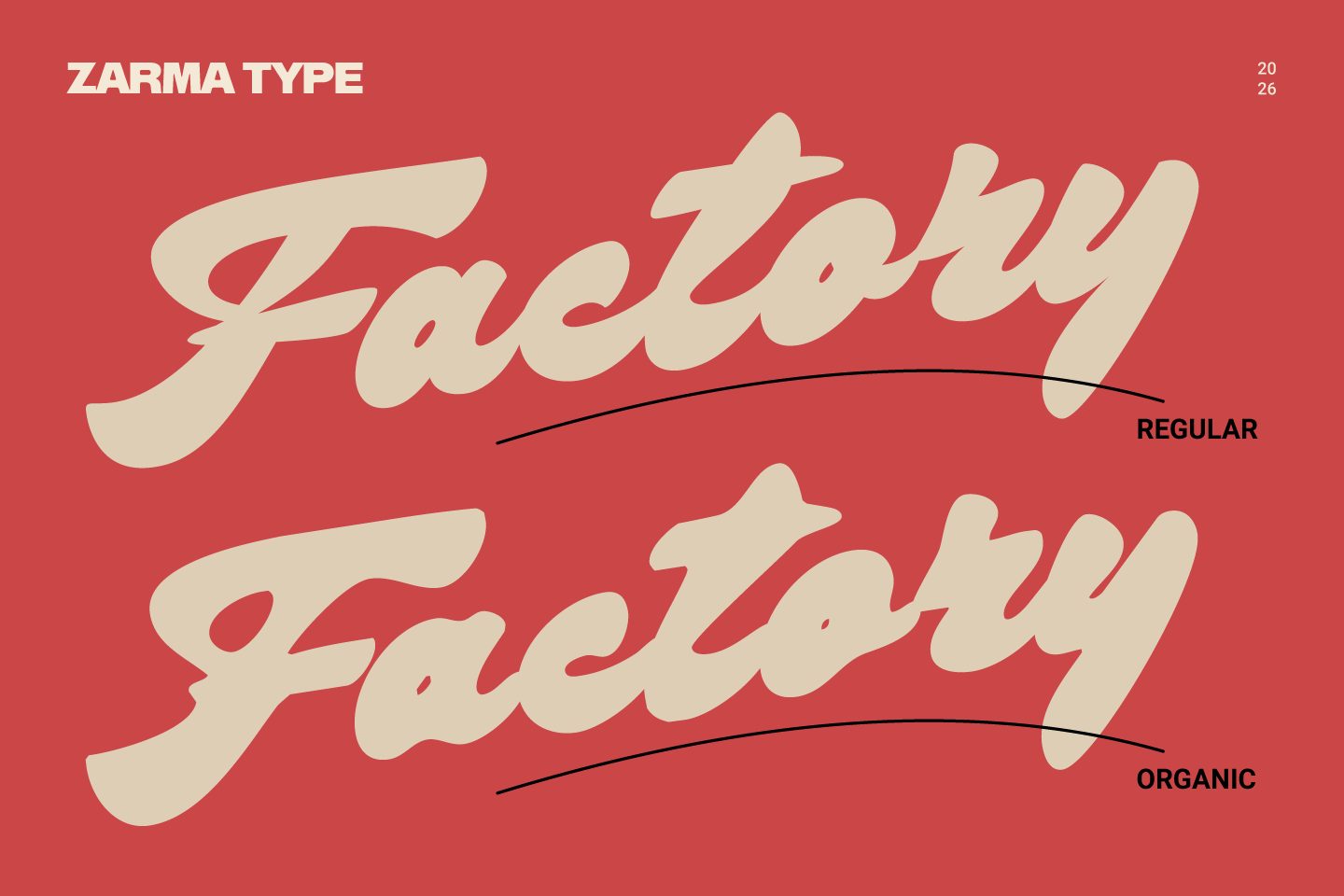
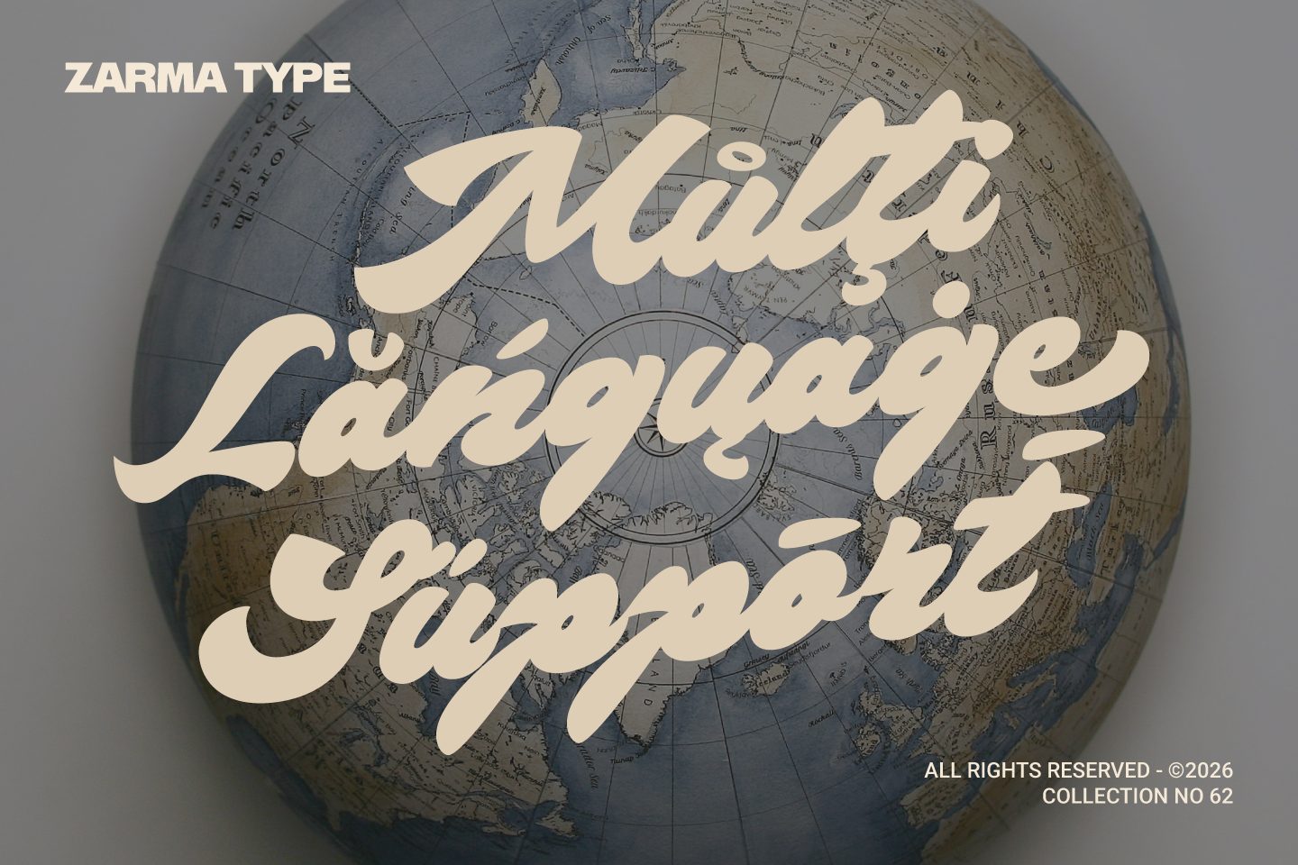
Bright Supply feels like the kind of lettering you would spot on a favorite local shop sign, a trusted bakery wrapper, or a poster worth saving. The strokes are thick and confident, yet the movement stays smooth and welcoming. That combination gives it a strong identity for branding while keeping the overall mood relaxed and human. The regular style delivers a cleaner finish, while the organic version brings extra texture and soul to the page. What makes Bright Supply special is how naturally it adds personality without overwhelming the layout. A few words are often enough to set the tone. It can feel nostalgic on packaging, energetic on social graphics, and stylish on merchandise. If you want typography that looks crafted, bold, and approachable at the same time, Bright Supply gives you that flexibility with ease.
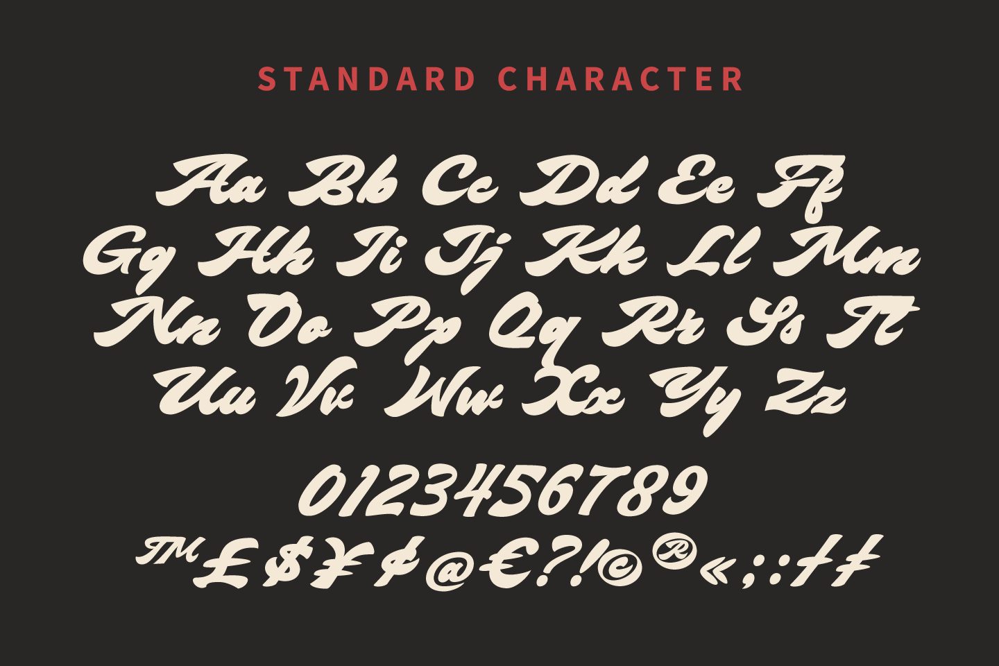
Glyphs