Family
Examples
Glyphs
Description
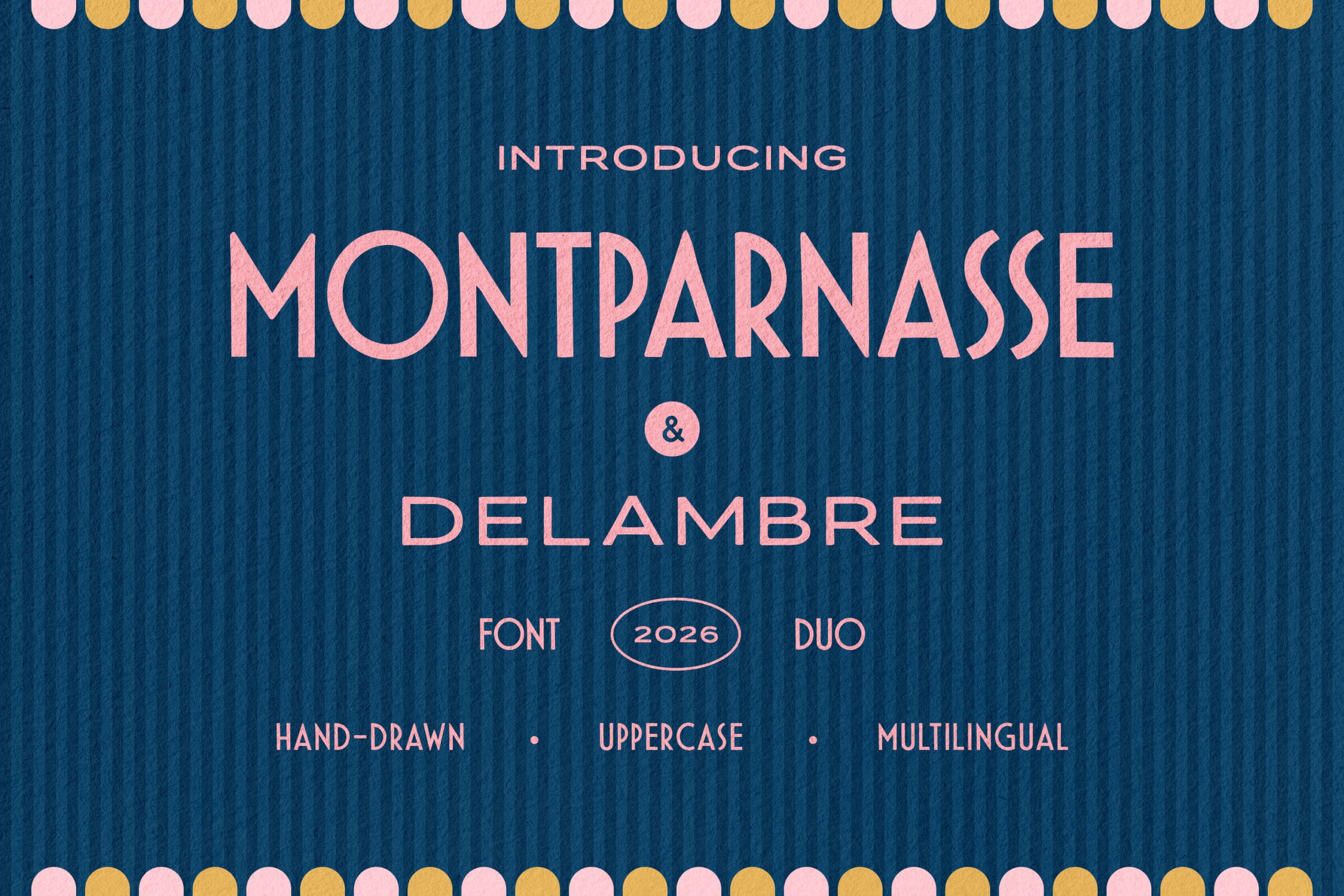
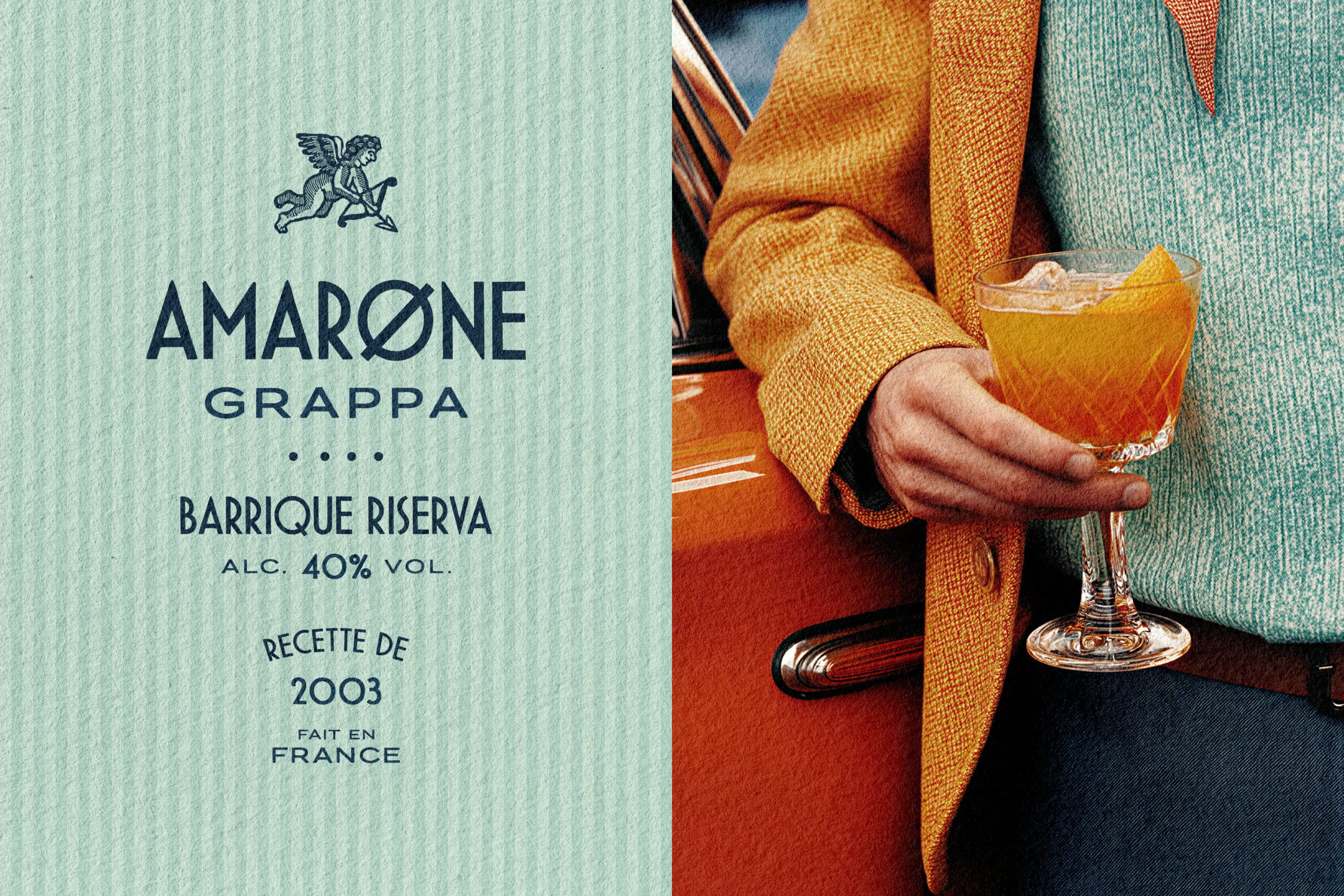
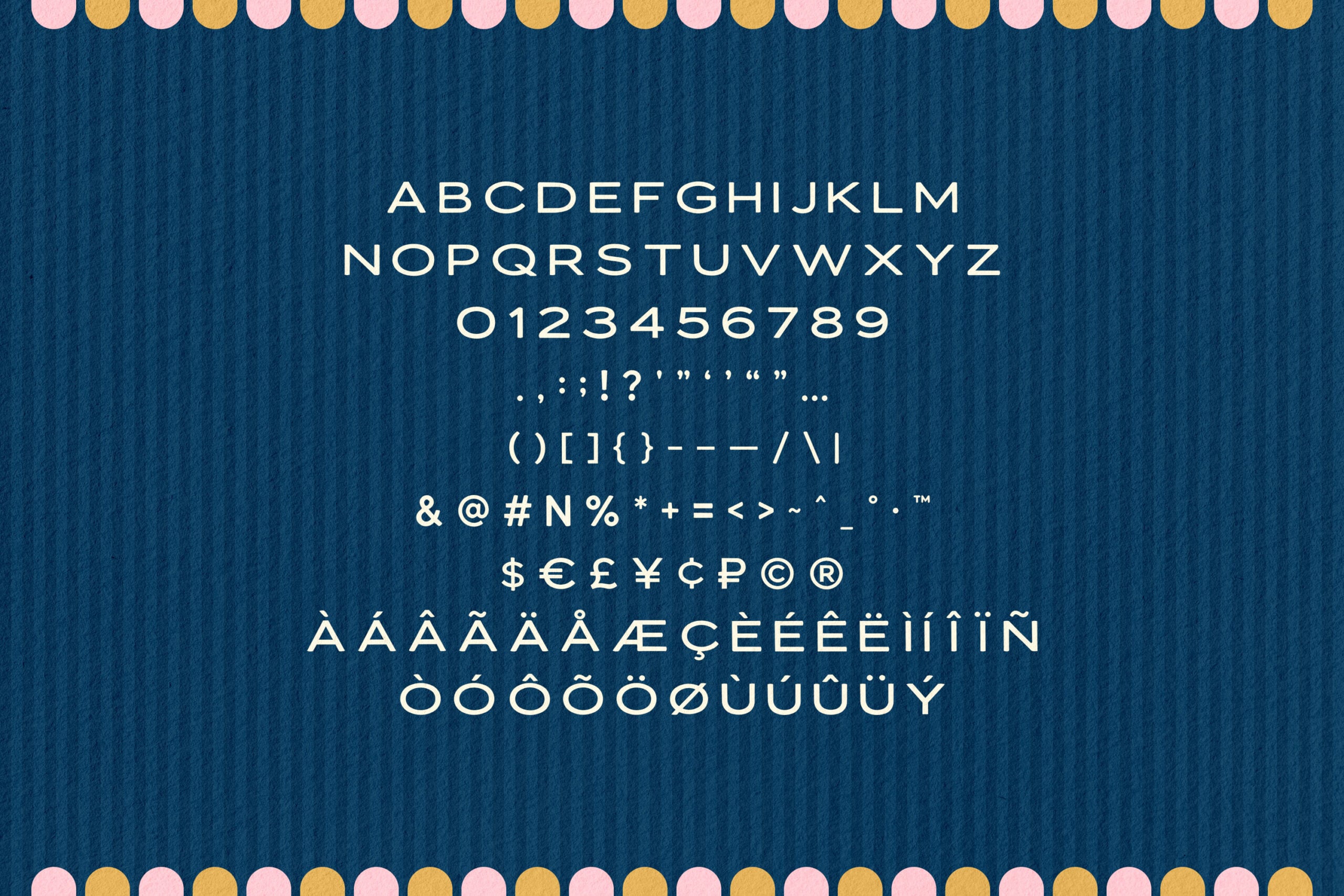
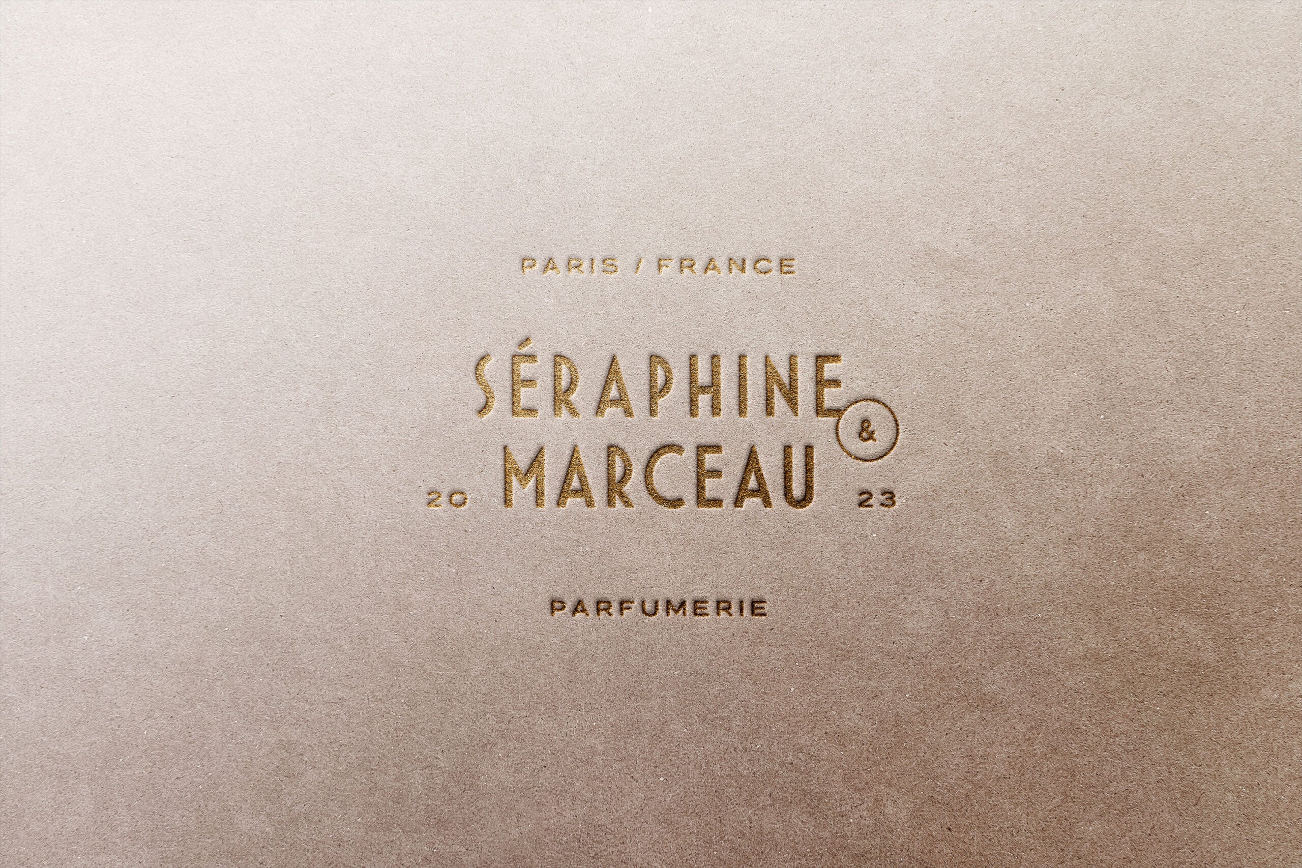
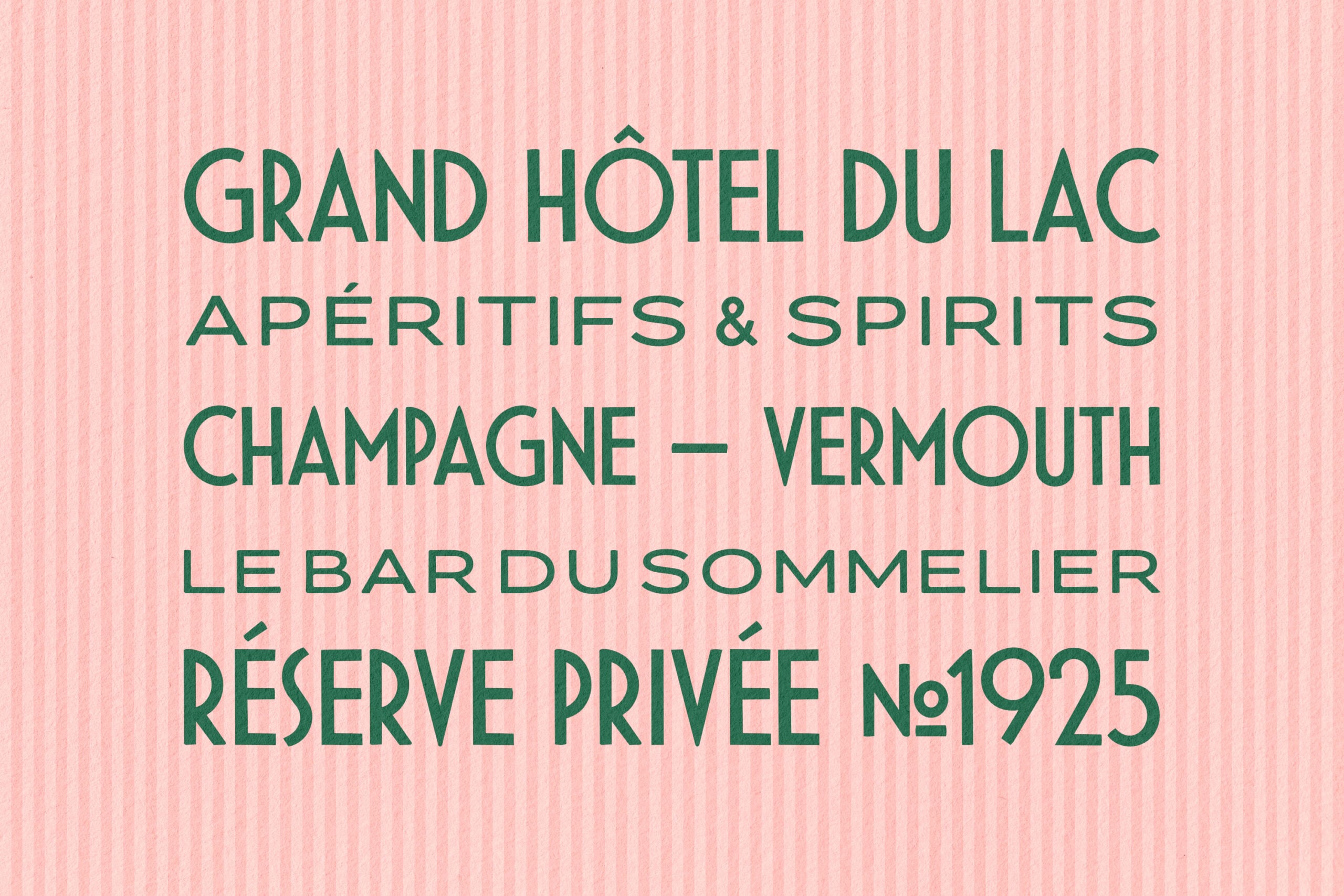
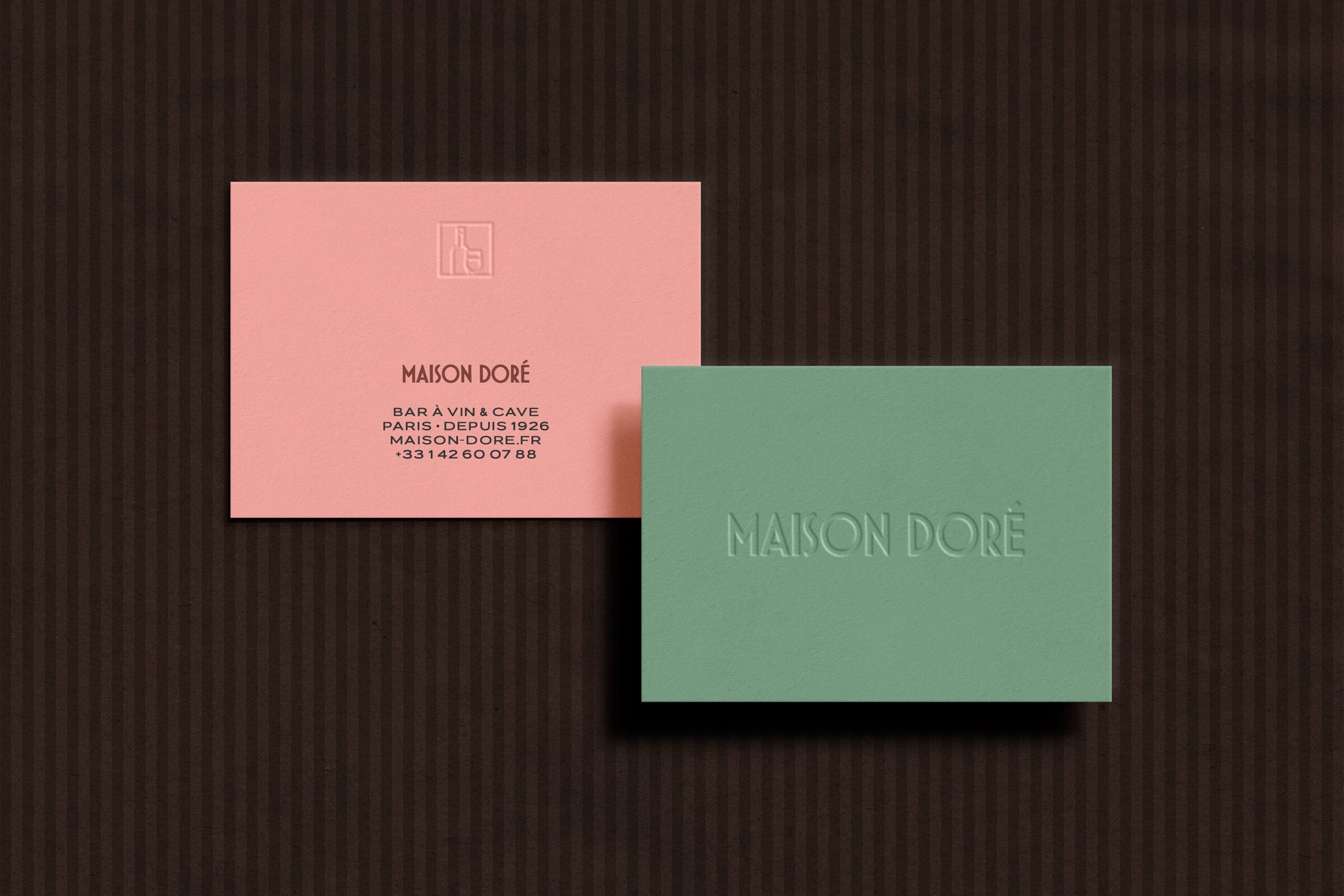
Montparnasse & Delambre are an Art Deco display duo drawn from the geometry that swept Paris around the 1925 Exposition des Arts Décoratifs. The..lettering of the age ran on bold geometric forms, so both fonts share the DNA. They bring high-waisted capitals, perfectly round bowls, pointed apexes, and a hand-drawn finish that softens the edges just short of a mechanical vector cut.
Even the name is an Art Deco easter egg: it evokes the jazz-age Left Bank, the Montparnasse of 1920s café society, where that geometry first found its way into signage and labels.
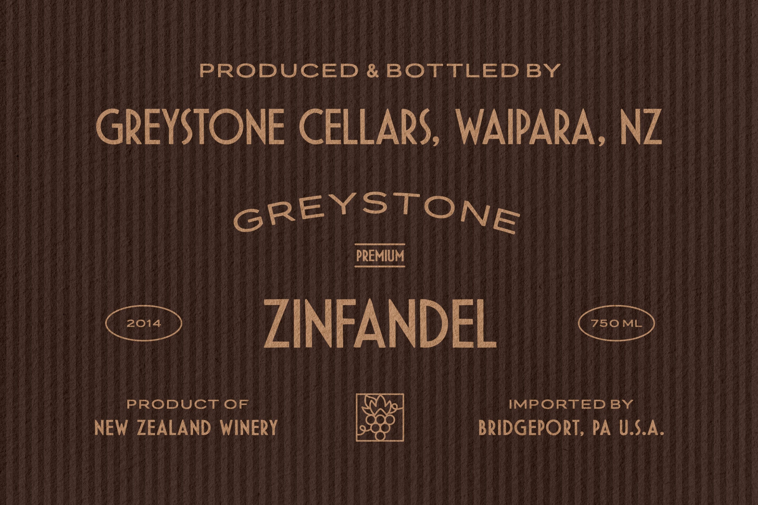
Montparnasse is the condensed cut, narrow and vertical, built to stack headlines into tall columns or run a long name down the length of a poster. Delambre opens the same skeleton out wide, with room to breathe across a logotype or a label face. Together, they do the real work of a deco lockup: a wide brand name over condensed supporting lines, a year, an origin, a measure. That layering builds the hierarchy of a spirit's label, a parfumerie box, or a grand hotel sign.
Practical uses:
- Branding and logos — wine and spirits labels, perfumeries, hotels and bars, patisseries, fashion houses.
- Packaging design — bottle and tin labels, perfume boxes, chocolate bars, gift wrap.
- Poster and signage — event bills, menu boards, façade and window lettering, gallery announcements.
- Editorial and print — magazine titles, invitations, certificates, monograms.
- Social content — title cards, announcement posts, story templates.
Features:
- 2 styles: Montparnasse (condensed) and Delambre (wide);
- uppercase letters;
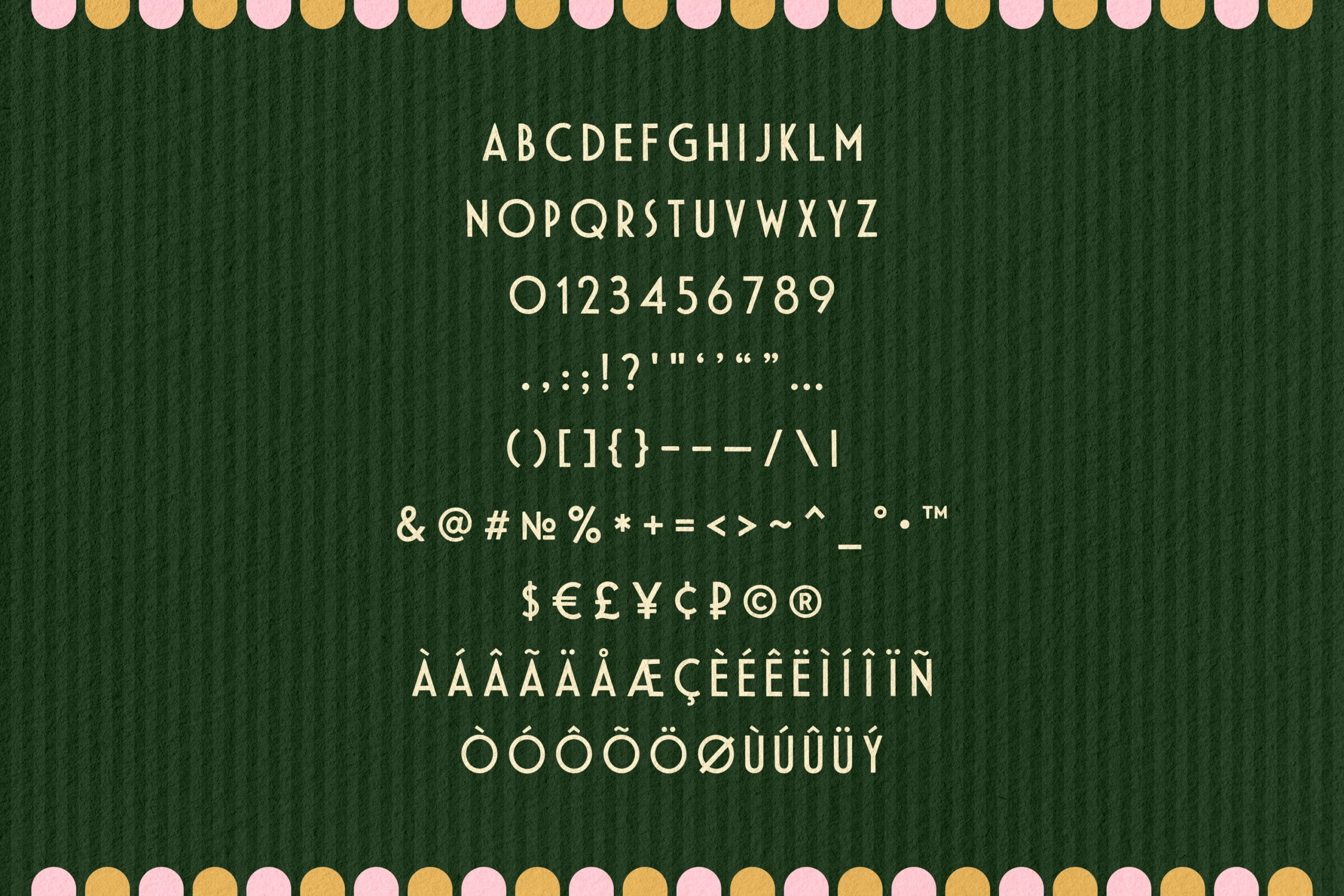
- numerals, punctuation, and currency symbols;
- multilingual support across Western European - languages;
- 120 glyphs per style.