Family
Examples
Glyphs
Description
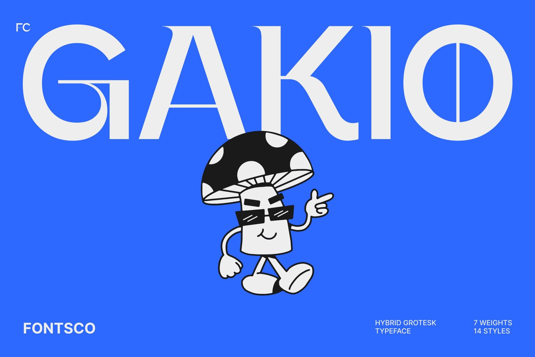
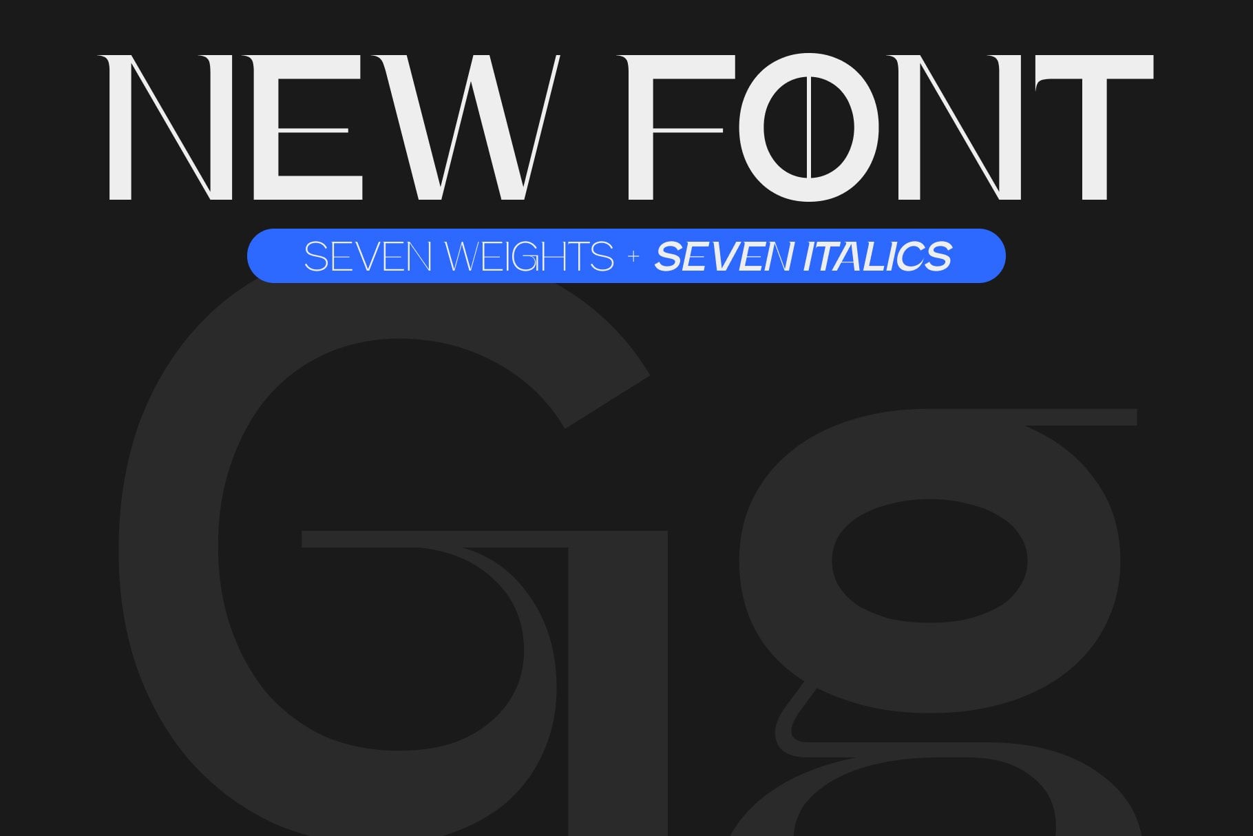
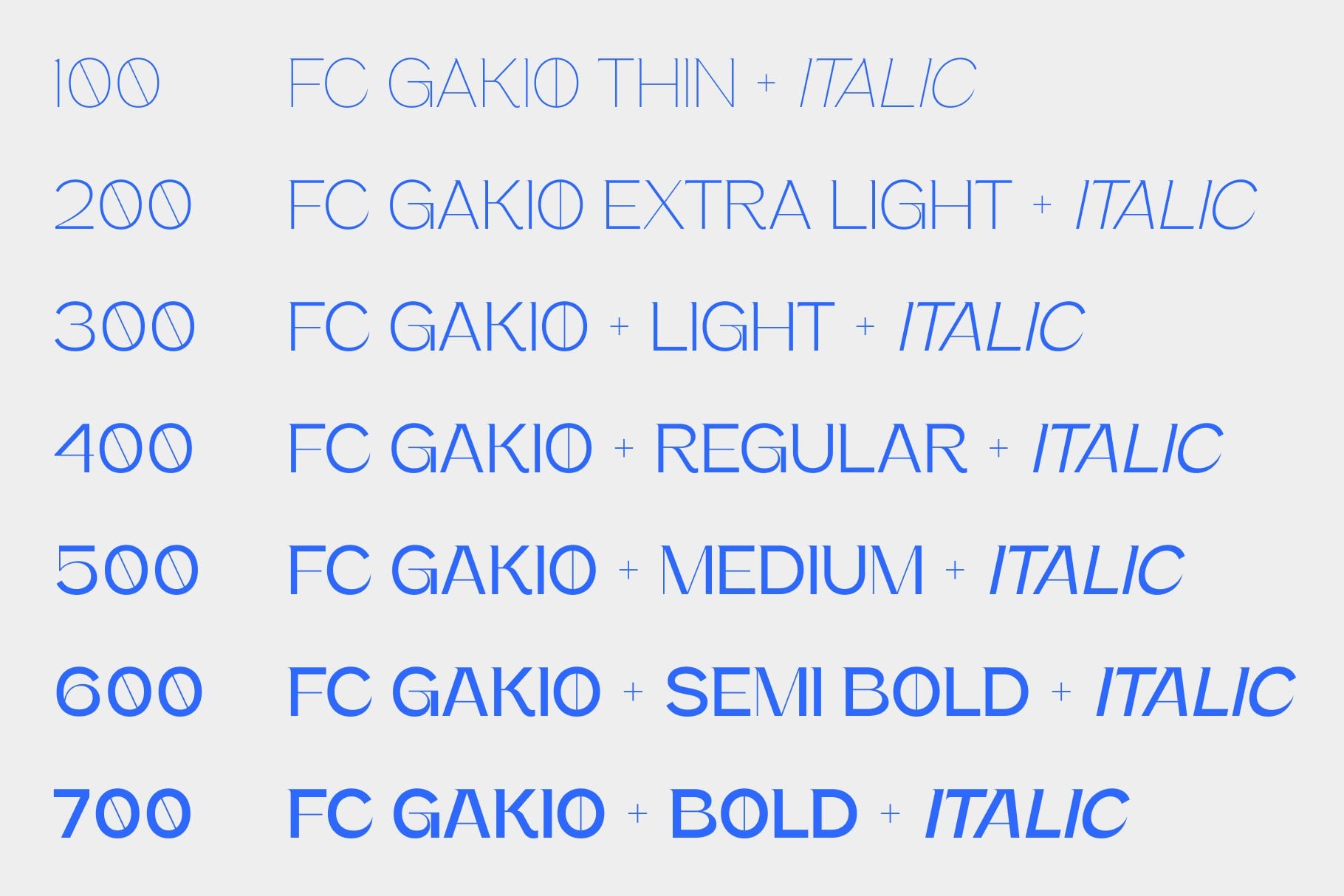
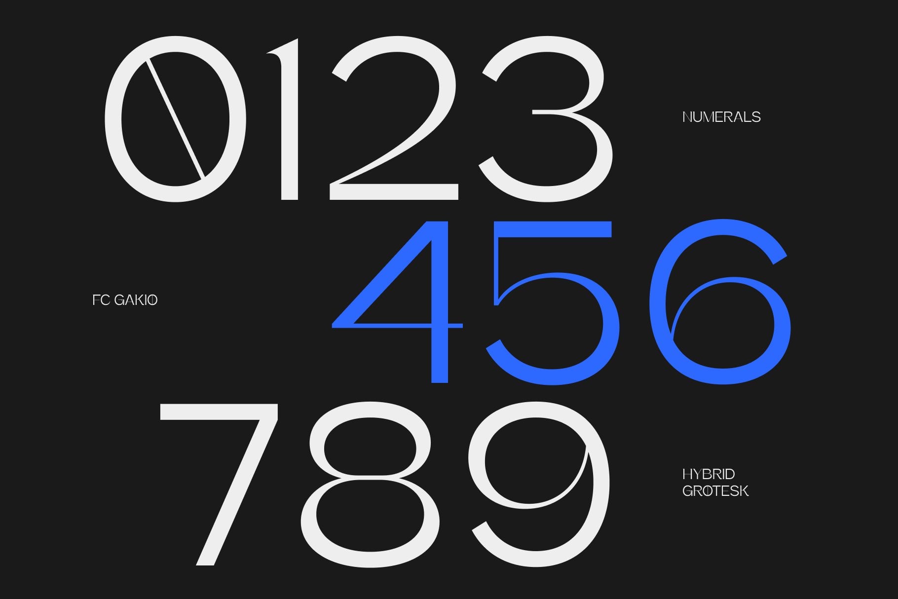

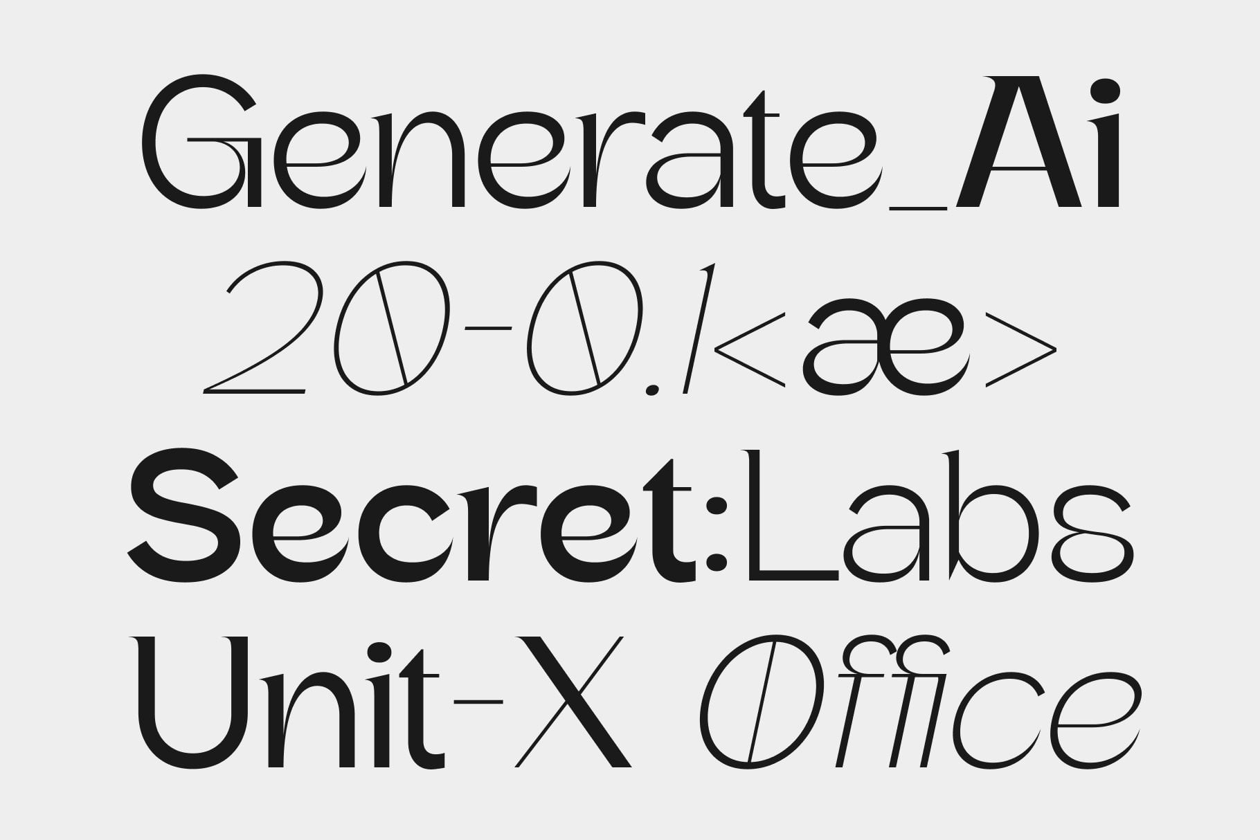
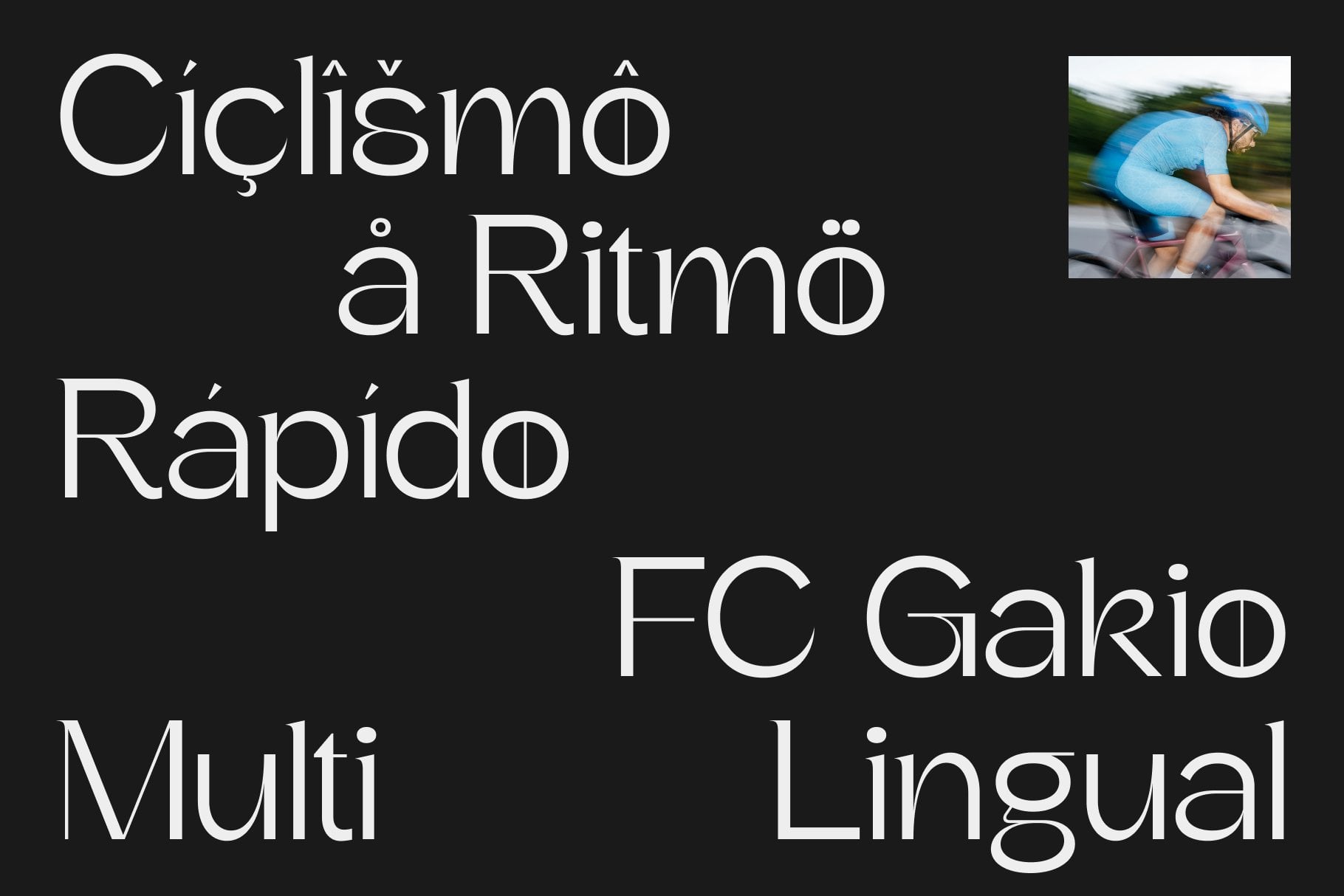
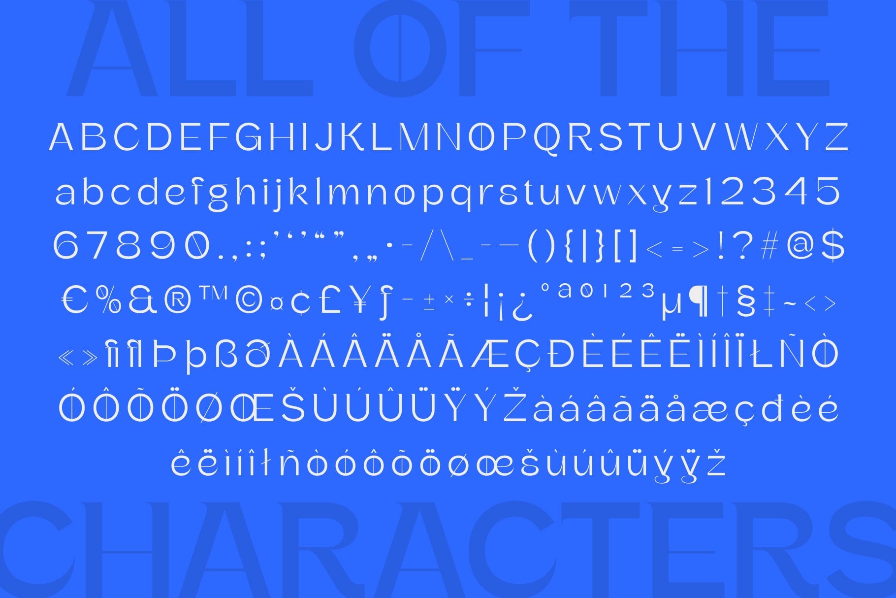
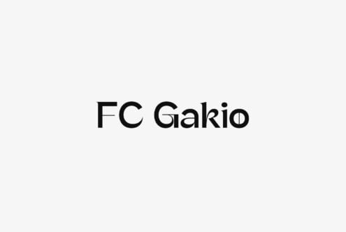
FC Gakio is a hybrid grotesk family from Fontsco that balances clean, modern lines with a warm, friendly feel. Its visual character is direct..but not cold: crisp shapes and contemporary proportions meet an approachable softness that makes the typeface feel easy to use across a wide range of design contexts.
What makes FC Gakio commercially versatile is its dual role. At display sizes it holds attention with clear, modern forms; at text sizes it stays readable and comfortable. The warm undercurrent keeps pages from feeling clinical, while the grotesk structure gives layouts a confident editorial backbone.
Use FC Gakio for branding systems that need to feel both polished and personable, and for web design where clarity matters without a sterile tone. In magazine work, it can carry headlines and supporting text with a consistent voice, helping art directors build hierarchy without switching to a different temperament.
The family's hybrid grotesk identity makes it a practical choice for designers who want modern lines and friendly character in one typeface. FC Gakio is suited to display and text sizes, giving teams a coherent tool for identity work, web interfaces and magazine pages, with a consistent voice across a project and its layout system.