Family
Examples
Glyphs
Description
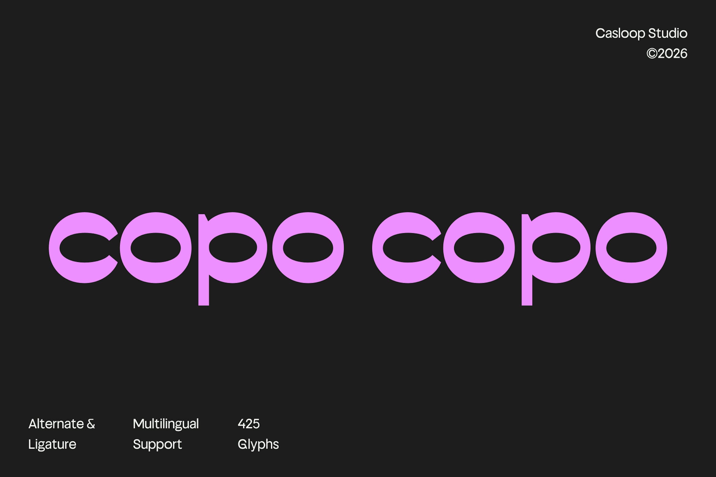
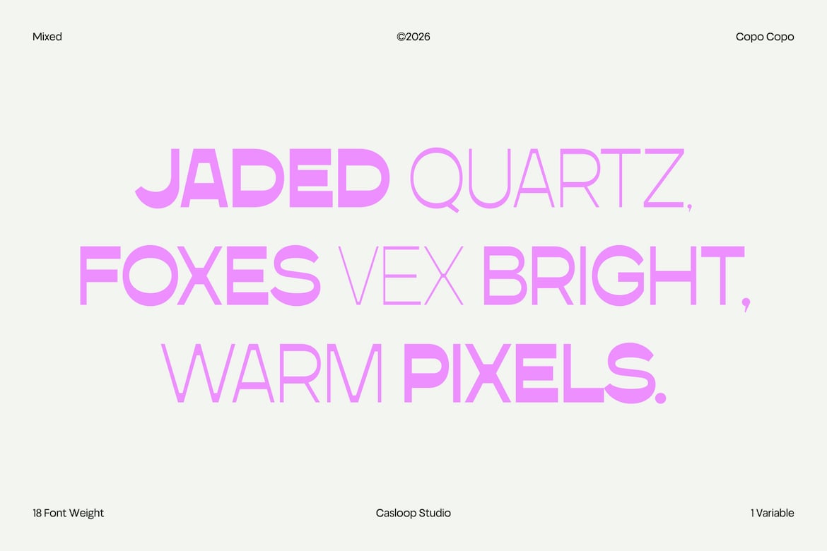
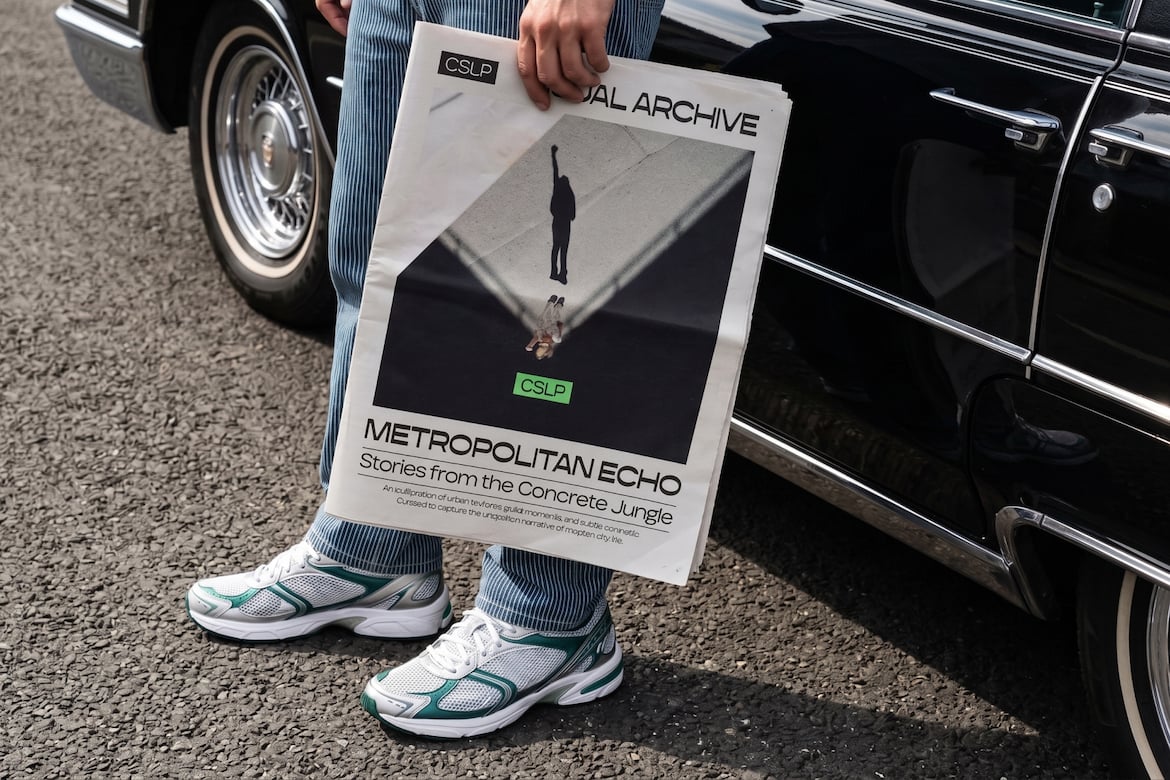
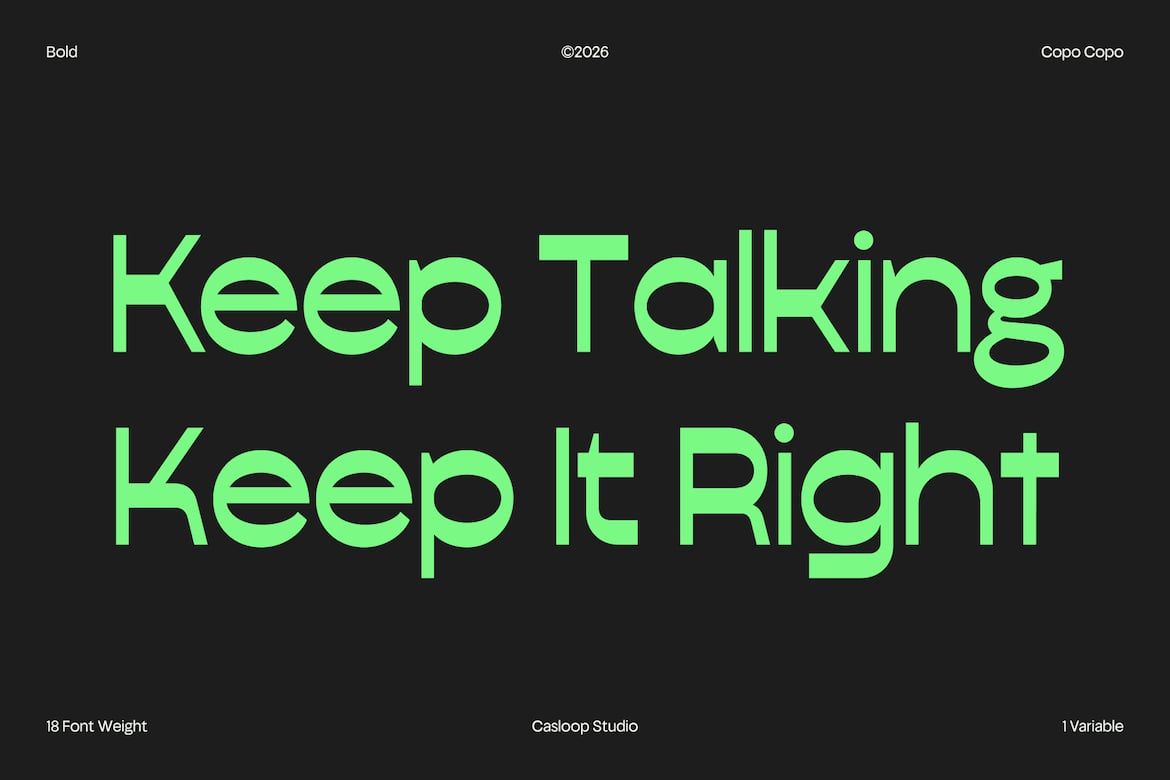
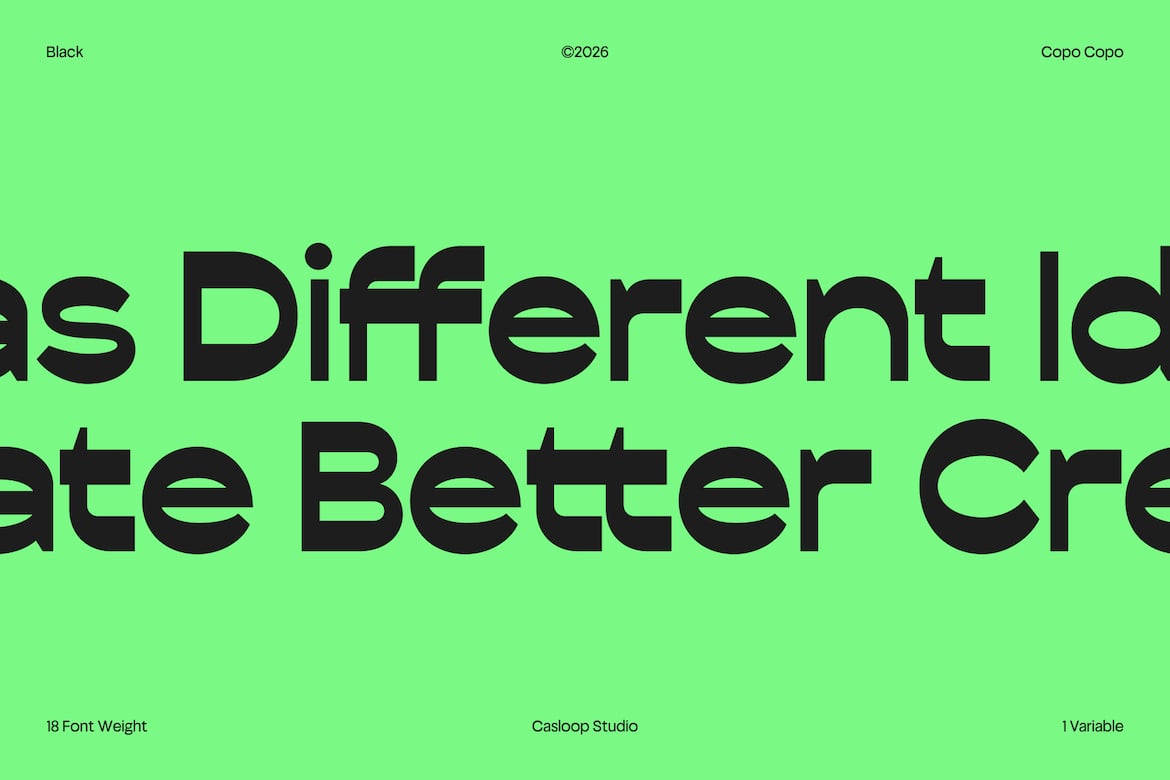
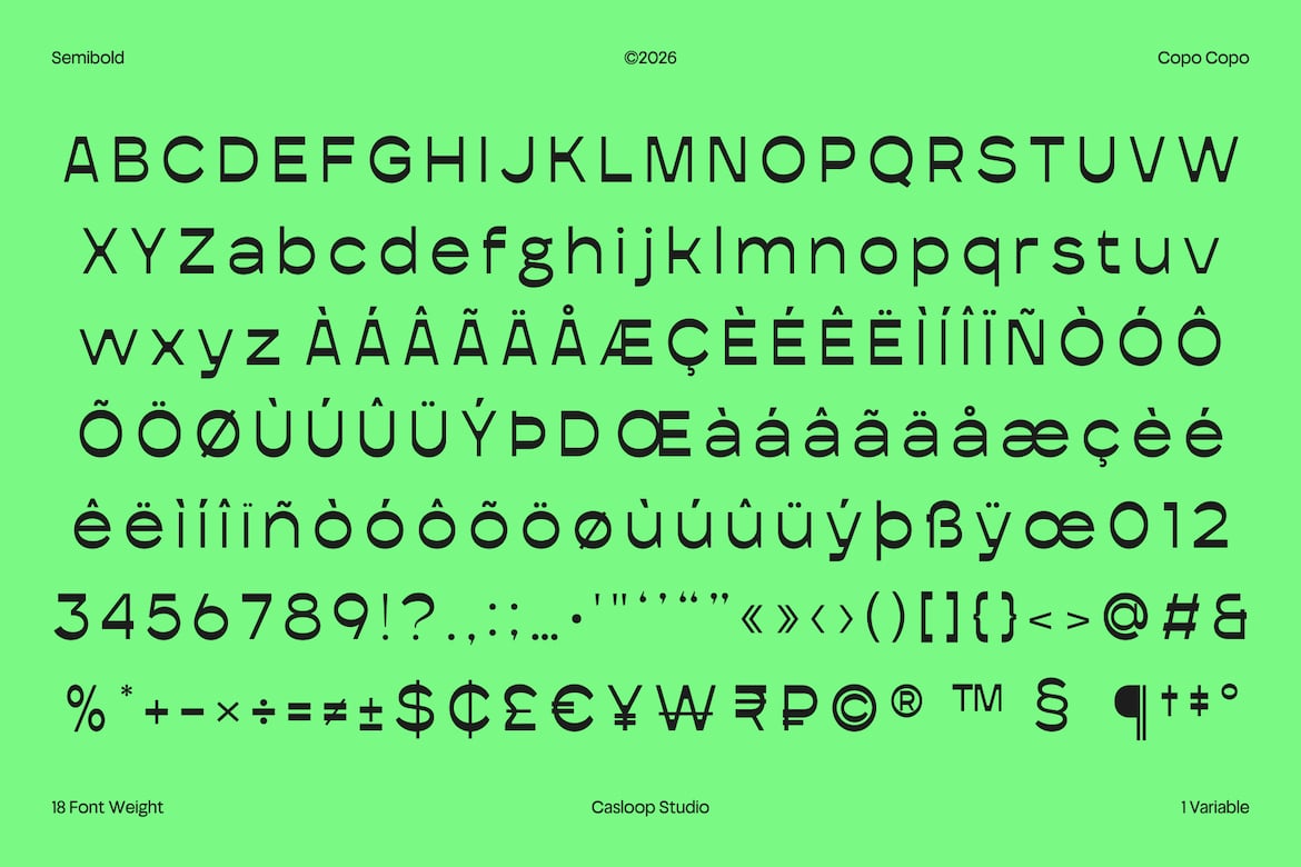
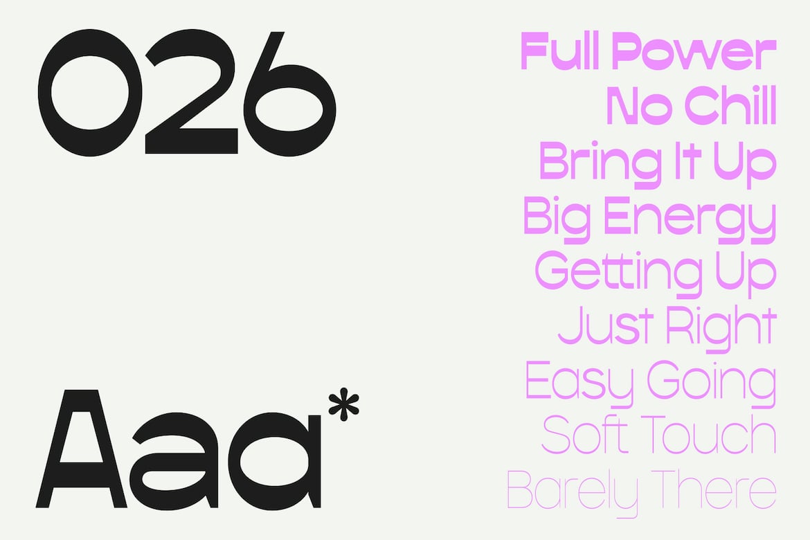
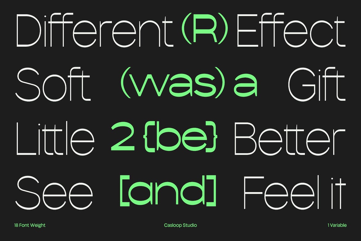
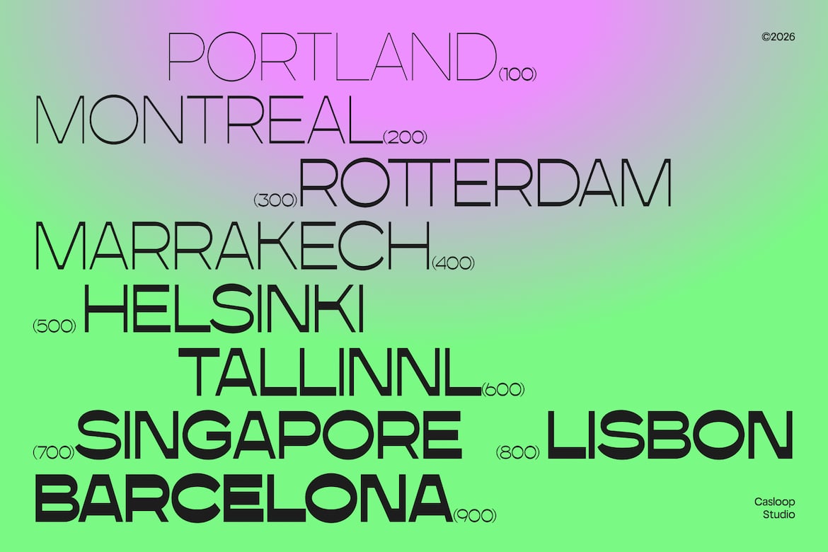
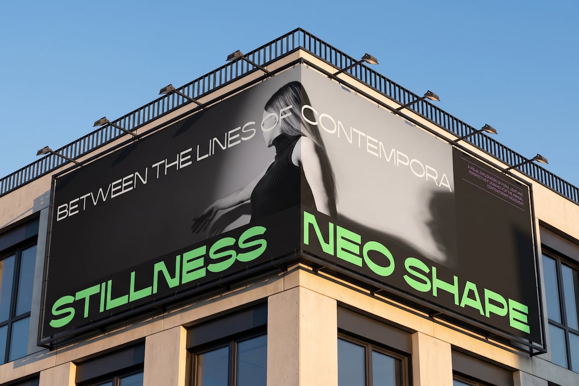
Copo Copo is a clean reversed contrast sans serif designed to bring a distinctive technical edge to modern corporate typography. Its defining characters Q,..R, a, e, g, and S combine geometric construction with reversed contrast, shifting visual emphasis across the strokes to create a unique yet controlled appearance. Strong horizontal accents establish a precise, technical rhythm, while the extensive 18-weight system with Extended styles provides flexibility across scales and applications. Copo Copo is ideal for corporate branding, technology identities, display typography, digital products, and visual systems that require a clean foundation with an unconventional, forward-thinking character. Recommended pairing with: Inter, IBM Plex Sans, Space Grotesk, Helvetica Neue, Univers, DIN