Heavy
Takeaways
Bold
Takeaways
ATP-Takeaways
Takeaways
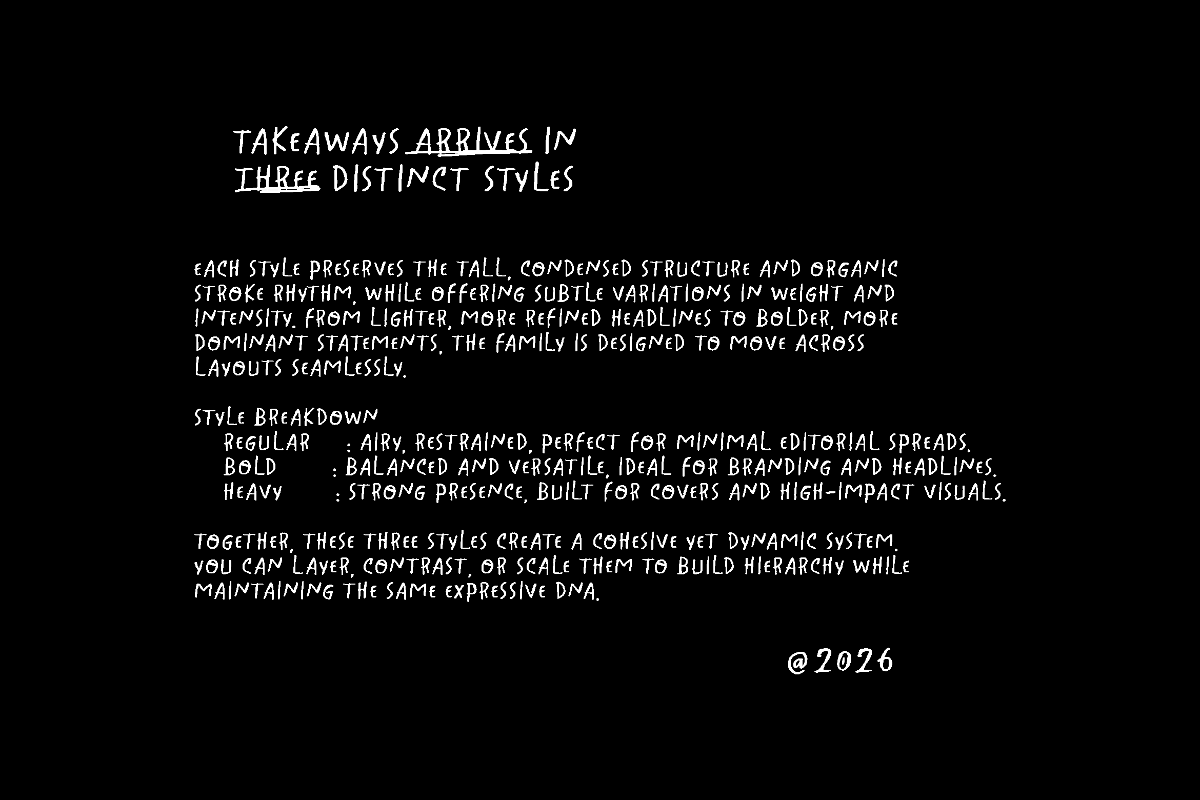
Family
HeavyBoldATP-Takeaways
Description
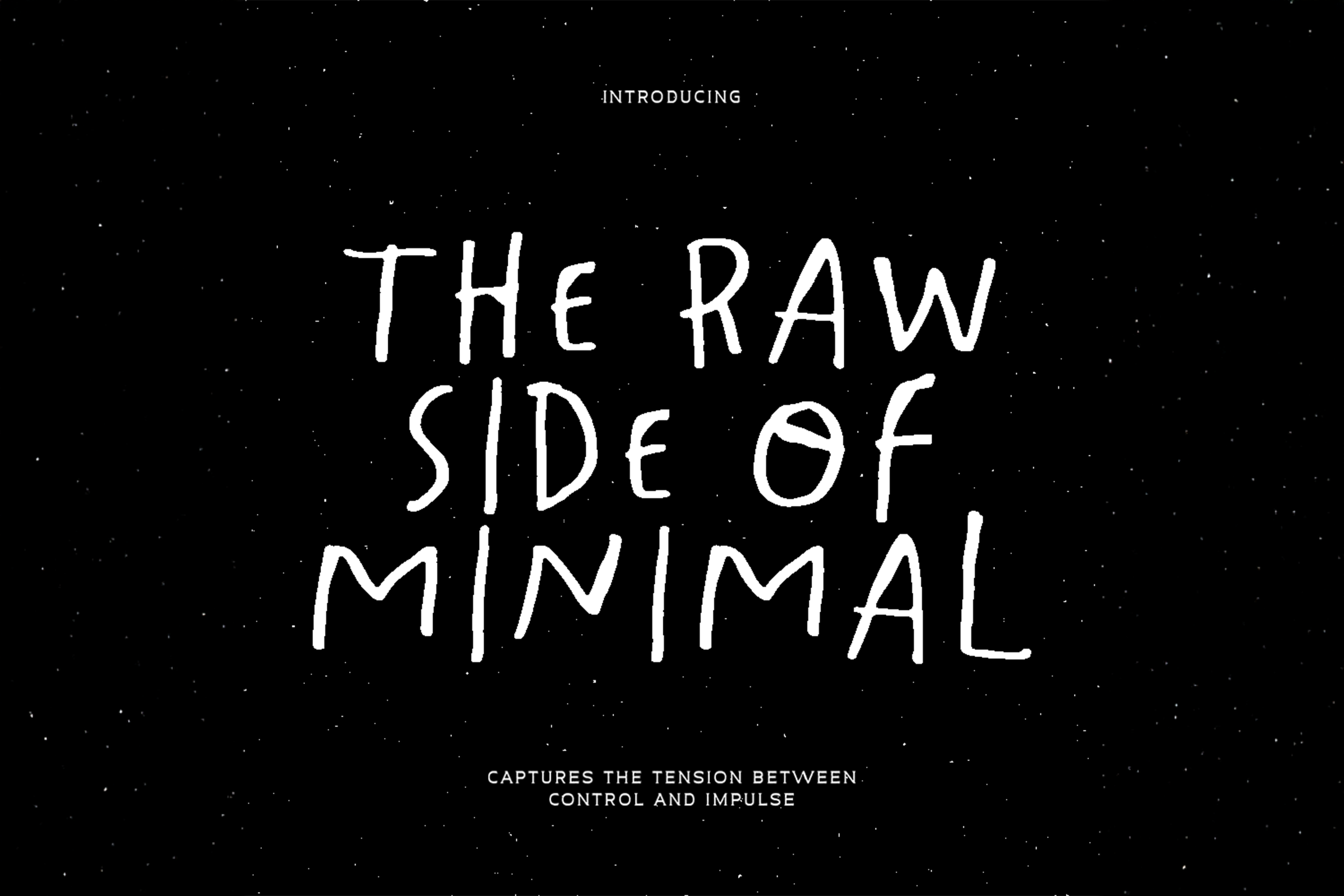
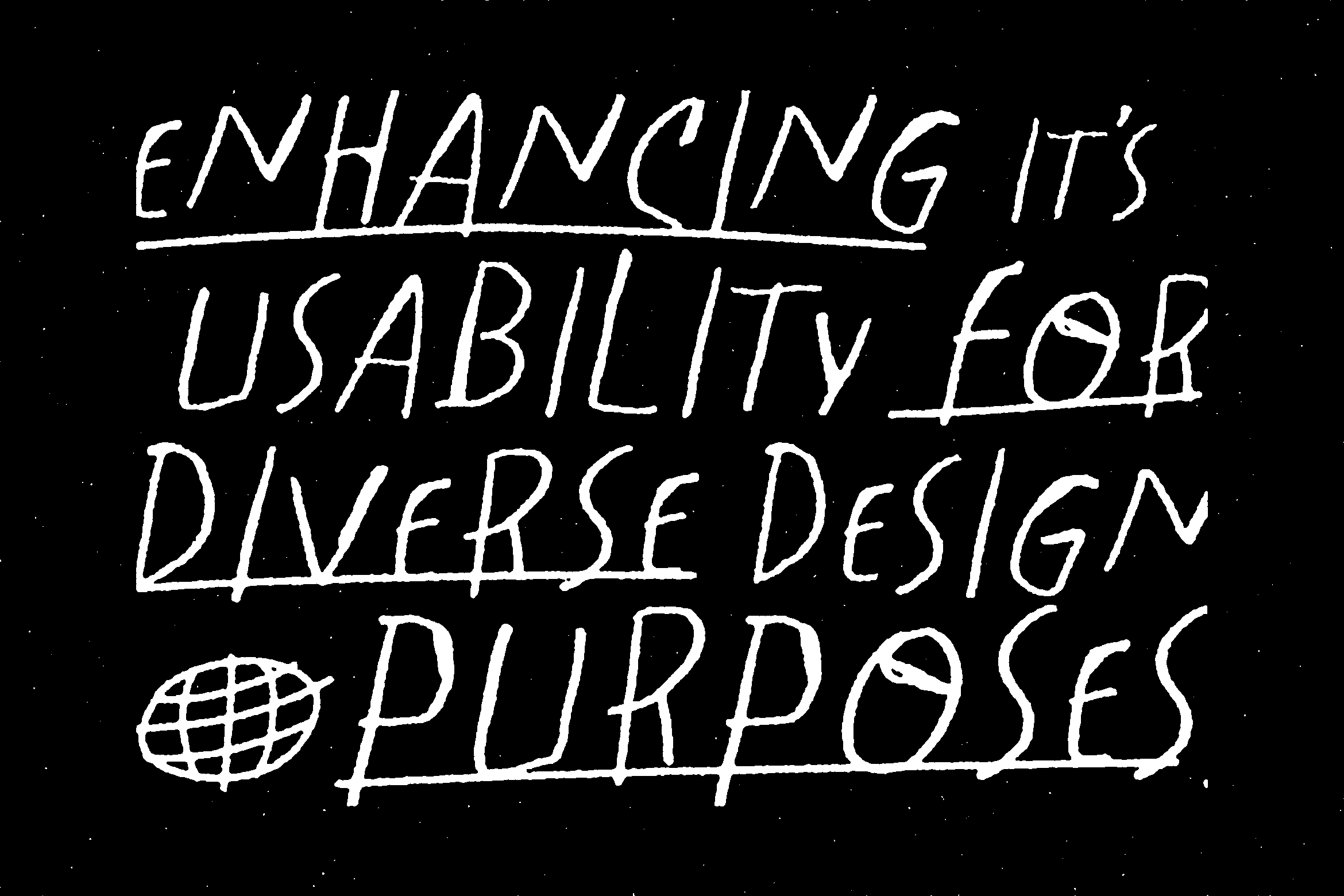
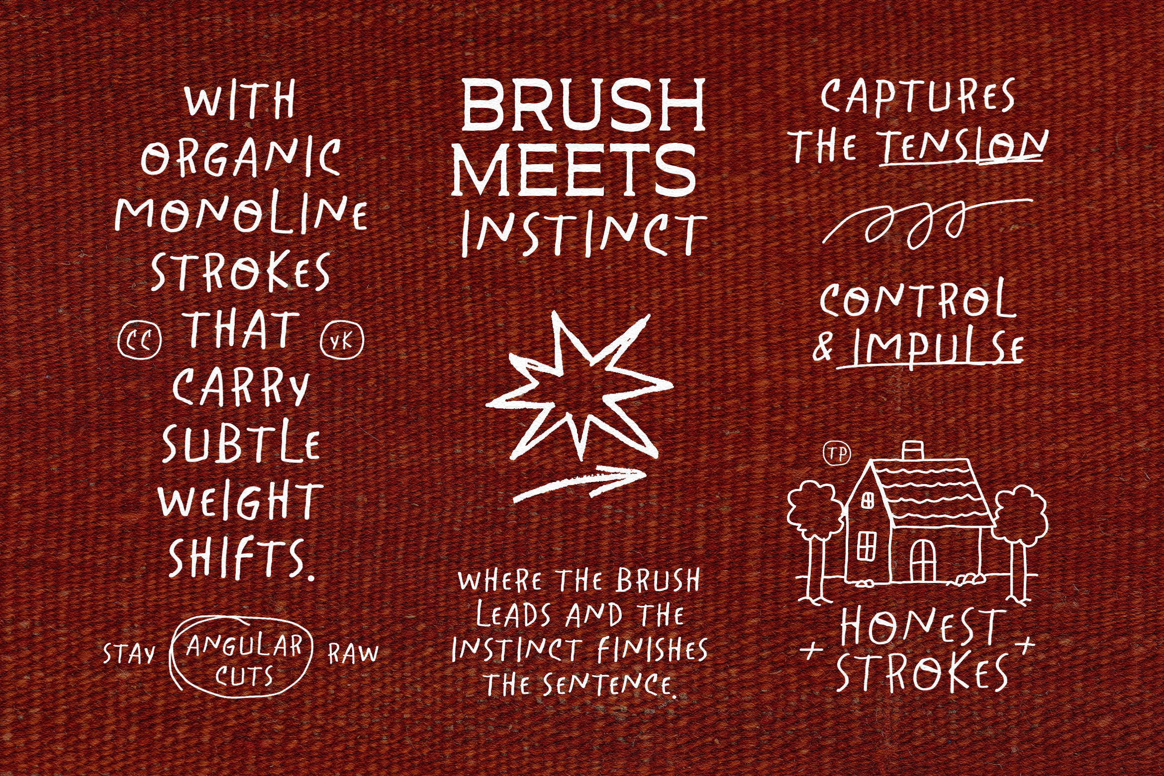
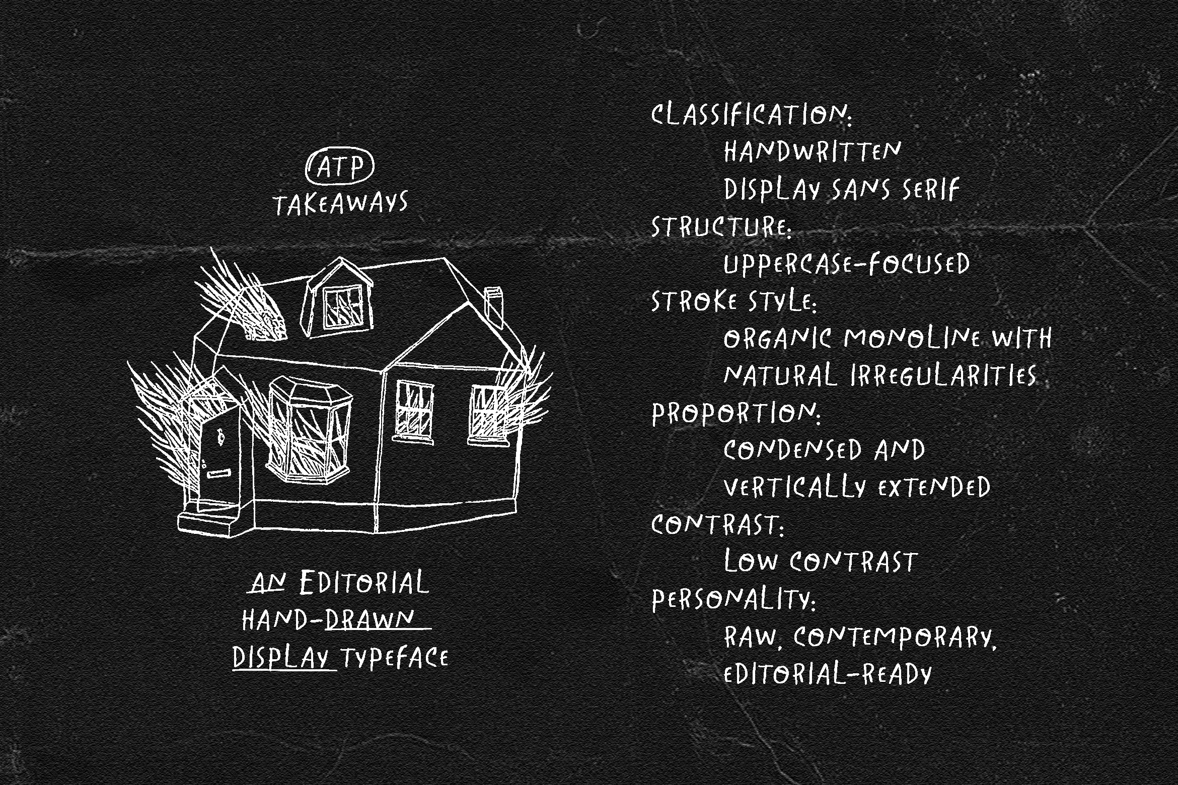
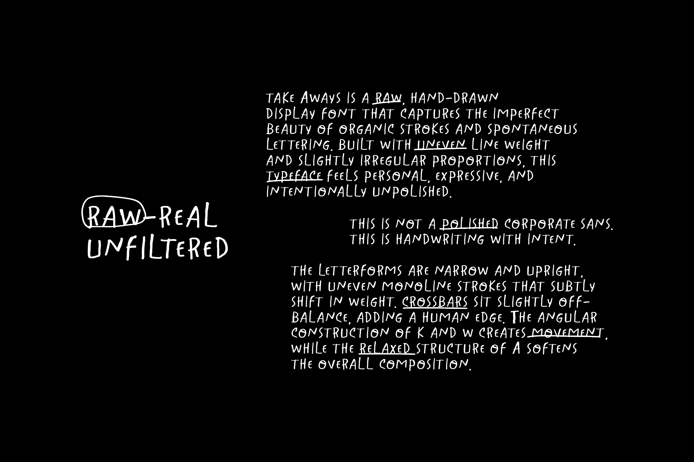
Takeaways feels like something pulled straight from the margins of a creative director’s notebook. It carries the rhythm of quick marker strokes, the confidence of tall proportions, and the quiet tension of imperfect geometry. This is not a polished corporate sans. This is handwriting with intent. The letterforms are narrow and upright, with uneven monoline strokes that subtly shift in weight. Crossbars sit slightly off-balance, adding a human edge. The angular construction of K and W creates movement, while the relaxed structure of A softens the overall composition. Every detail feels immediate. Personal. Unfiltered.
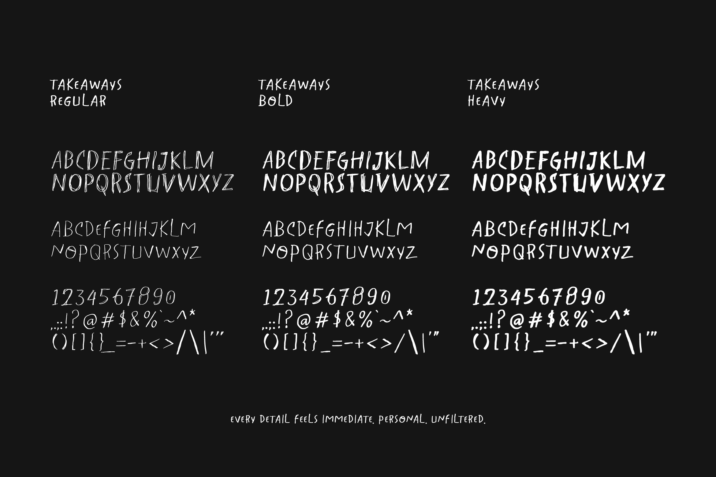
Glyphs