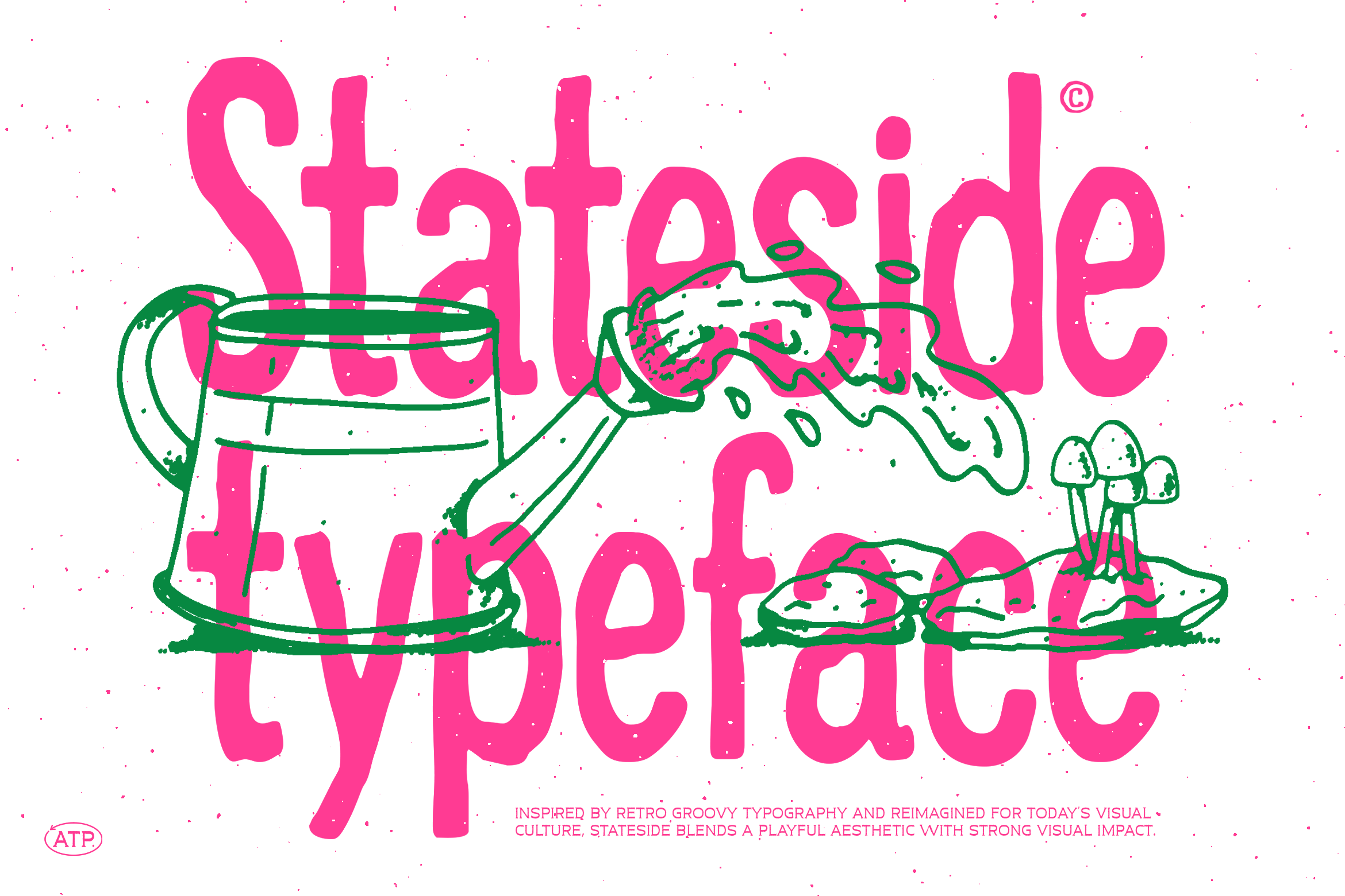
Stateside
Stateside
Family
Stateside
Description
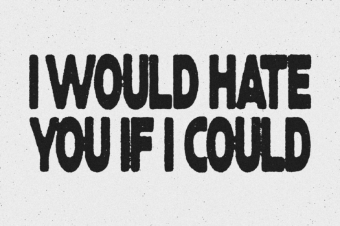
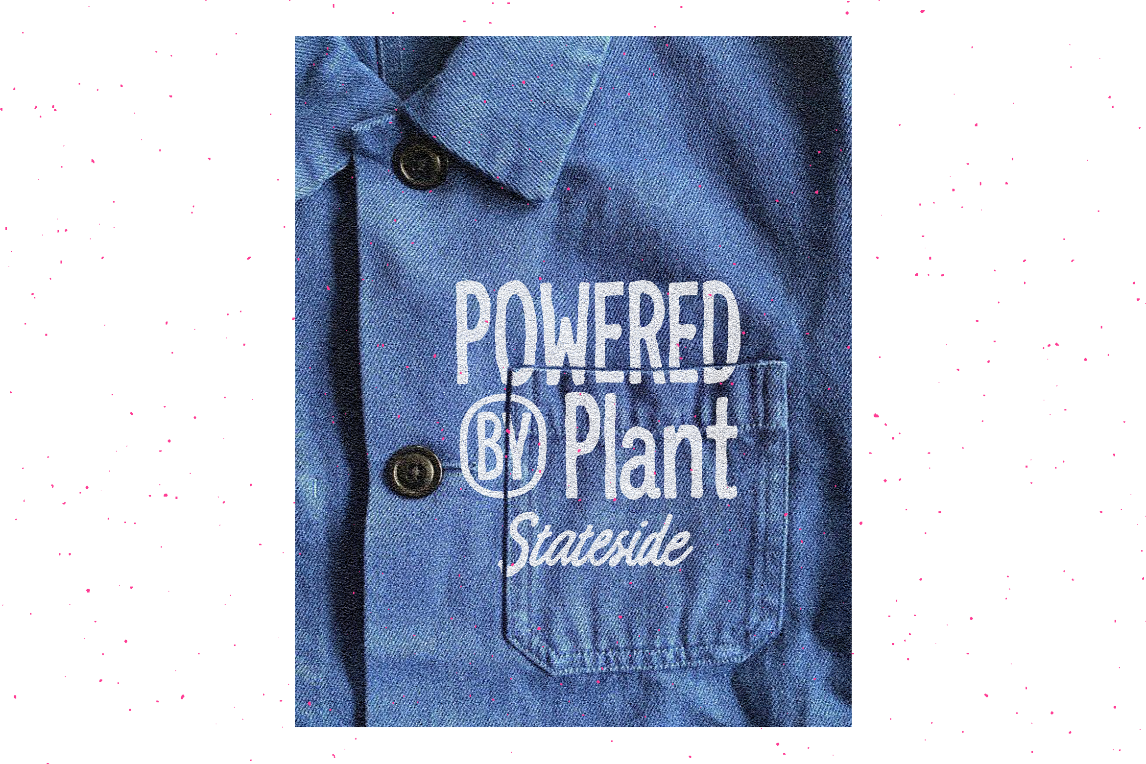
This is a hand-driven, high-impact display typeface that lives somewhere between naive lettering and controlled chaos. Every curve carries a human pulse. Every stroke refuses to be perfectly geometric. It leans into imperfection on purpose, giving it that raw, almost stubborn personality that polished fonts usually try to hide. The forms are soft, rounded, and slightly swollen, but not in a cute or predictable way. There’s tension in the shapes. The terminals feel blunt yet alive. The vertical rhythm isn’t rigid, and that’s exactly where the charm hits. It creates a visual cadence that feels spoken rather than typeset.
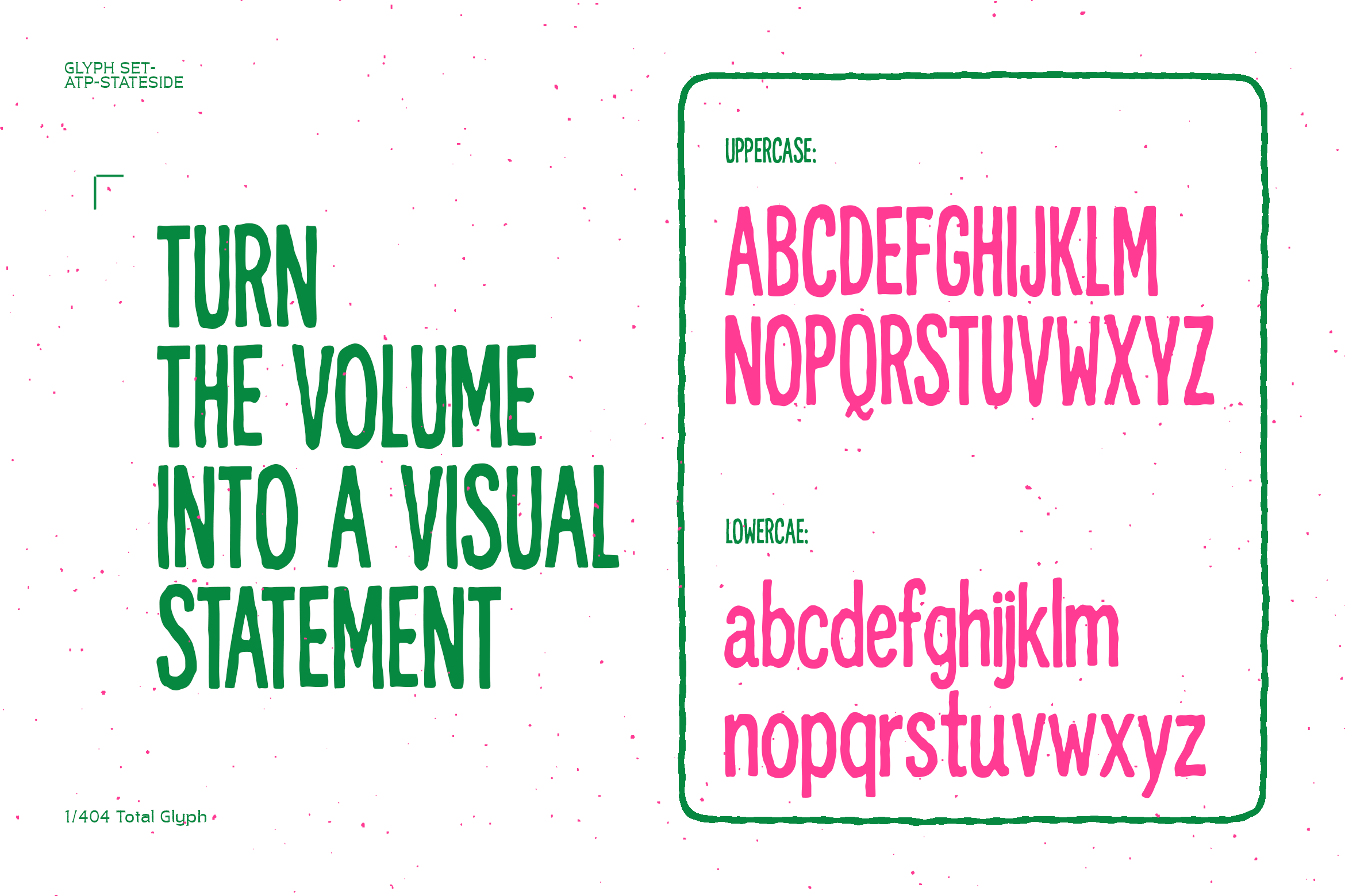
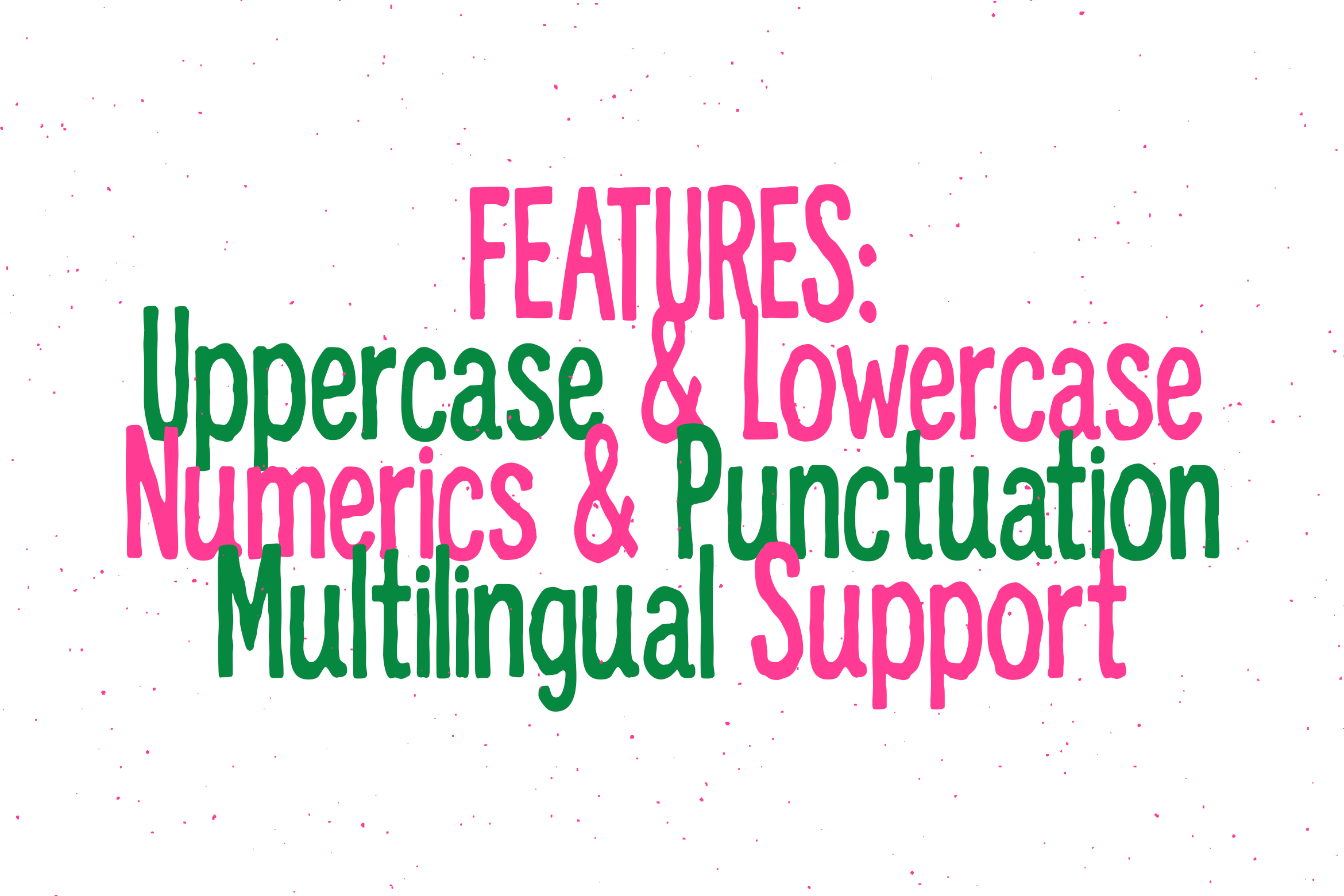
Glyphs