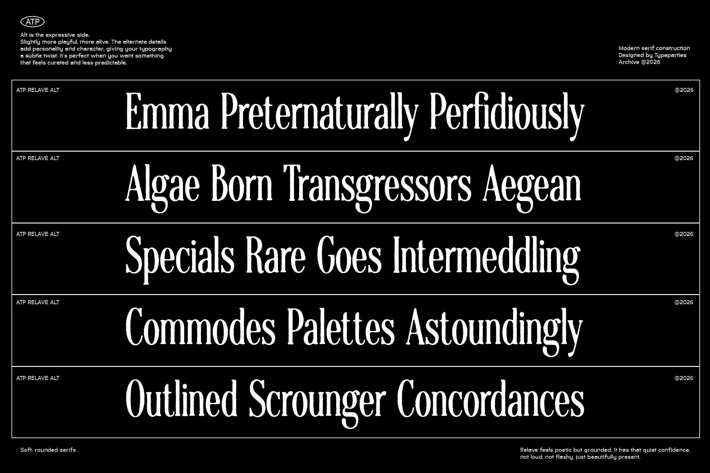
Relave Alt
Relave
Relave Outline
Relave
Relave
Relave
Family
Relave AltRelave OutlineRelave
Description
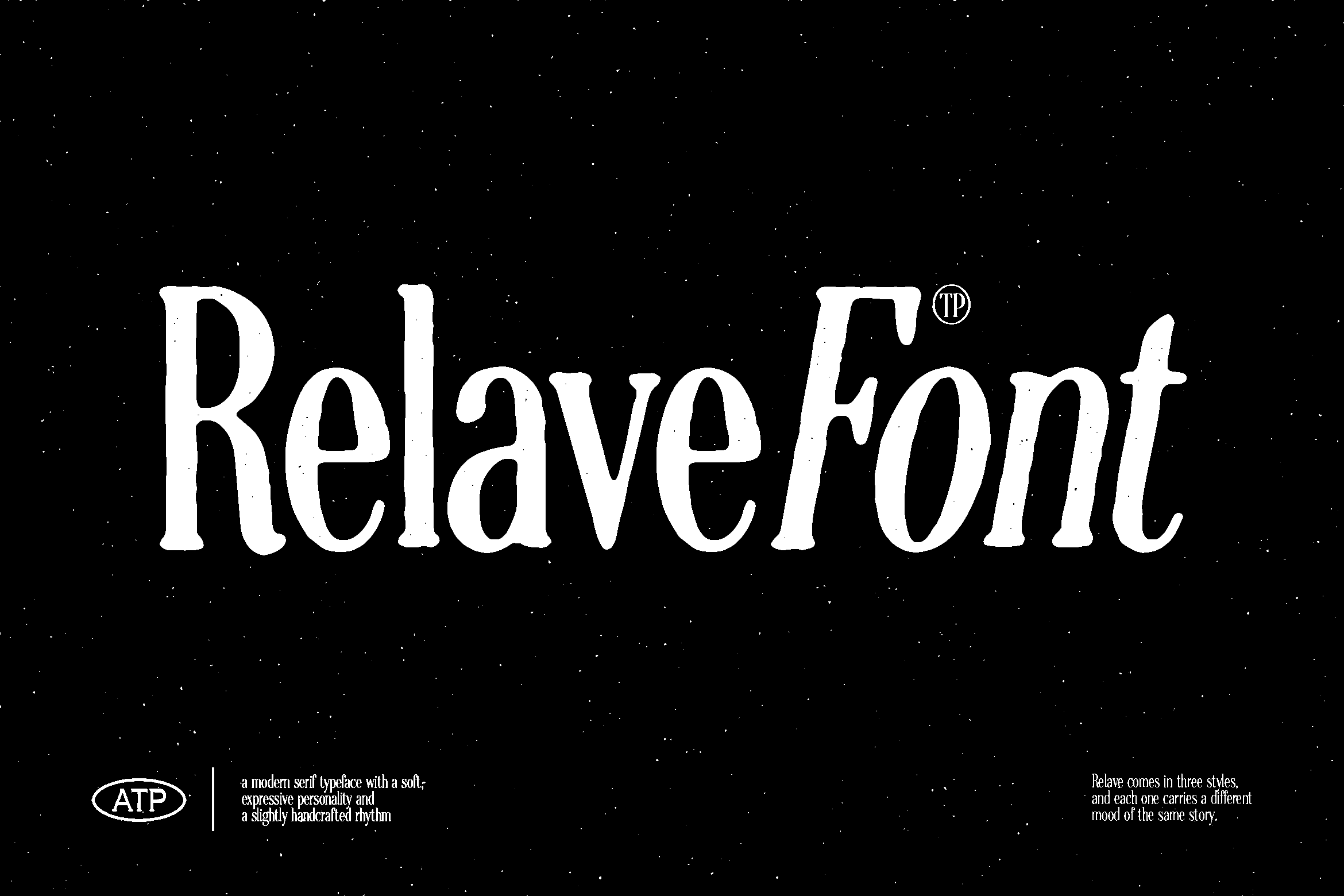
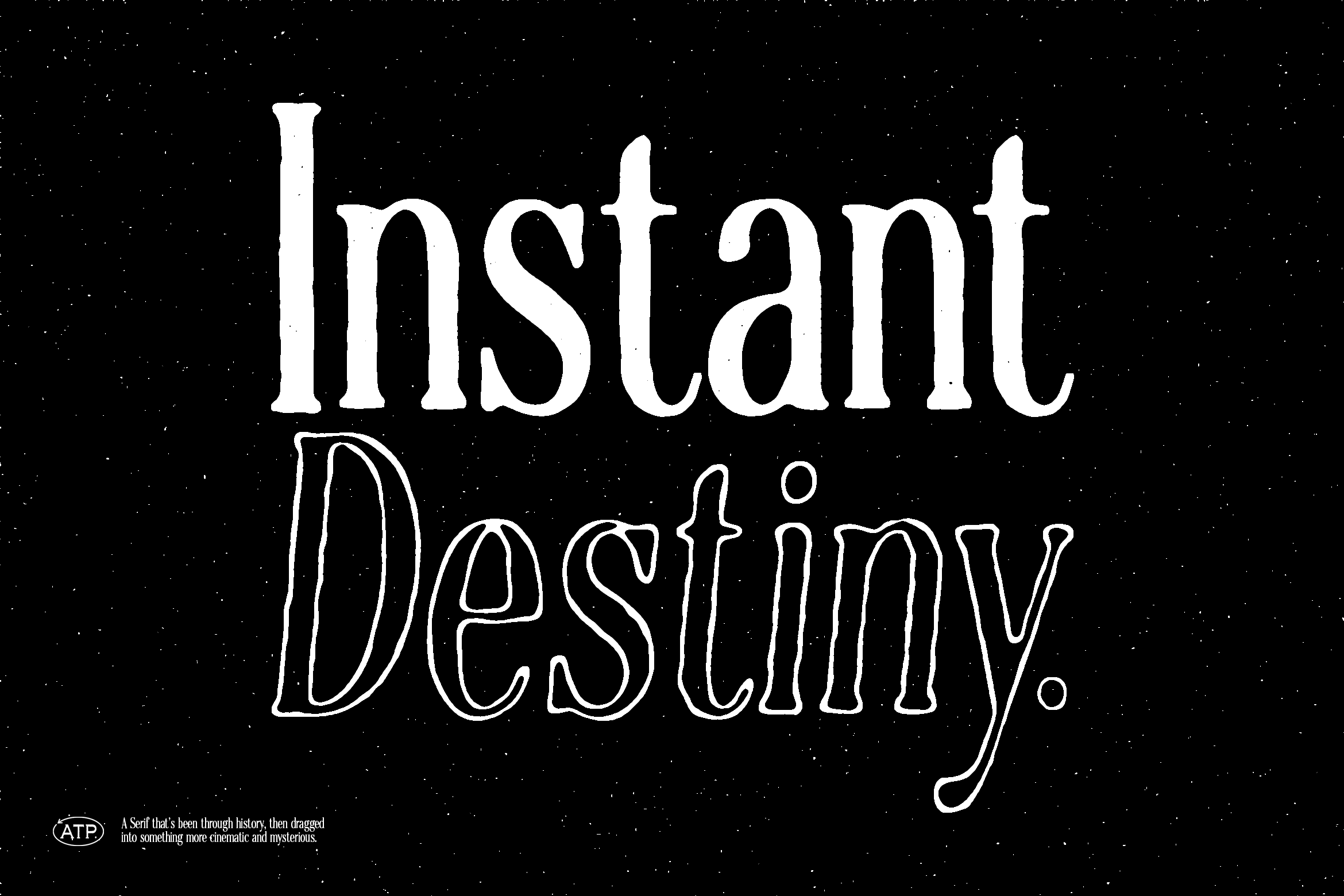
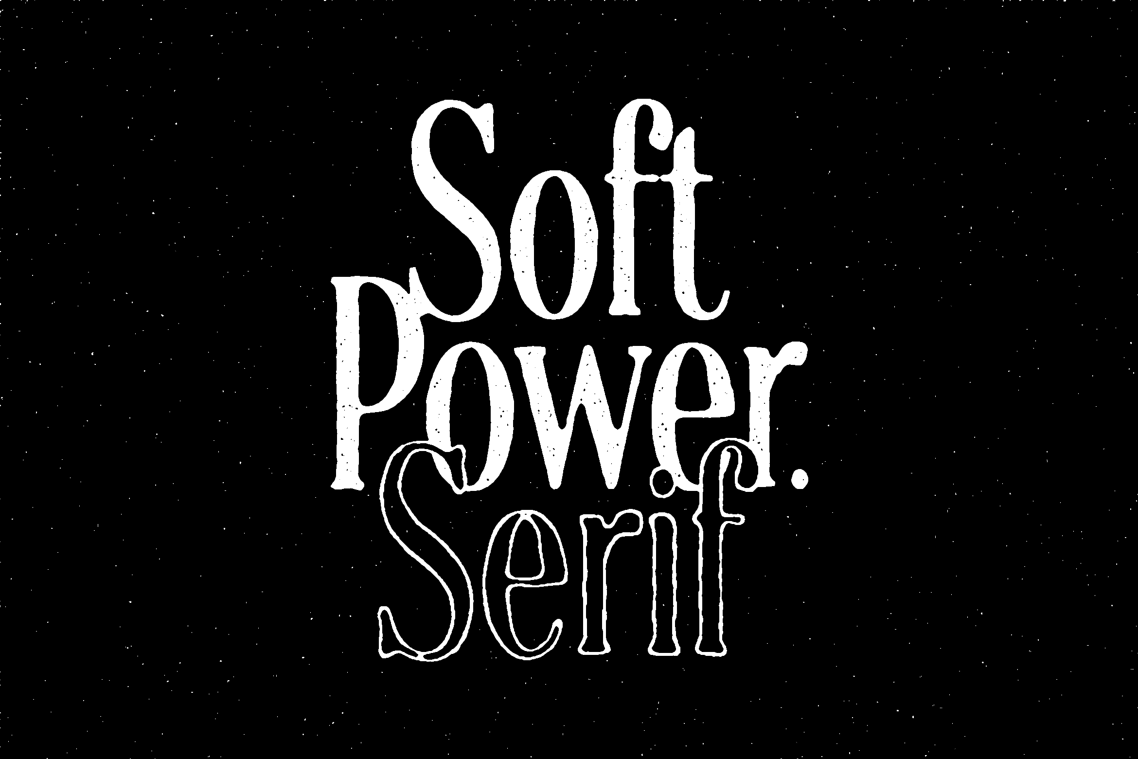
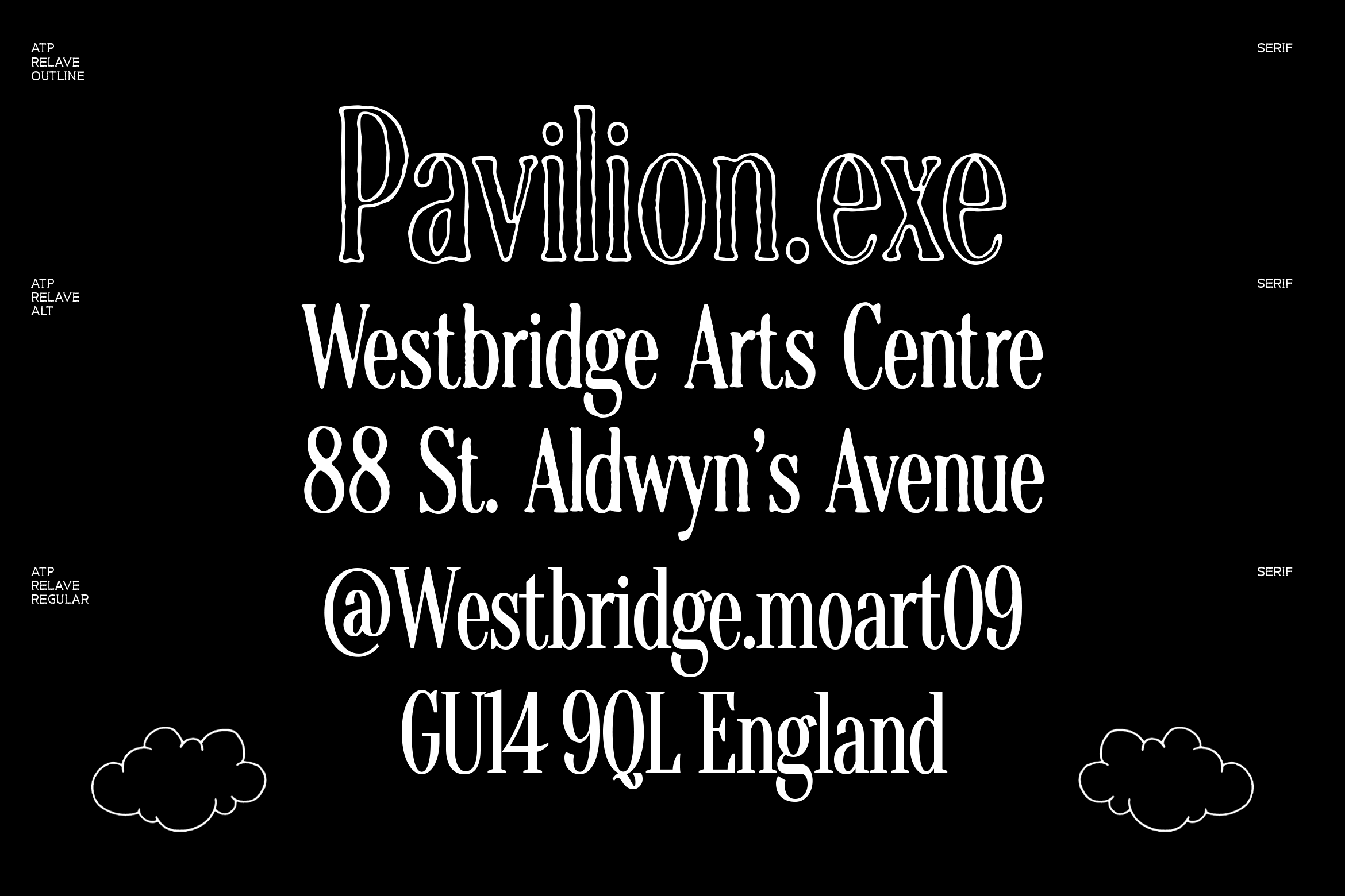
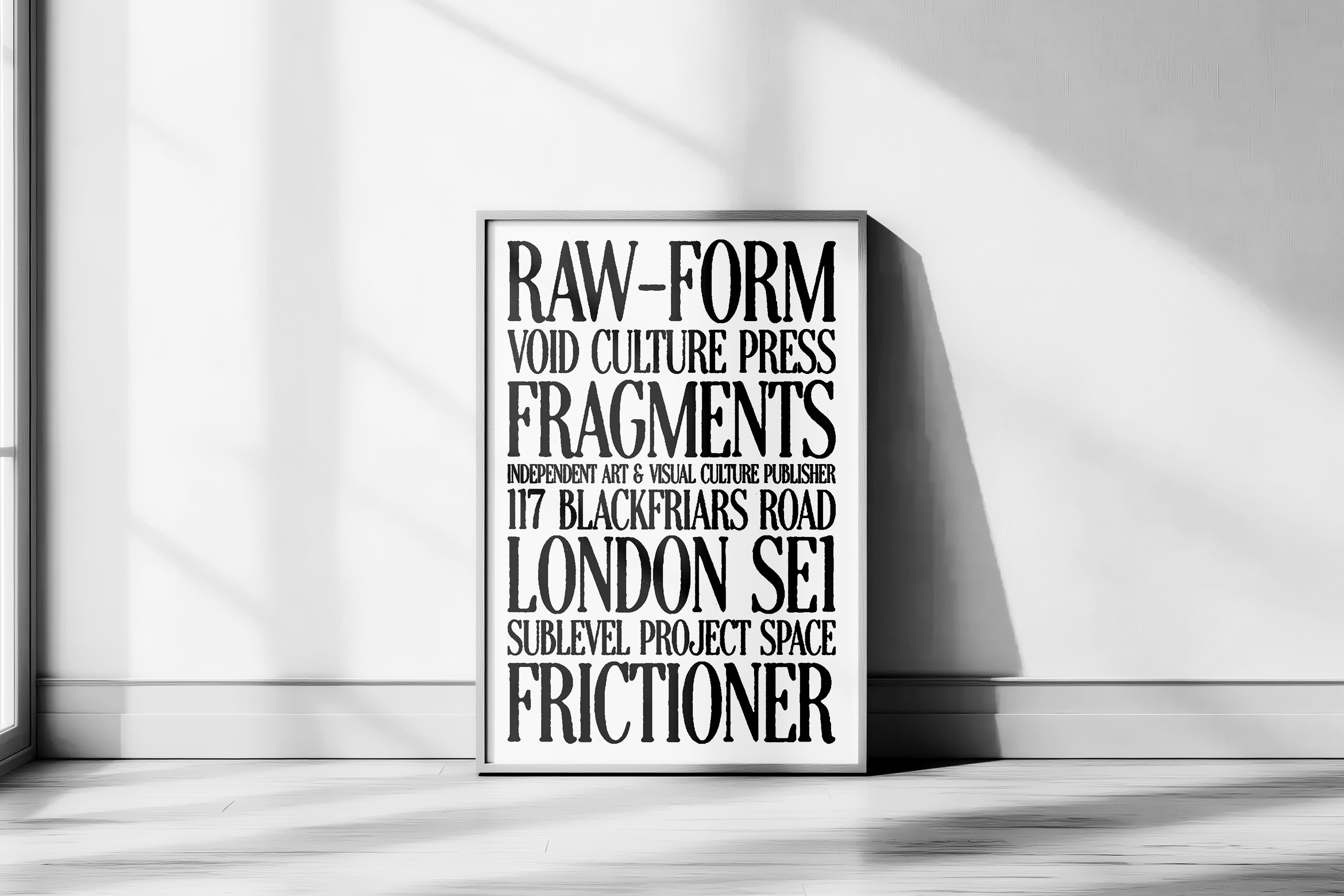
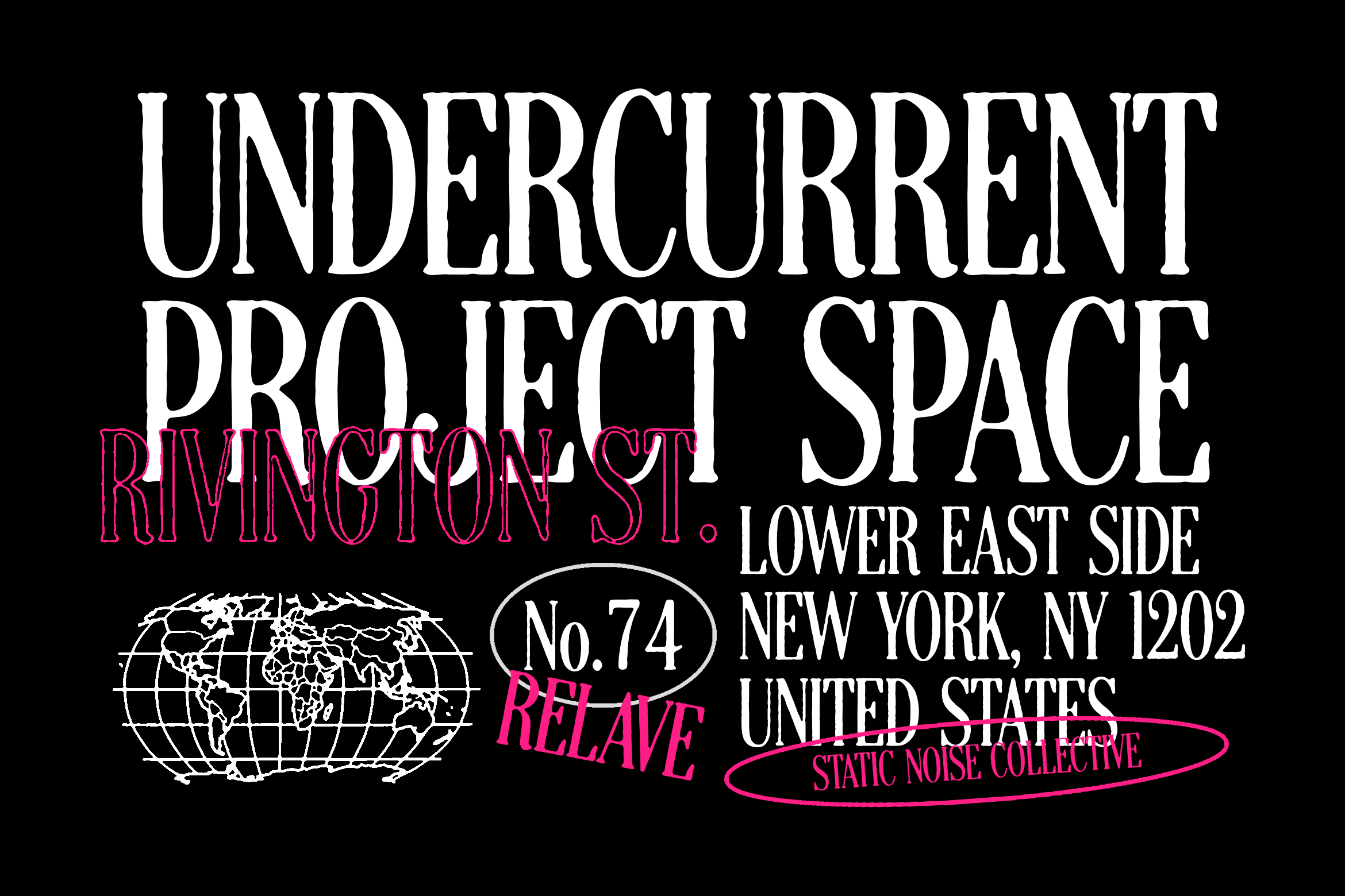
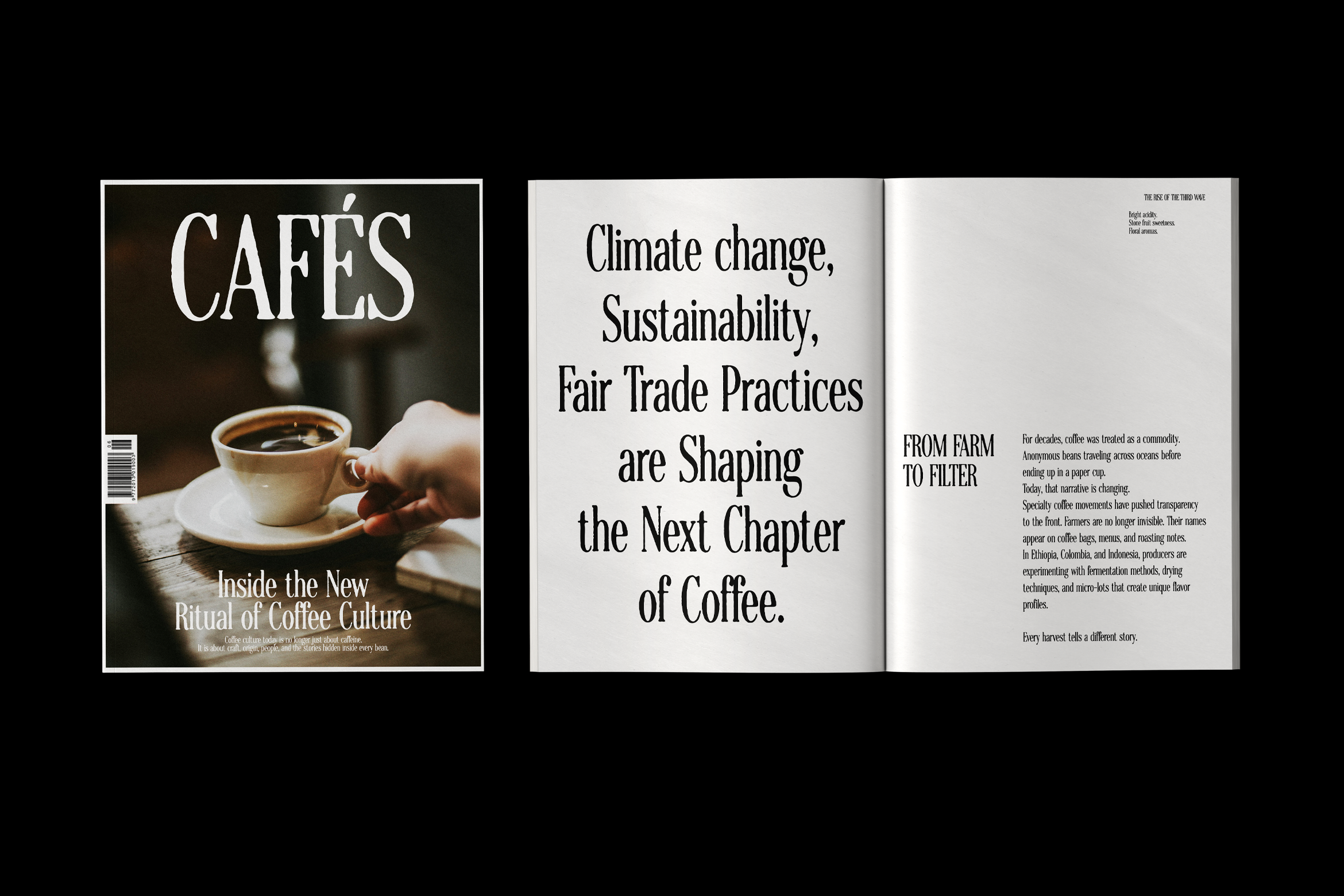
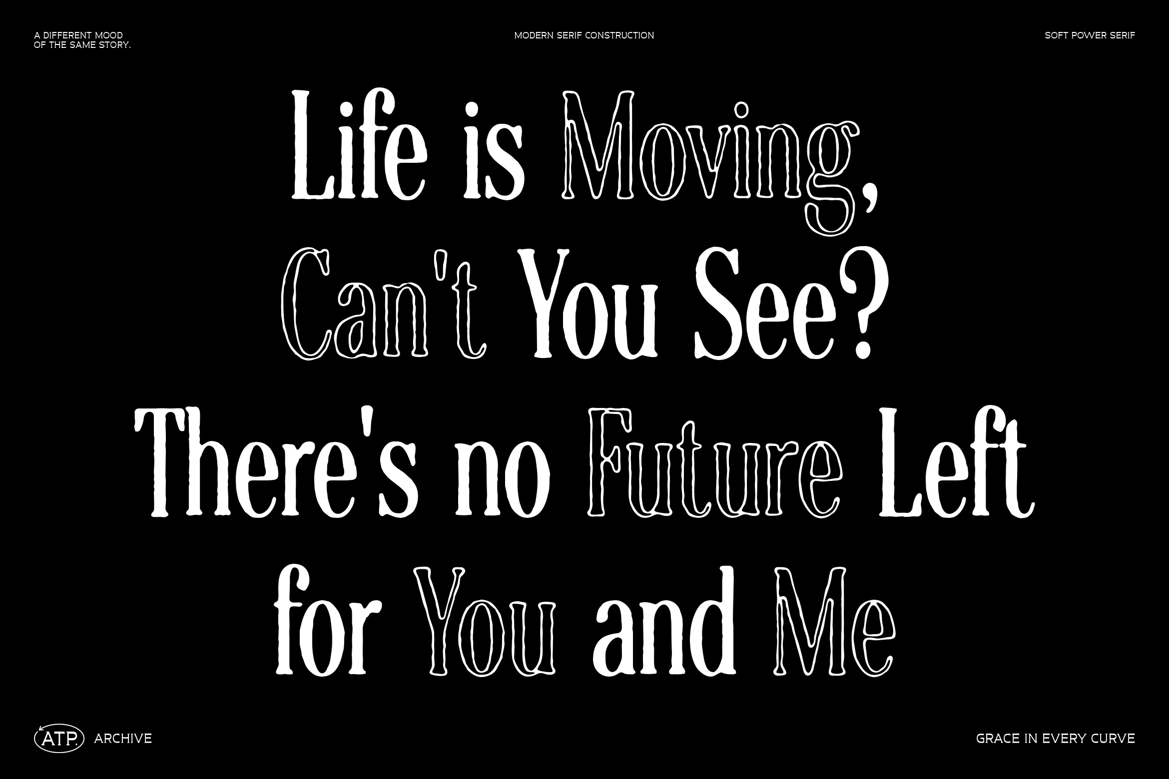
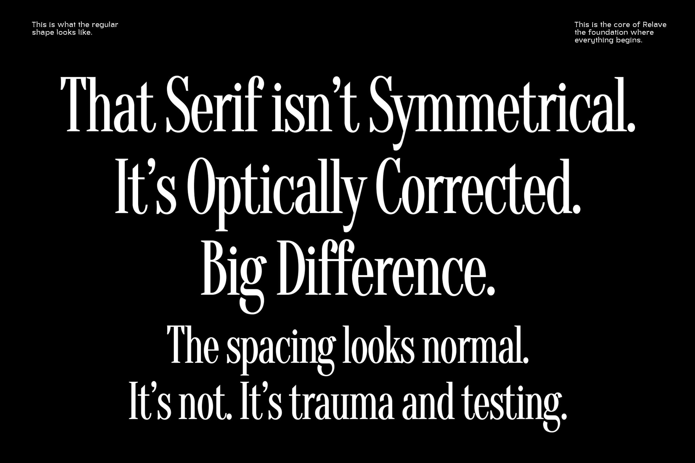
a serif that’s been through history, then dragged into something more cinematic and mysterious. The letterforms carry that old-world elegance, but they’re not clean or polished in a traditional way. There’s texture, slight imperfections, and a worn-in personality that makes it feel human, not mechanical. The contrast is what really sells it. You’ve got classic serif proportions—tall stems, soft curves, and subtle calligraphic influence—but paired with a grainy, almost cosmic backdrop, it suddenly shifts into something deeper. It doesn’t just read as typography, it reads as atmosphere.
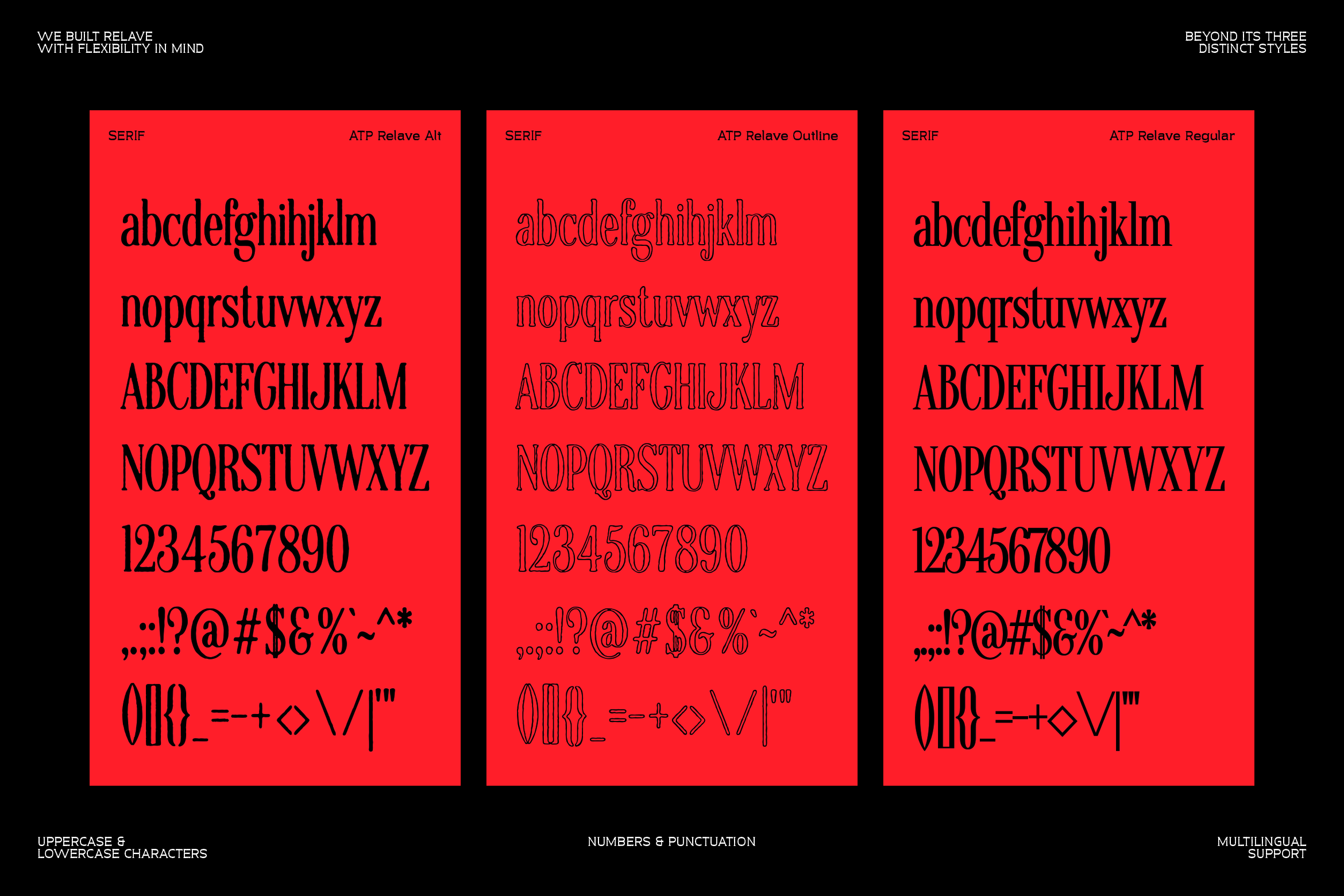
Glyphs