Porcile
Porcile
Porcile Slant
Porcile
Family
PorcilePorcile Slant
Description
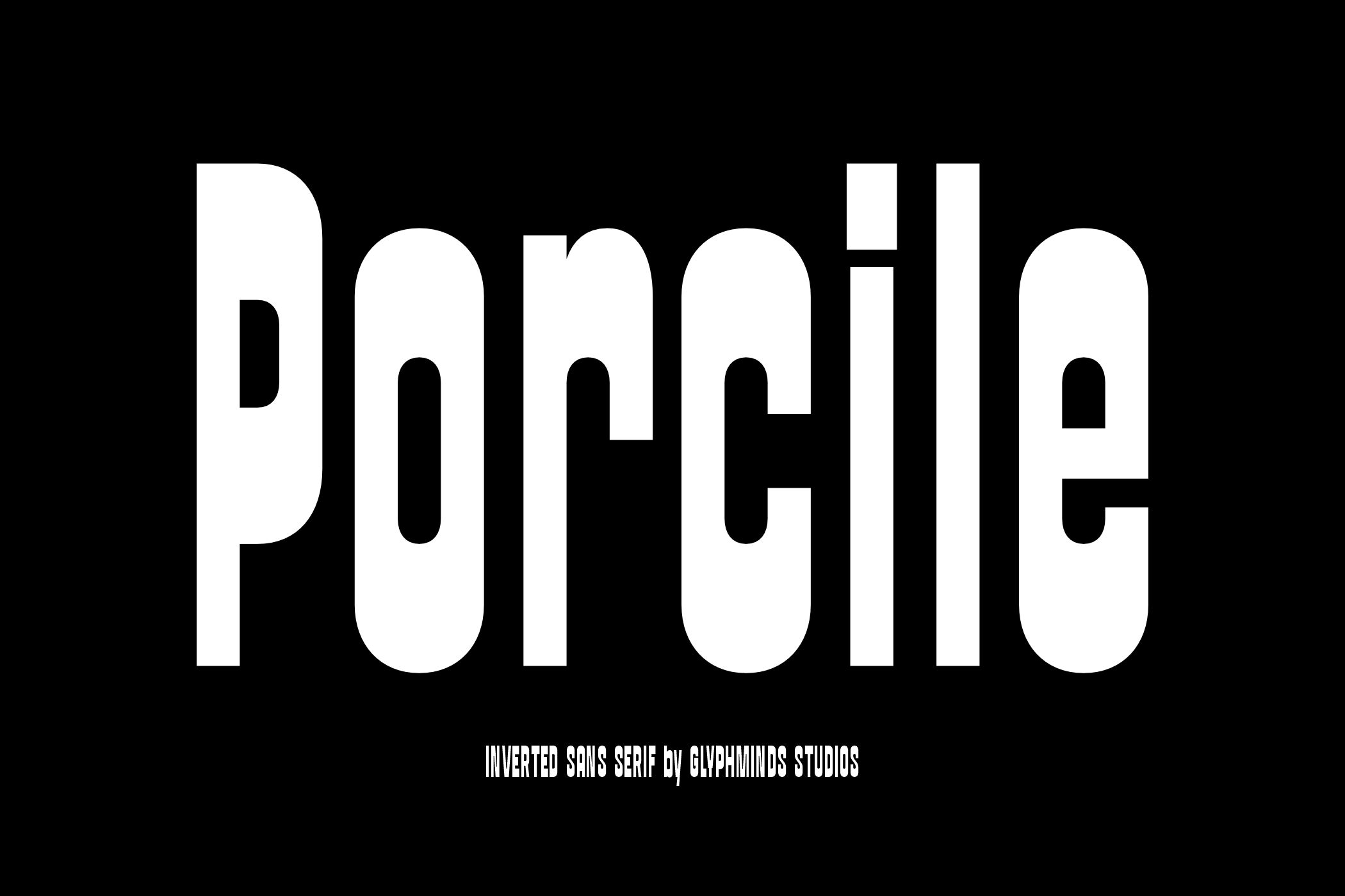
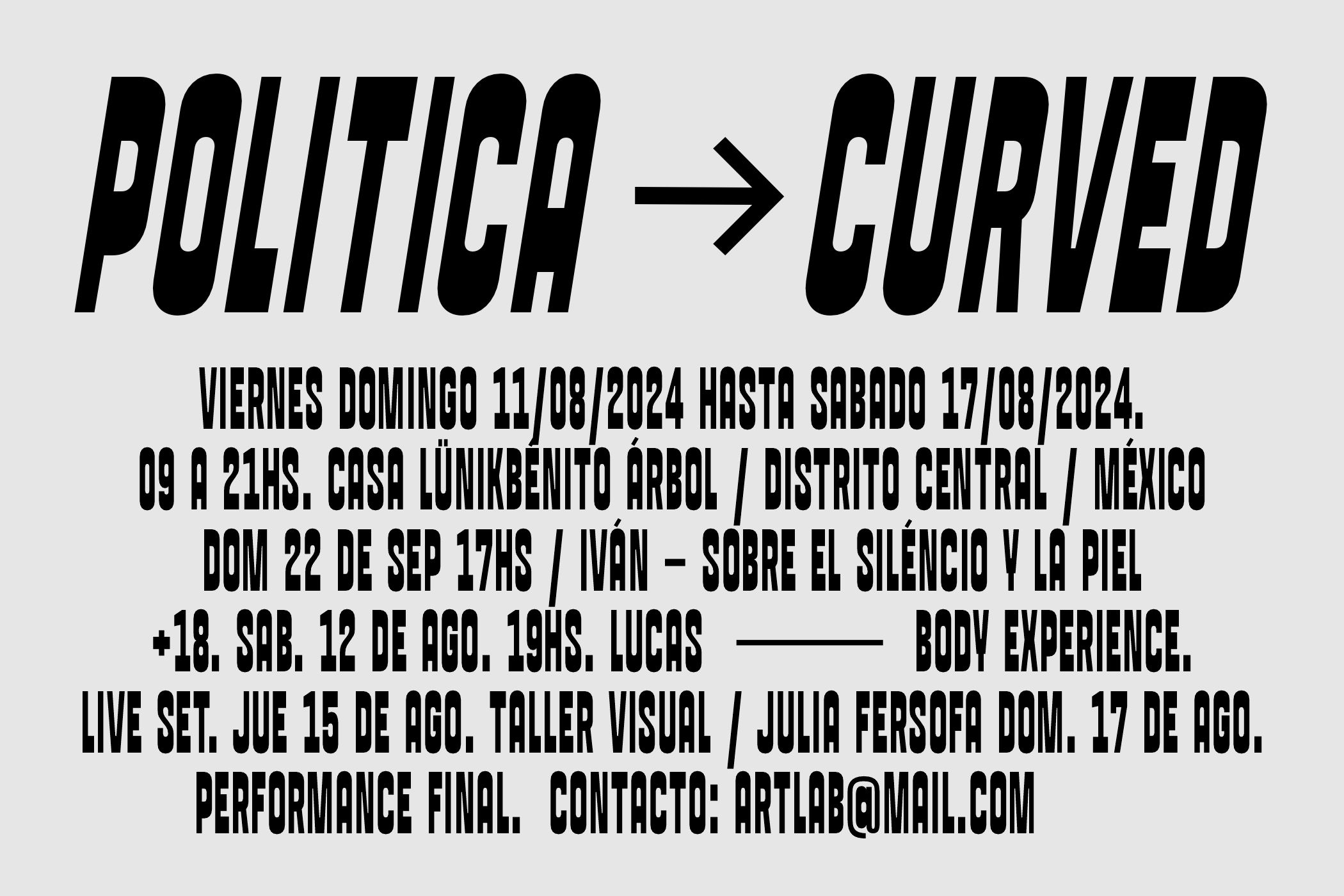
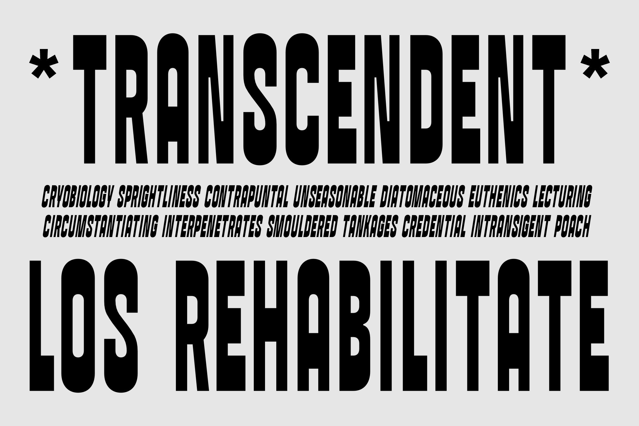
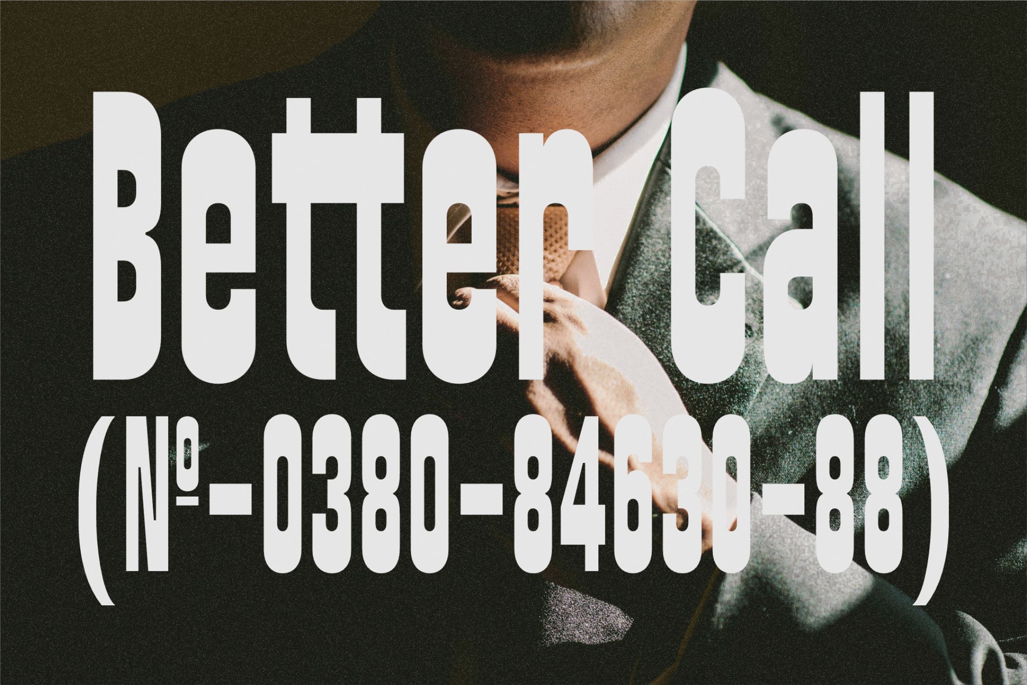
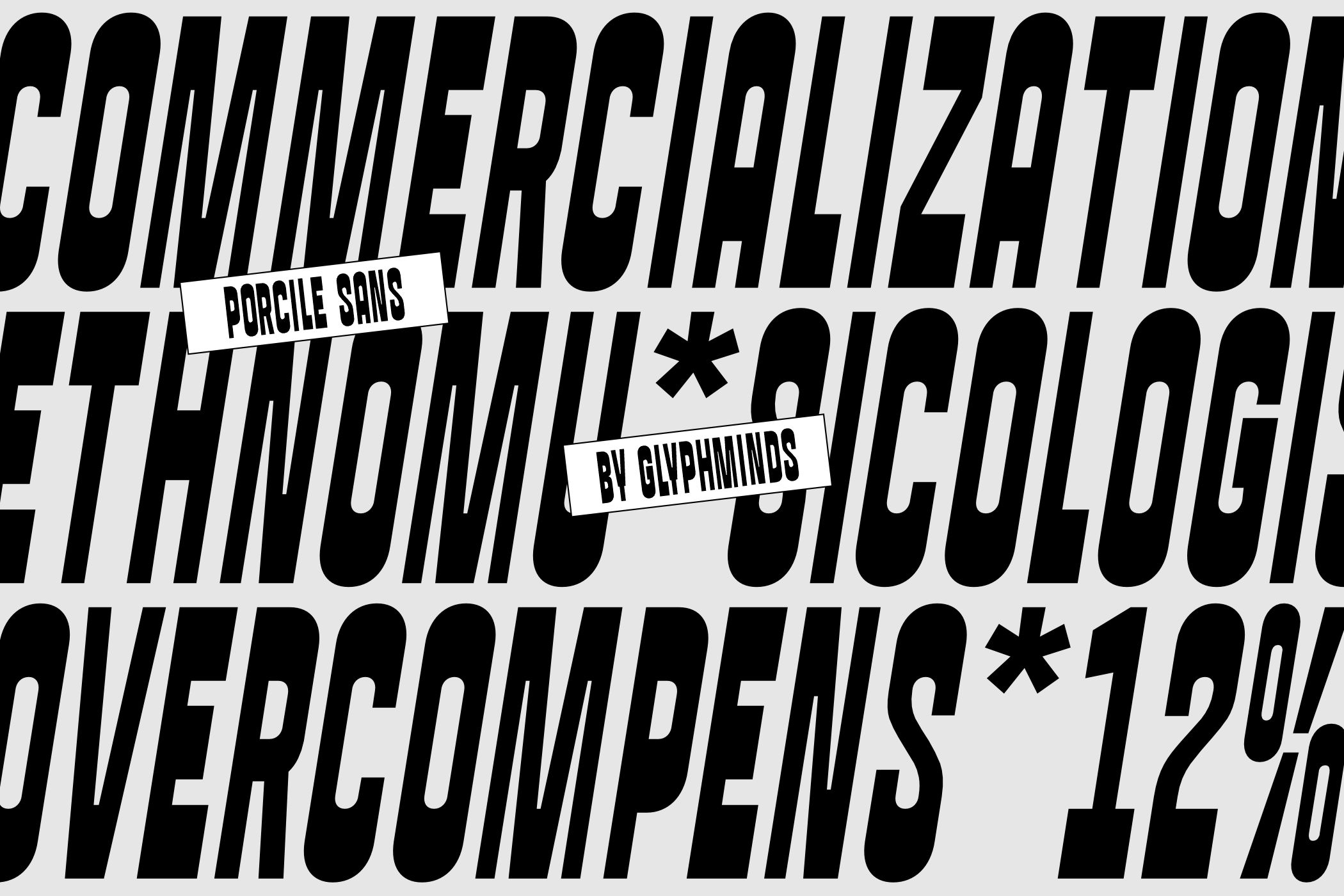
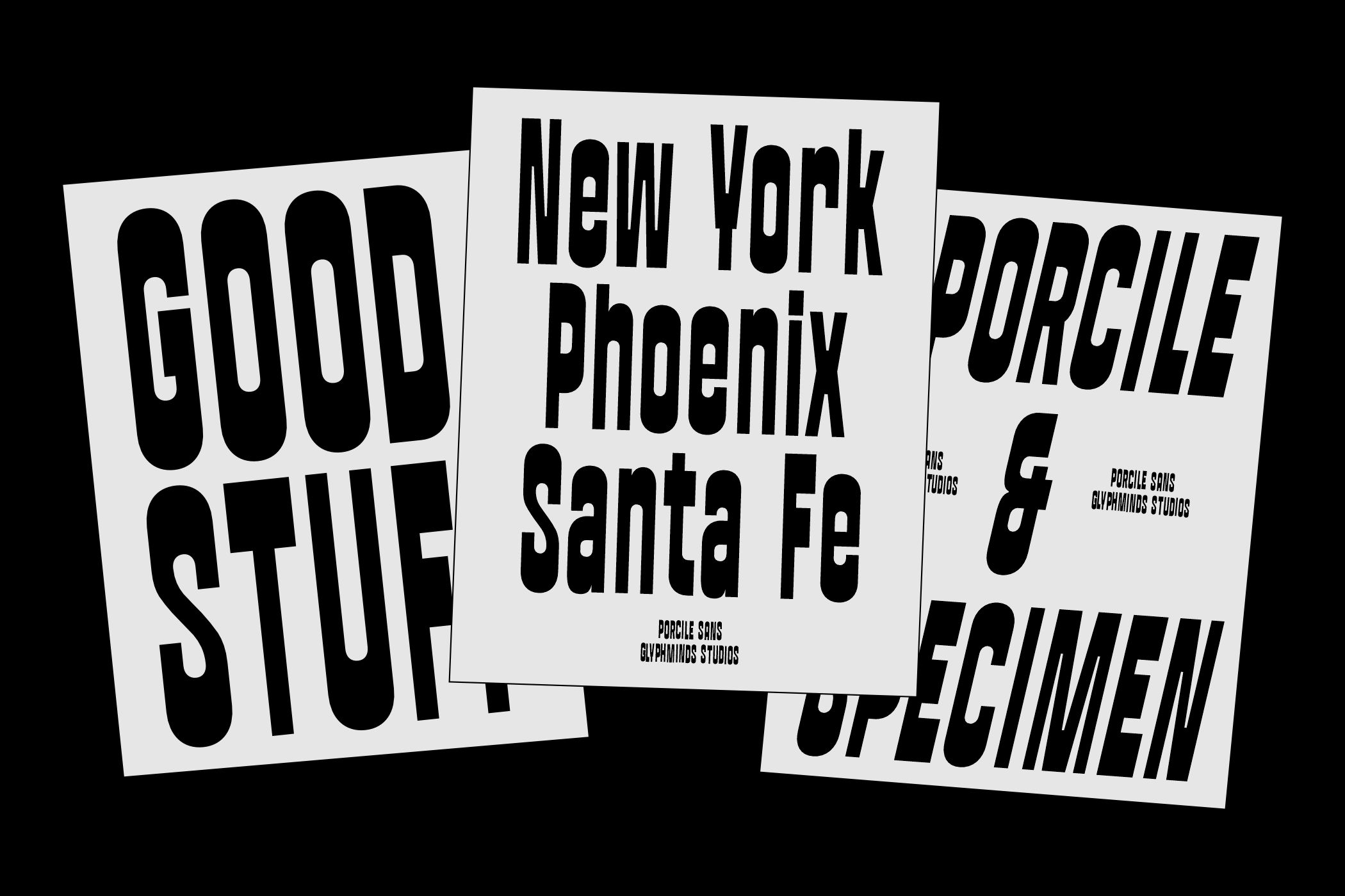
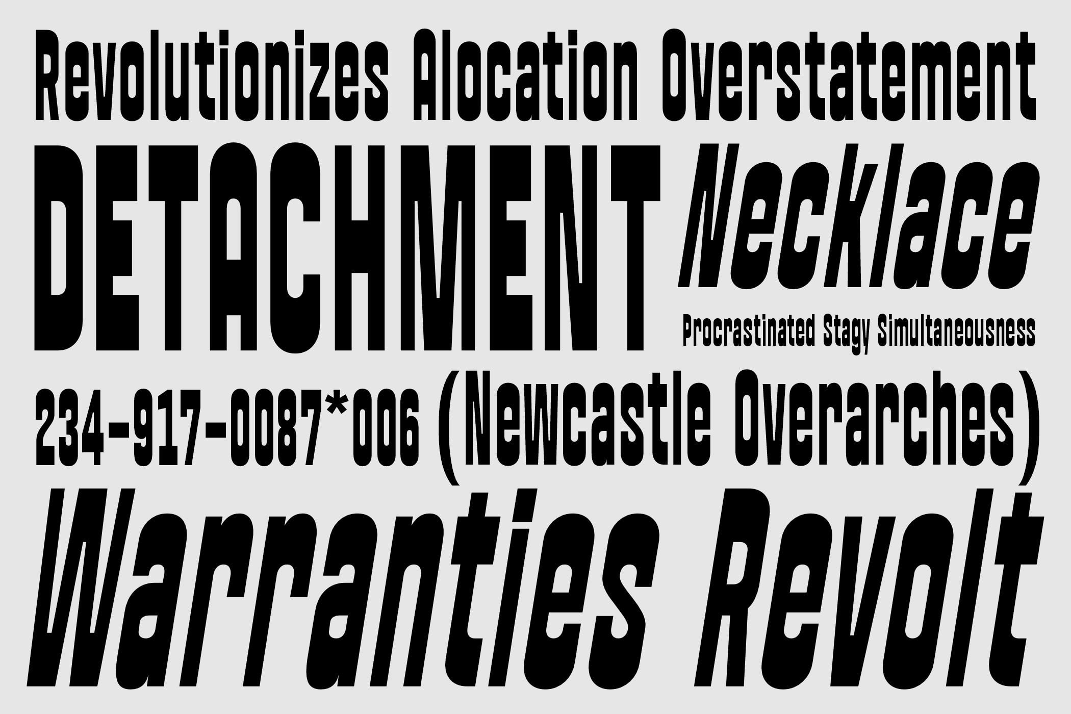
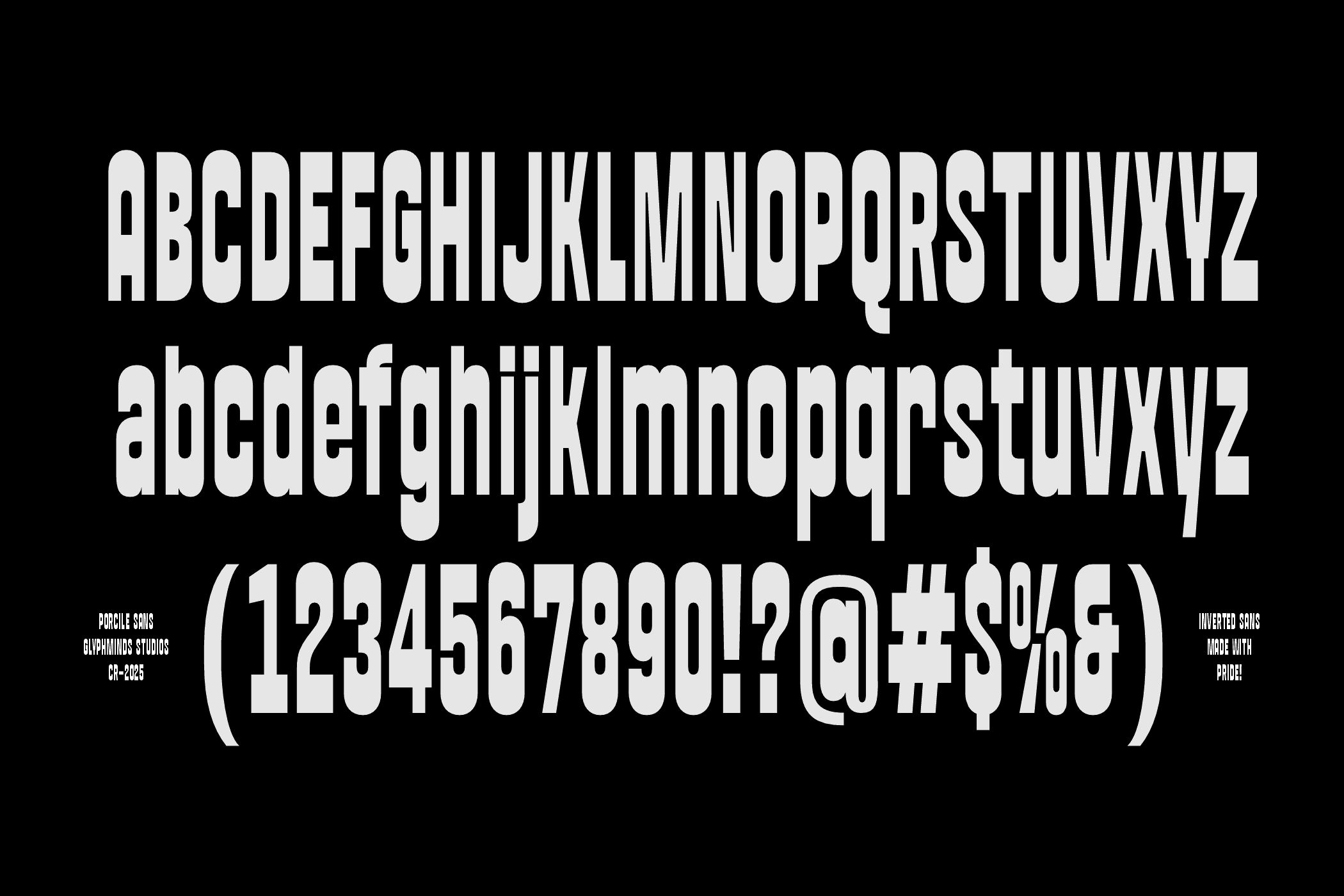
Porcile: Maximize Impact, Minimize Space. Meet Porcile, the Inverted Sans Serif that dominates any layout. Designed for maximum visual density, Porcile is an ultra-heavy, condensed display typeface built for commanding headlines. Its imposing structure and super-tight kerning squeeze a massive message into minimal horizontal space, making it an essential tool for designers tackling everything from high-rise billboards to album sleeves. Porcile balances raw power with clean design. While its heavy weight and verticality give it a brutalist, uncompromising feel, the subtly rounded corners soften the edge, ensuring it remains versatile for modern branding, apparel, and digital media.
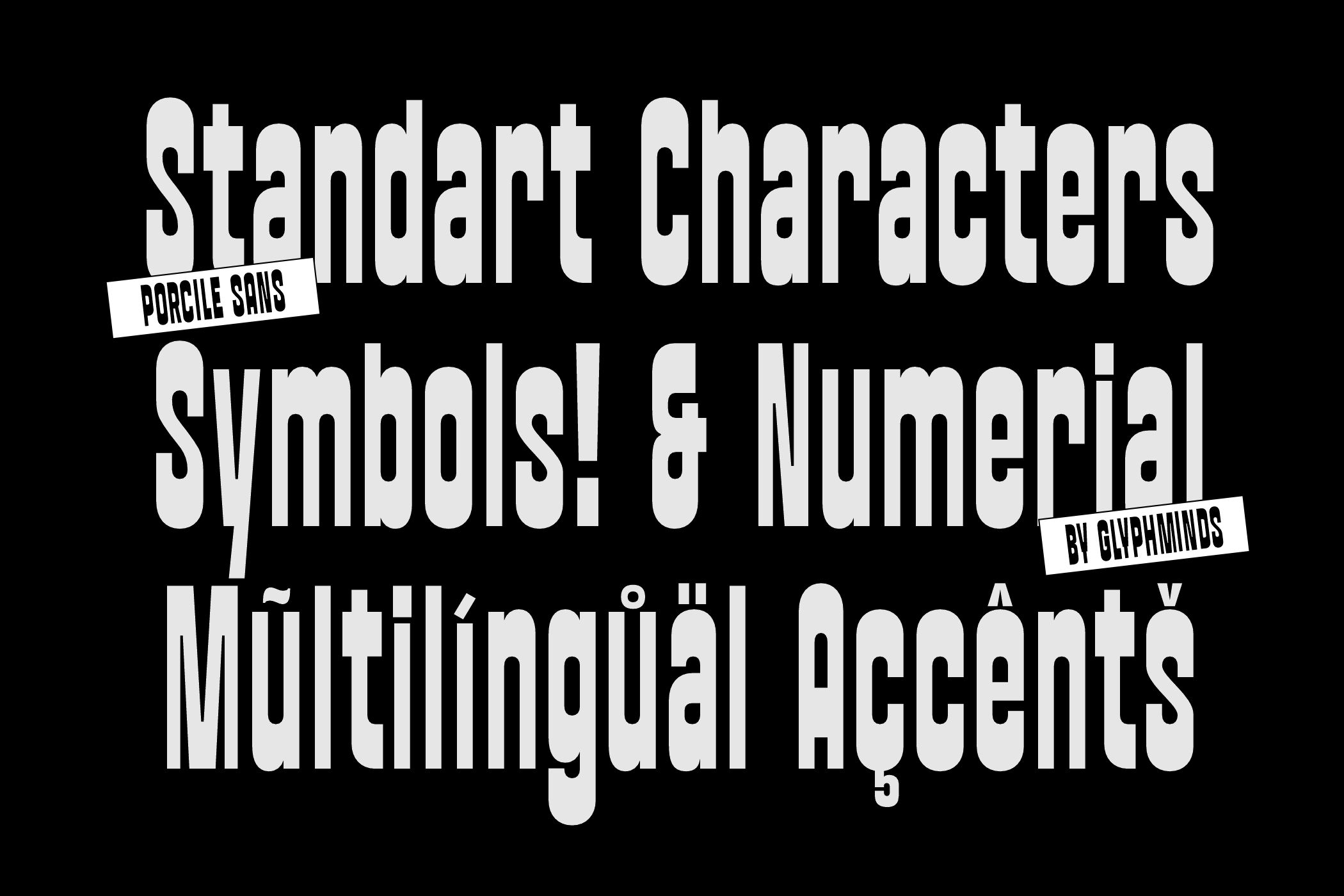
Glyphs