Family
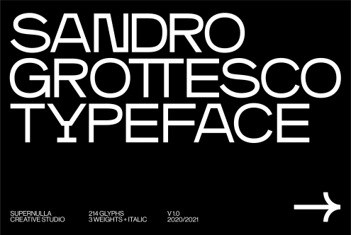
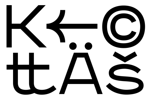
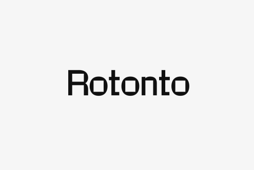
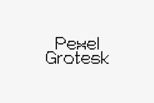
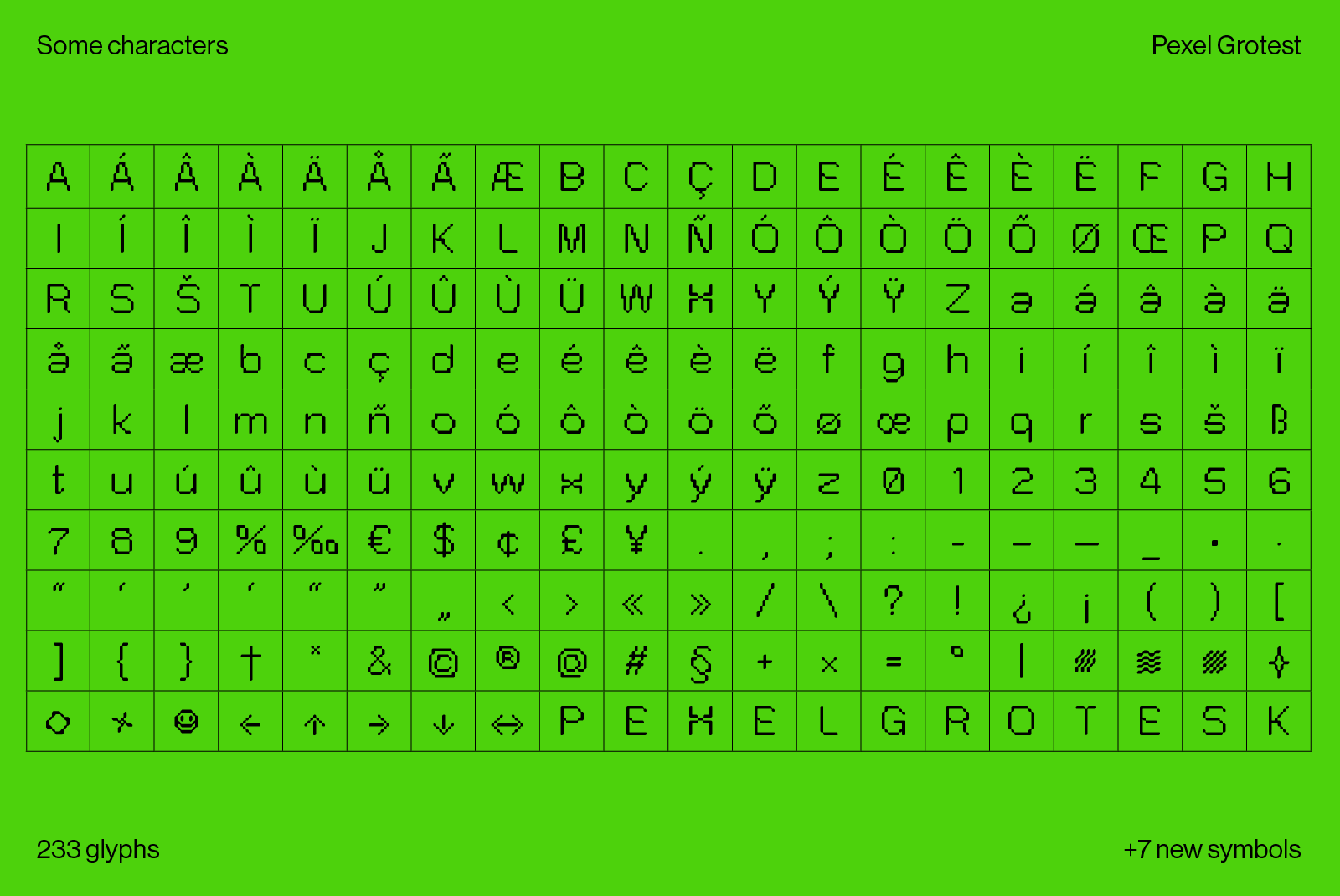
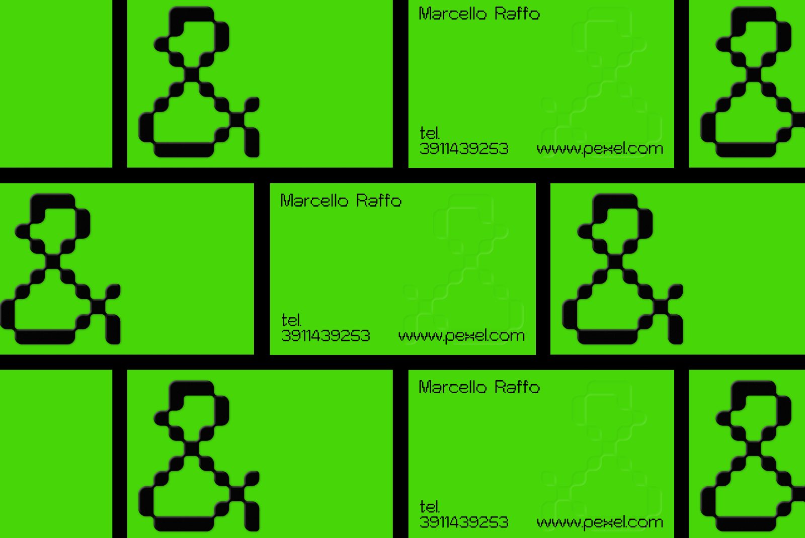
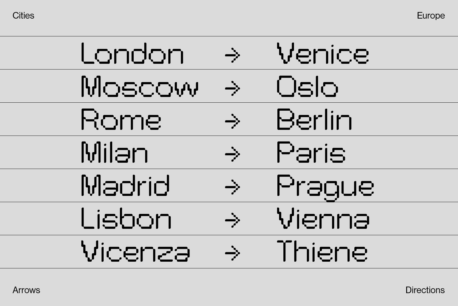
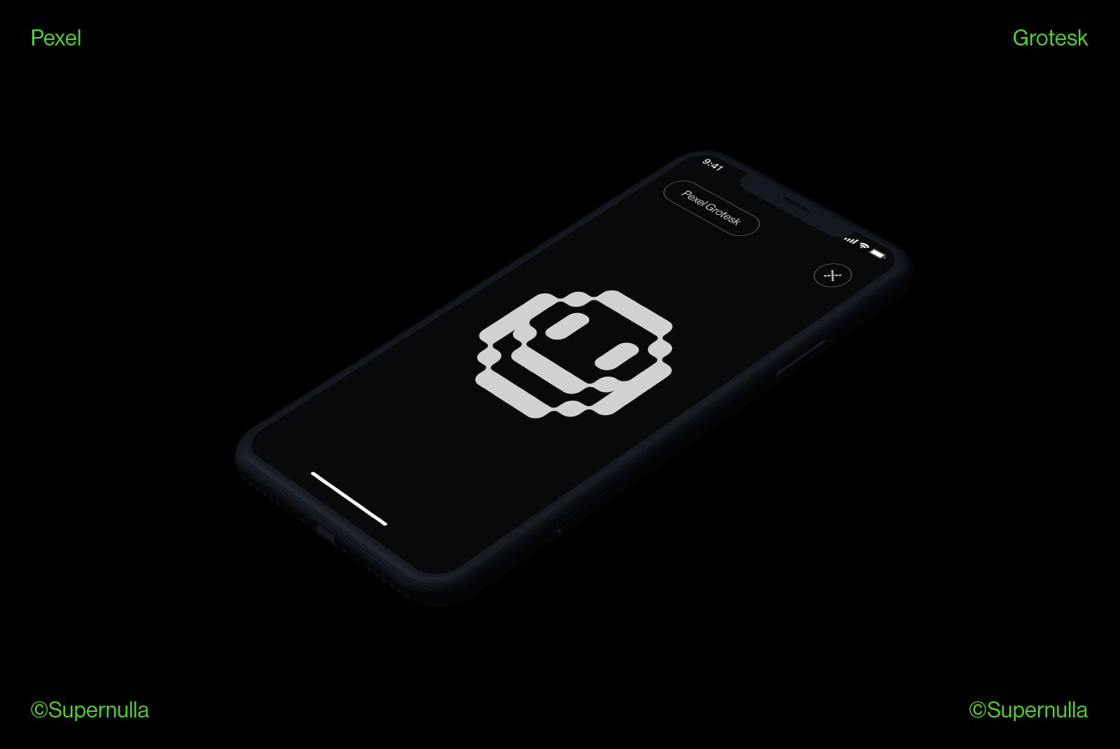
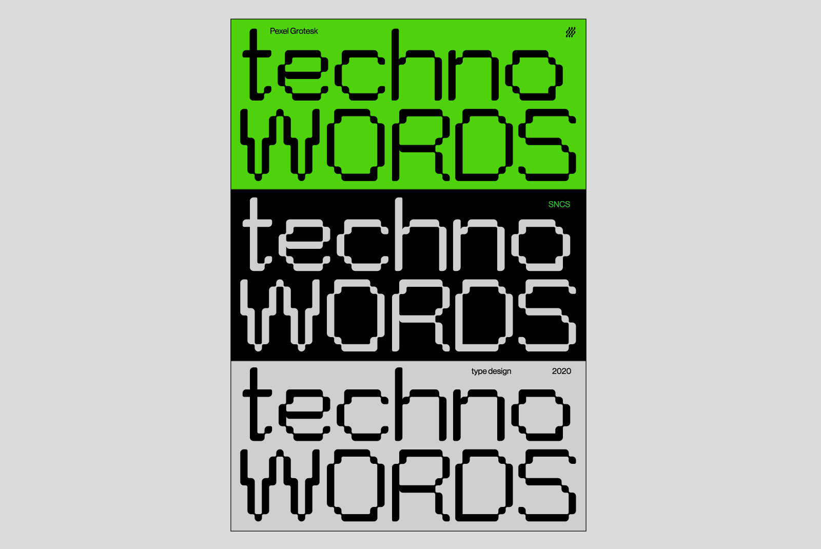
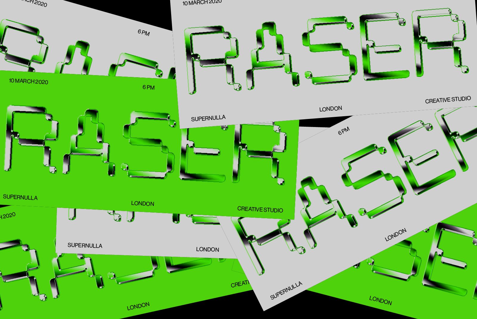
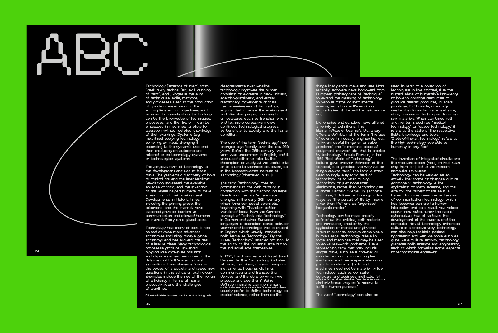
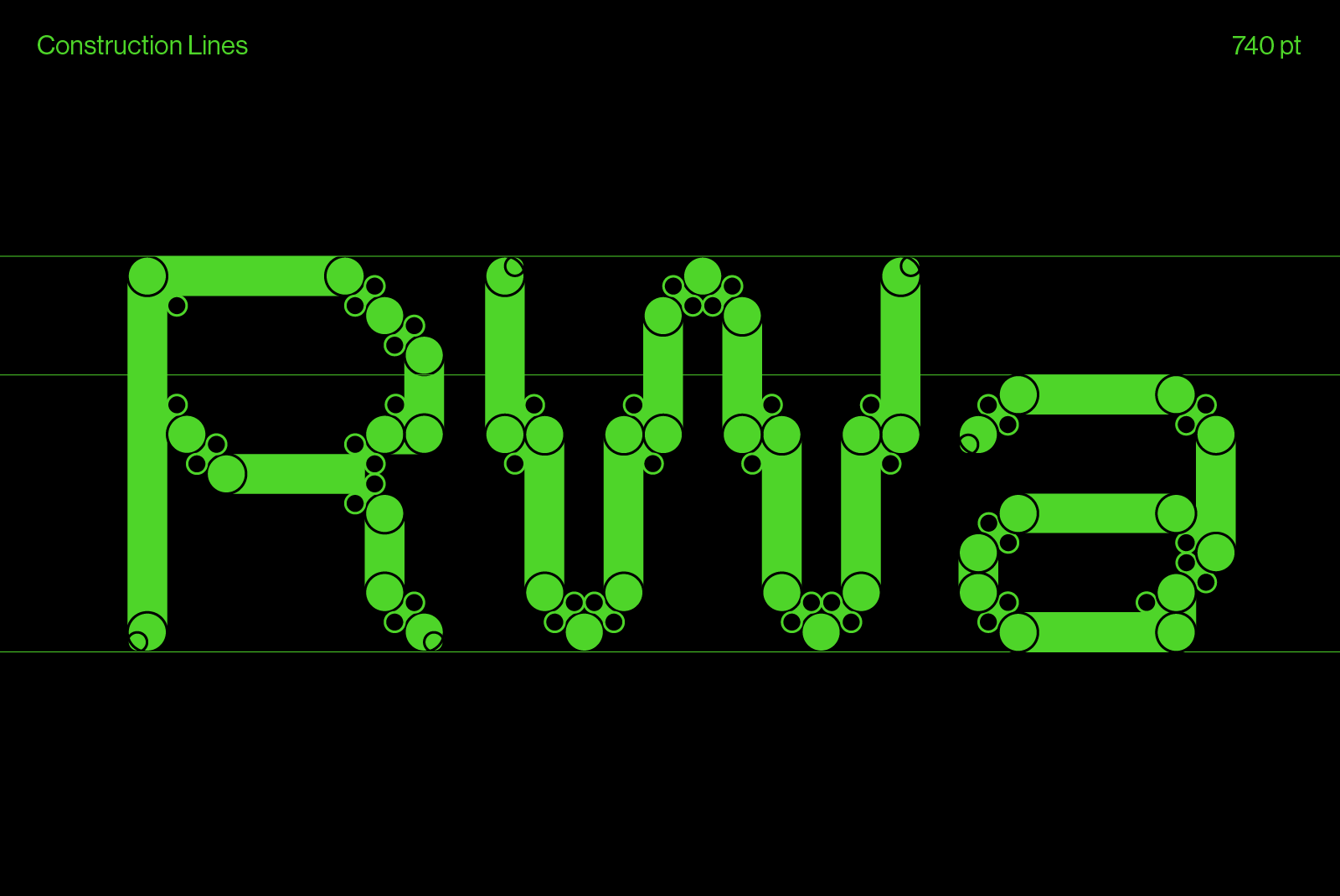
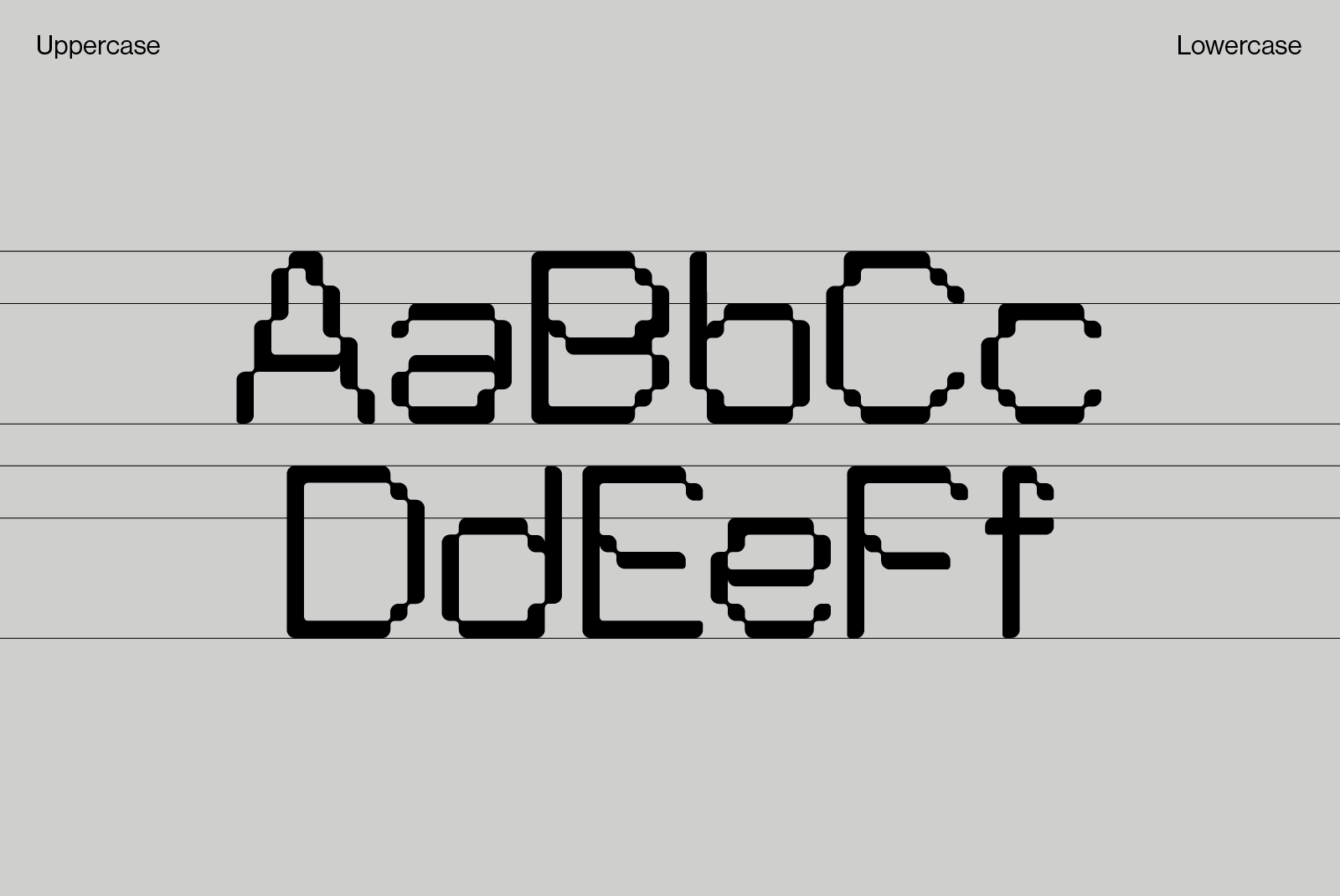
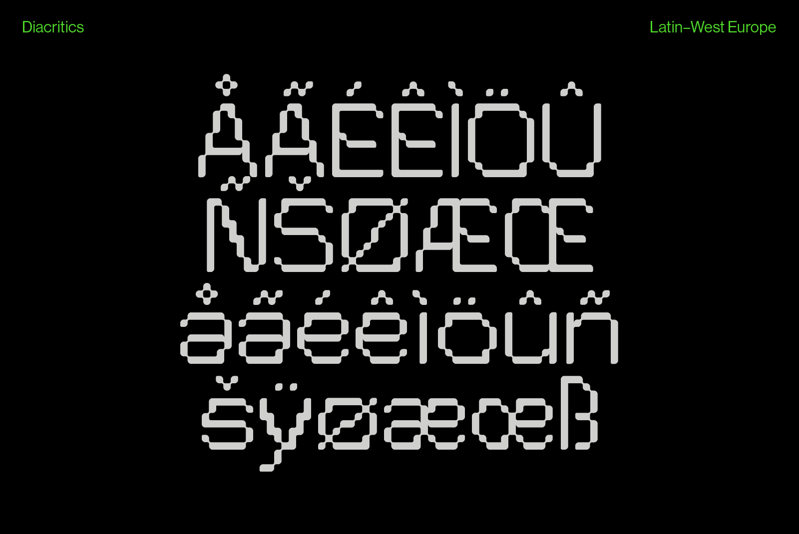
Pexel Grotesk was designed with the idea to create a good looking and balanced pixel font. Pexel Grotesk wants to imitate the letter dimension and proportion of a grotesque type while remaining inside his strict grid. Some of the letters are not designed as we think they should be constructed as a pixel font. This helps the type to be different, but consistent at the same time. The roundness of the edges, that could sound like an oxymoron for a pixel type, gives at the type an interesting shape, especially if it is used in large format.

Lorem ipsum dolor sit amet consectetur adipisicing elit. Provident eveniet eius sunt quos praesentium voluptates consequatur incidunt, minus rerum sed impedit error quasi corrupti! Omnis pariatur autem veritatis doloremque cum ipsum totam?
