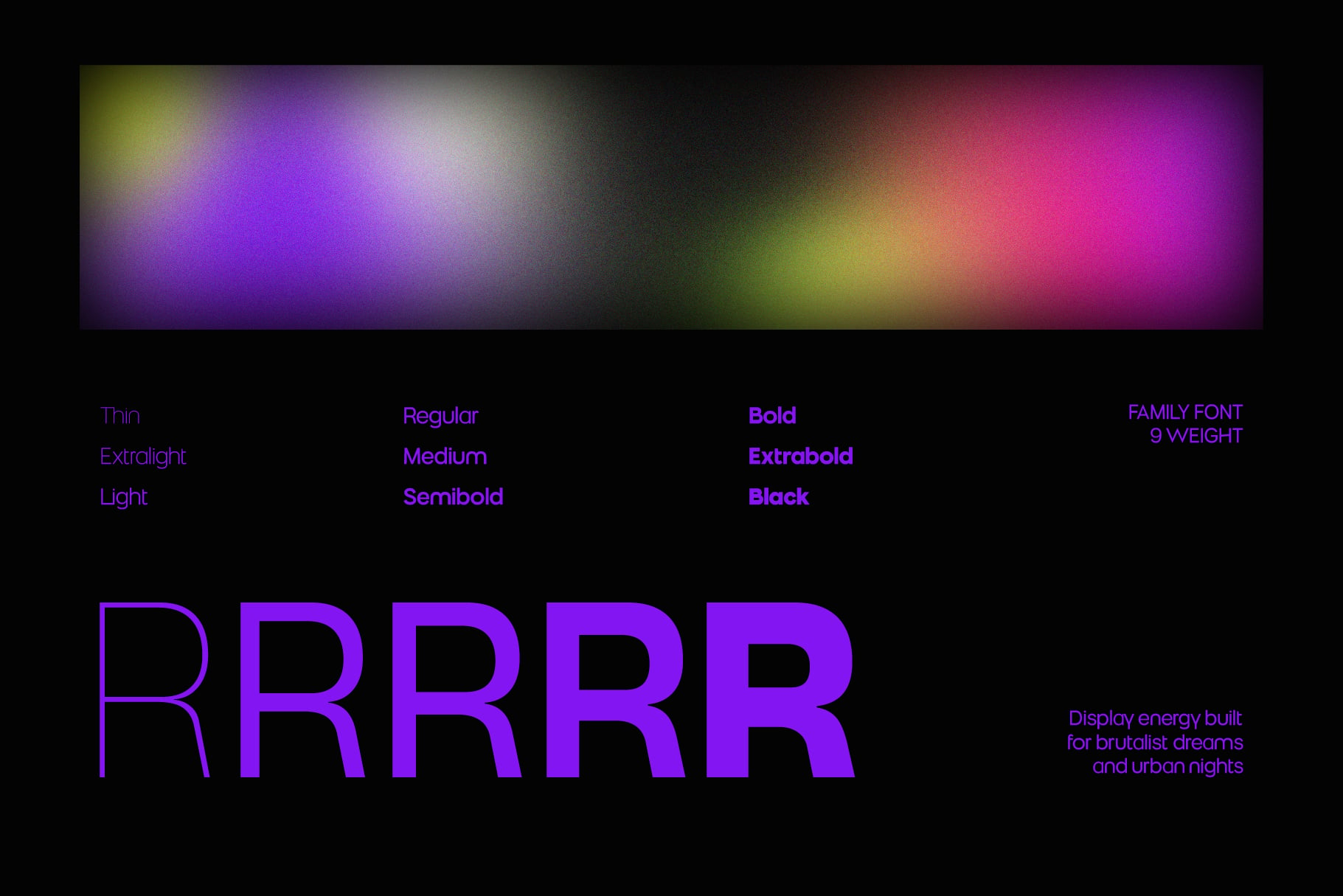
Muring02-Thin
Muring 02
Muring02-Extralight
Muring 02
Muring02-Light
Muring 02
Muring02-Regular
Muring 02
Muring02-Medium
Muring 02
Muring02-Semibold
Muring 02
Muring02-Bold
Muring 02
Muring02-Extrabold
Muring 02
Muring02-Black
Muring 02
Family
Muring02-ThinMuring02-ExtralightMuring02-LightMuring02-RegularMuring02-MediumMuring02-SemiboldMuring02-BoldMuring02-ExtraboldMuring02-Black
Description
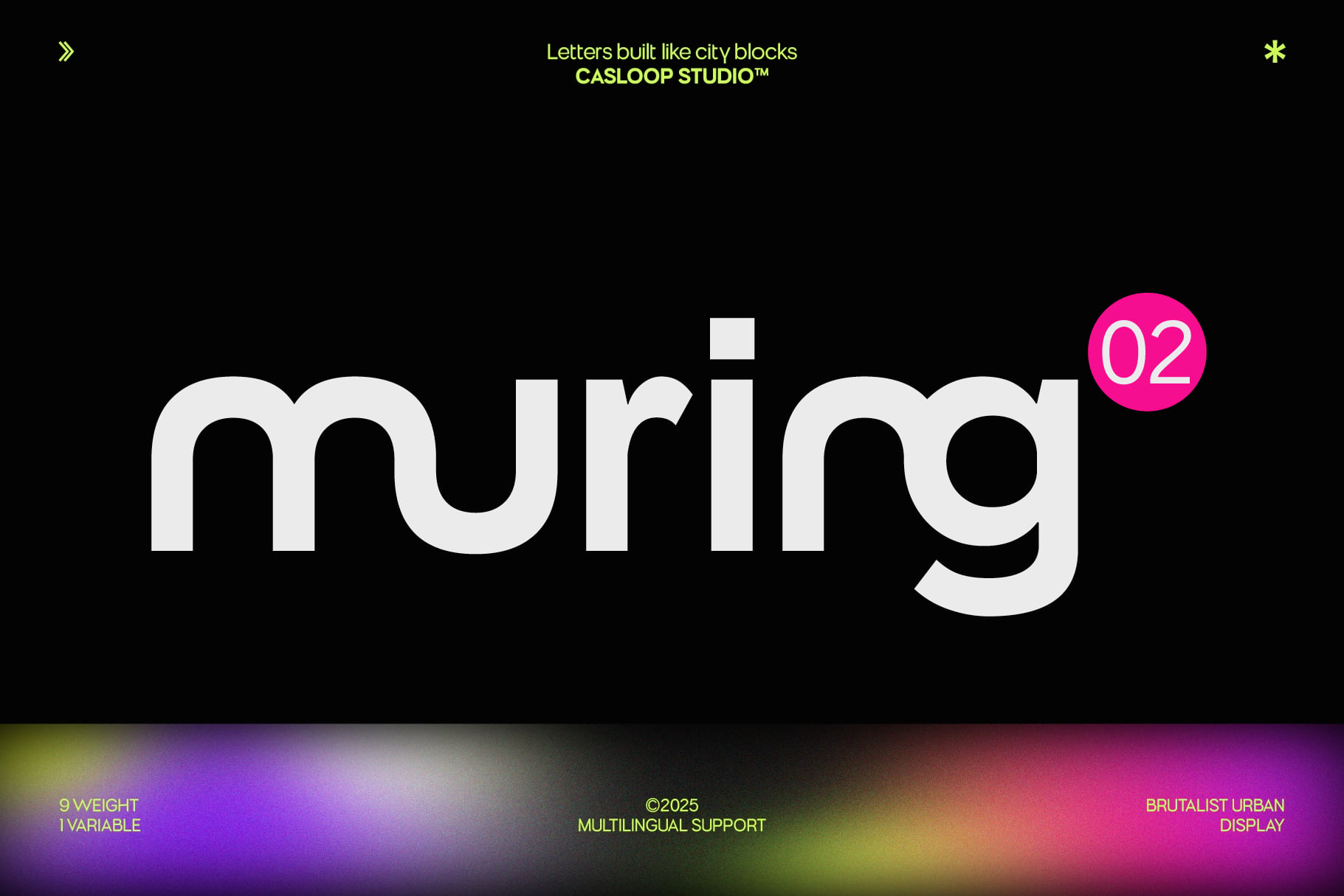
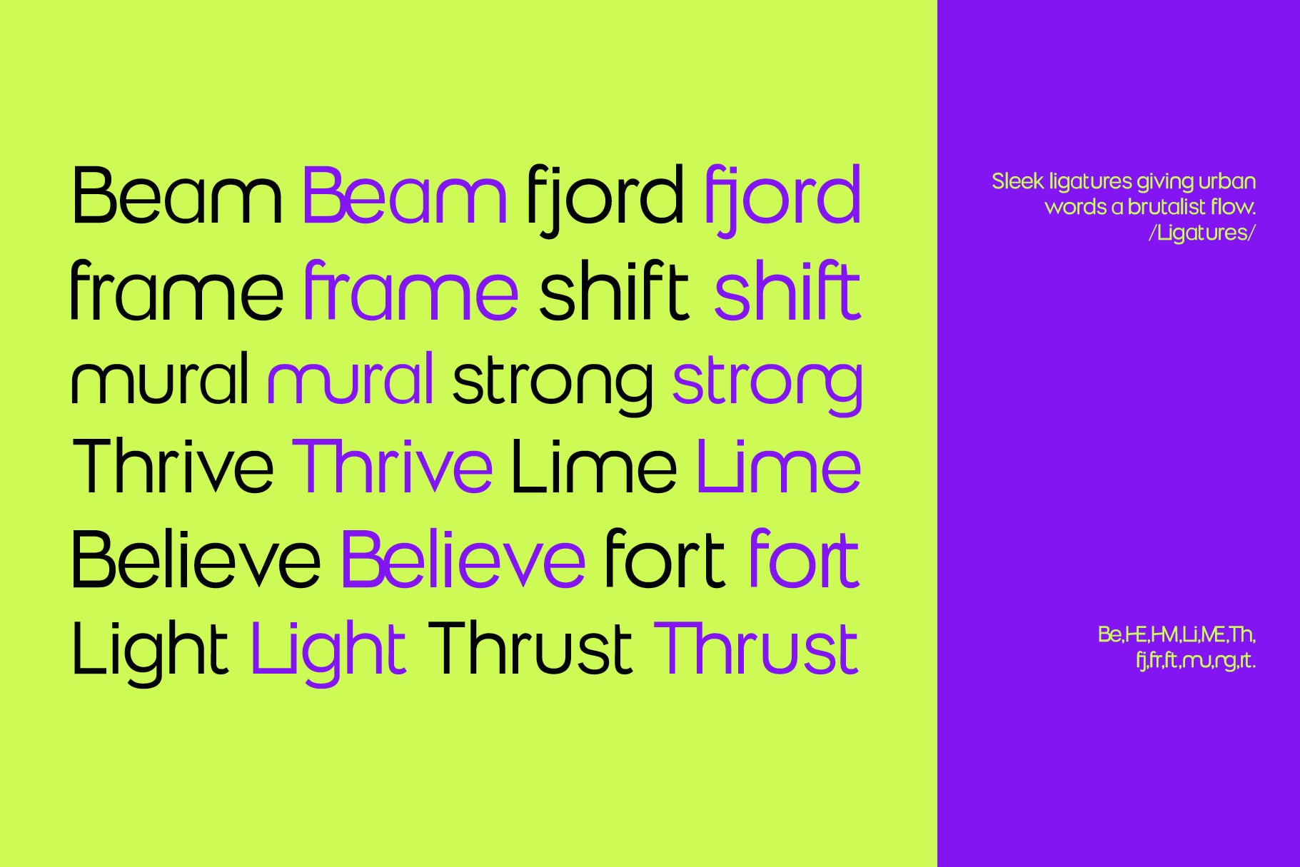
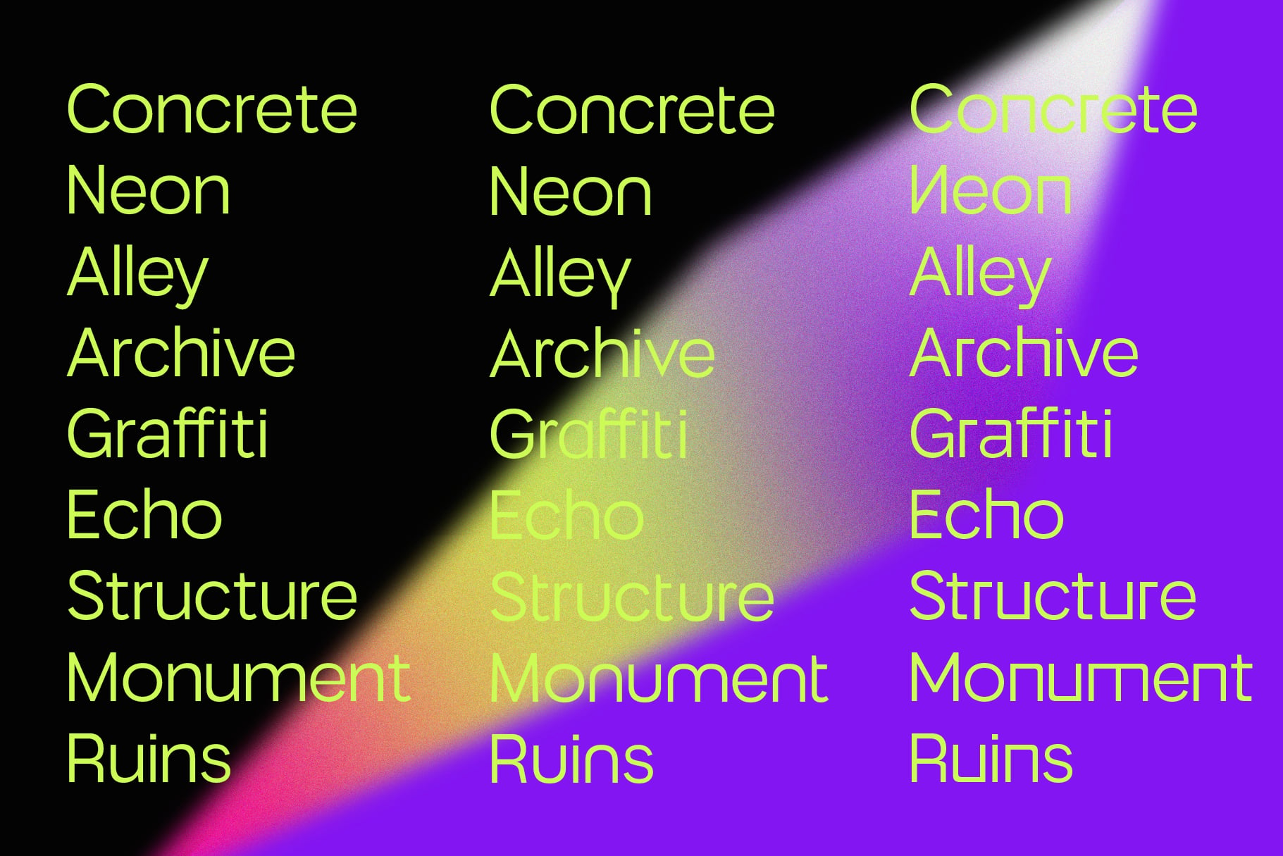
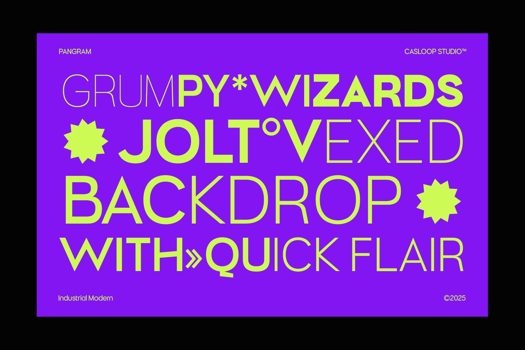
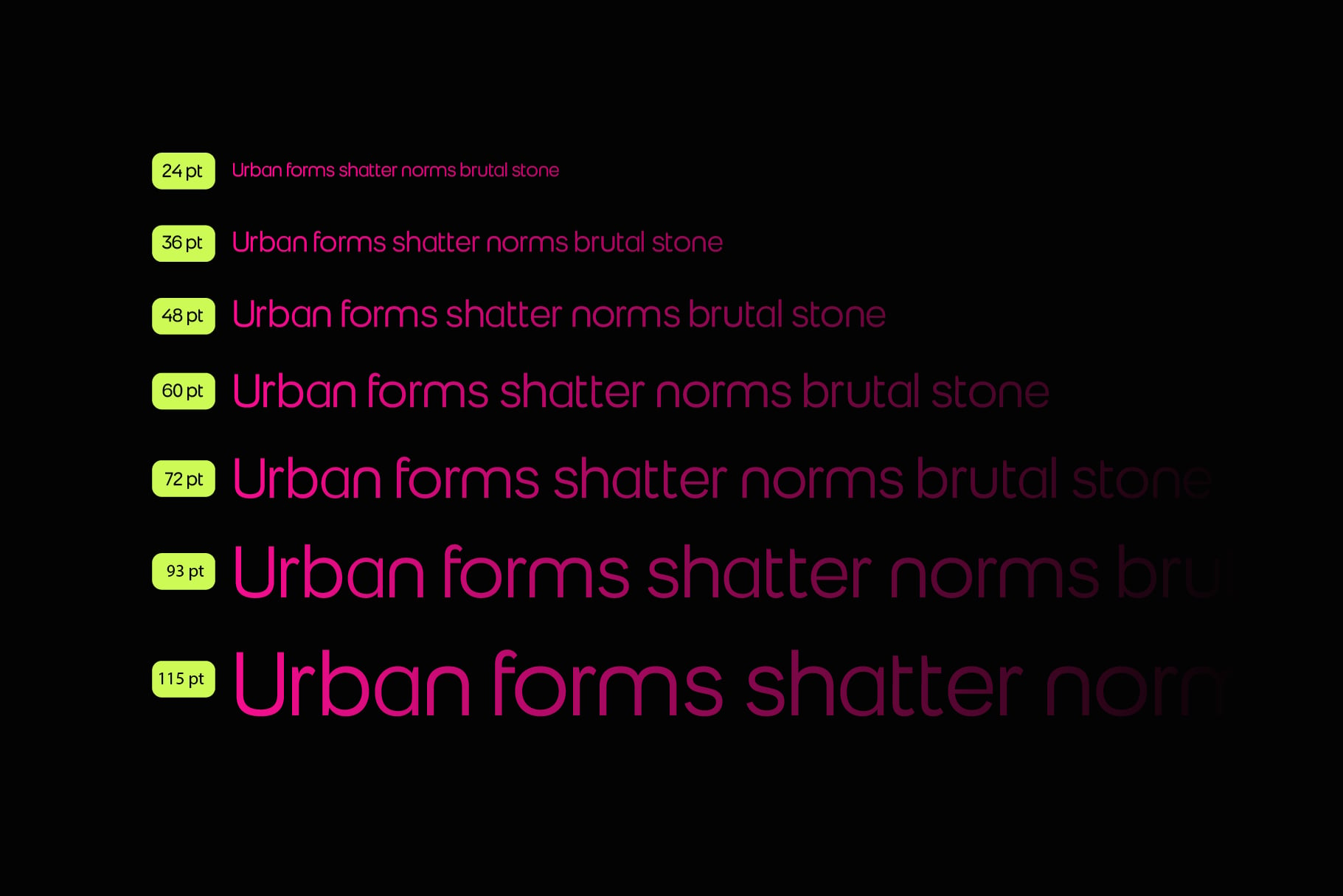
Muring.02 is the refined sibling in the Muring family — still brutalist at its core but with cleaner geometry and structured rhythm. Its forms are powerful yet practical, making it a reliable choice for both corporate branding and creative projects that demand clarity without losing strength. Its strongest detail is found in the character “R” — sharp, confident, and commanding. Along with stylistic alternates for letters like R, A, and T, Muring.01 allows expressive flexibility, giving every project a distinctive visual rhythm. Built in 9 weights (Thin to Black) and available in OTF, TTF, WOFF, WOFF2, and Variable Font, it adapts easily across editorial, digital, and environmental design.

Glyphs