Regular
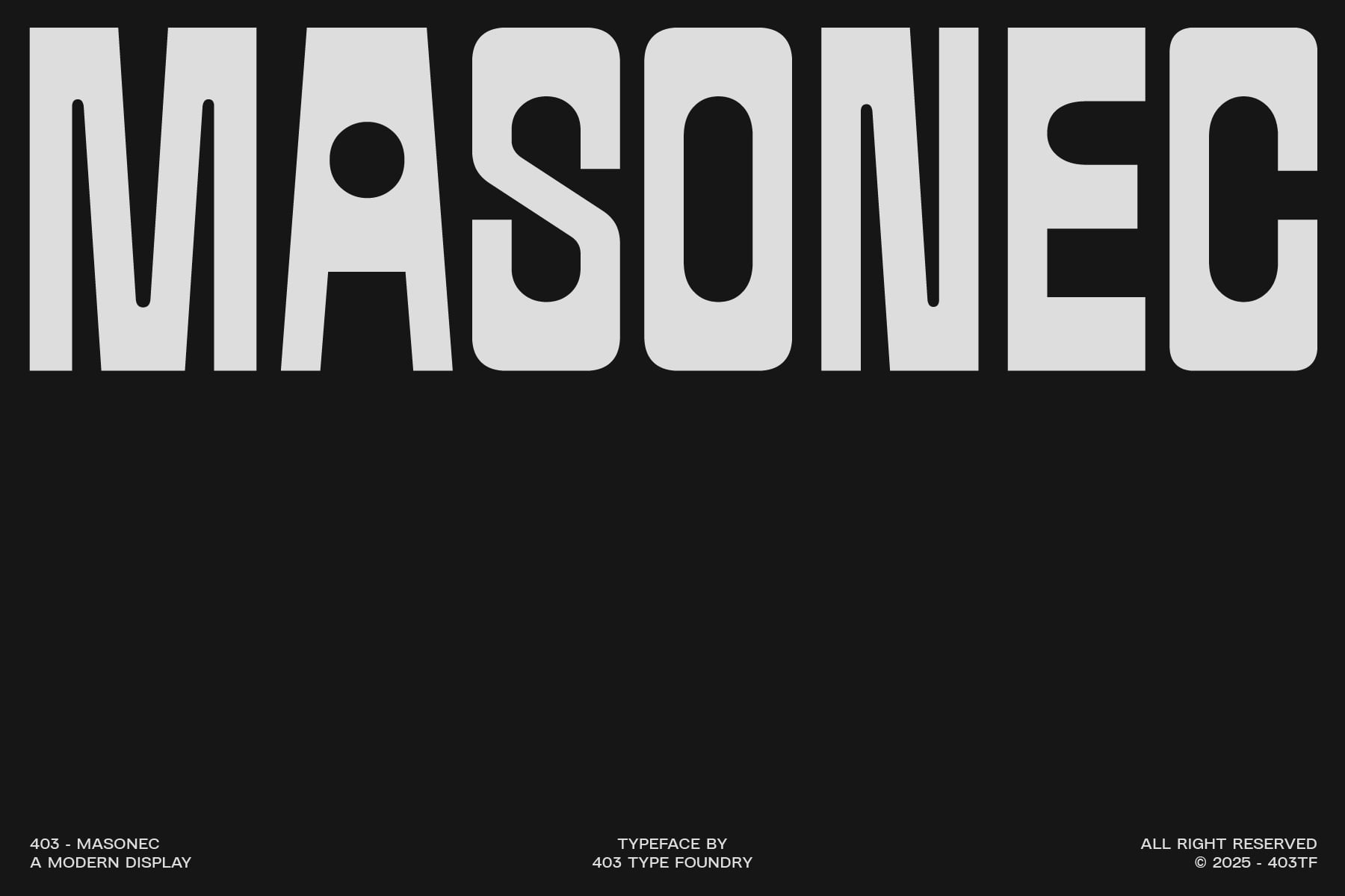
403 Masonec
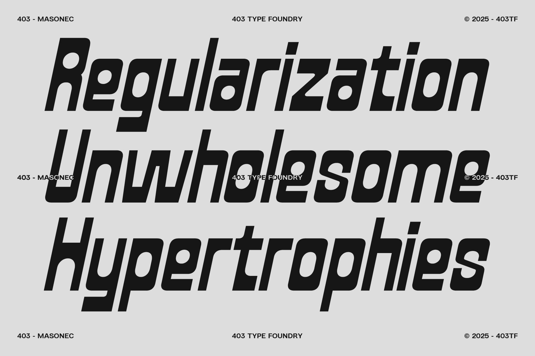
Slanted
403 Masonec
Family
RegularSlanted
Description
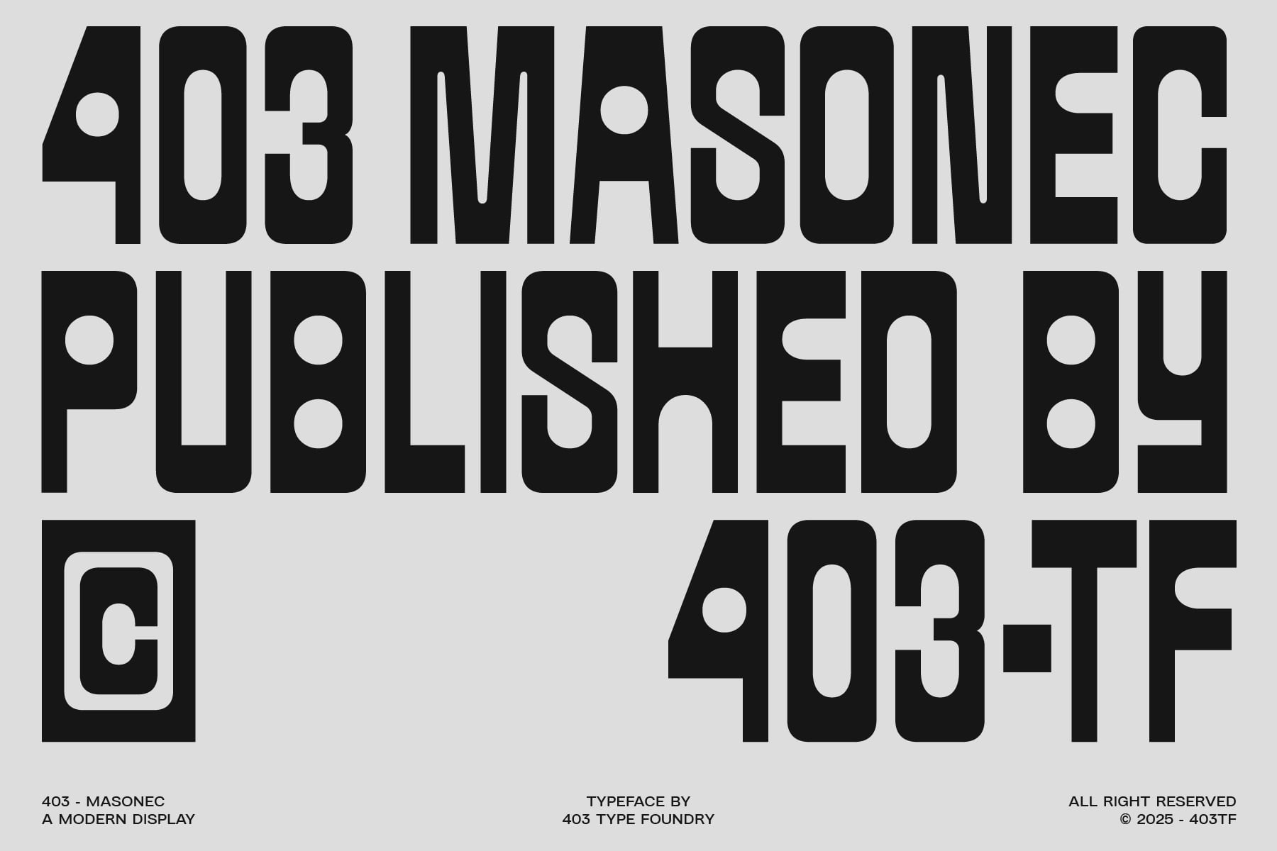
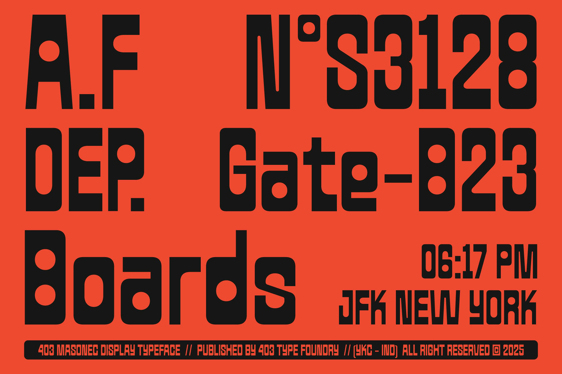
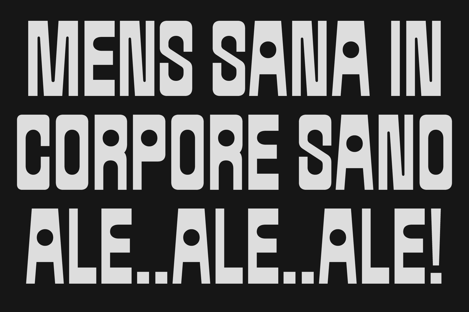
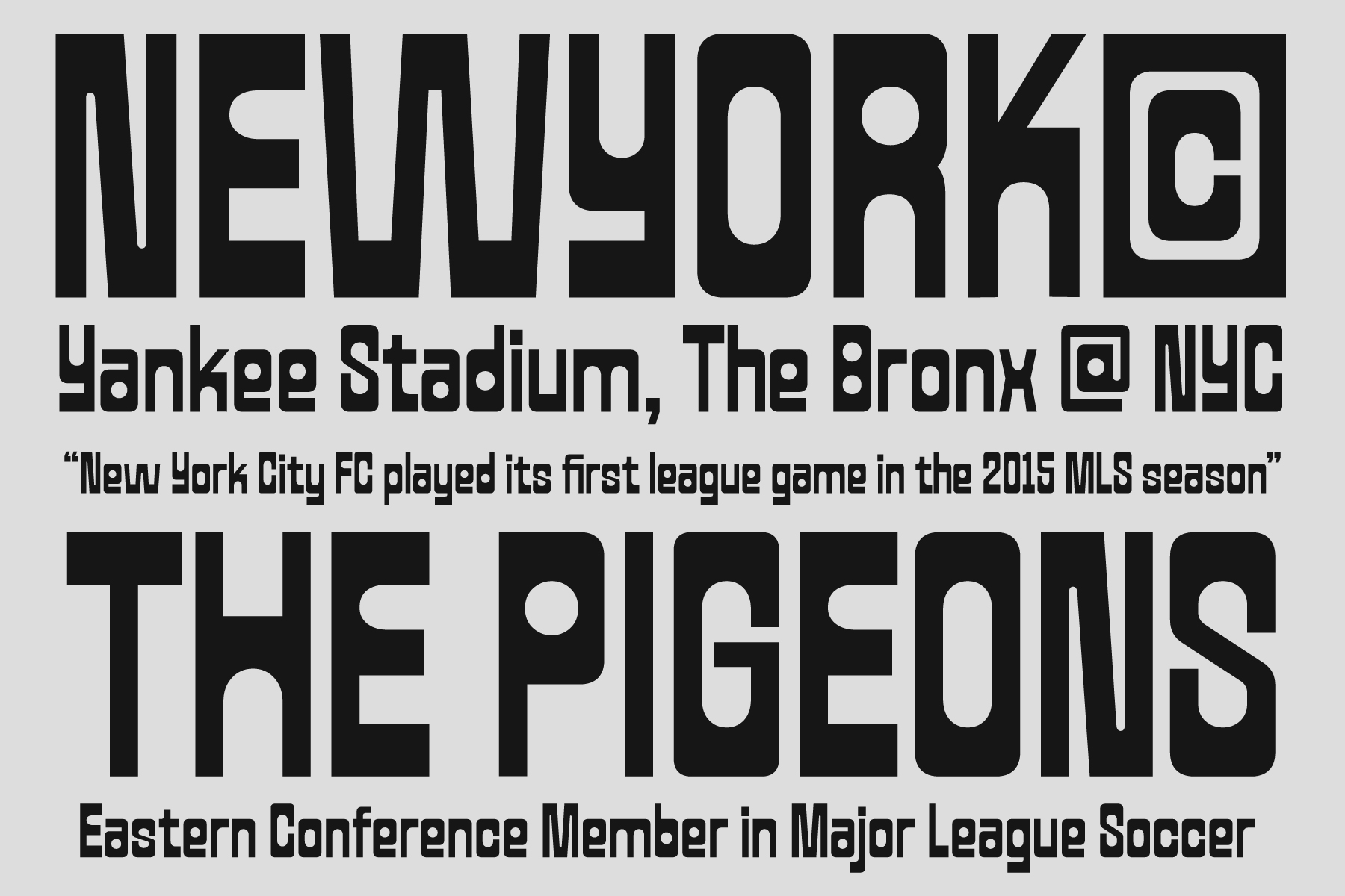
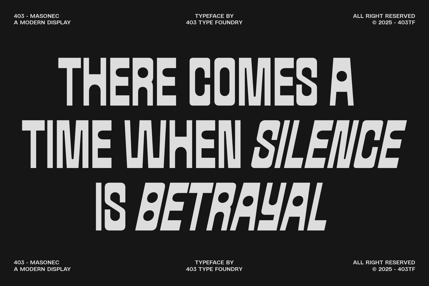
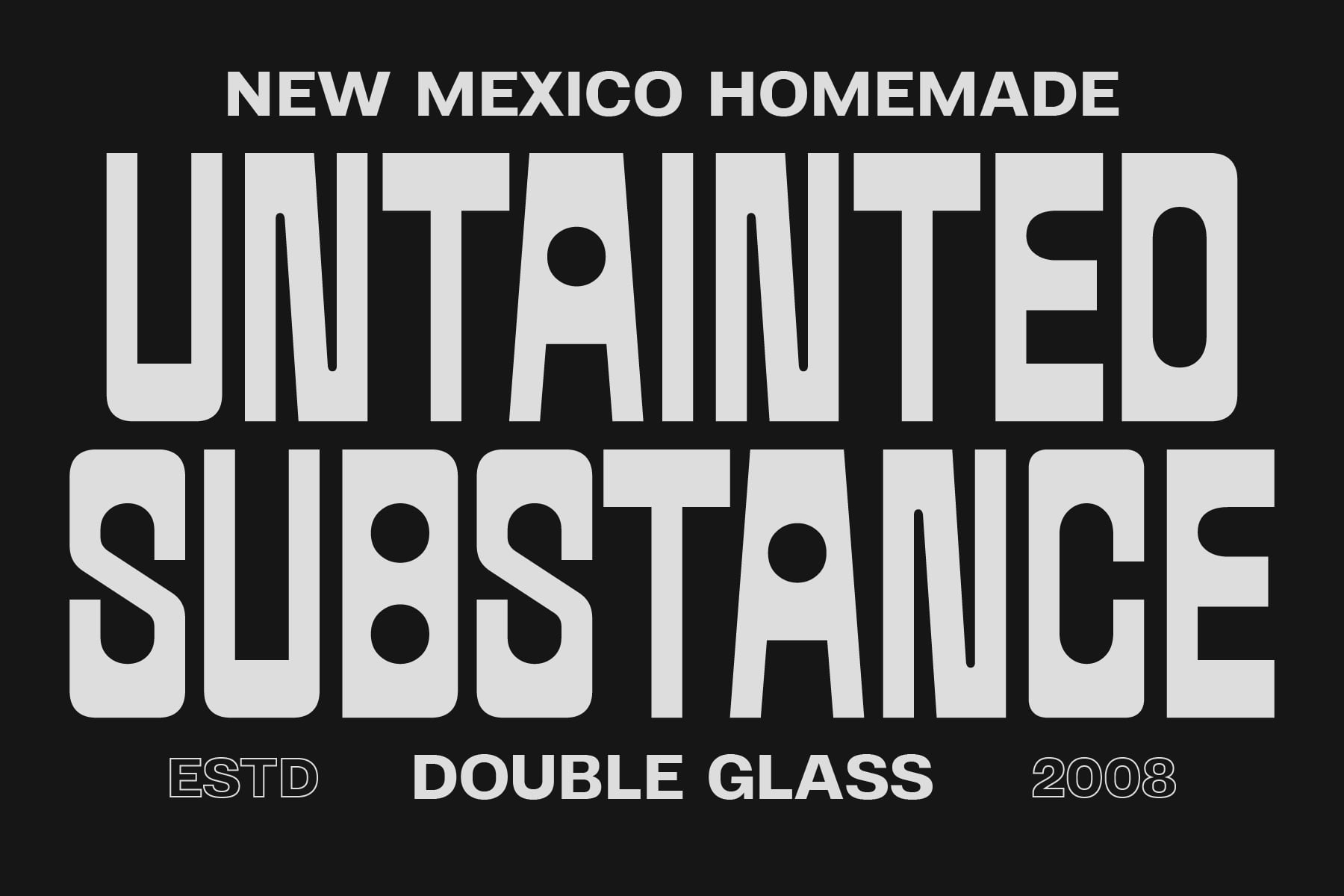
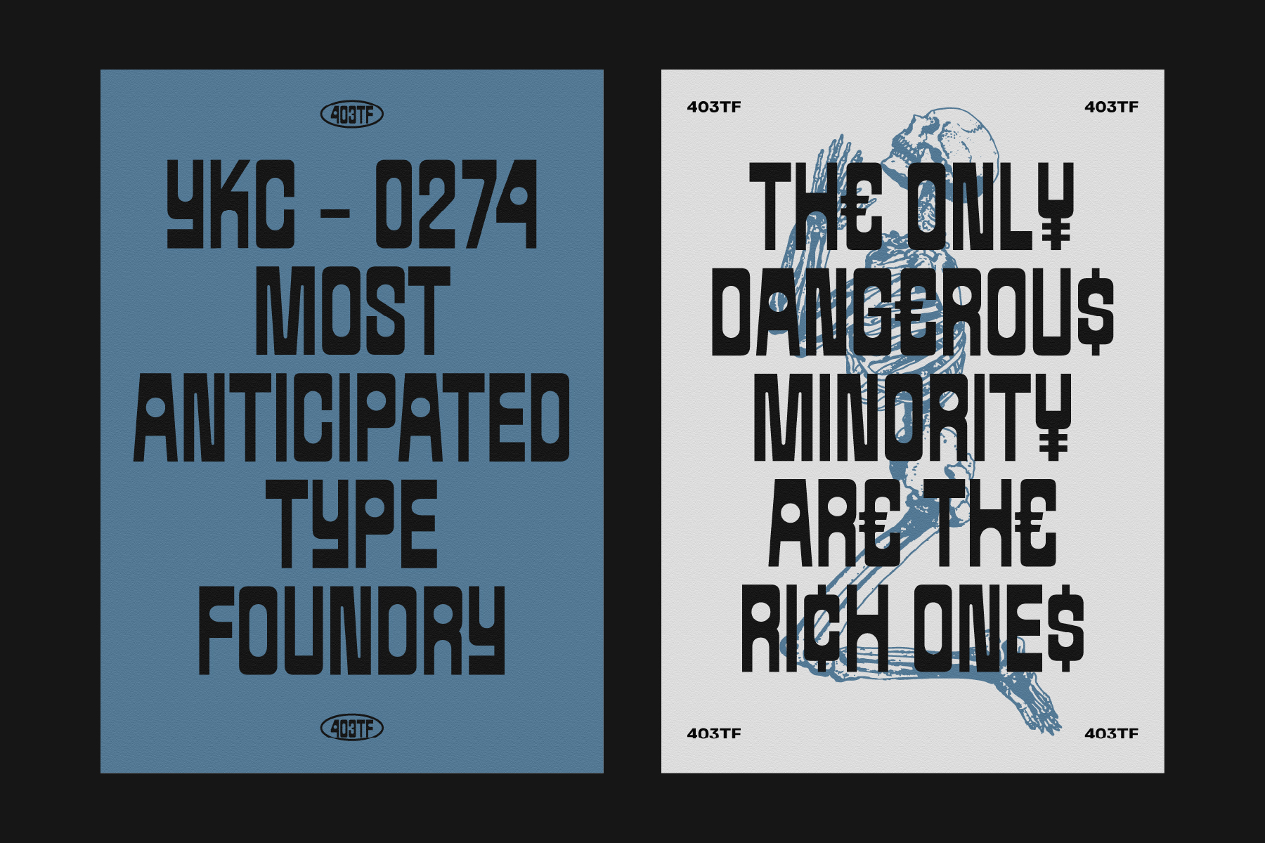
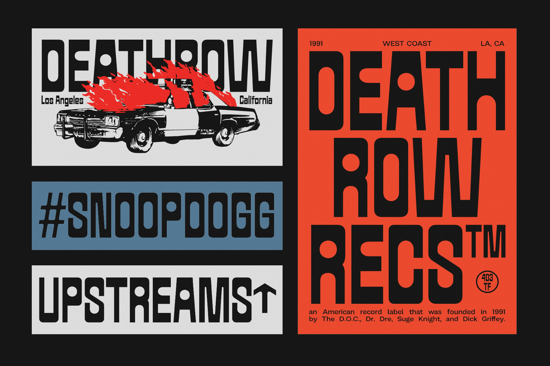
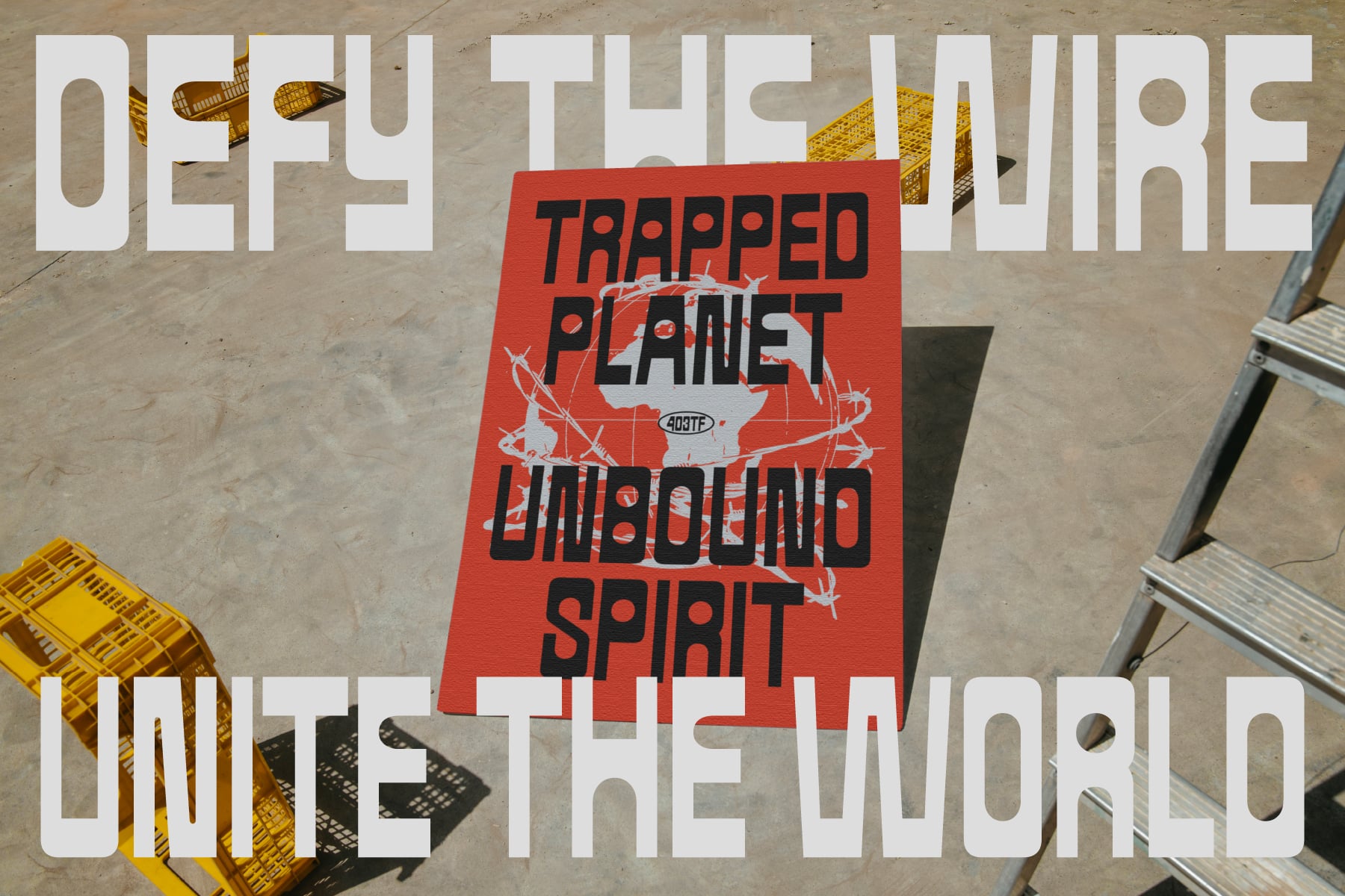
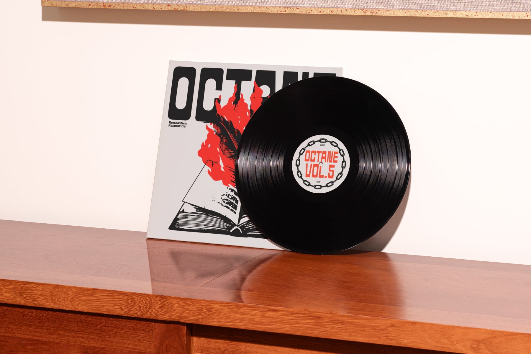
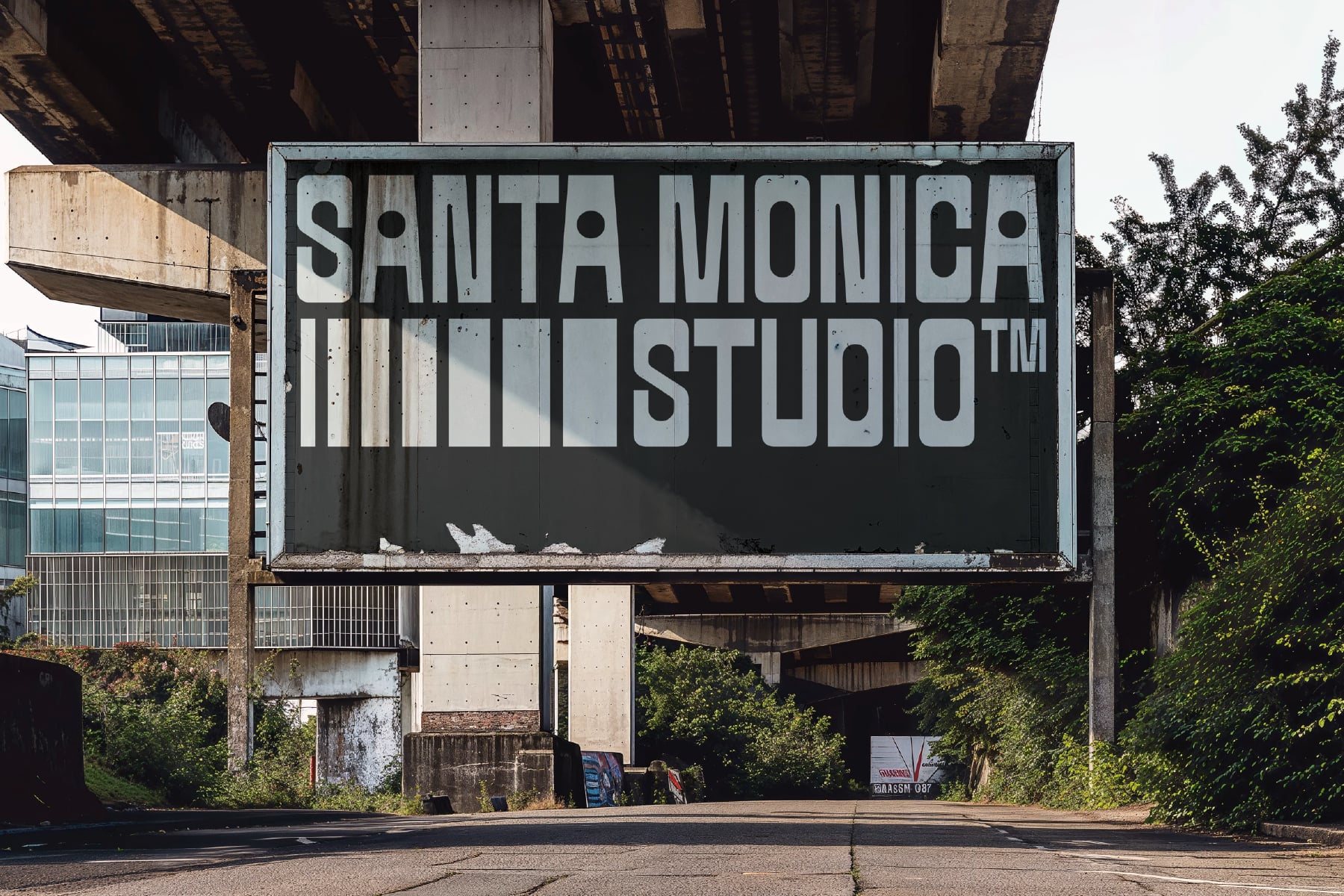
Inspired by industrial signage, brutalist architecture, and grid-based design systems, each character in 403 Masonec is designed as a block of visual power. Vertical rhythm shapes the structure, while rounded counters break through the density to create contrast and breathing space. With its monospaced feel and assertive tone, this typeface doesn’t whisper, it declares. It thrives in editorial design, transit graphics, music packaging, and sports or protest visuals, adding weight and character wherever it appears.
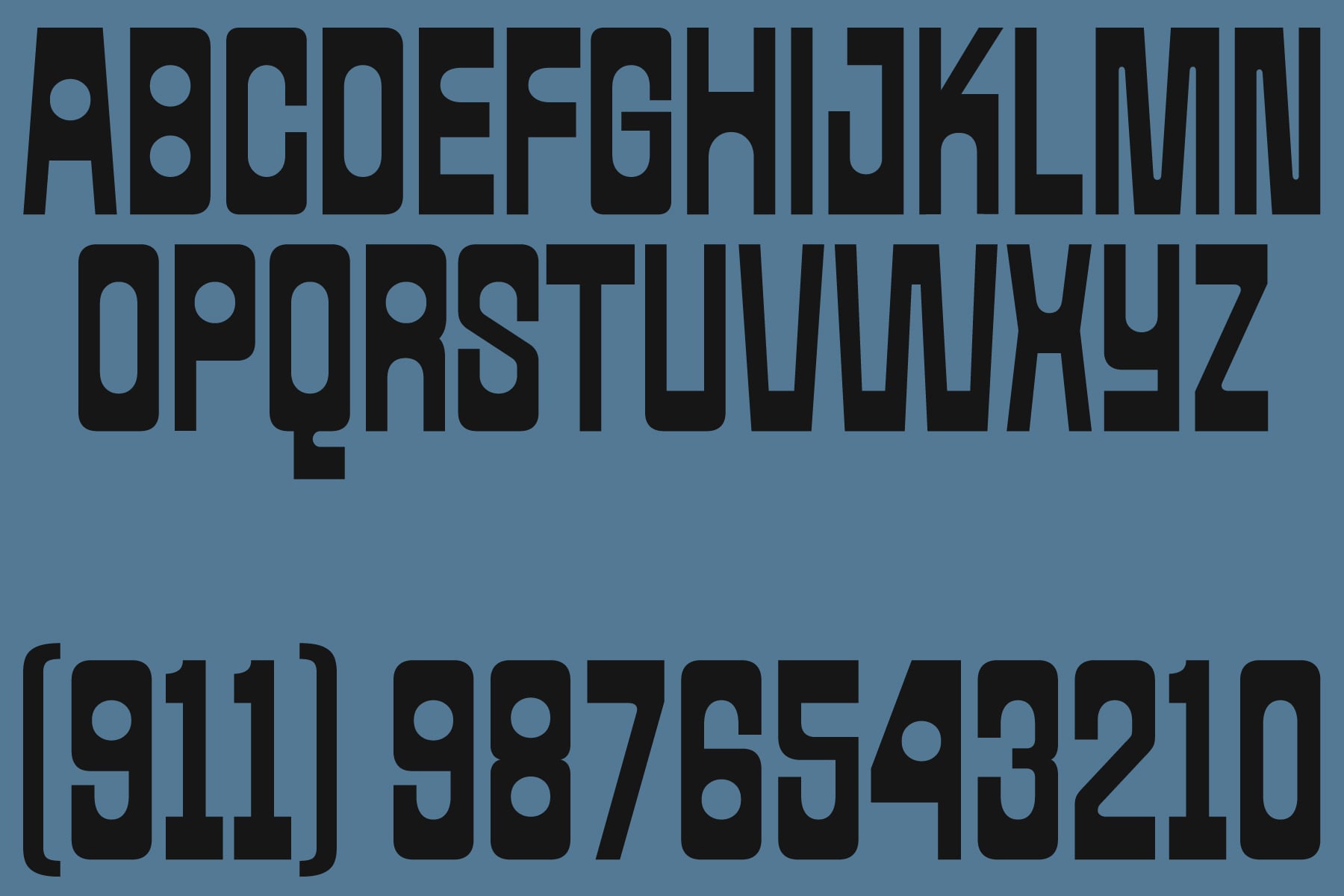

Glyphs